Figo Lager Brand Design
Louis Essien
Great products aren’t just invented in boardrooms; they are born from the single, passing moments that stick with us.
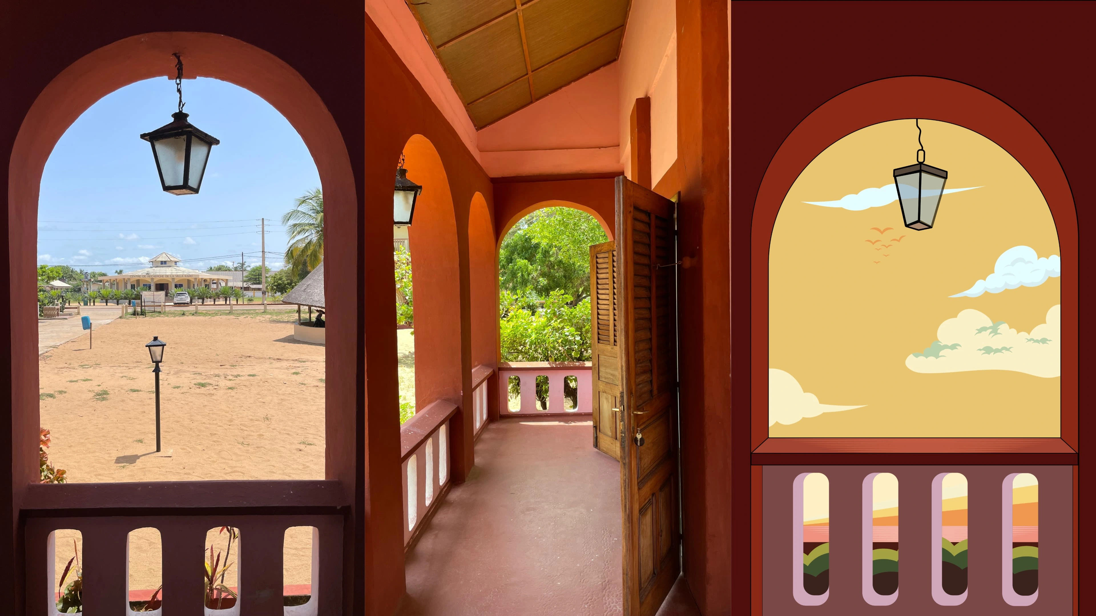
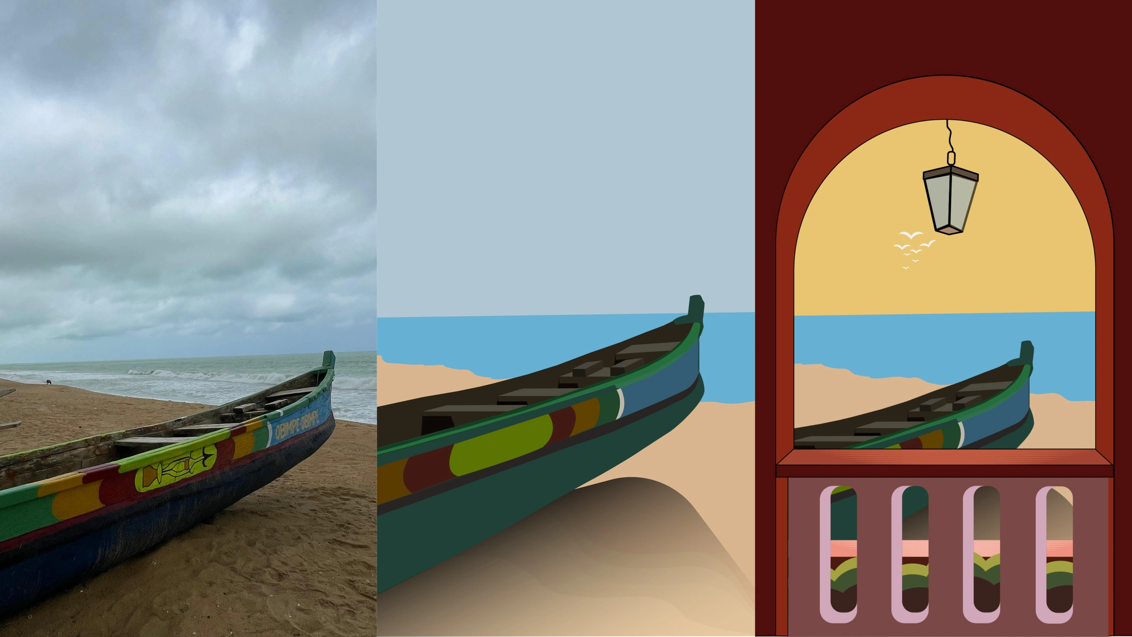
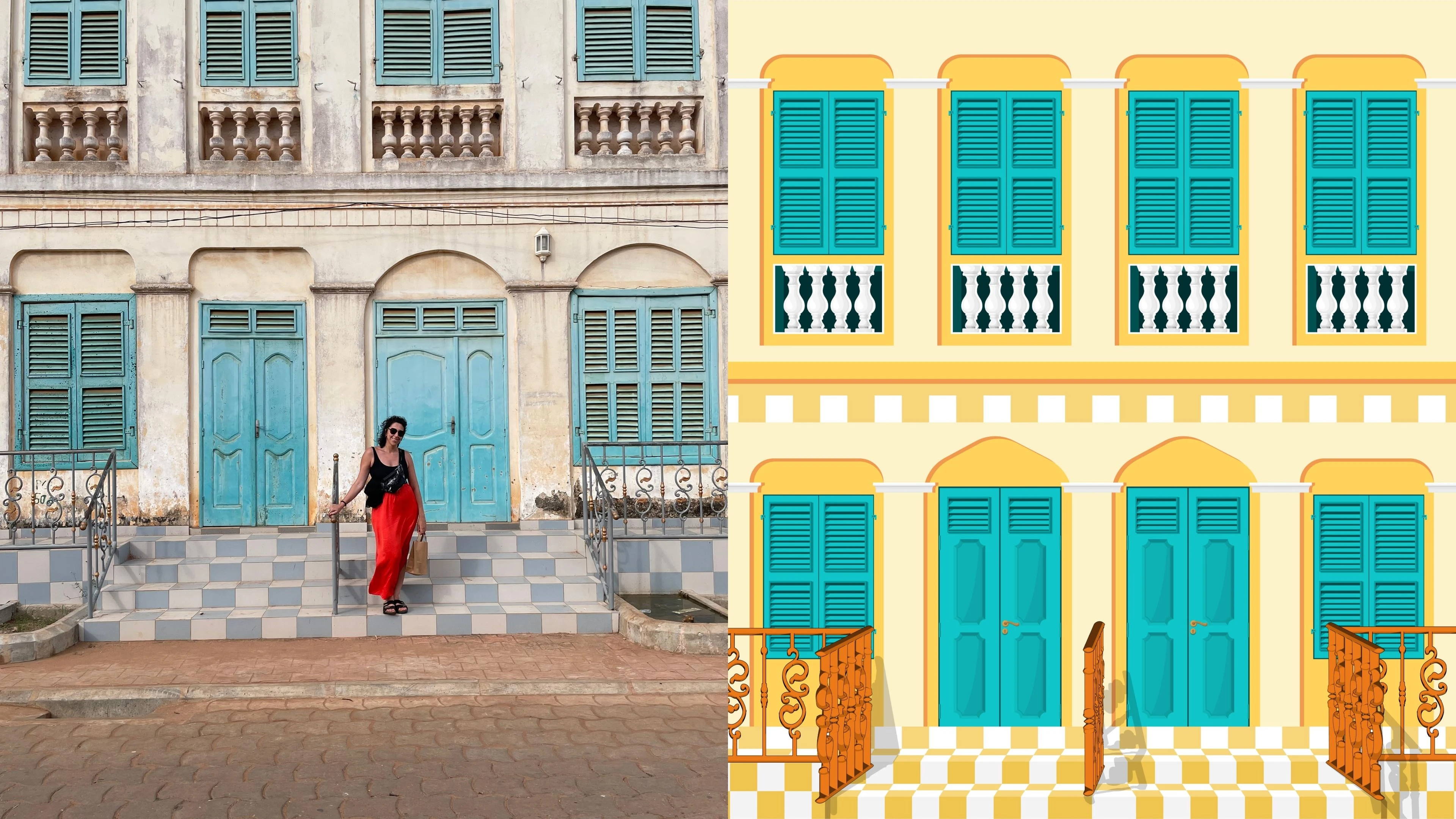
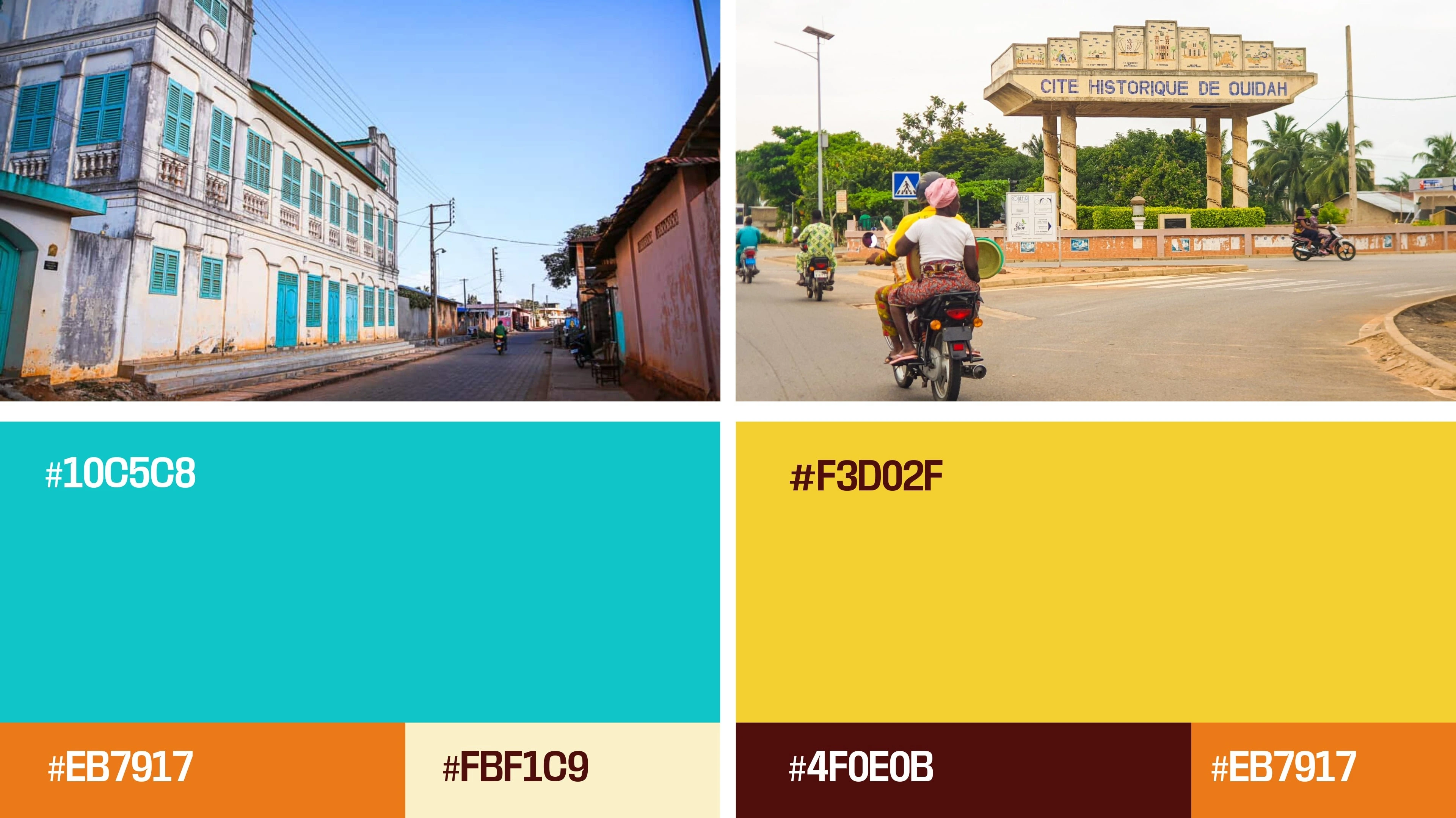
For this project, we operated on the belief that a physical place can dictate creative direction. We looked at Ouidah and Grand Popo (Benin Republic)—not as tourist destinations, but as “Style Archives.” The way the sun hits a colonial wall in Ouidah isn’t just weather; it’s a color palette. The quiet dignity of those streets isn’t just history; it’s a mood.
We wanted to fabricate a product that holds these moments—tightly enough to honor them, but lightly enough to be enjoyed.
02. The Name: The Code We All Know
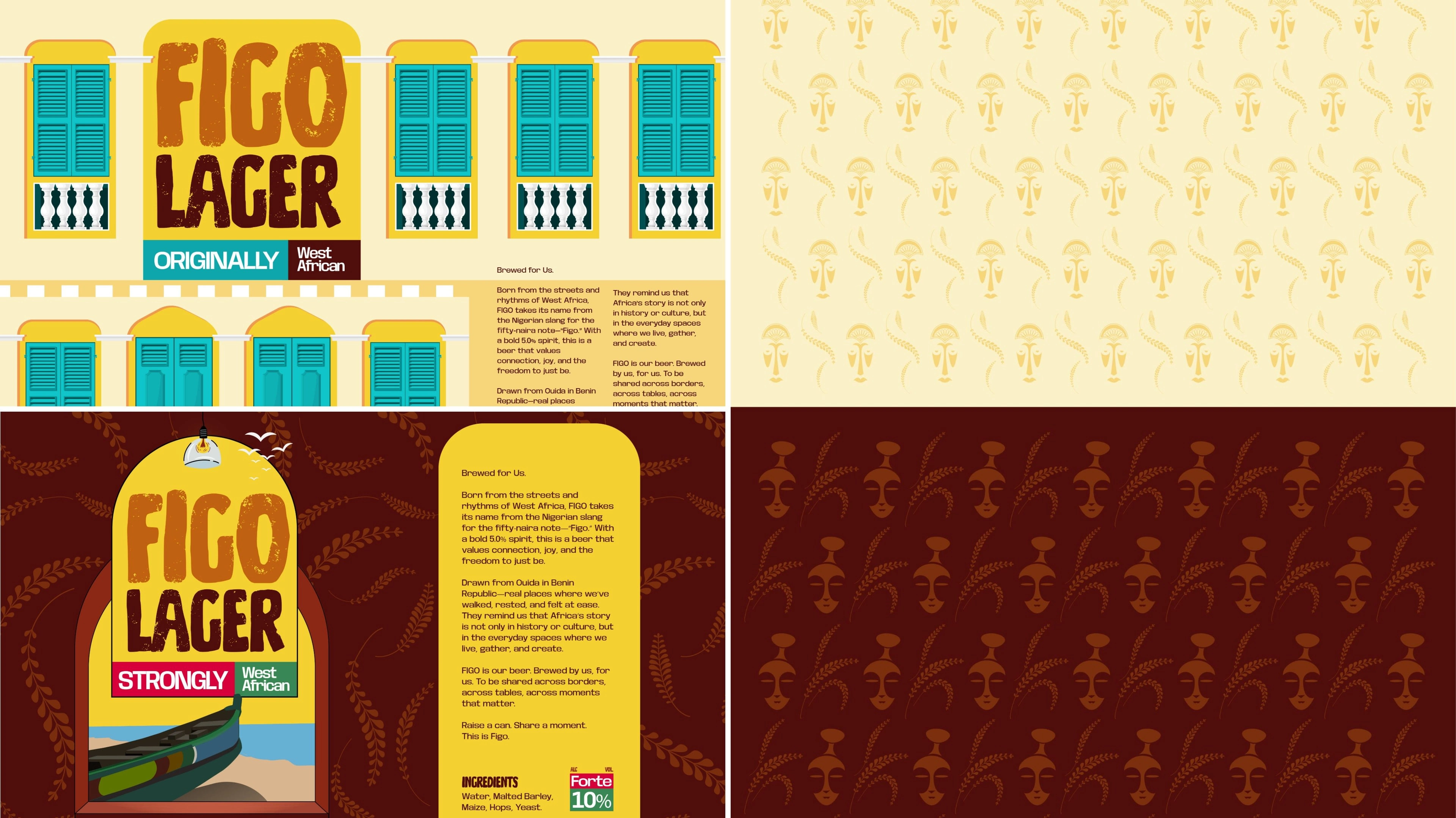
“Figo” In Nigeria, you don’t need to explain what “Figo” means. It is the street code for the 50 Naira note.
It represents the currency of the everyday. It is the handshake, the bus fare, the exchange between friends. By naming the lager Figo,
we anchored the product in a linguistic reality that belongs to the people. It is a word that requires no translation; it is simply understood.
03. The Intersection: Lagos Hustle x Ouidah Calm
The design challenge was to merge two distinct energies:
The Nigerian Perspective: The sharp, knowing wit of the “Figo” slang.
The Beninese Aesthetic: The washed-out teals, warm oranges, and deep creams of the Ouidah coastline.
The result is a brand that feels “Cross-Border” by nature. It acknowledges that culture doesn’t stop at the immigration checkpoint. The visual identity sits comfortably between the chaotic energy of a Lagos street bar and the slow, sun-drenched afternoon in Grand Popo.
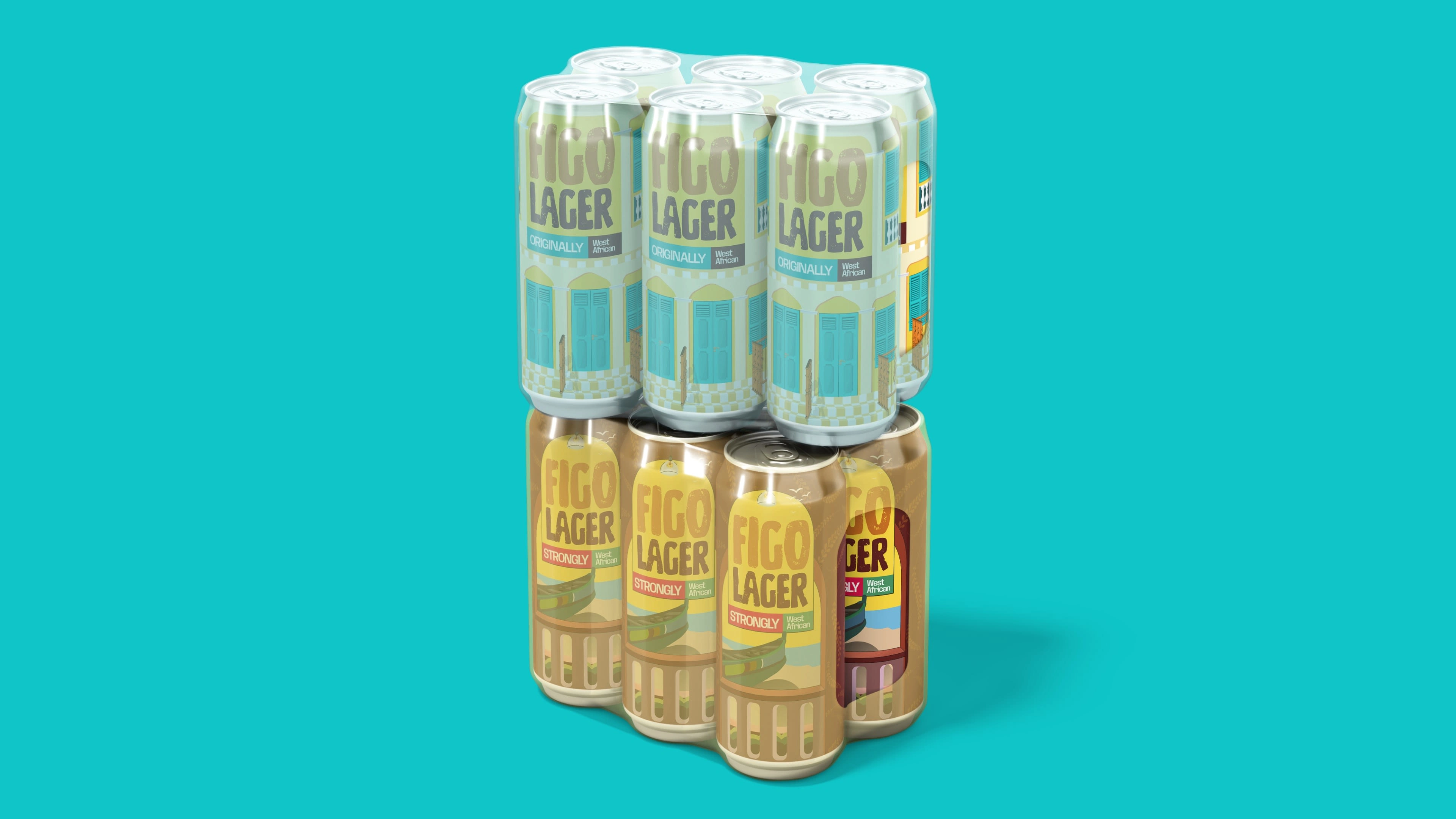
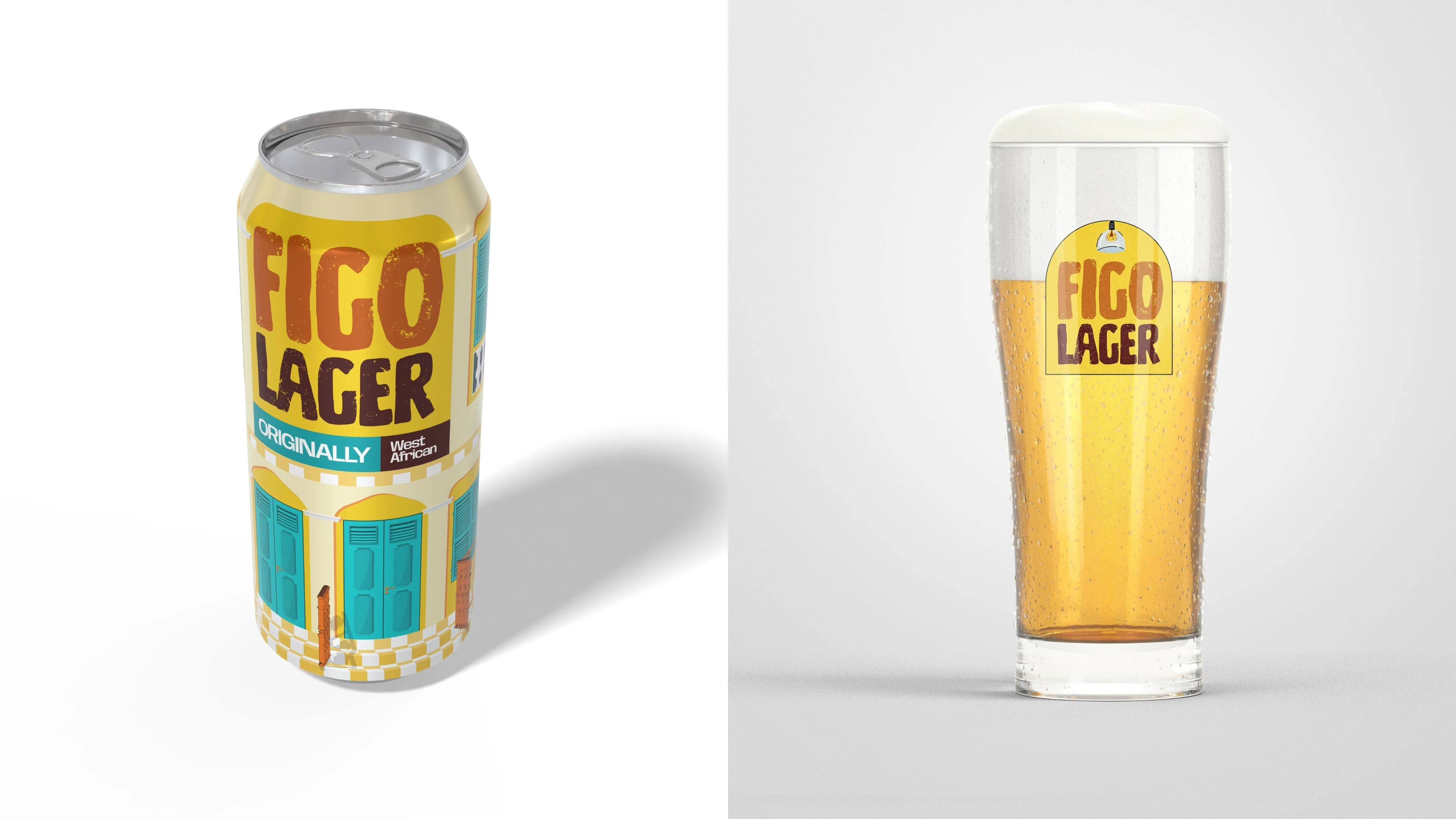
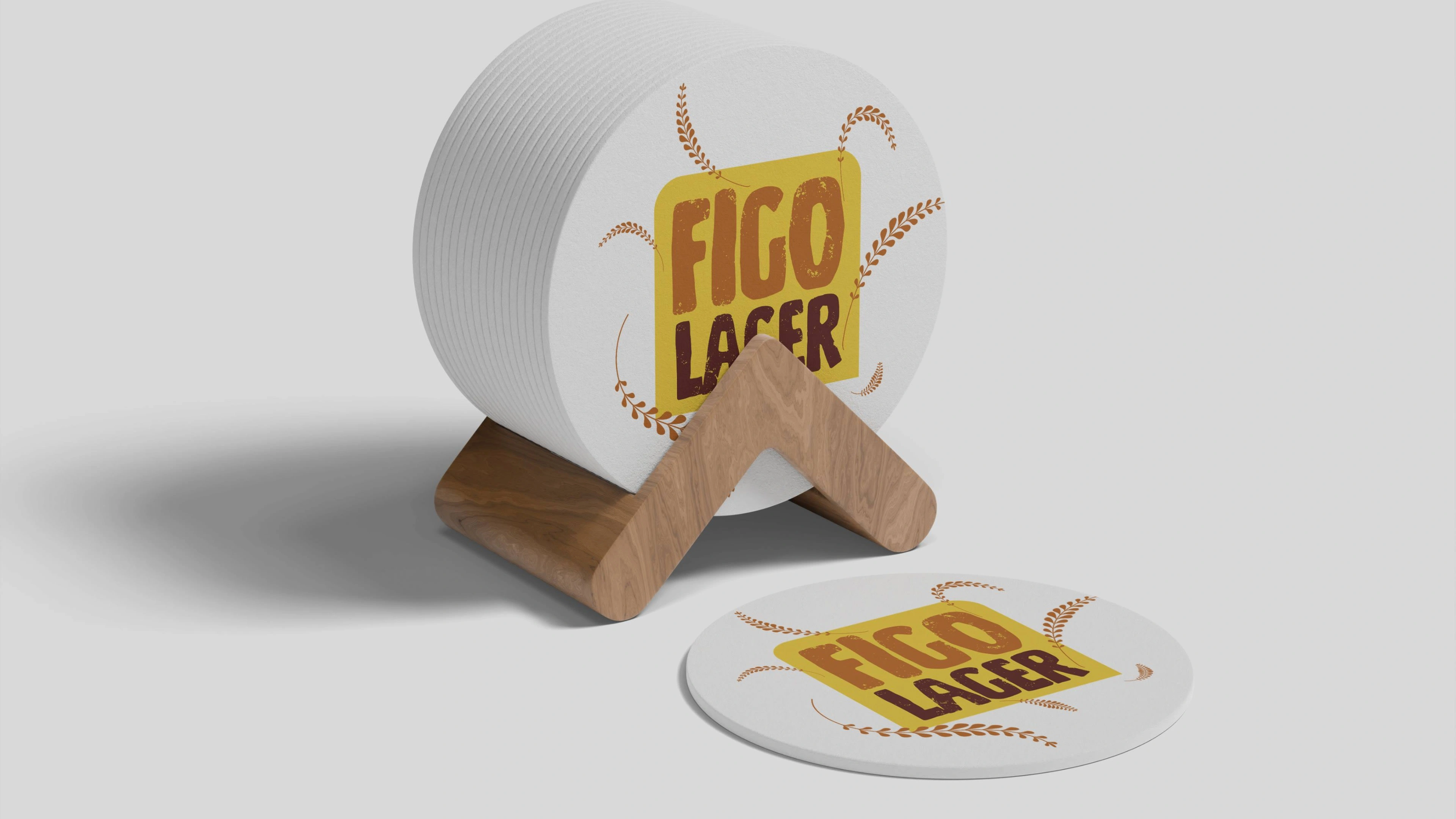
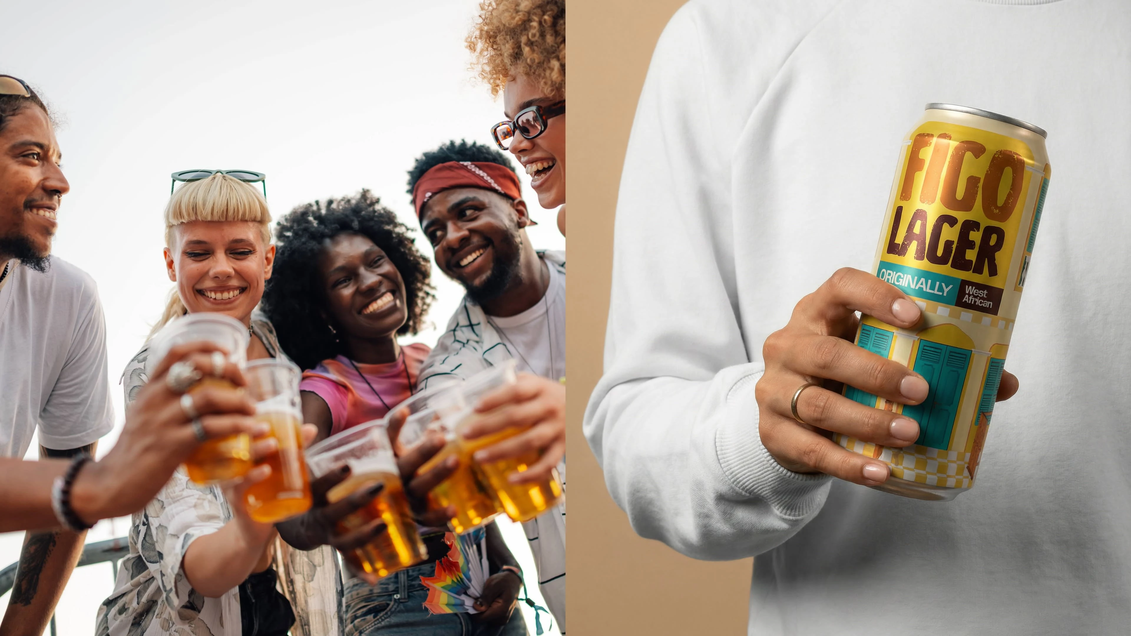
04. The Fabrication (The Visuals)
We treated the can not as a package, but as a canvas for this cultural intersection.
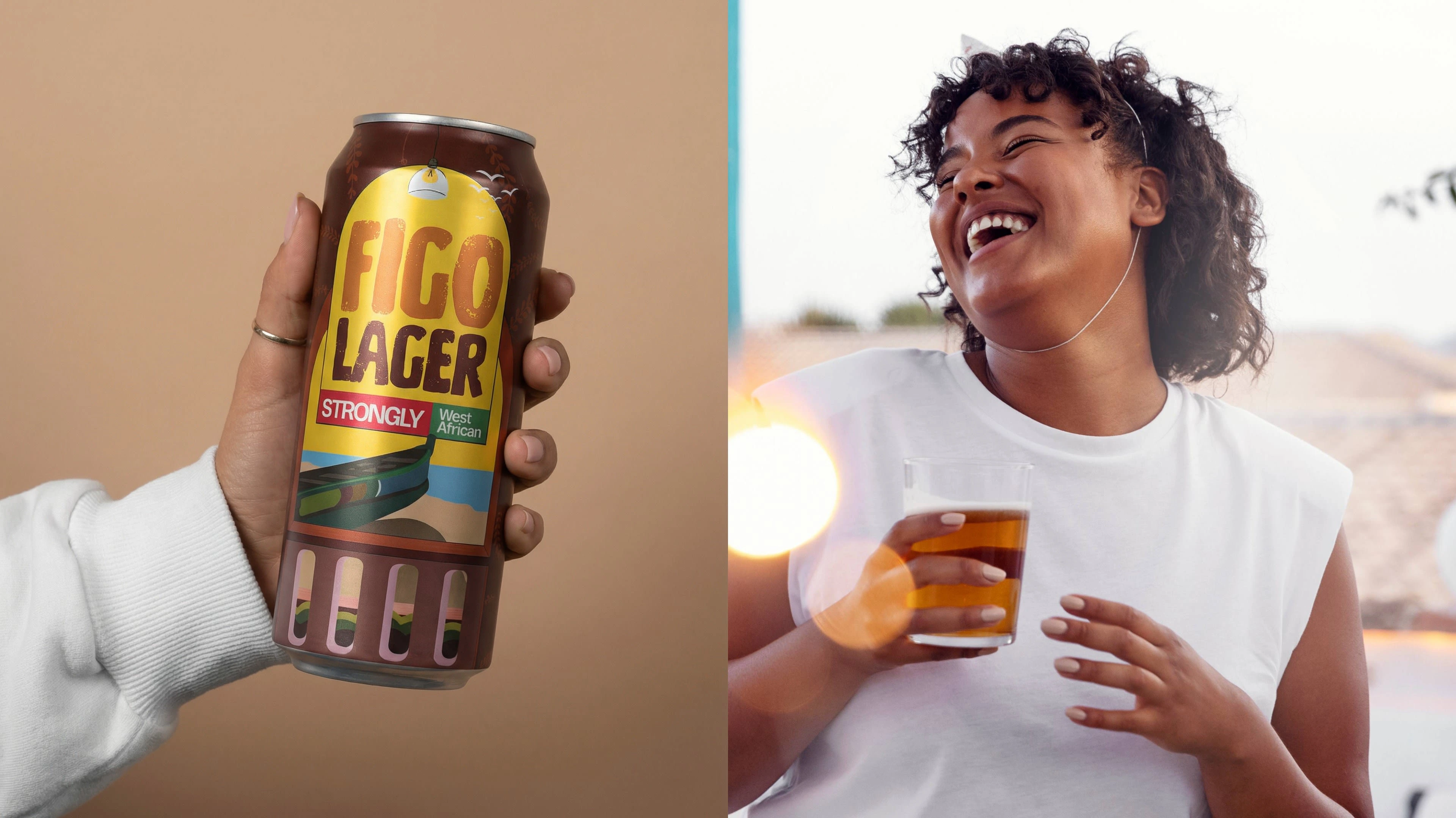
The Palette: We rejected the standard “commercial gold.” We used Ouidah Teal and Harmattan Orange— colors that feel like they were scraped off a wall in the French Quarter of Grand Popo.
The Typography: Bold, imperfect, and loud. It mimics the hand-painted signage of the West African street— holding the “Urban” energy of the name.
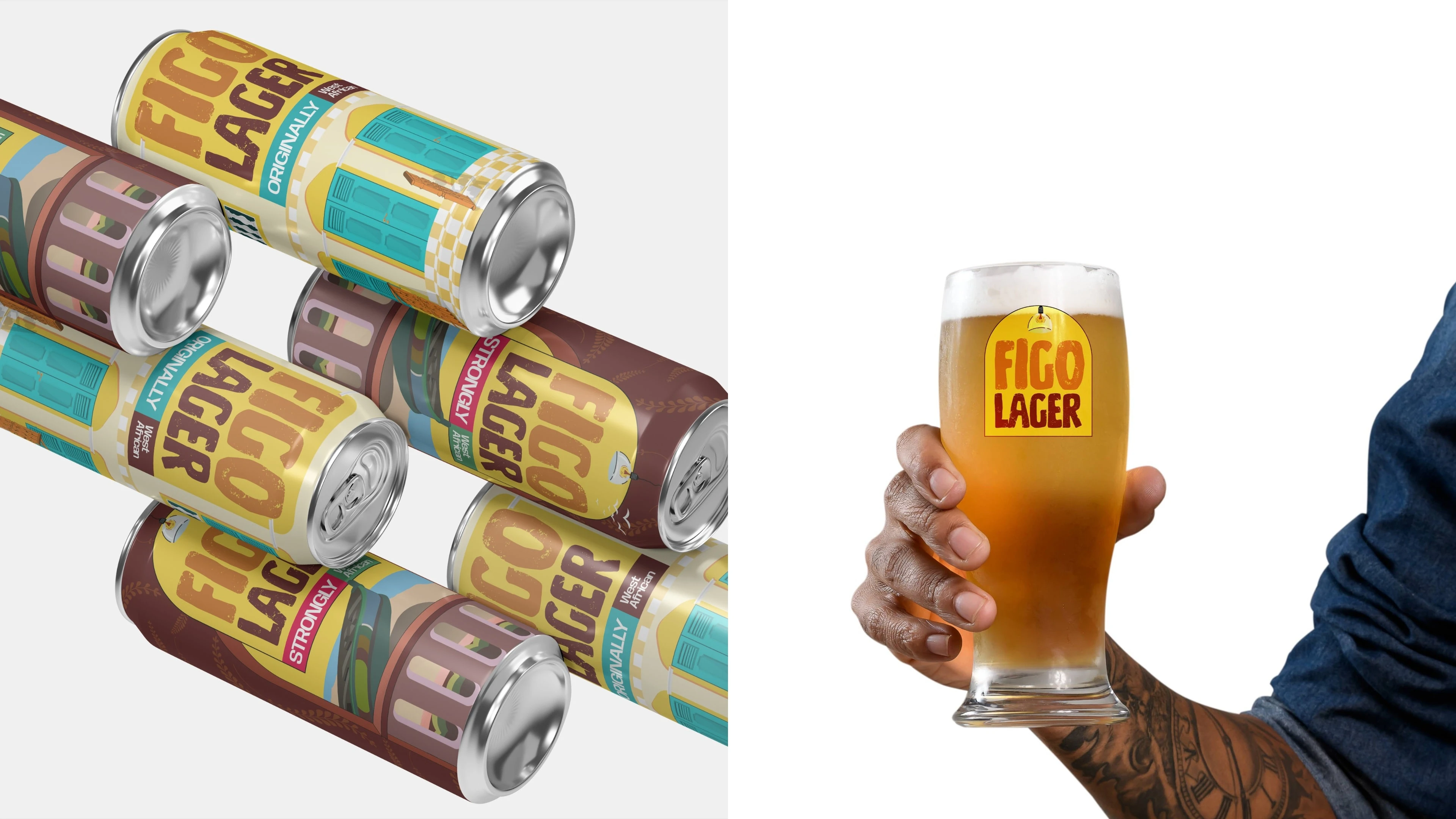
The Meaning: The design holds the culture “Tightly yet Lightly.”
Tightly: Through the “Strongly West African” seal, creating a sense of ownership.
Lightly: Through the playfulness of the “50” concept and the vibrant, relaxed colors.
Like this project
Posted Feb 16, 2026
Created a lager brand inspired by Nigerian and Beninese cultural elements.