Food Delivery App
Olufemi Tofunmi
🍽️ Food Delivery App — Mobile UX/UI Case Study
End-to-End Product Design | 2025
👋 Overview
This is a complete mobile food-delivery experience I designed from scratch — covering onboarding, restaurant discovery, ordering, checkout, payment, and live tracking.
My goal was to create a clean, modern, and intuitive flow that reduces friction and helps users order food in under 3 minutes.
🎯 Project Goals
• Design a simple and intuitive end-to-end user journey
• Improve readability and reduce cognitive load
• Build a consistent, scalable design system
• Provide early accessibility options
• Create a fast checkout flow with trust-building elements
• Visualize delivery tracking clearly
🧠 Problem
Food delivery apps often feel:
• Cluttered
• Slow to navigate
• Packed with unnecessary text
• Confusing at checkout
• Hard to read for people with accessibility needs
Users want to order food quickly with confidence, not decode a complicated interface.
✨ The Solution
A minimalist, accessible mobile experience with:
• Clear onboarding
• Fast login
• Organized restaurant discovery
• Clean food menus
• Transparent checkout
• Multiple payment options
• Real-time delivery tracking
• Simple rating flow
This project shows how design clarity leads to a smoother ordering experience.
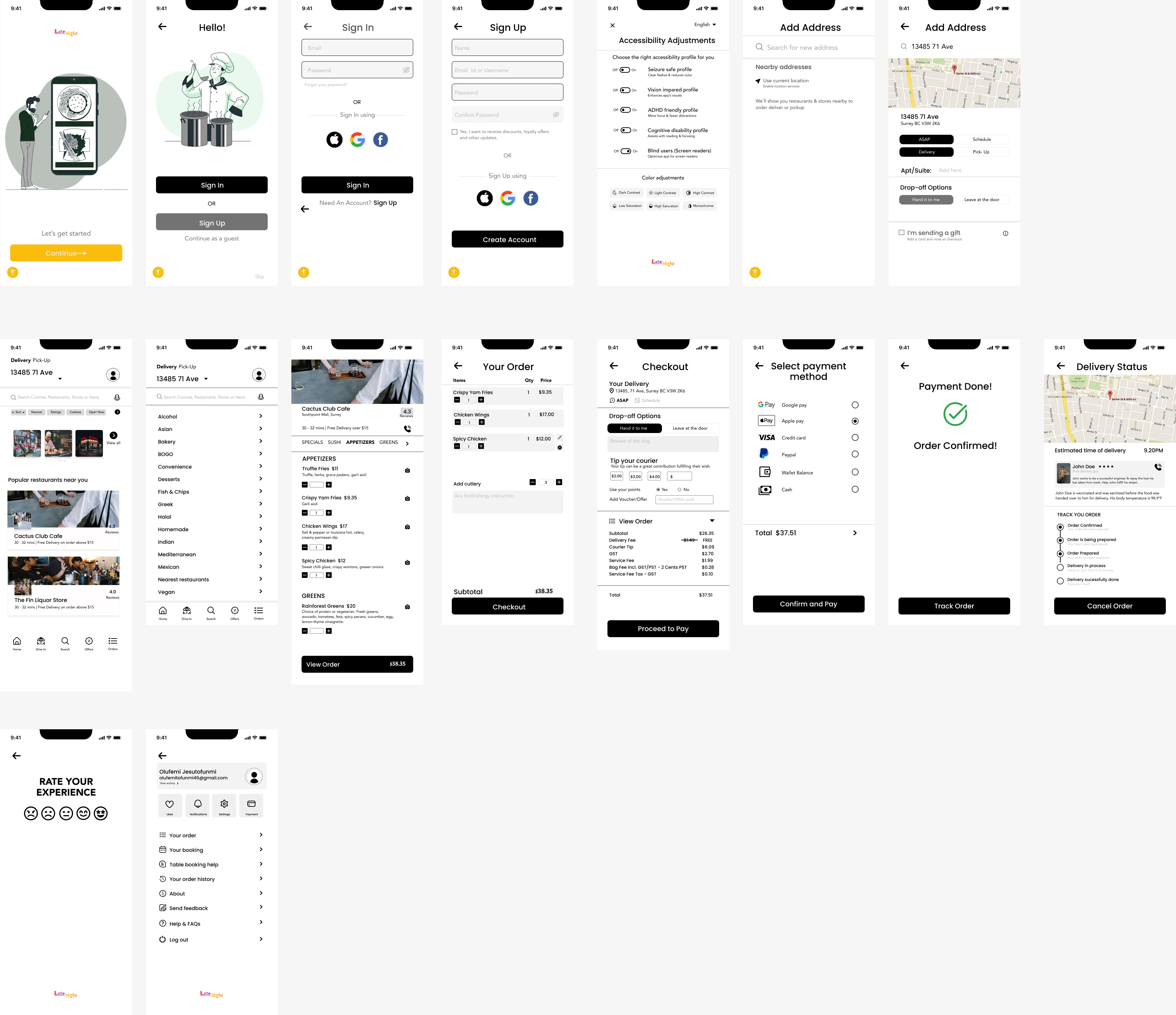
📌 USER FLOW
Onboarding → Authentication → Accessibility → Address → Home → Restaurant → Item Customization → Cart → Checkout → Payment → Order Confirmed → Live Tracking → Rating → Profile
This flow covers the complete lifecycle of a food order.
📱 KEY SCREENS
Below are the major screens with the thinking behind them.
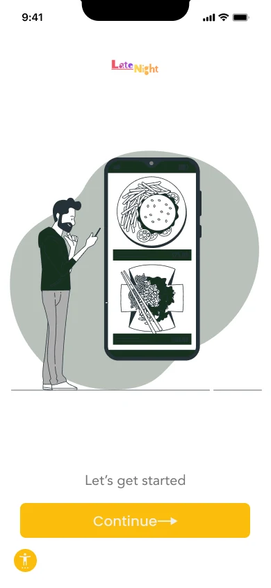
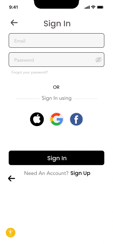
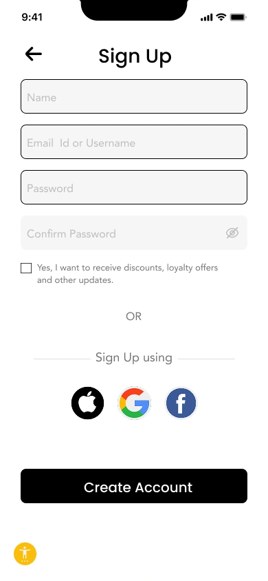
01 — Onboarding & Authentication
Objective: Get users into the app quickly.
• Minimal text
• Friendly illustration
• Clear CTAs
• Social login for 1-tap entry
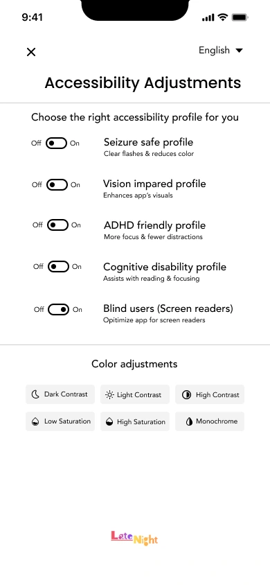
02 — Accessibility Setup
Accessibility appears immediately after signup so users can adjust:
• Text size
• High-contrast mode
• Motion/vibration preferences
Insert: Accessibility screen
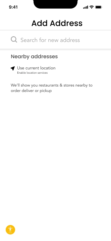
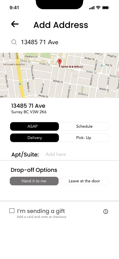
03 — Address Setup
Designed for speed and clarity:
• Map interaction
• Auto-fill suggestions
• Save multiple addresses
• Gift-delivery toggle
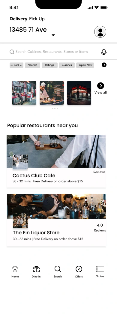
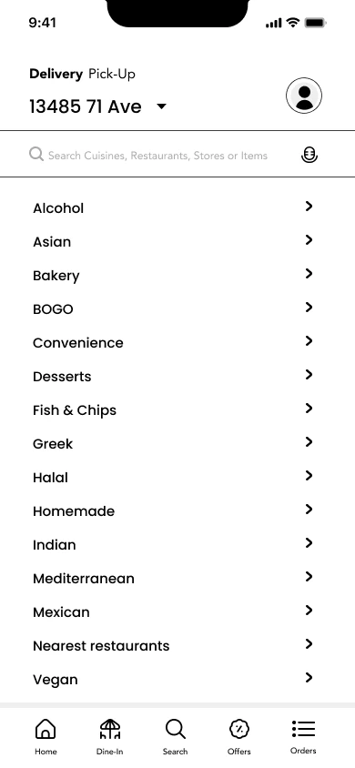
04 — Home Screen
Clean layout built for fast discovery:
• Category row
• “Popular Near You” section
• Restaurant cards with:
• Image
• Rating
• Delivery time / distance
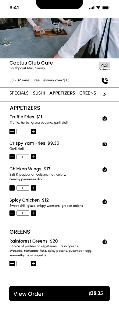
05 — Restaurant Page
Minimal and structured:
• Hero photo
• Menu categories
• Simple item cards
• Quick add (+) buttons
06 — Order Customization
Clarity + flexibility:
• Quantity selector
• Add-ons with checkboxes
• Auto price updates
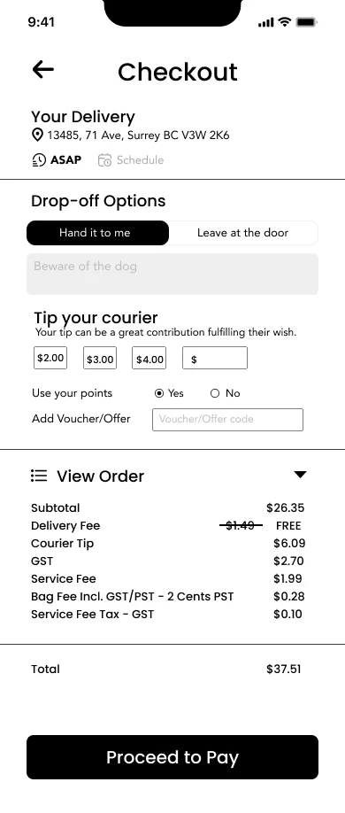
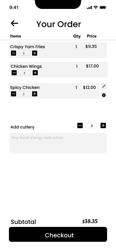
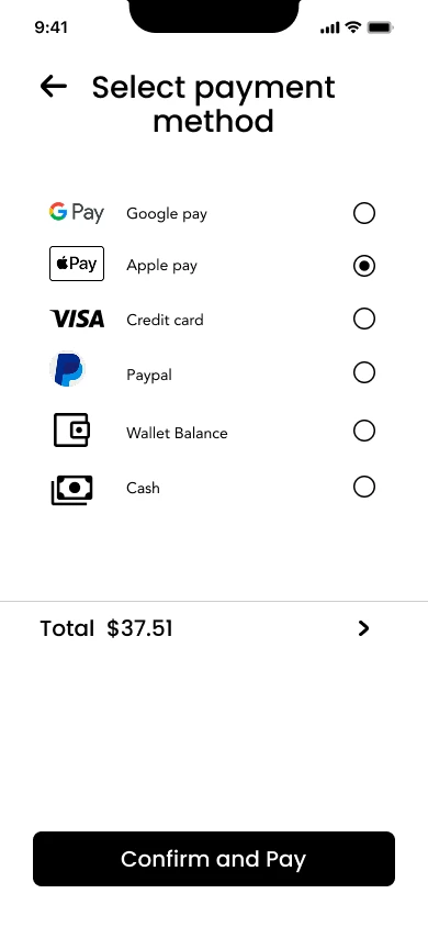
07 — Checkout Flow
The most optimized part of the experience:
• Delivery address
• Tip options
• Payment summary
• Transparent breakdown
• Strong primary CTA
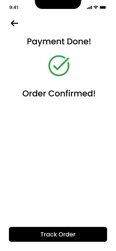
08 — Order Confirmation
• Success animation
• Simple order summary
• “Track Order” CTA
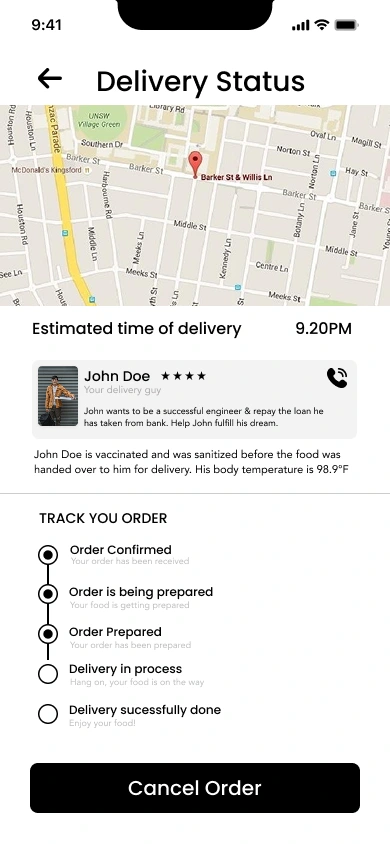
09 — Live Delivery Tracking
High-information screen, minimal clutter:
• Real-time map
• Driver info
• Restaurant info
• ETA highlight
• Contact options
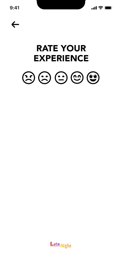
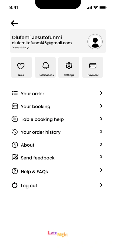
10 — Ratings & Profile
• Quick emoji-style rating
• Clean profile with essential options
• Order history
• Saved addresses
• Payment methods
🎨 DESIGN SYSTEM
Typography
• Primary: SF Pro Display / Bold
• Body: SF Pro Text / Regular
• Created for readability and consistency
Color Palette
Used Color Primary #000000 Accent #FFC727 Background#FFFFFF
A neutral palette for focus and clarity.
Components
• Buttons (Primary / Ghost)
• Restaurant cards
• Menu cards
• Bottom navigation bar
• Input fields
• Toggles and radio buttons
🔍 Challenges
1. Reducing clutter
Food apps show a lot of information.
Solved with clean spacing, dividers, and strong hierarchy.
2. Making checkout trustworthy
Costs and fees can feel confusing.
Solved with a transparent breakdown and large headings.
3. Designing for accessibility
Users shouldn’t dig through settings to adjust text size.
Placed accessibility setup early in the flow.
📈 Outcome
The final design delivers:
• A smooth end-to-end journey
• Clear visual hierarchy
• Faster checkout
• Better accessibility
• Clean tracking experience
• A consistent and scalable system
This project proves I can design a complete mobile product, not just isolated screens.
💡 Final Thoughts
This project was a deep dive into designing a full mobile experience.
It strengthened my skills in:
• UX flow planning
• UI design
• Interaction design
• Accessibility
• Visual hierarchy
• Product thinking
I designed every screen from scratch with the aim of making food ordering simple, modern, and enjoyable.
Like this project
Posted May 28, 2026
I designed every screen from scratch with the aim of making food ordering simple, modern, and enjoyable.