Truflation Platform Redesign

Mitul Gajera

Date: 2022-2023
Description: I re-designed the global economical data platform by transforming complex inflation metrics and AI-powered insights into an intuitive dashboard that increased user retention by 40%, improving conversion rate and leading to higher revenue.
Overview: The need for accurate, transparent, and real-time inflation data
Traditional inflation metrics like the Consumer Price Index (CPI) suffer from critical limitations: they rely on limited sampling, update monthly rather than daily, and often fail to reflect consumers' lived economic experiences. In a world increasingly dependent on real-time information, these outdated methods create significant information gaps for investors, businesses, and individuals making financial decisions.
Truflation emerged to solve this problem by providing unbiased, data-driven, real-market inflation rates and economic indicators available daily and on-chain. Unlike CPI's 80,000 surveyed items updated monthly, Truflation processes over 10 million products weekly from 30+ independent sources, delivering transparency through blockchain verification.
Challenge
Truflation emerged to solve this problem by providing unbiased, data-driven, real-market inflation rates and economic indicators available daily and on-chain. Unlike CPI's 80,000 surveyed items updated monthly, Truflation processes over 10 million products weekly from 30+ independent sources, delivering transparency through blockchain verification.
My role
I joined Truflation after its MVP launch as the lead product designer, responsible for:
Redesigning the entire web platform to improve engagement, clarity, and retention with goal of information Accessibility.
Launching new 0-1 products like the Truflation widget, inflation calculator, and a scalable design system for new markets to drive growth.
Designing interactive Real-Time AI Index visualisation graphs to translate complex financial data into clear, digestible insights.
Enhancing UX/UI consistency across desktop, mobile.
Marketing materials
And many more...
First, I dissected our problem scope to understand it in greater depth and below research guided our roadmap and various usability improvements.
Discovery: Finding complexity in current platform
Conducted comparative analysis of Truflation’s interface with other financial/ economic data visualisations dashboards like TradingView, CPI, Bloomberg, etc.
Did user Interviews with different user segments → Spoke to set of DeFi users, traders, financial analysts from community to understand their pain points. Feedback from these users interview help me identify pain points Which I will talk about below.
Mapped different user journeys for key personas (investors, institutions, businesses and individuals).
Audited existing UI components to identify inconsistencies.
Data usability testing → Analysed where users dropped off and what information they struggled to interpret.
Insights, Key Challenges & Solutions
Data Analysis
The initial dashboard had a 40% bounce rate with users spending less than 30 seconds on a page because they had almost no clue how to understand and digest information.
Heatmap analysis showed users were missing critical information below the fold.
User testing revealed confusion around how the inflation figure was calculated.
Comparative analysis with existing solution showed opportunity for in-depth data for clarity.
User Research Insights & understanding user needs
Financial professionals like macro investors needed to quickly assess daily changes in inflation rates before doing in depth analysis.
Non-expert users needed contextual information to interpret inflation figures.
Daily users wants to understand how this inflation can affect their cost of living.
Mobile users required streamlined views that prioritised key metrics.
Truflation's initial platform had usability challenges:
Complex data representation → The depth of data led to cognitive overload, making it difficult for users to extract meaningful insights.
Retention issues → Users struggled with navigation and engagement, leading to low return rates despite valuable information.
Unstructured information architecture → Too much data was crammed into the first fold, making it hard to digest.
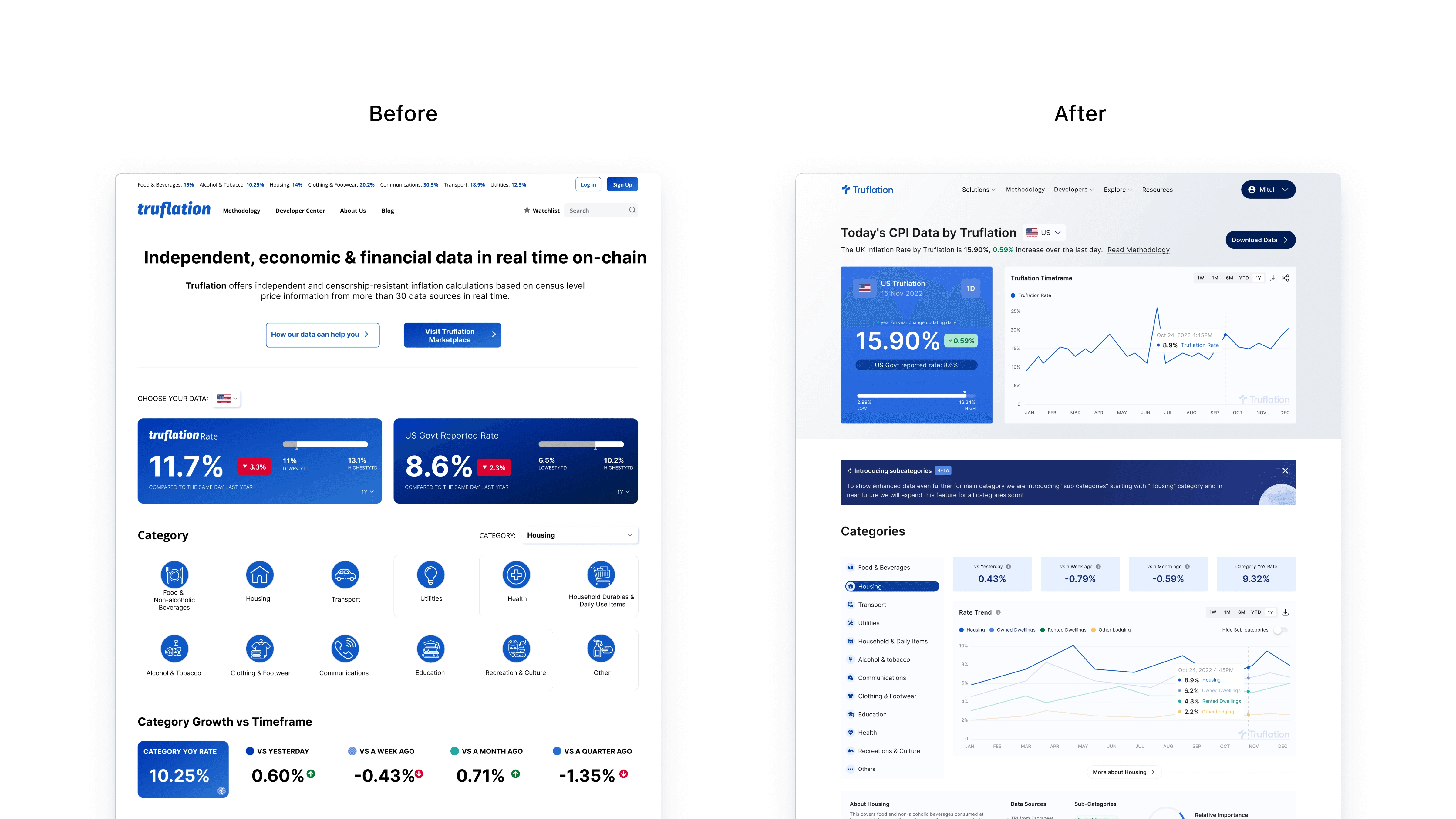
Design approach
Designing each user flow approach for Truflation has its own story, I worked on key product initiatives with founder and core team for end-to-end design across different product our entire product portfolio but for now, I’ll focus on how we designed dashboard. After studying current product and next business strategy I came up with following improvement that aligned with business, while doing improvement i constantly shared prototypes with founder, key stakeholders and test users in community to get feedback.
High-level summary upfront (daily inflation rate comparison vs. government CPI).
Granular breakdown per category (e.g., food, housing, transportation) this helps progressive disclosure of information to prevent cognitive overload.
Created a hierarchical structure that allowed users to navigate from overview to detailed category analysis.
Established clear visual sections with distinct purposes, improving scalability.
Interactive charts allowing users to explore historical trends.
Responsive design for different screen sizes and devices.
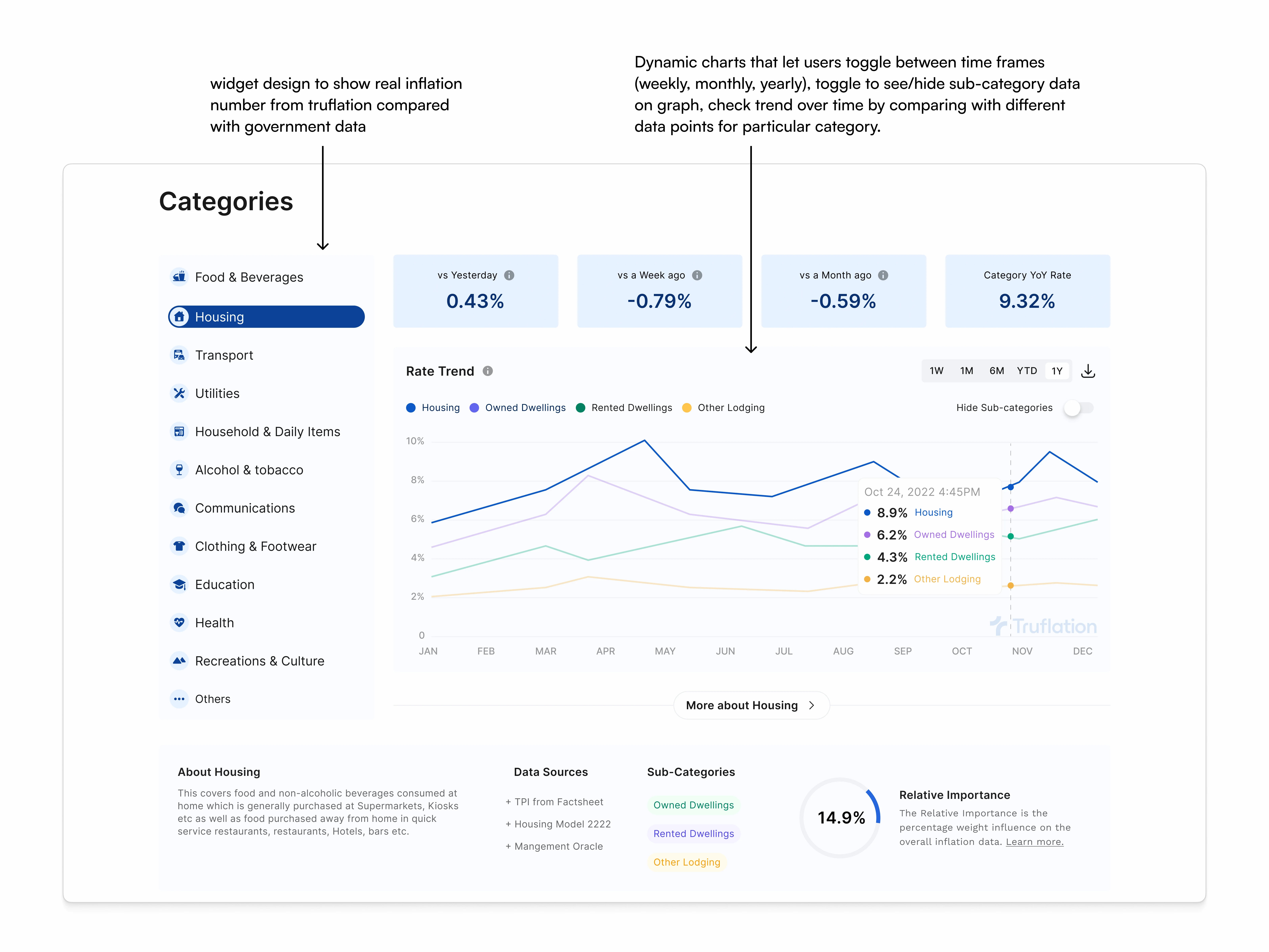
Data Visualisation for Clarity
Problem: Inflation data across 12+ categories needed to be digestible so that users can understand how each category is affecting inflation number without overwhelming users.
Solution:
Developed a comprehensive design system with consistent components and color coding for different inflation sub-categories.
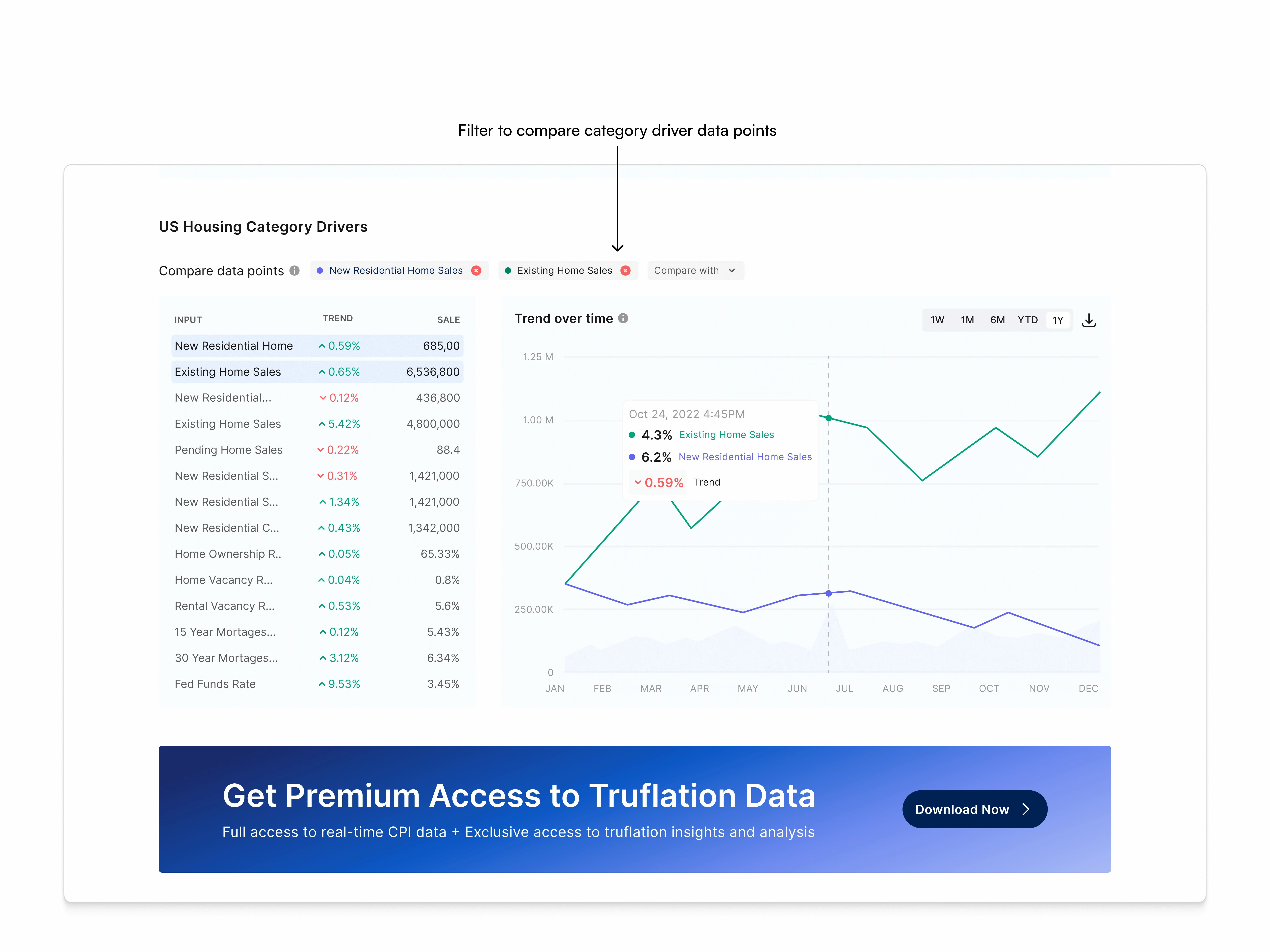
Dynamic charts that let users toggle between time frames (weekly, monthly, yearly), toggle to see/hide sub-category data on graph, check trend over time by comparing with different data points for particular category.
Contrast and whitespace improvements for better readability.
Established clear visual sections with distinct purposes
Enhanced color contrast to highlight critical information and trends
Impact: Users could now scan inflation trends within seconds by analysing which category affects most to overall inflation number with data points like relative importance instead of struggling to decode numbers.
While moving forward with the re-design, I was constantly collaborating with the team for feedback, showing prototypes to get consensus from senior leadership. We spent considerable time debating design options for this new big re-design. I organised structured feedback sessions, created decision matrices to weigh options against business goals, and used high-fidelity figma prototypes to align on information architecture early.
Managing diverse feedback and bringing everyone to consensus proved challenging. When swimming in a sea of different viewpoints, I learned to identify which feedback addressed core user needs and when to advocate strongly for design decisions backed by UX principles.
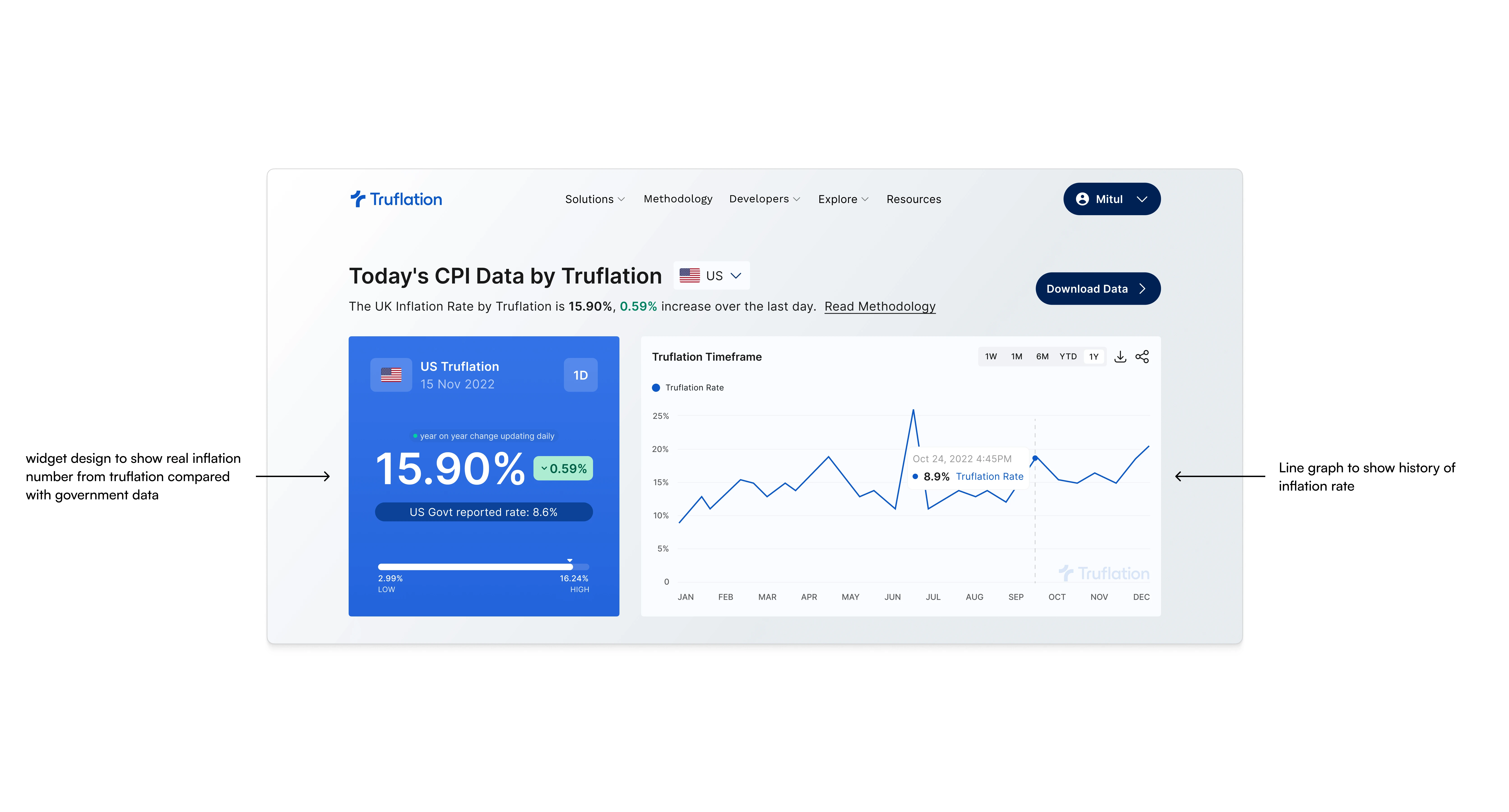
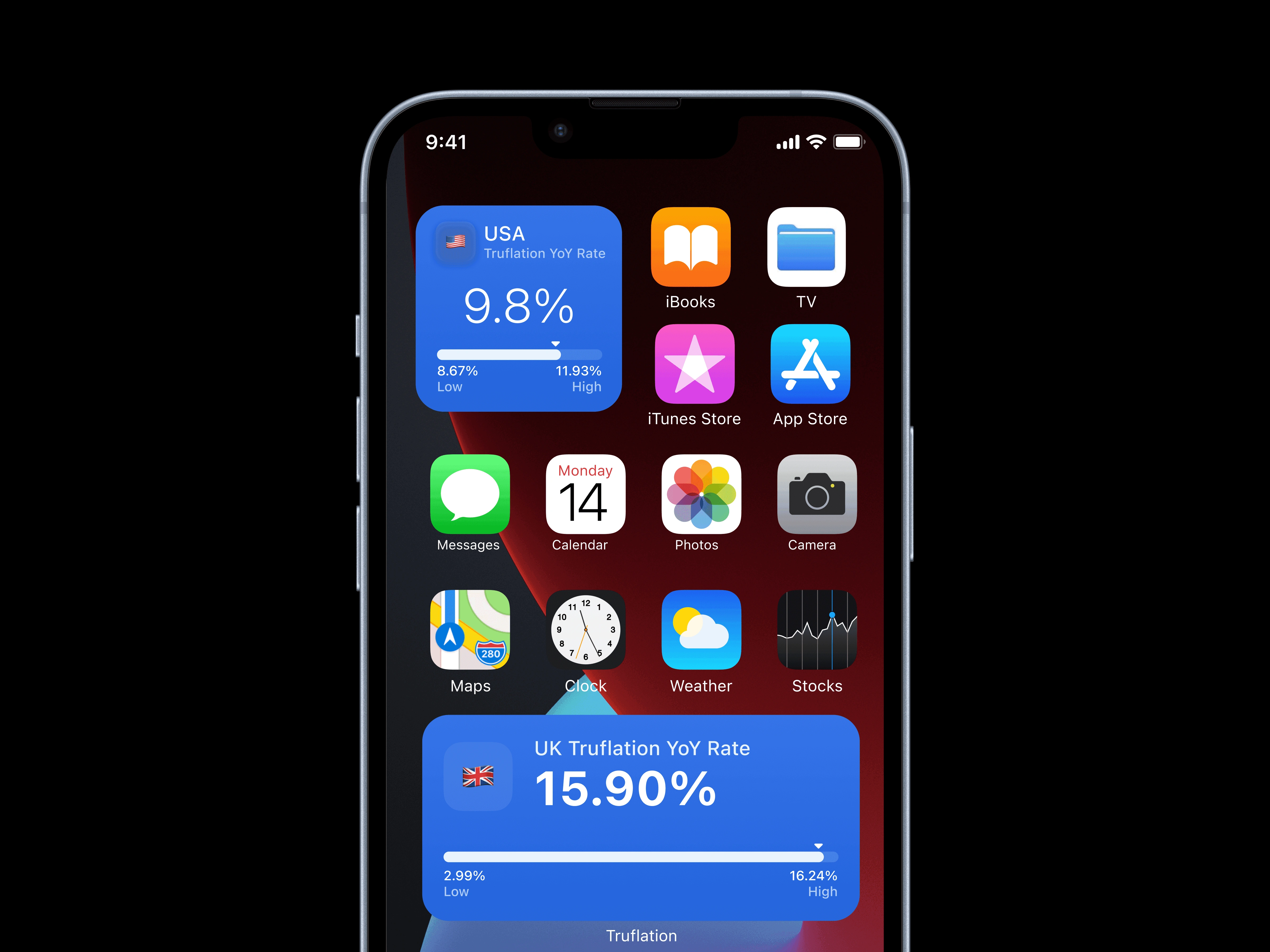
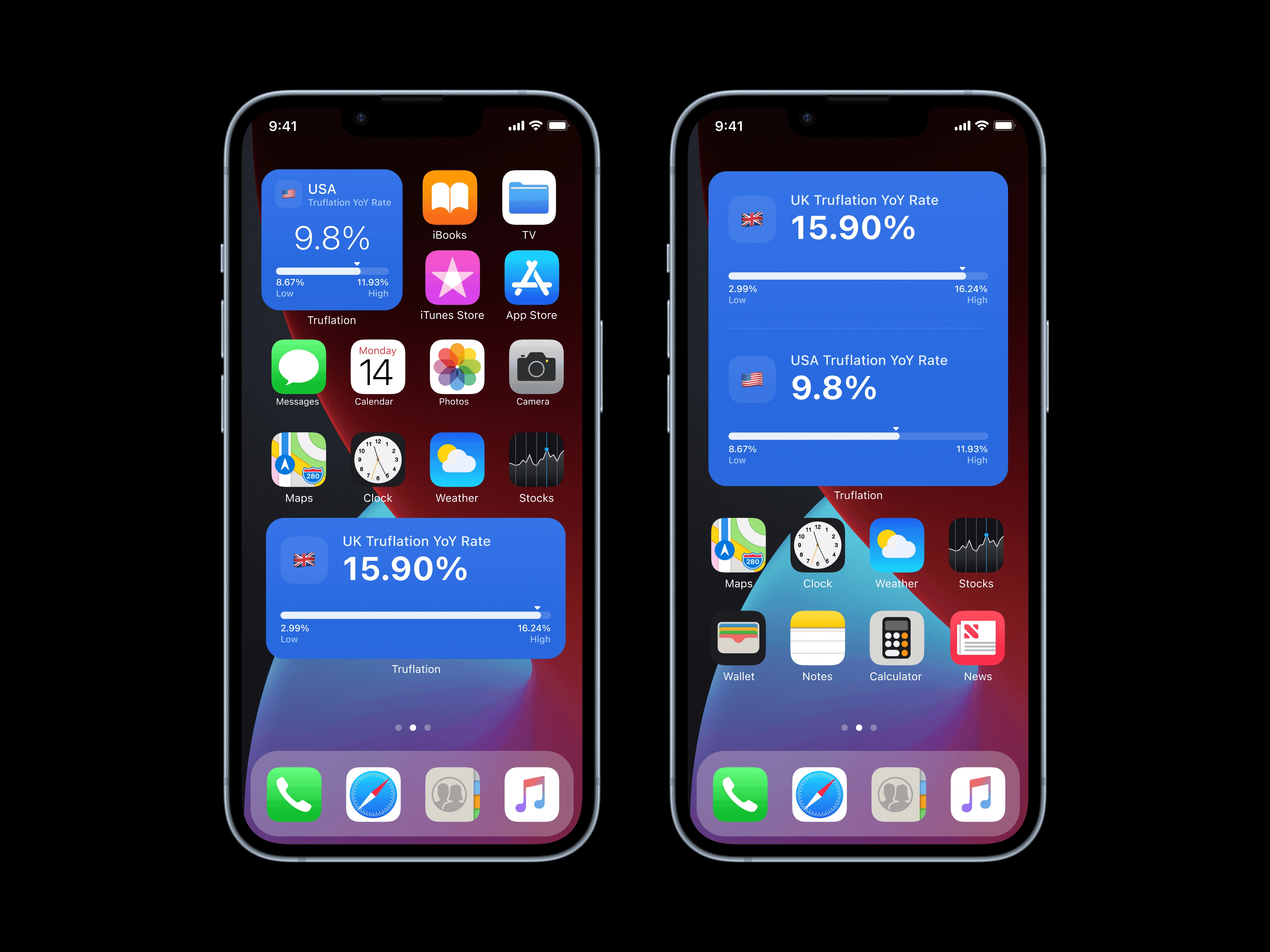
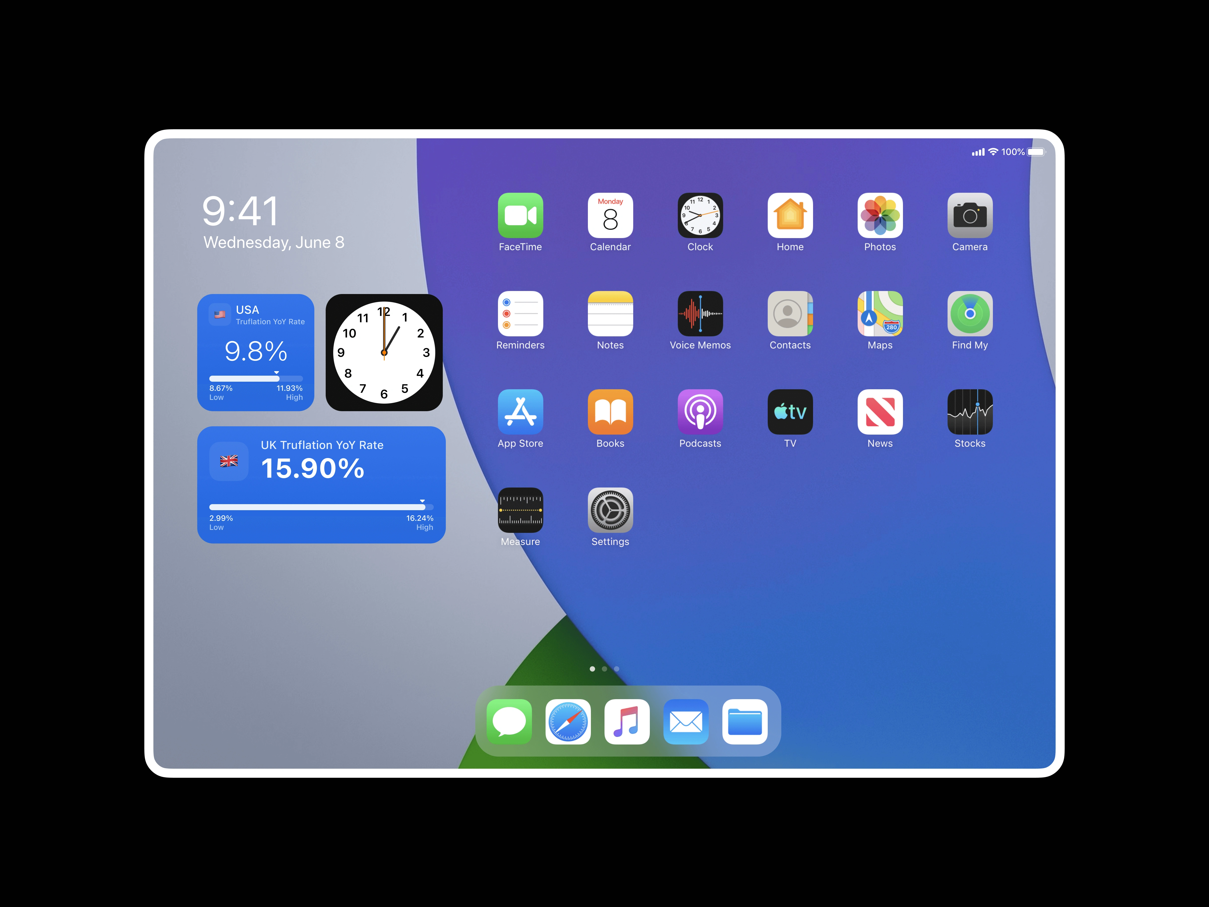
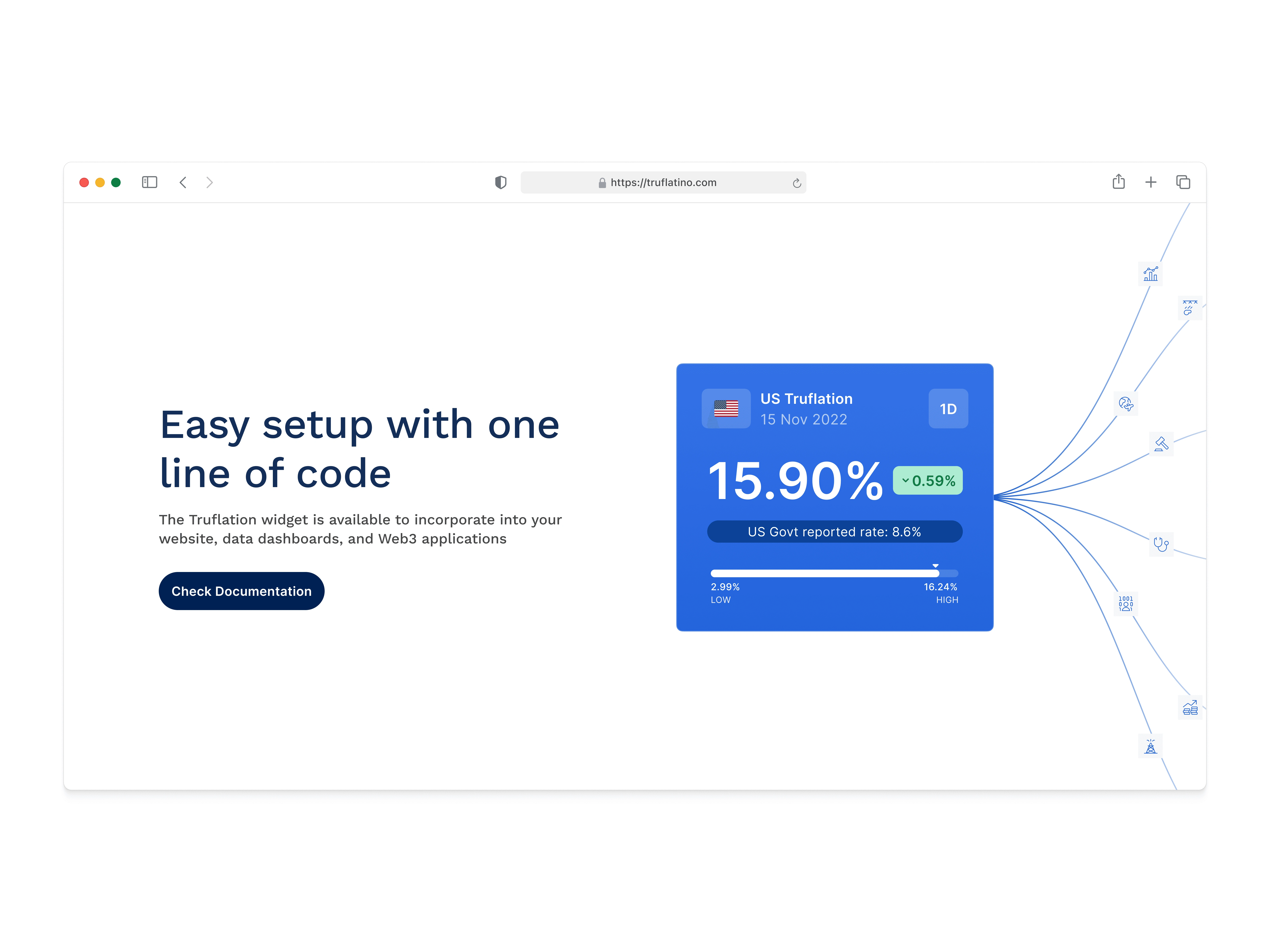
Truflation Widget
Truflation widget is key component which gives insight by comparing Truflation inflation data with goverment data. To make it more useful we developed embeddable components for partners to integrate Truflation data.
Along with this we decided to start sharing daily data update on twitter social using this widget.
sharing daily update using widget on twitter paid off, and made big hit by attracting big accounts.
I also created concept of responsive variants optimised for mac OS.
Inflation Calculator
Use Case: Individuals can use Truflation's personal inflation calculators (e.g., for India, the U.S., the U.K., and Argentina) to assess how inflation affects their personal finances and purchasing power.
Created intuitive input mechanisms for users to enter household expenses
Visualised personalised inflation impact based on individual spending patterns
Examples: Indian consumers can input their household expenses to get personalised inflation insights.
Cross-Platform Accessibility:
We began investigating user metrics thoroughly at the outset of this project, and found that the vast majority of our non-desktop users were attempting to access their information on an mobile and smaller screen size device as well.
Created responsive designs optimised for desktop, tablet, and mobile experiences.
Developed design system that maintained consistency across screen sizes
Final Impact & Results
10% increase in daily active users.
40% increase in user retention post-redesign.
Increased engagement with the inflation calculator & data update post using widget on social.
Improved usage metrics with longer session times on smaller devices.
In the news and love from social media
🌍 Adoption by macro investors, former FED members, enterprises, and over 100+ protocols looking for real-time economic insights.
💡 Coinbase and Balaji Srinivasan recognized Truflation as an innovation in financial transparency.
Takeaways
My time leading this re-design was transformative. The challenge of balancing analytical precision with intuitive interfaces taught me invaluable lessons about information architecture and building trust in AI-driven data platform. Truflation successfully transformed complex economic data into accessible insights that served diverse user needs, demonstrating how thoughtful design decisions can make financial information both approachable and actionable. Navigating diverse stakeholder perspectives while maintaining a clear vision wasn't easy, but seeing our user retention climb by 25% and watching businesses and investors embrace our platform made it all worthwhile.
Thanks for making it till the end :)
Want to know more?
sure let’s connect, reach out at mitulgajera16@gmail.com, or DM on twitter(gajeramitulv).
Thanks for reading!
Like this project
Posted Apr 29, 2025
Redesigned Truflation's platform, improving user retention and engagement with new tools and features.
Likes
0
Views
0
Timeline
Jan 1, 2022 - Jan 1, 2023
Clients
Truflation