Little League
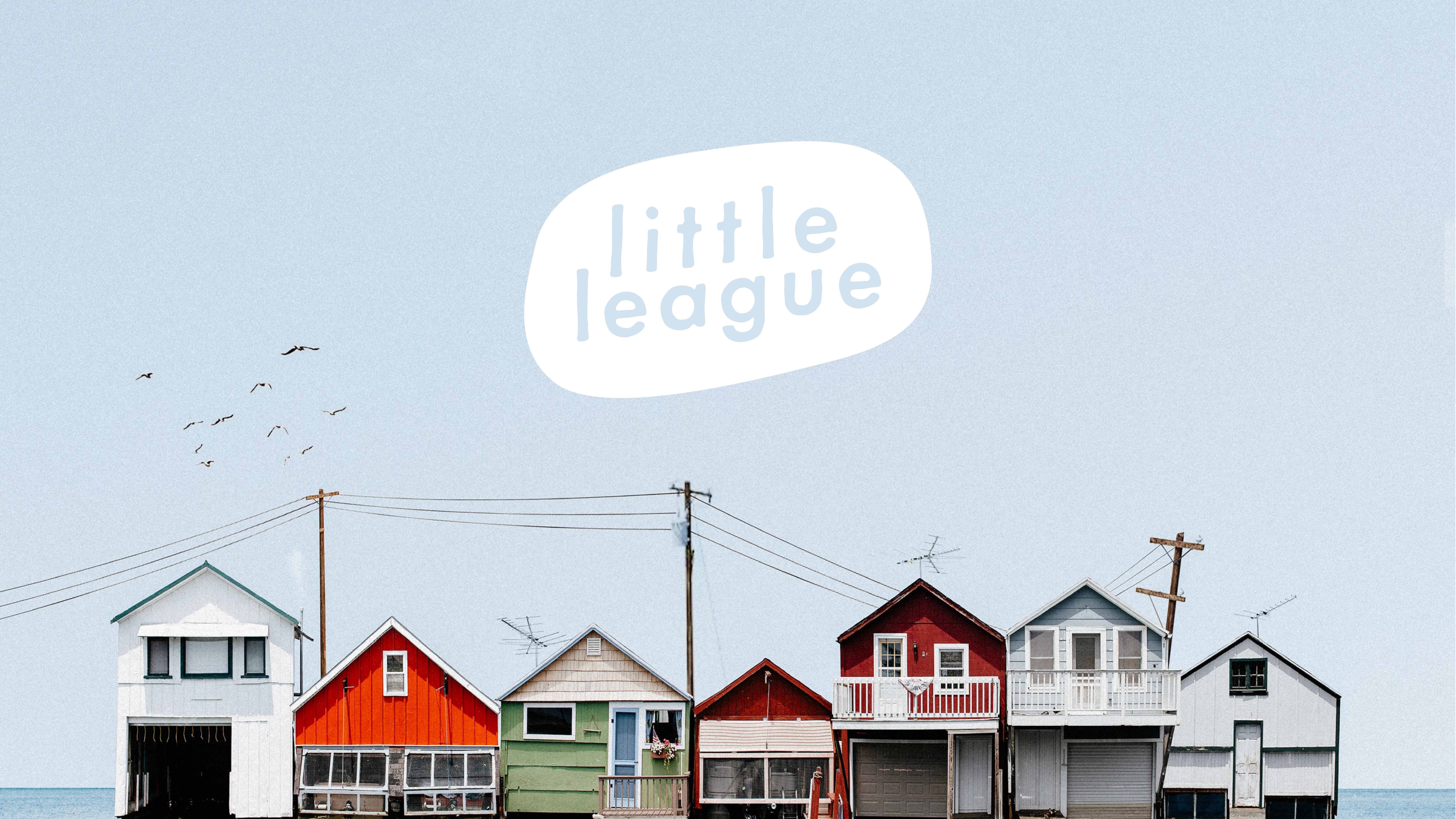





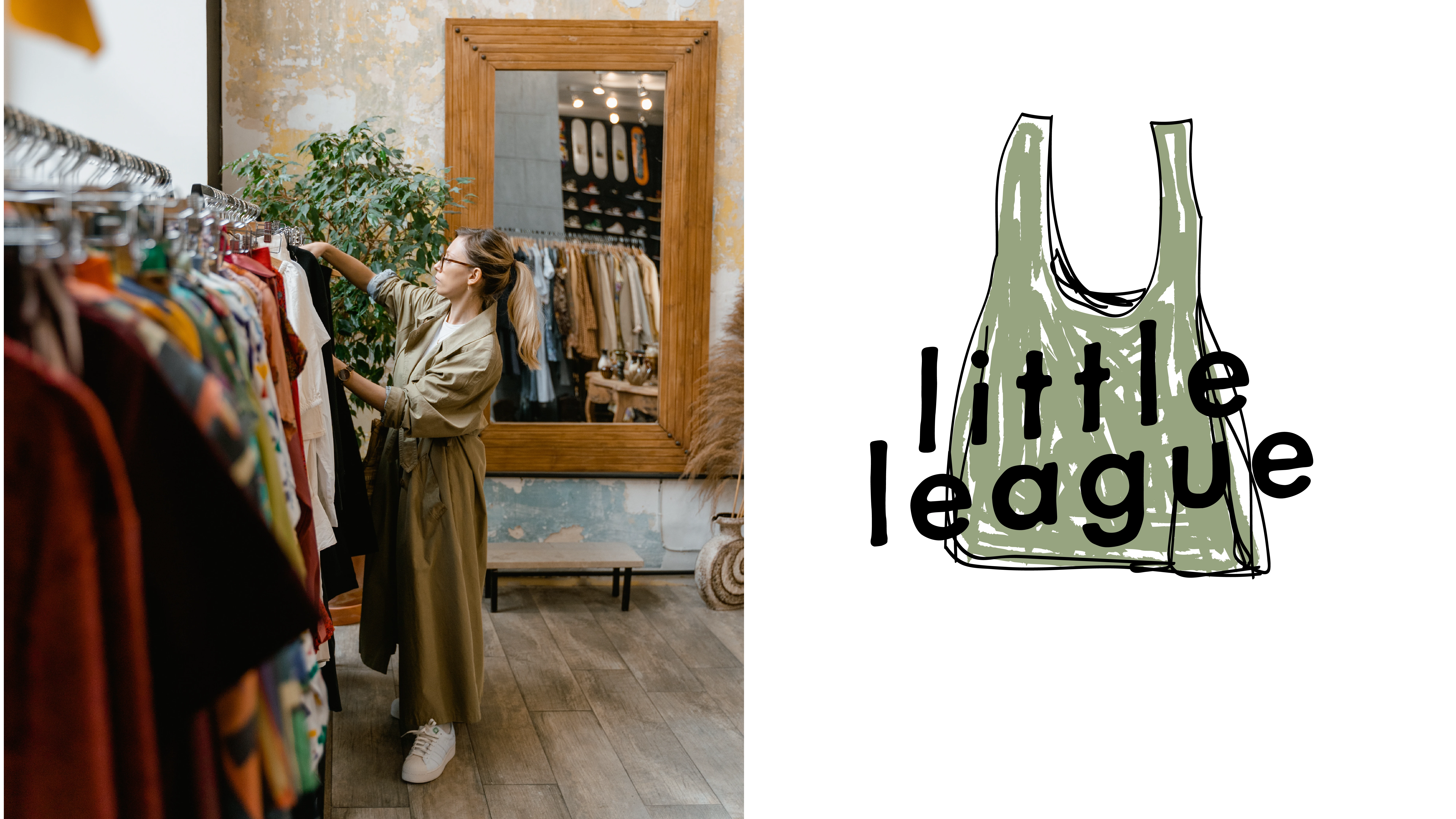
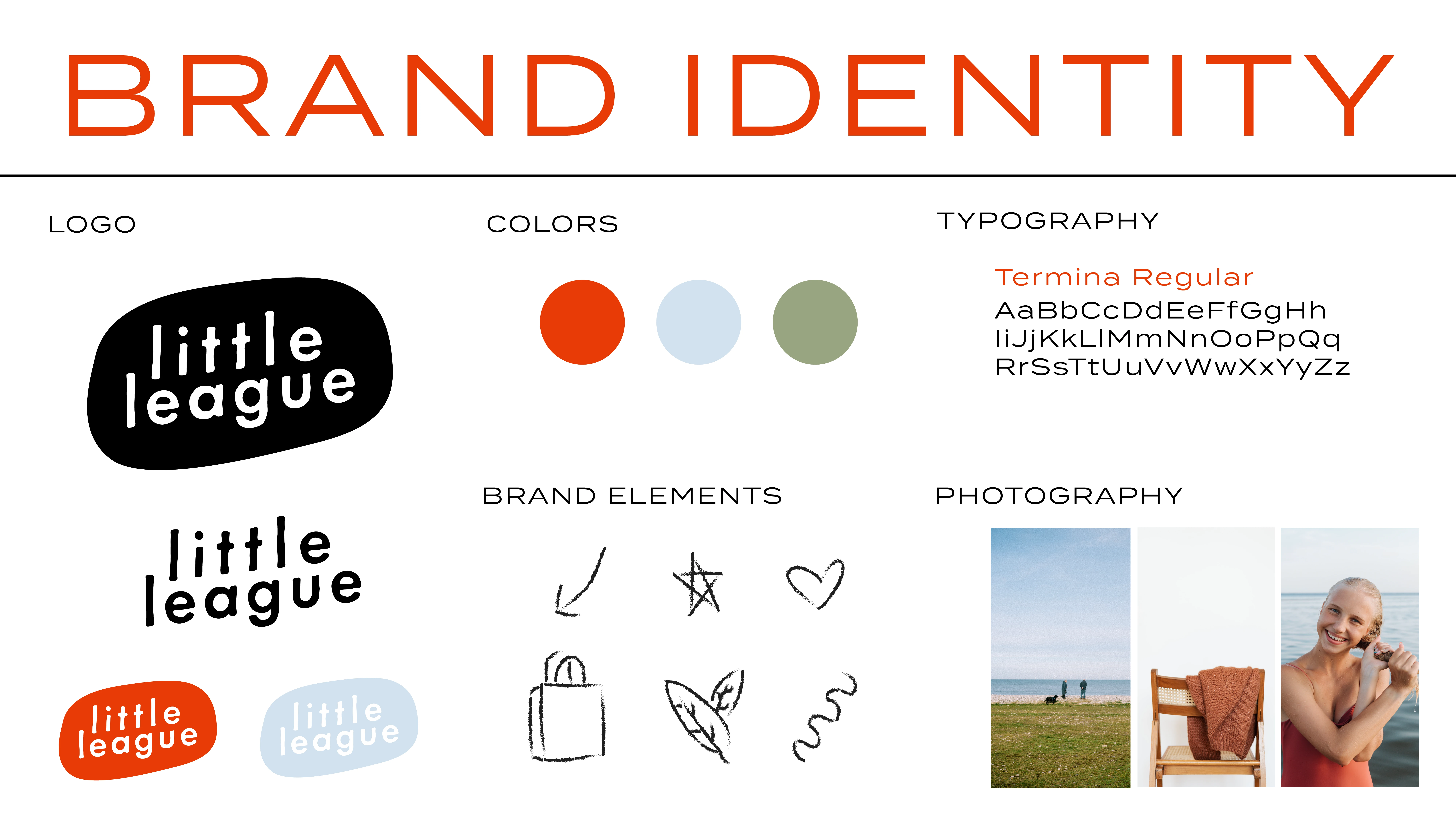
Brand identity for Little League. The small business has a heart of gold and operates within the bounds of thoughtful consumption and sustainable practices. Shopping small has never felt so good. The logo balances a playful spirit of soft, lowercase letters with a bold slant to create an approachable, modern, and timeless feel. The color palette draws inspiration from the natural world, with an energetic red, a clear sky blue, and a foliage green. The type used throughout branding pieces, Termina Regular, is a wide san serif that balances the playful logo to bring out the professional qualities of Little League. This business values mindful living, curated simplicity, and empowered communities and it shows through its branding. The vibrant colors, timeless logo, and organic photography encourage steps toward a more conscious and connected world.
Like this project
Posted Sep 9, 2023
Designed a detailed brand identity for a small business.

