Revel Street: SaaS UX Across Web, Tablet & Mobile

Hamza Jilani

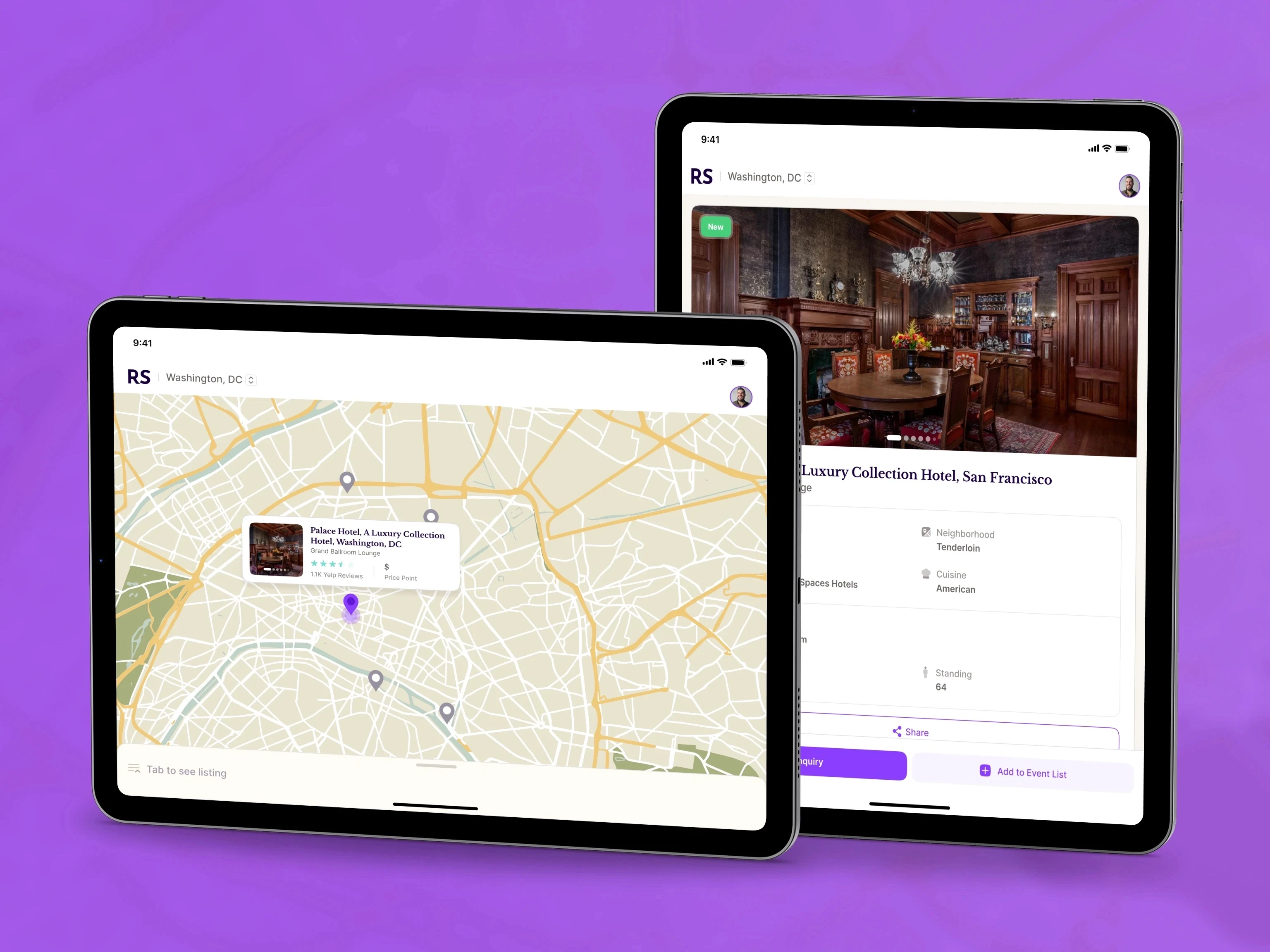
Revel Street helps event planners find and compare venues without juggling separate search, map, and booking tools.
I redesigned the experience across responsive web, tablet, and mobile. The core challenge was keeping filters, venue details, map context, availability, and saved choices understandable as the layout changes. I mapped the search-to-booking journey, simplified the hierarchy, and built reusable UI patterns for venue cards, filters, and key states.
The work covered information architecture, user flows, responsive interface design, Figma prototyping, and developer handoff.
See the full case study: https://plexable.com/cases/revel-street
Prototype: browse venues, review a space, and move toward an inquiry in one continuous flow.
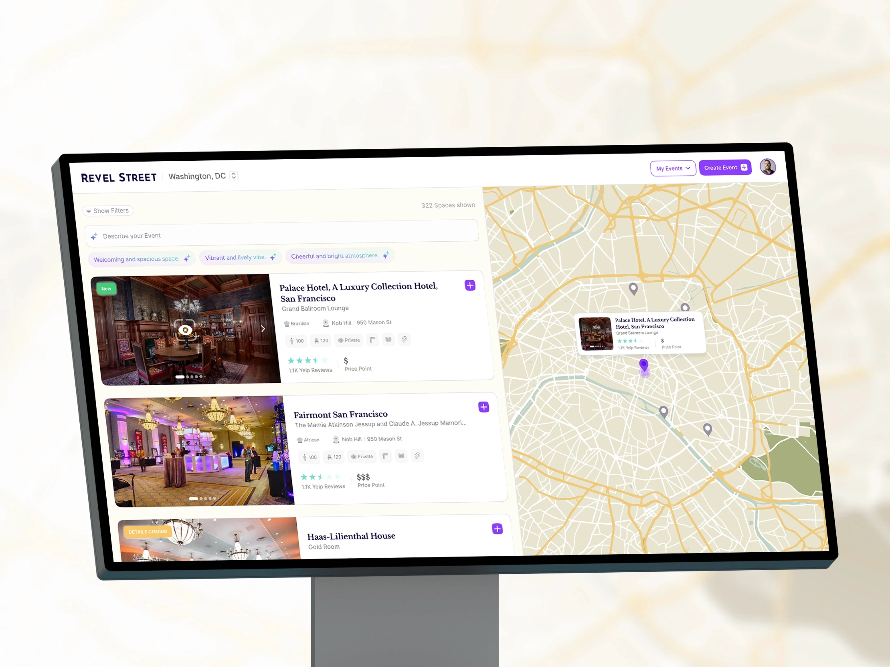
Desktop keeps venue results and map context side by side, with search and event actions always visible.
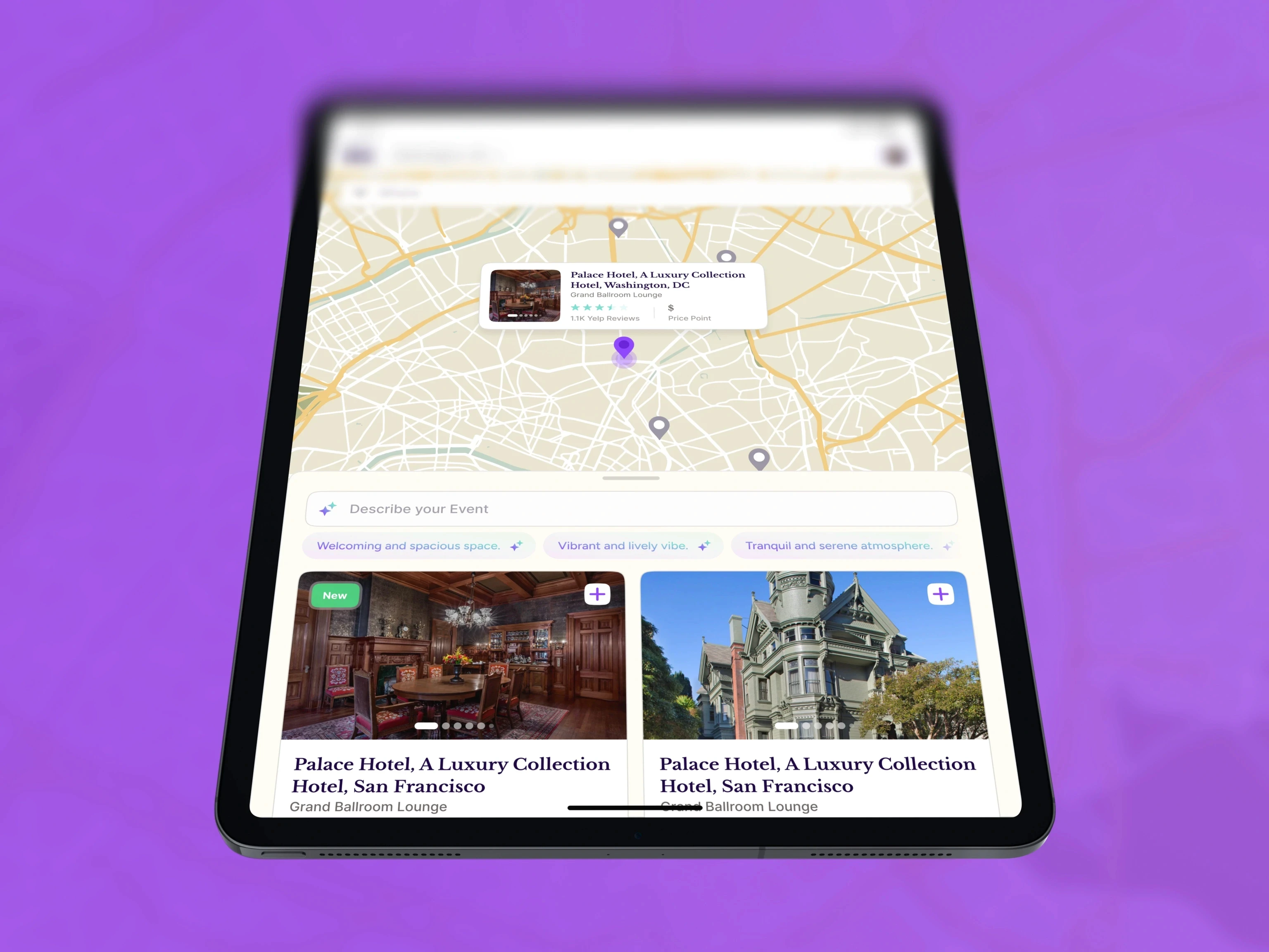
On tablet, the map stays above the venue cards so planners can move between location and detail without losing their place.
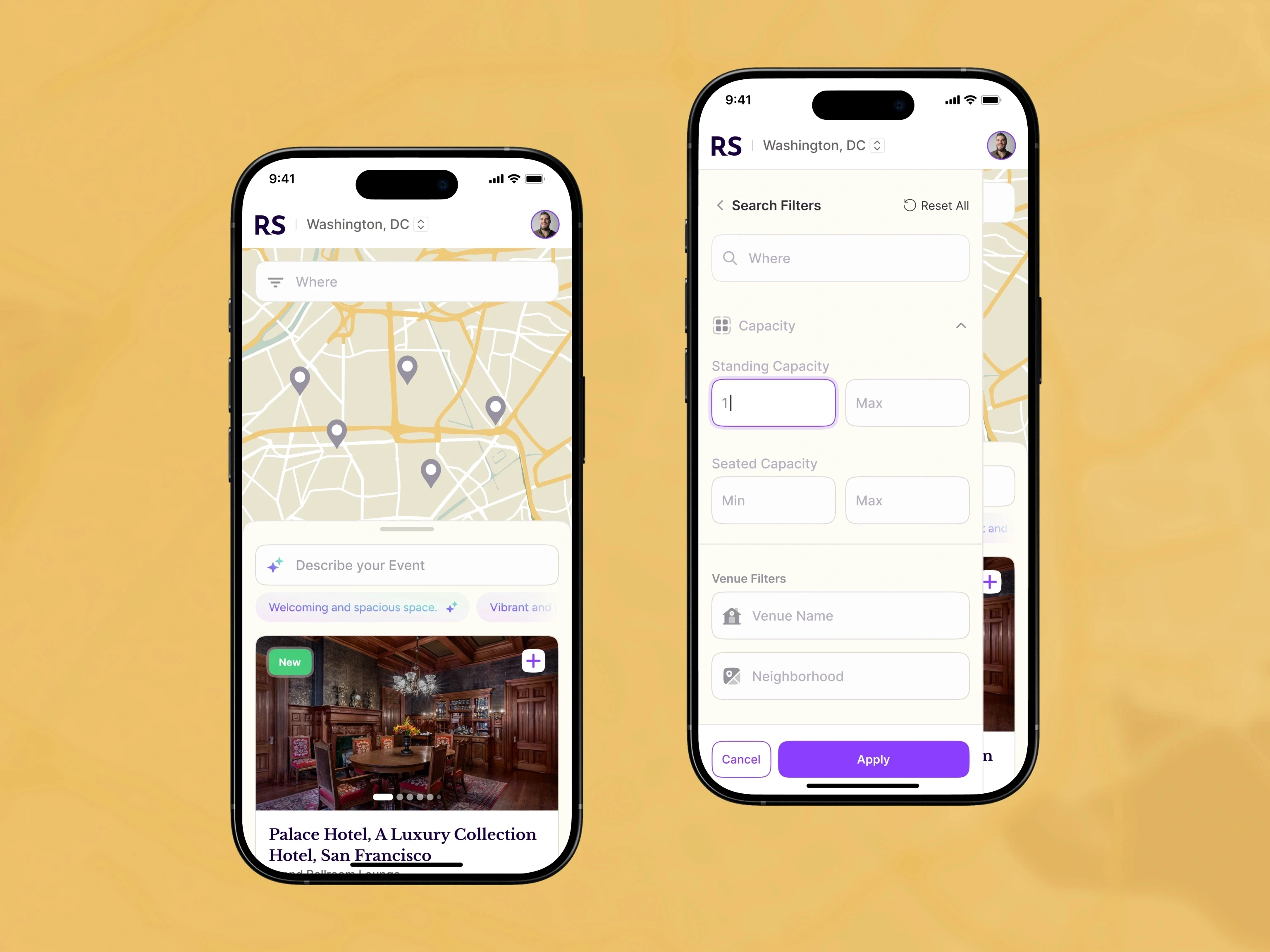
The mobile filter drawer handles capacity and venue criteria without covering the discovery flow.
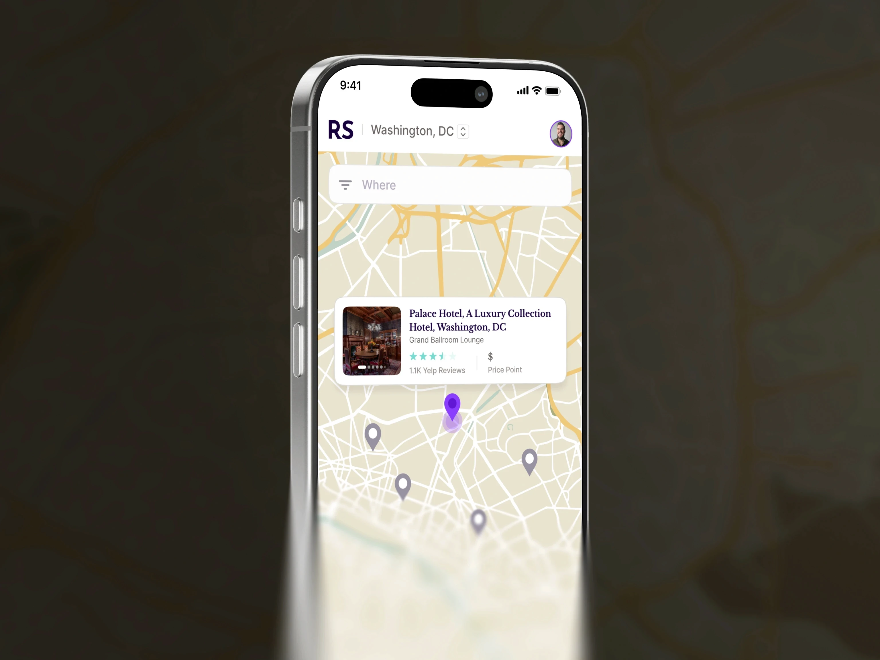
Selecting a map pin brings the venue summary into view while nearby options remain visible.
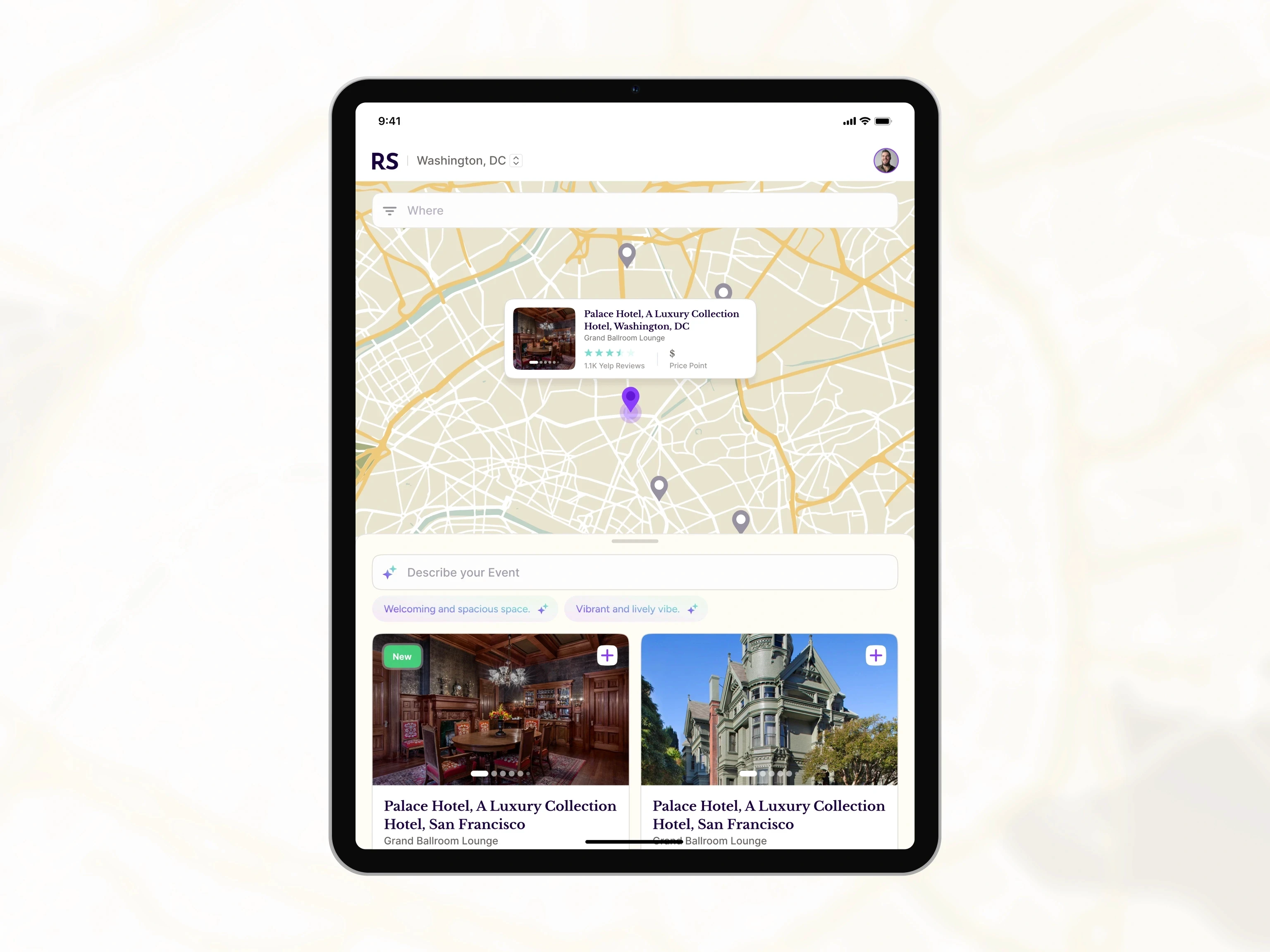
On tablet, the event description field and suggested prompts sit between the map and venue cards.
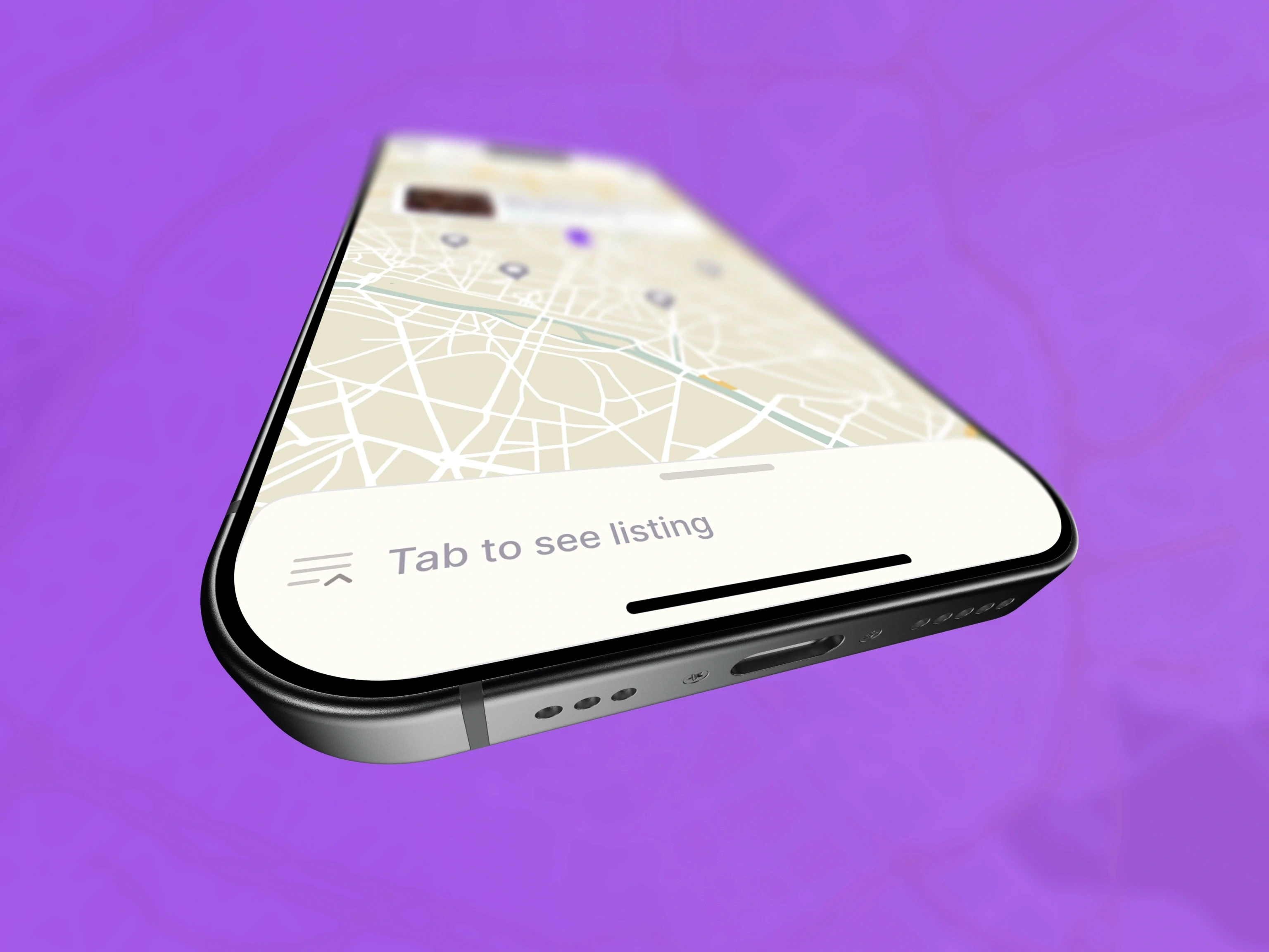
A bottom control switches the mobile map into the venue listing when more detail is needed.
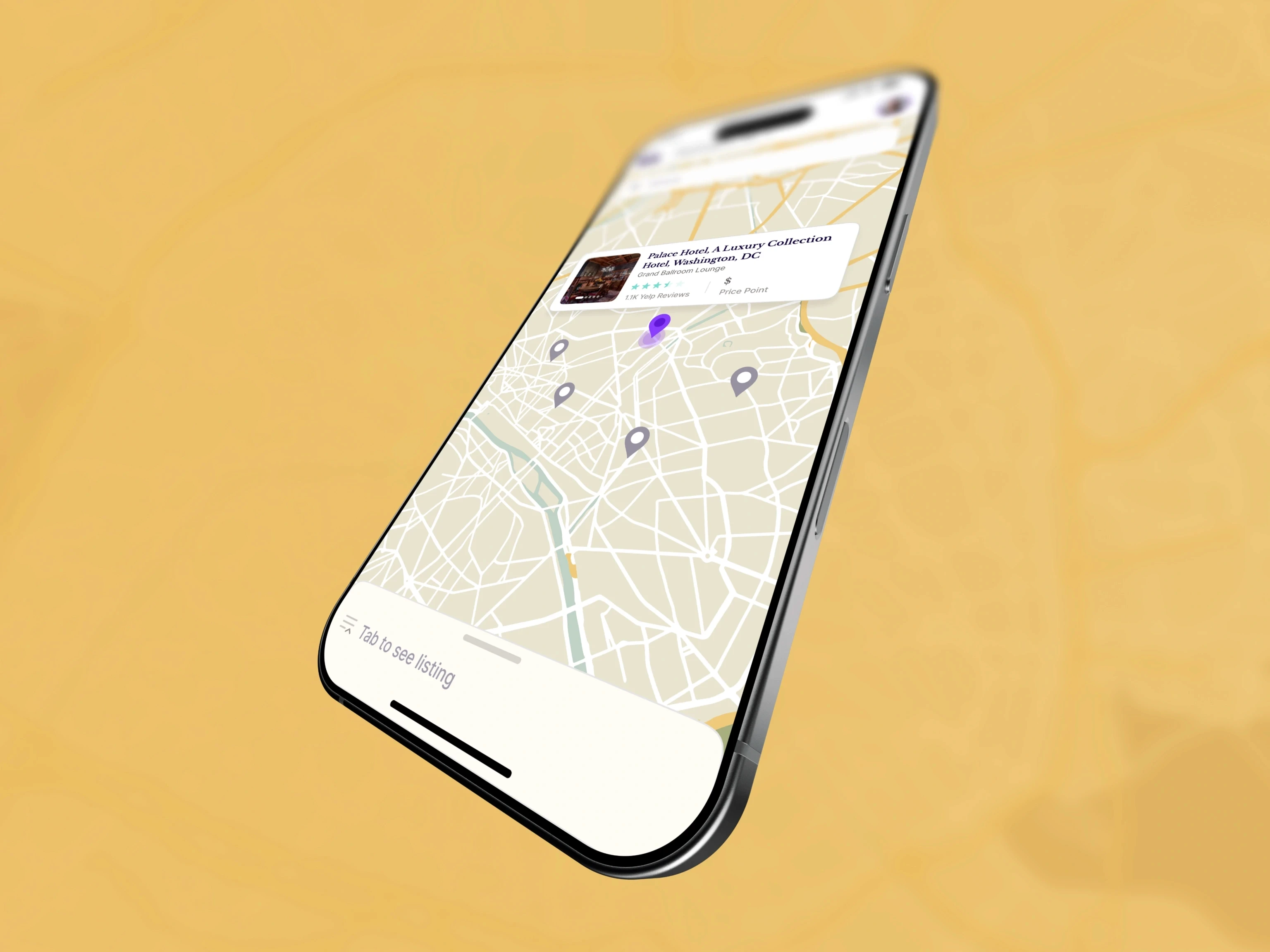
The selected venue card stays anchored to its map pin on mobile.
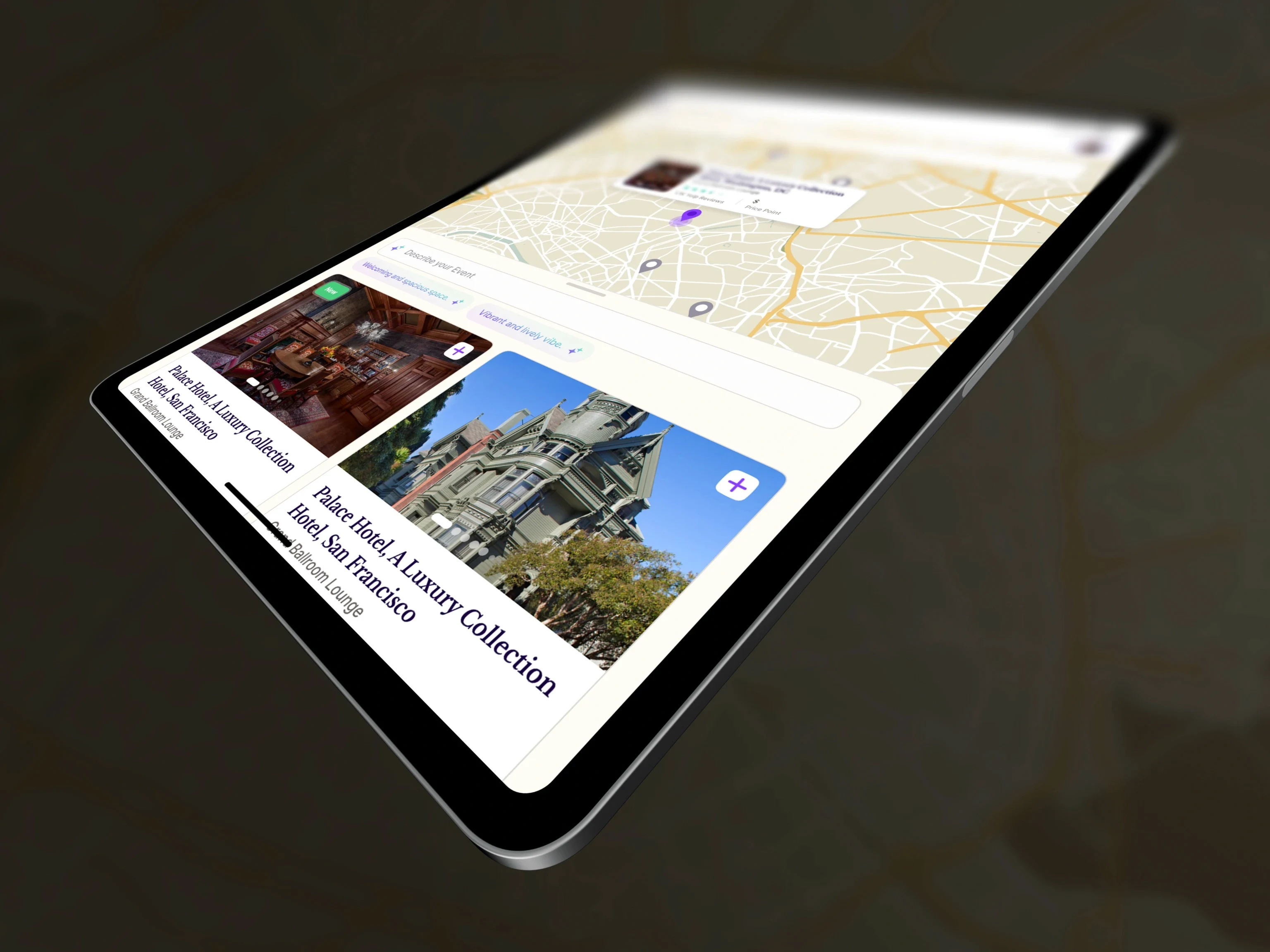
The tablet layout gives venue cards more room without disconnecting them from the map.
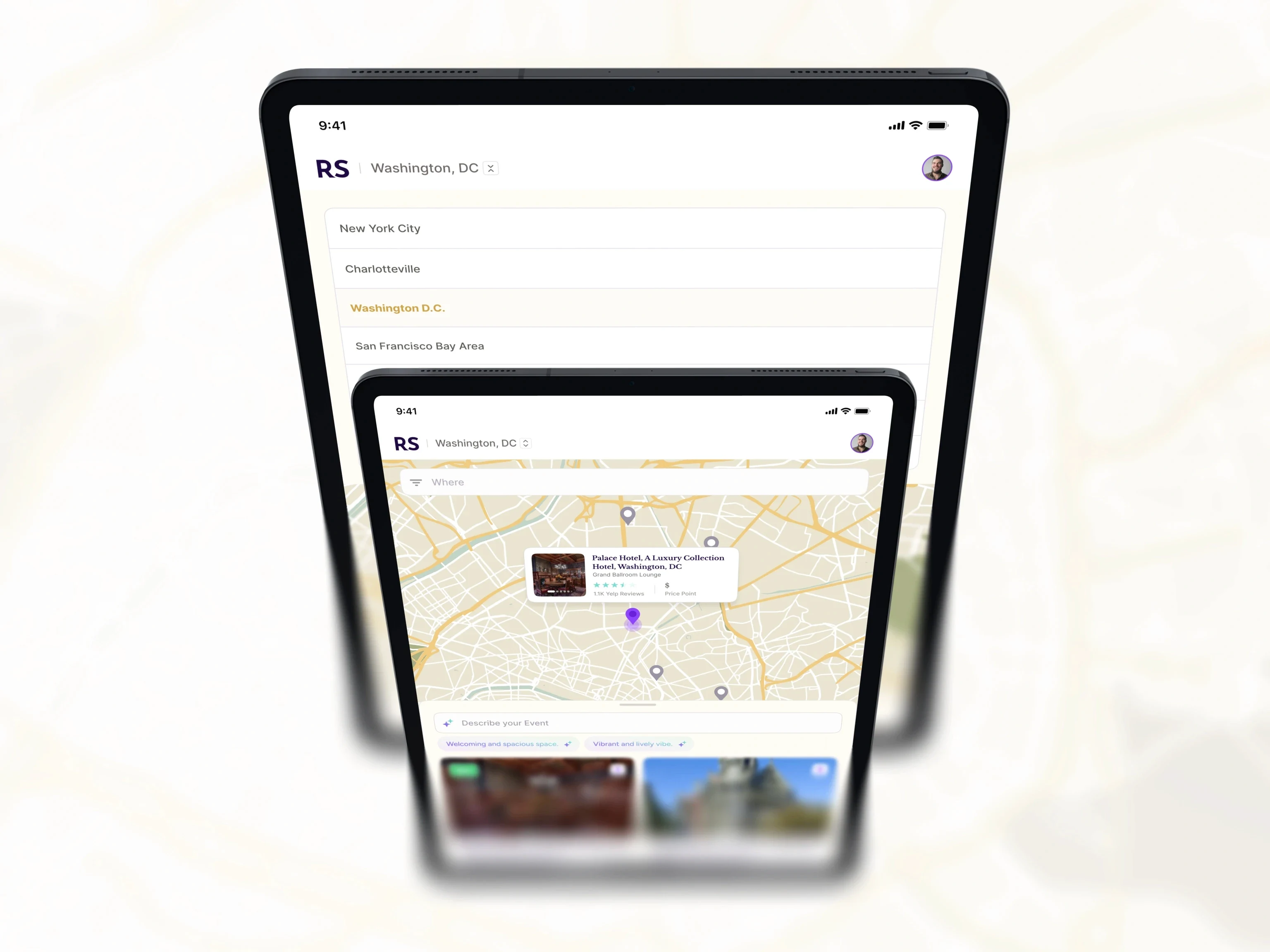
City selection and venue discovery adapt to the available tablet space without changing the underlying flow.
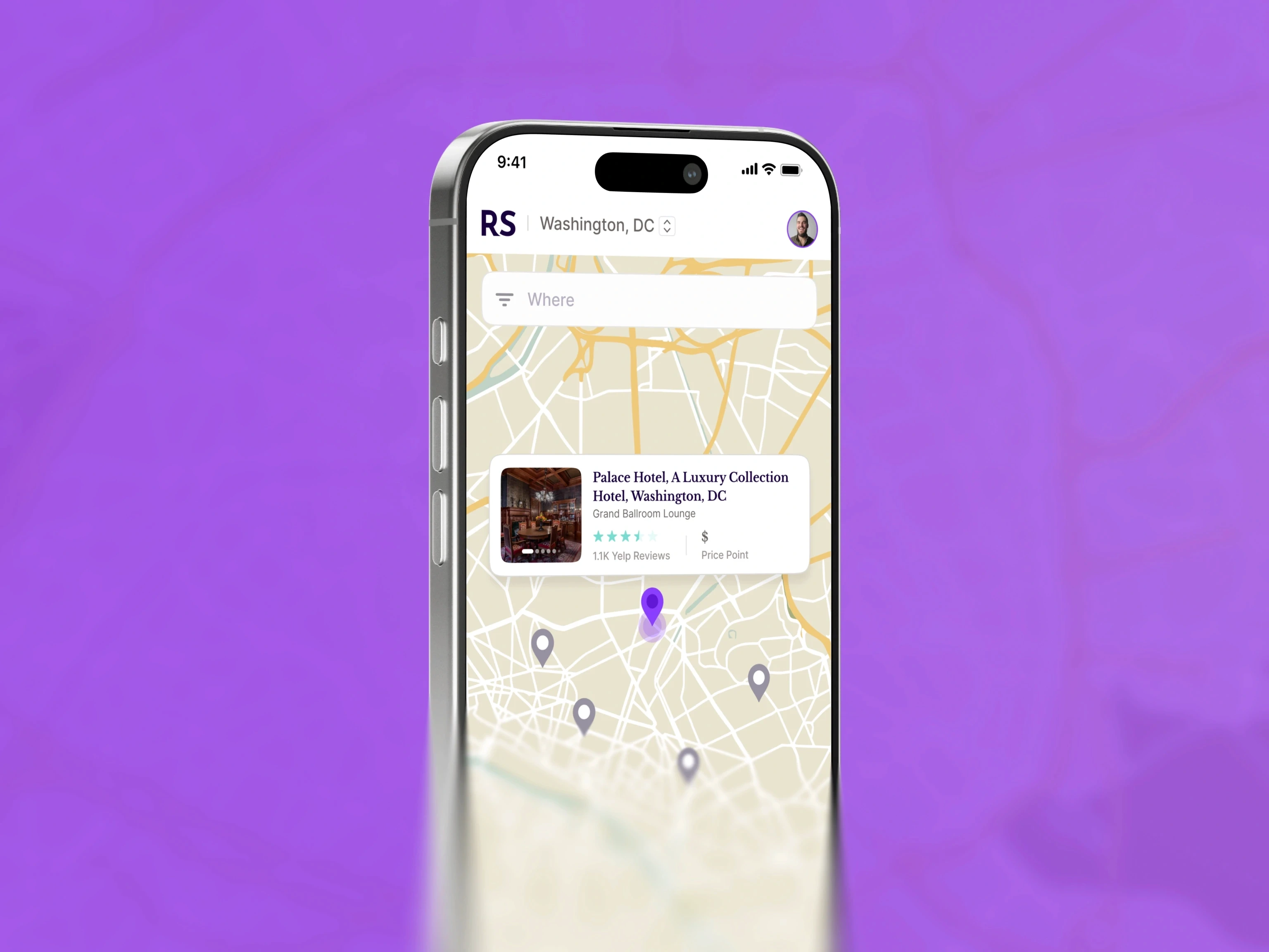
The mobile map keeps search, the selected venue, and nearby pins readable on a narrow screen.
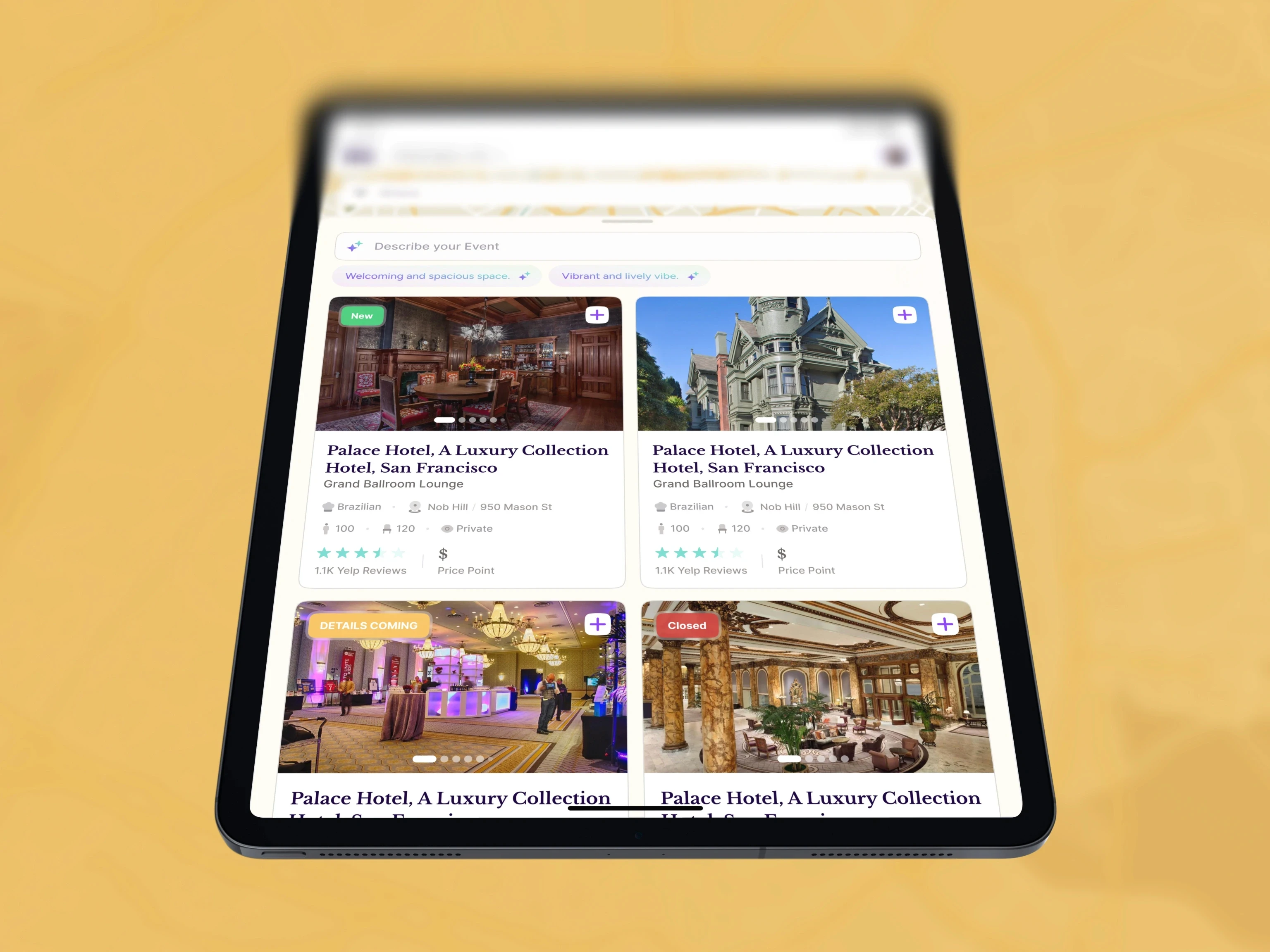
Venue cards expose the details planners need before opening a record, including availability, capacity, location, and price.
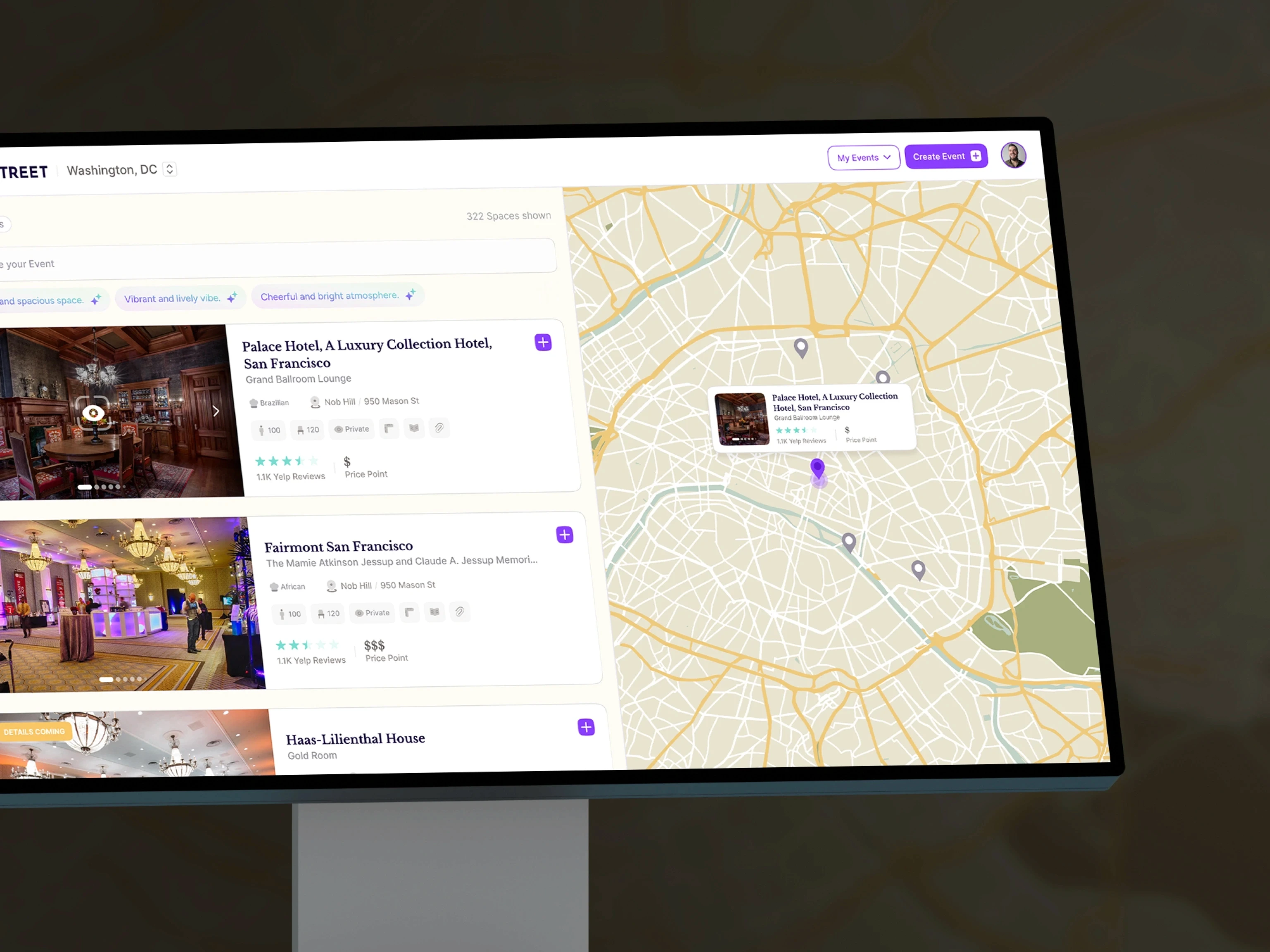
The desktop view balances a dense result list with the map and selected venue context.
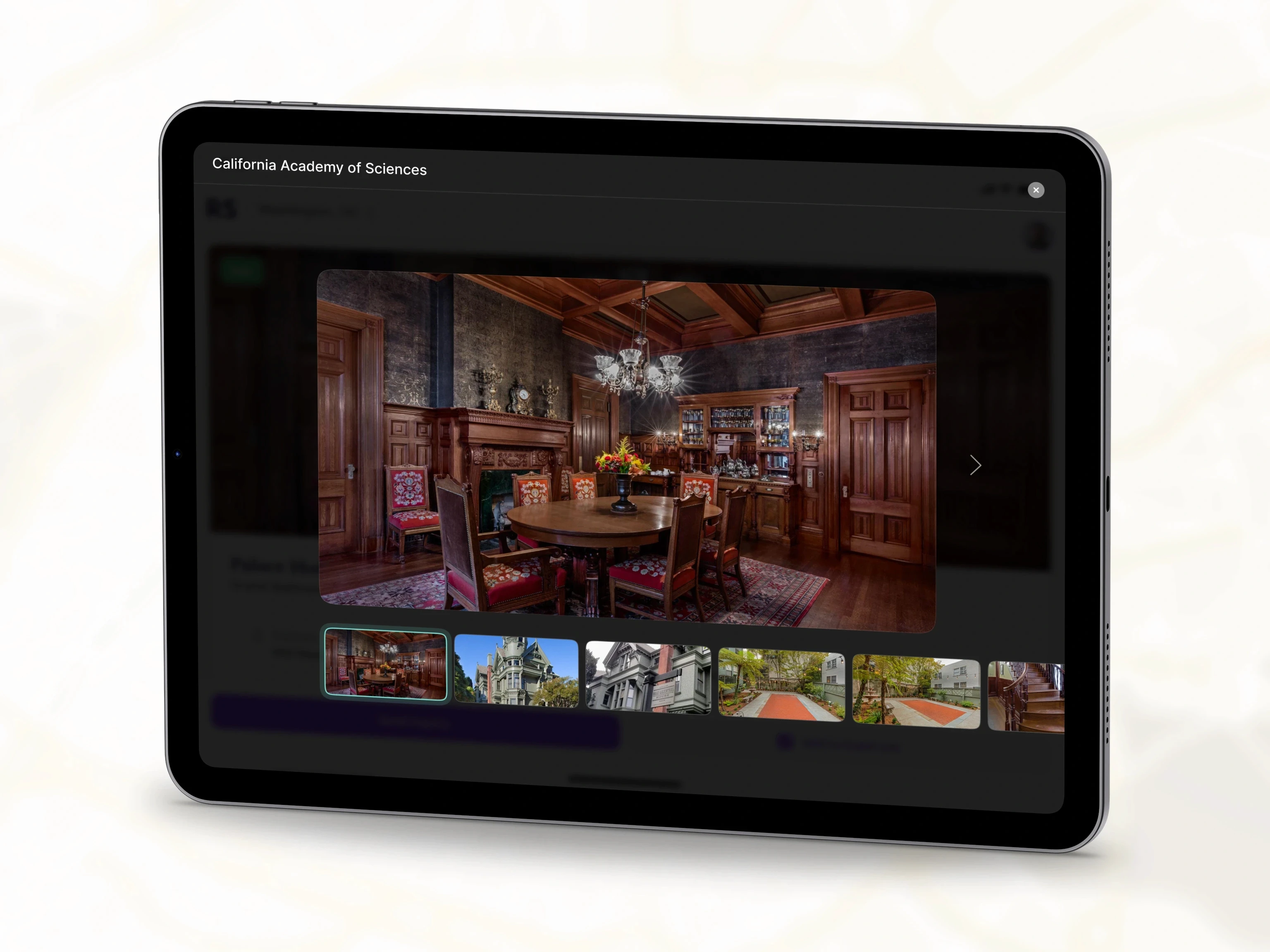
The venue gallery opens as a focused overlay with a large image and thumbnail navigation.
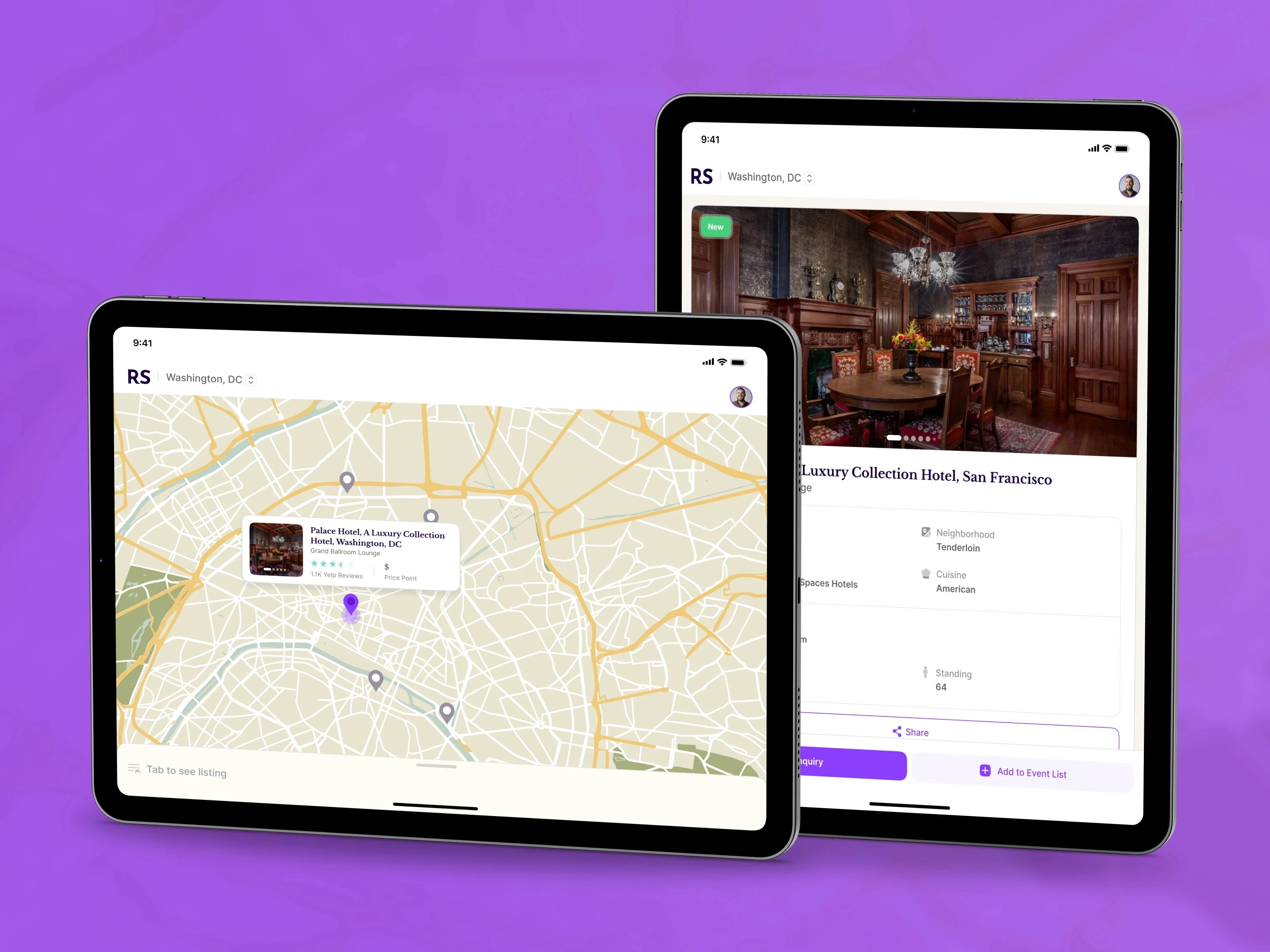
The same tablet system supports map discovery and venue detail. Inquiry, sharing, and event-list actions stay close to the selected venue.
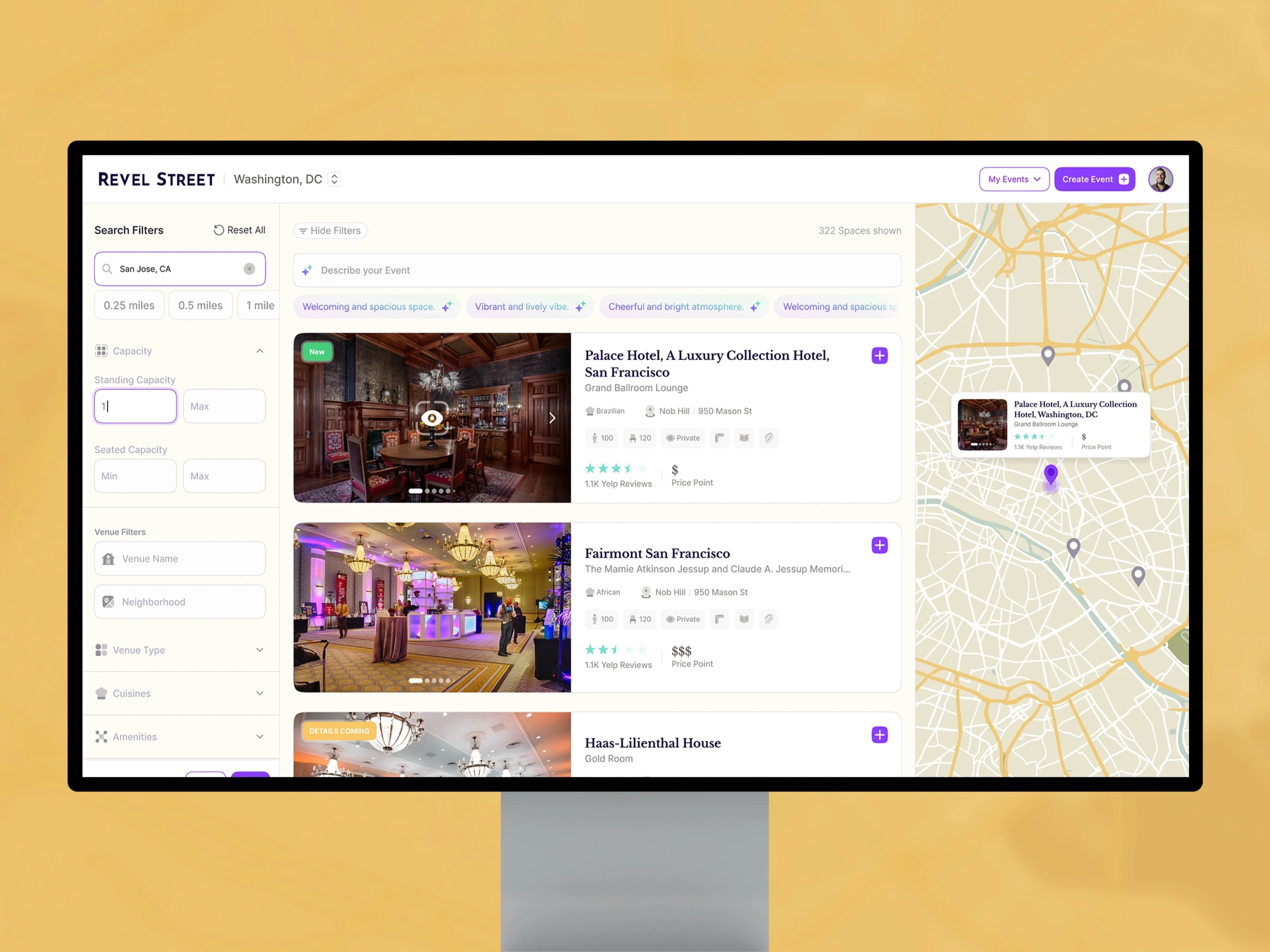
The full desktop workspace brings filters, venue results, and the map together for detailed planning.
Like this project
Posted Aug 31, 2026
Product design for an event-discovery platform spanning responsive web, tablet, and mobile experiences.
Likes
0
Views
1