AirUX - A UX Case Study
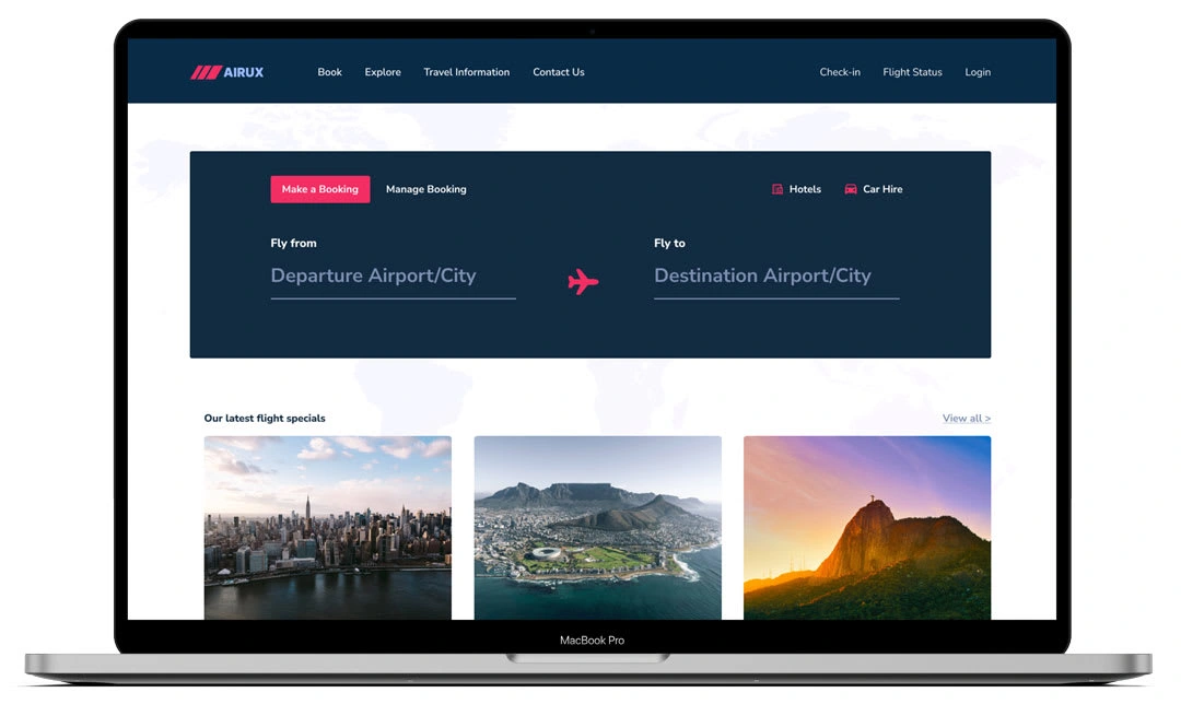
This project, focused on creating a user-friendly online flight booking experience for a new airline, served as my case study submission for the UX Design Institute's Professional Diploma in UX Design. Through a rigorous UX design process, I aimed to ensure a clear and seamless user journey for online flight bookings.
Phase 1: Research
The research phase, designed to define the problem and user needs, employed four key methods: Competitive Benchmarking, Online Surveys, User Note Taking, and Usability Testing.
Competitive Benchmarking
To understand the existing landscape, I conducted a competitive benchmarking exercise focusing on four key areas:
Homepage: This evaluated the user's initial experience, including the clarity and ease of initiating the search process.
Search: This assessed the user's ability to select their desired destination, return flight, and manipulate the calendar for departure and return dates.
Selection: This analyzed the user flow for selecting flights, including how different fares are displayed and understood.
Payment: This examined the user experience during information entry and payment processing.
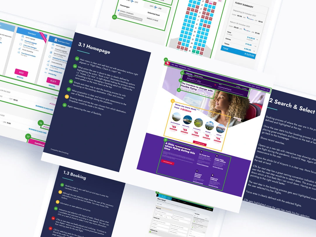
Competitive Benchmarking
For this exercise, I selected a list of best-in-class airlines (local and international) and an aggregator website. These included kulula.com, safari.com, virginaustralia.com, and travelstart.com.
Key Findings:
Clear and Concise Search Bar: Users were consistently presented with a clear and concise search bar, allowing for easy initiation of the flight search process.
Intuitive Layout: A clear and structured layout facilitated a smooth user journey towards their desired booking goals.
Efficiency Matters: The ability for users to complete the booking process quickly emerged as a significant advantage.
Timely Information Delivery: Displaying the most crucial information at the appropriate stages of the booking process proved to be highly beneficial for users.
Online Survey
To gain a deeper understanding of user behavior, goals, and pain points during the flight booking process, the online survey employed a mix of structured and unstructured questions, yielding both quantitative and qualitative data.
Survey Focus Areas:
Goals: We explored user objectives through questions like "When was the last time you booked a flight online?" and "What were you trying to achieve during your visit?"
Behavior: User actions and challenges were assessed with questions like "Were you able to complete your booking?" and "What improvements would you suggest for the website/app?"
Expectations: User satisfaction was gauged by questions like "Did the website/app meet your expectations?"
Context: Device usage and platform preference were determined by asking "Which device did you use?" and "Which airline booking website/app did you visit?"
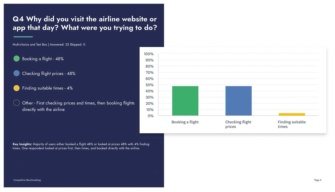
Online Survey
Key Learnings:
Frequent Online Booking: A significant portion of respondents (68%) indicated using an airline booking website or app within the past 4 months.
Pandemic Impact: 16% of respondents haven't used an airline booking platform in the last year, likely due to the pandemic.
Calendar Preference: A clear preference emerged for an improved calendar view with filtering options to prioritize cheaper flights, highlighting the user's focus on price.
Transparency in Pricing: Uncertainty and confusion regarding additional fees emerged as a common pain point, suggesting a need for clearer pricing structures.
Direct vs. Aggregator Usage: A near-even split was observed between users visiting airline websites/apps directly (55%) and using aggregator websites (45%).
User Interview & Usability Testing
To gather in-depth user insights, three usability tests were conducted. These insights directly informed design decisions for an improved user experience.
Test Objectives:
Context of Use: Understand user behavior and the environment in which they interact with the website.
Goals and Behaviors: Gain insights into user objectives and actions during the flight booking process.
Key Findings:
Distraction and Focus: Users were demonstrably hindered by excessive pop-ups and advertisements, highlighting their preference for a distraction-free experience.
Simplicity for Efficiency: A clean and minimalist design facilitated faster decision-making for users.
Transparency and Progress: Clear visibility of flight information and progress within the booking process emerged as a crucial factor for user satisfaction.
Phase 2: Data Analysis and Problem Identification
Following data collection, a comprehensive analysis phase was undertaken to identify core user problems. This process leveraged techniques such as Affinity Diagrams and Customer Journey Mapping to gain a deeper understanding of the challenges faced by users during flight booking.
Affinity Diagrams
Affinity Diagramming played a pivotal role in organizing and synthesizing the qualitative data. This method involved:
Individual Observations: Each key finding was captured on a separate sticky note.
Grouping and Categorization: By reviewing and grouping related observations, user pain points within the booking process were identified.
This data organization allowed me to effectively identify the root causes of user frustrations, paving the way for targeted design solutions.
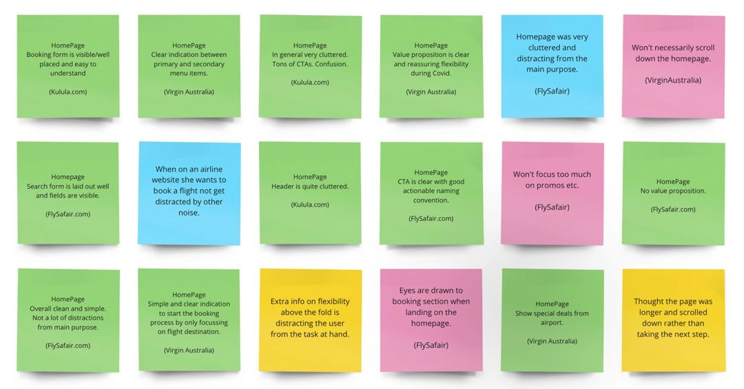
Data Collection
Customer Journey Mapping
Leveraging the insights gleaned from Affinity Diagram groupings and usability testing, I constructed a customer journey map. This map charted the user's emotional experience throughout the flight booking process.
Bridging the Gap:
The customer journey map revealed a disconnect between the design model (how the website intended users to interact) and the user's mental model (how users intuitively expected to interact). This misalignment caused friction points within the booking process.
Optimizing the Journey:
By visualizing the user's journey, the map pinpointed areas for improvement. This facilitated the development of solutions to streamline the booking process and enhance user satisfaction.
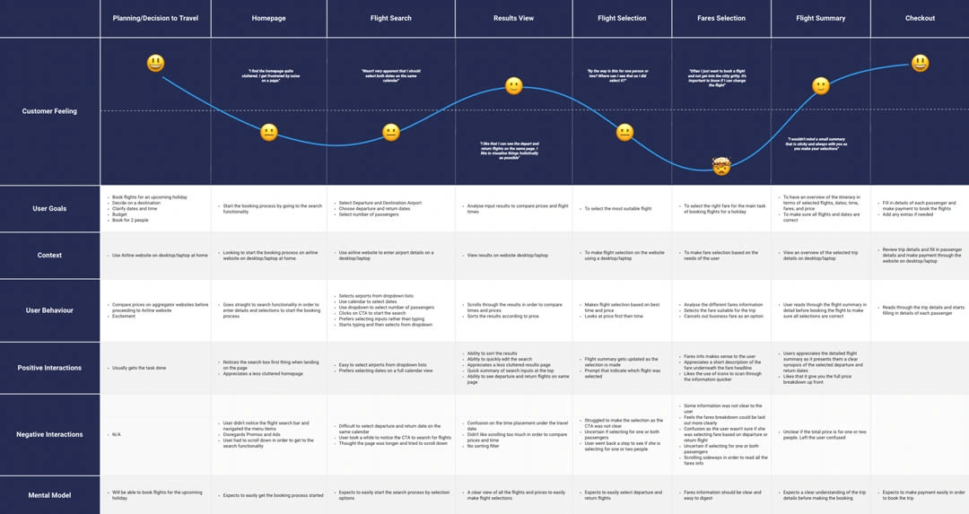
Customer Journey Mapping
Design
Informed by the research findings, the design phase focused on crafting solutions that addressed the identified user pain points. Key design activities included flow diagrams, interaction design, prototyping, and annotations.
Flow Diagram
The foundation of the design phase was the creation of a user flow diagram. This visual map charted the user's journey through the booking process, optimized for simplicity and efficiency.
The flow diagram was developed with the following objectives in mind:
Prioritizing User Needs: It addressed the key issues identified in the research phase.
Optimizing the User Journey: It streamlined the booking process by focusing on the most common use case and ensuring a smooth user experience.
Visualizing the Path: It provided a clear roadmap for the website's architecture, illustrating how users would navigate to different screens.
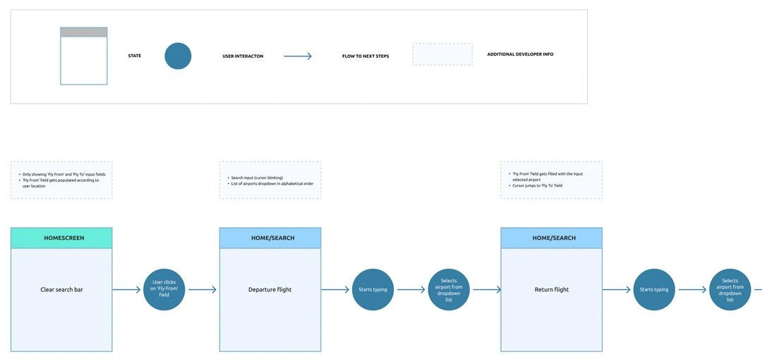
User Flow Diagram
Interaction Design
Having established a deep understanding of the user's needs and challenges through the research phase, the focus shifted towards crafting solutions. Leveraging the insights from the customer journey map and affinity diagram, I began the interaction design process.
This stage involved creating low-fidelity wireframes, which served as a foundational visual representation of each webpage. These wireframes prioritized the establishment of a clear visual hierarchy, ensuring information is presented in a way that effectively guides users towards their goals.
The initial wireframes underwent several iterations to refine the design and address any identified pain points.
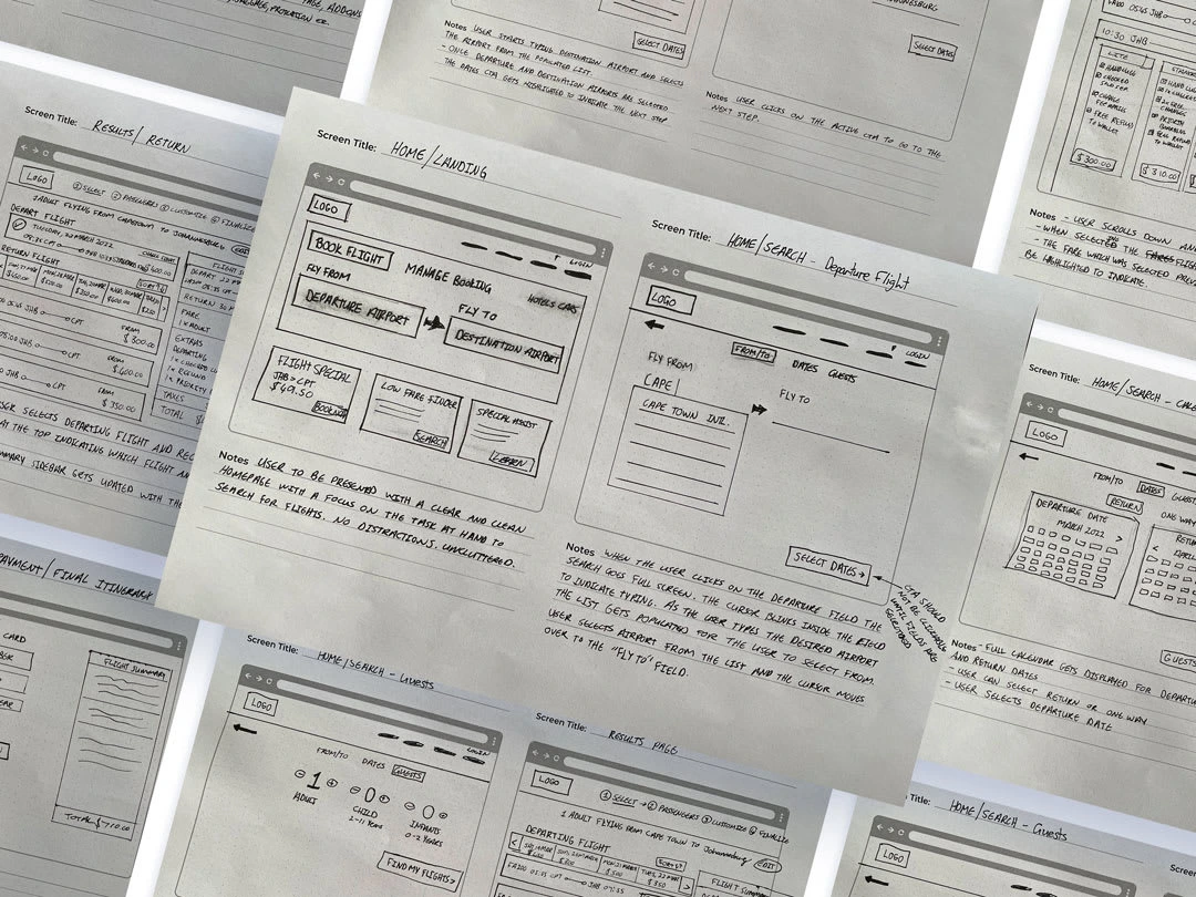
Wireframes and Prototyping
Following the creation of low-fidelity wireframes, the design transitioned to a digital medium using Figma. This facilitated the development of medium-fidelity prototypes that offered a more interactive and realistic user experience.
The prototypes were meticulously refined to optimize the user experience. Usability testing played a crucial role in this process, allowing for the identification and rectification of any usability issues. Through iterative testing and refinement, the prototypes evolved to address user needs and ensure a seamless booking process.
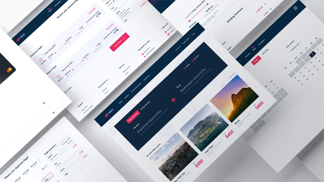
Design Handoff and Development
The final stage of the UX design process involved creating comprehensive annotations to facilitate a smooth handoff to the development team. These annotations documented each screen and component in detail, including:
Functionality: Clear explanations of how each element should function within the user interface.
Visual Specifications: Precise details regarding visual design elements (e.g., colors, typography, spacing) to ensure consistent visual identity.
User Interaction: Instructions on how users should be able to interact with each component.
This meticulous documentation ensured the development team possessed a clear understanding of the design intent, enabling them to translate the prototypes into a fully functional and user-centered product.
Conclusion: The Power of User-Centered Design
This project exemplifies the importance of user-centered design in crafting a successful user experience. By prioritizing in-depth research throughout the UX design process, I gained valuable insights into user pain points, mental models, goals, behaviors, and context of use. This data-driven approach empowered me to make informed design decisions that directly addressed user needs.
The iterative nature of UX design ensures continuous improvement. The learnings gleaned from this project can be applied to future iterations, fostering a product that constantly evolves to meet the ever-changing needs of its users.
Like this project
Posted Jul 9, 2024
This project was my case study submission to the UX Design Institute for my professional diploma in UX Design. The goal of the project was to create an easy and
Likes
0
Views
22

