WAGGO Brand Identity Design

Mirza Abbas

Business Overview
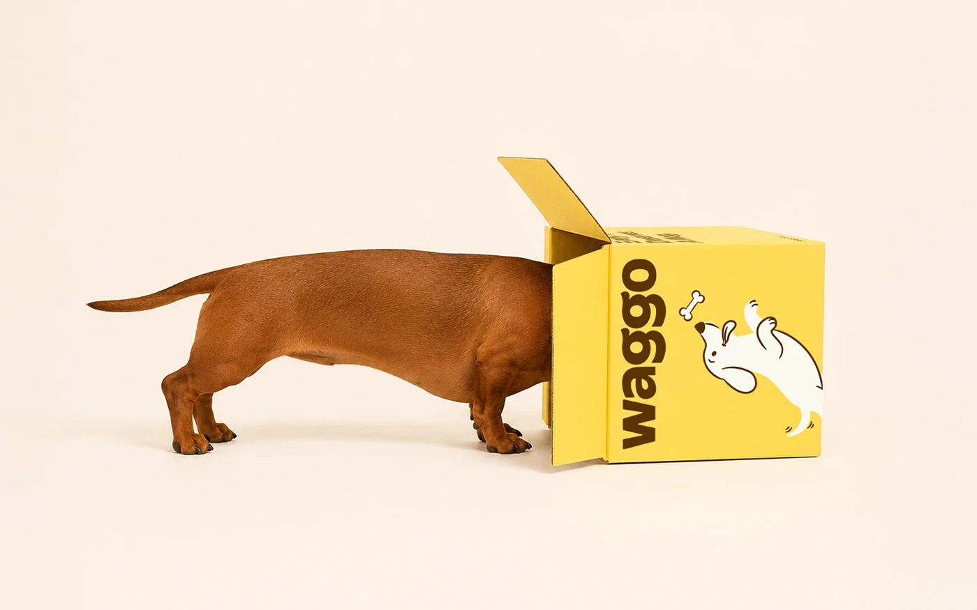
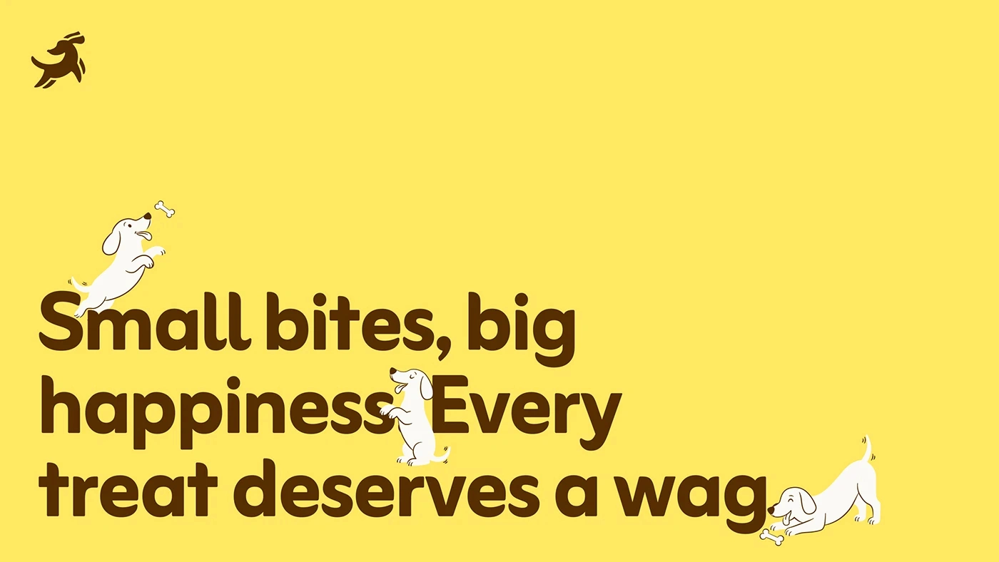
WAGGO is a premium dog treat brand built around the simple idea of celebrating the bond between dogs and the people who love them. The brand was designed to make everyday treat-giving feel like a small ritual — something joyful, warm, and worth sharing.
The identity brings together a playful personality with a premium feel, allowing WAGGO to stand out without becoming overly childish or generic. From the illustrated dog character to the bold packaging and friendly visual language, every element is designed to feel approachable, optimistic, and full of personality.
Colour Palette
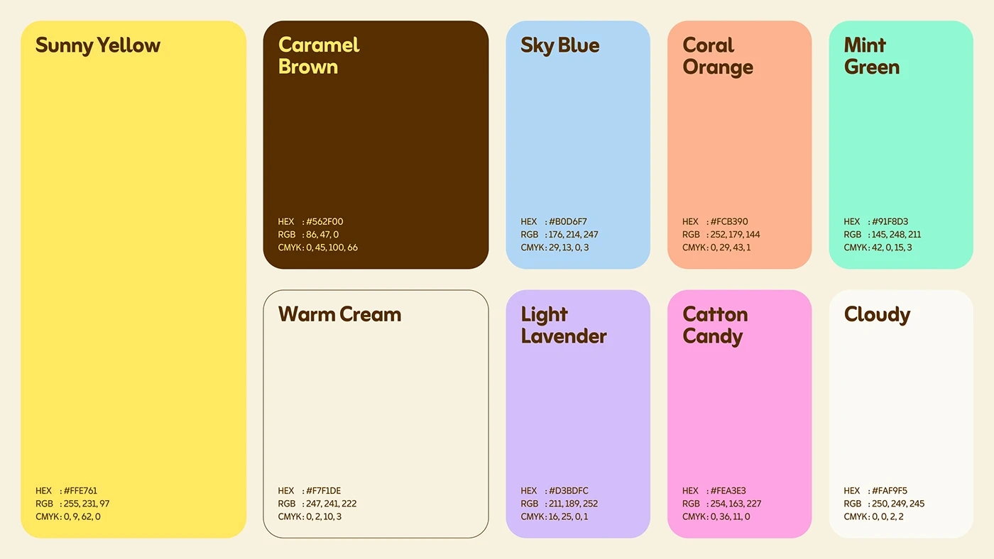
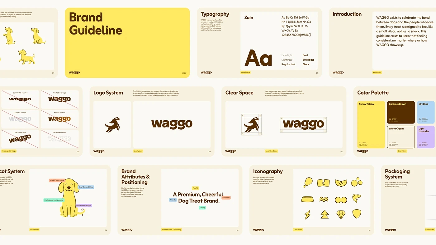
The WAGGO colour palette was created to balance the brand’s playful personality with a sense of warmth and quality. Sunny Yellow acts as the primary brand colour, bringing energy, optimism, and instant visual recognition to the identity. It gives WAGGO a bright and cheerful presence that naturally connects with the joyful nature of dogs.
Caramel Brown provides contrast and acts as an important grounding colour, adding warmth and a premium, natural feel. Supporting colours such as Sky Blue, Coral Orange, Mint Green, Light Lavender, and Cotton Candy introduce flexibility and personality across different brand touchpoints, while Warm Cream and Cloudy provide softer neutral backgrounds.
Together, the palette gives WAGGO a distinctive visual language that feels energetic without becoming overwhelming.
Typography
Typography plays an important role in giving WAGGO its friendly and confident personality. The primary typeface, Zain, was selected for its rounded, approachable character and strong visual presence. Its soft forms complement the illustrated identity and help the brand feel playful without losing its premium positioning.
The typography system uses a range of weights, from Extra Light and Light Italic through Regular, Bold, Extra Bold, and Black, giving the brand enough flexibility to create hierarchy across headlines, supporting copy, packaging, and digital applications.
Like this project
Posted Sep 14, 2026
WAGGO is a premium dog treat brand built around the simple idea of celebrating the bond between dogs and the people who love them.
Likes
1
Views
6