Schar Gluten-Free Bread Packaging Rebranding
Nadia Mousaoui
Rebranding Proposal for Schar Gluten-Free Sliced Bread
The project focused on the gluten-free sliced bread line, with the goal of unifying and clarifying the packaging design to improve shelf visibility and enhance brand recognition.
Schar’s existing packaging for their gluten-free sliced bread faced several challenges:
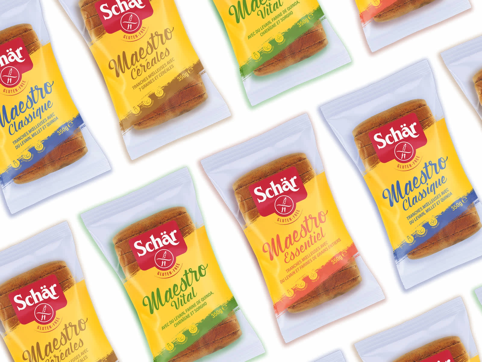
Lack of Visual Unity: The packaging design varied across product lines, creating inconsistency and diluting brand identity.
Low Shelf Visibility: The design struggled to stand out in a competitive market, especially in crowded gluten-free sections.
Excessive Ink Usage: The current design relied heavily on ink, which increased production costs and environmental impact.
Clarity Issues: Key product information, such as “gluten-free” and nutritional benefits, was not prominently displayed, leading to confusion among consumers.
The purpose of this rebranding was to create a cohesive, eye-catching, and sustainable packaging solution that would strengthen Schar’s brand presence while addressing these challenges.
To address the challenges, I developed a comprehensive rebranding strategy that focused on simplicity, sustainability, and shelf impact. Here’s how I approached the project:
1. Unified Visual Identity
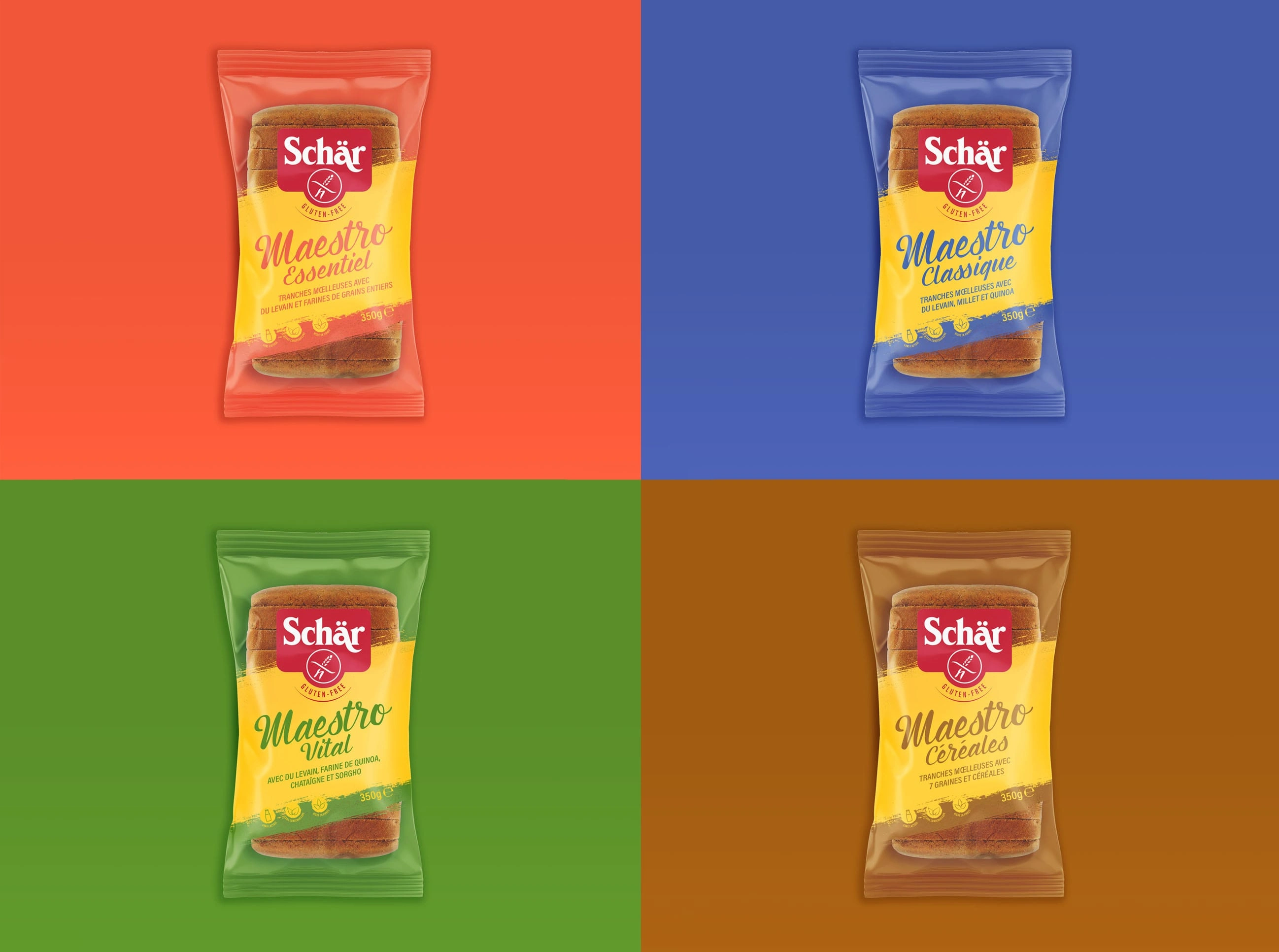
Color Coding: a consistent color palette across all Schar gluten-free sliced bread variants. Each product type is assigned a unique but harmonious color, making it easy for consumers to identify their preferred product while maintaining a cohesive brand look.
Typography Hierarchy: streamlined typography to ensure clarity and readability. The brand name “Schar” was emphasized as the focal point, with supporting text in a clean, modern font.
Iconography: simple, intuitive icons were added to highlight key product attributes, making it easier for consumers to quickly understand the product’s benefits.
2. Enhanced Shelf Visibility
Bold Branding: redesigned logo placement to make it more prominent, ensuring that the Schar brand stands out even from a distance.
Contrast and Simplicity: by reducing visual clutter and using high-contrast elements, the packaging now grabs attention without overwhelming the consumer.
Transparency: I incorporated a transparent area on the packaging, allowing customers to see the product inside. This not only builds trust but also adds a tactile and visual appeal.
3. Sustainable Design
Ink Reduction: I minimized the use of ink by opting for a clean, minimalist design. Large areas of the packaging were left unprinted, reducing environmental impact and production costs.
Eco-Friendly Materials: I proposed the use of recyclable and biodegradable materials for the packaging, aligning with Schar’s commitment to sustainability.
4. Improved Clarity and Consumer Experience
Clear Product Information: Key information, such as “gluten-free” and nutritional benefits, was prominently displayed on the front of the packaging. This ensures that consumers can quickly identify the product’s unique selling points.
Like this project
Posted Mar 23, 2025
The rebranding proposal addressed Schar’s challenges by creating a packaging design that is visually cohesive, eye-catching, sustainable and consumer-centric.