Helping Users Feel at Home on Wicrypt
Chiedozie Okafor
Helping Users Feel at Home on Wicrypt
Redesigning onboarding and verification to turn confusion into confidence
Hey, I’m Chiedozie and here’s a story about helping users find their way.
I joined the Wicrypt team as the sole product designer on a fast-moving 6-week sprint. Our mission was bold but clear: help people in Sub-Saharan Africa share mobile internet and get rewarded using blockchain technology.
But there was a problem most users didn’t stick around long enough to benefit from what we’d built.
The Bigger Picture
Mobile data is incredibly expensive in parts of Sub-Saharan Africa. Wicrypt was created to change that allowing anyone to turn their device into a hotspot, share internet, and earn tokens in return.
But as innovative as the idea was, our analytics told a different story:
Only 10% of users were active out of 30,000 total signups.
Something wasn’t clicking.
The Problem Beneath the Surface
I teamed up with the product manager, two developers, and our QA analyst to investigate. We reached out to users, listened to their stories, and watched how they used the app.
Here’s what we heard:
“I signed up… then what?”
“I didn’t know how to tell people about my shared internet.”
“The verification process is hard… I gave up.”
It wasn’t that people didn’t want to use the app—they just didn’t feel guided, confident, or capable of getting started.
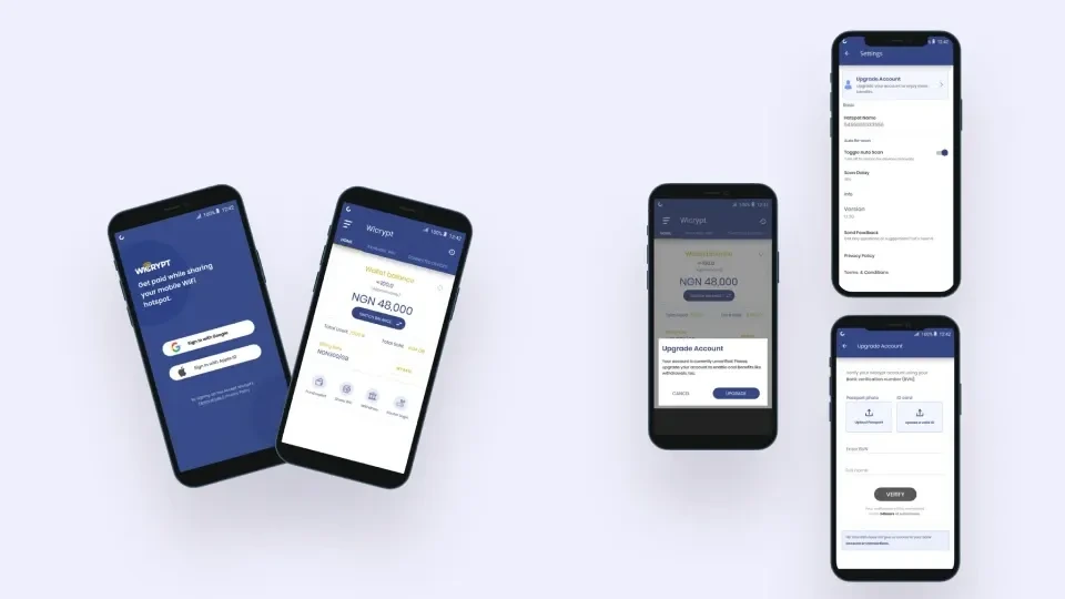
Old UI Shots
Our Goal
We set out to make the Wicrypt experience:
Welcoming for first-time users
Clear about what to do next
Inclusive for people across regions and abilities
Supportive in helping users share their services and earn
Digging Deeper: My Design Process
1. Discover
I spoke with users, read feedback, and reviewed data with the team. The insights were honest and human:
People felt lost after sign-up
They didn’t know how to share their service
Many couldn’t get past verification
2. Define the Problems – with Empathy
Using the “How Might We” approach, I framed the issues in human-centered terms:
How might we help users feel confident about what to do next?
How might we make it easy and natural to tell others about their service?
How might we make verification smooth and accessible for everyone?
Designing with Clarity and Care
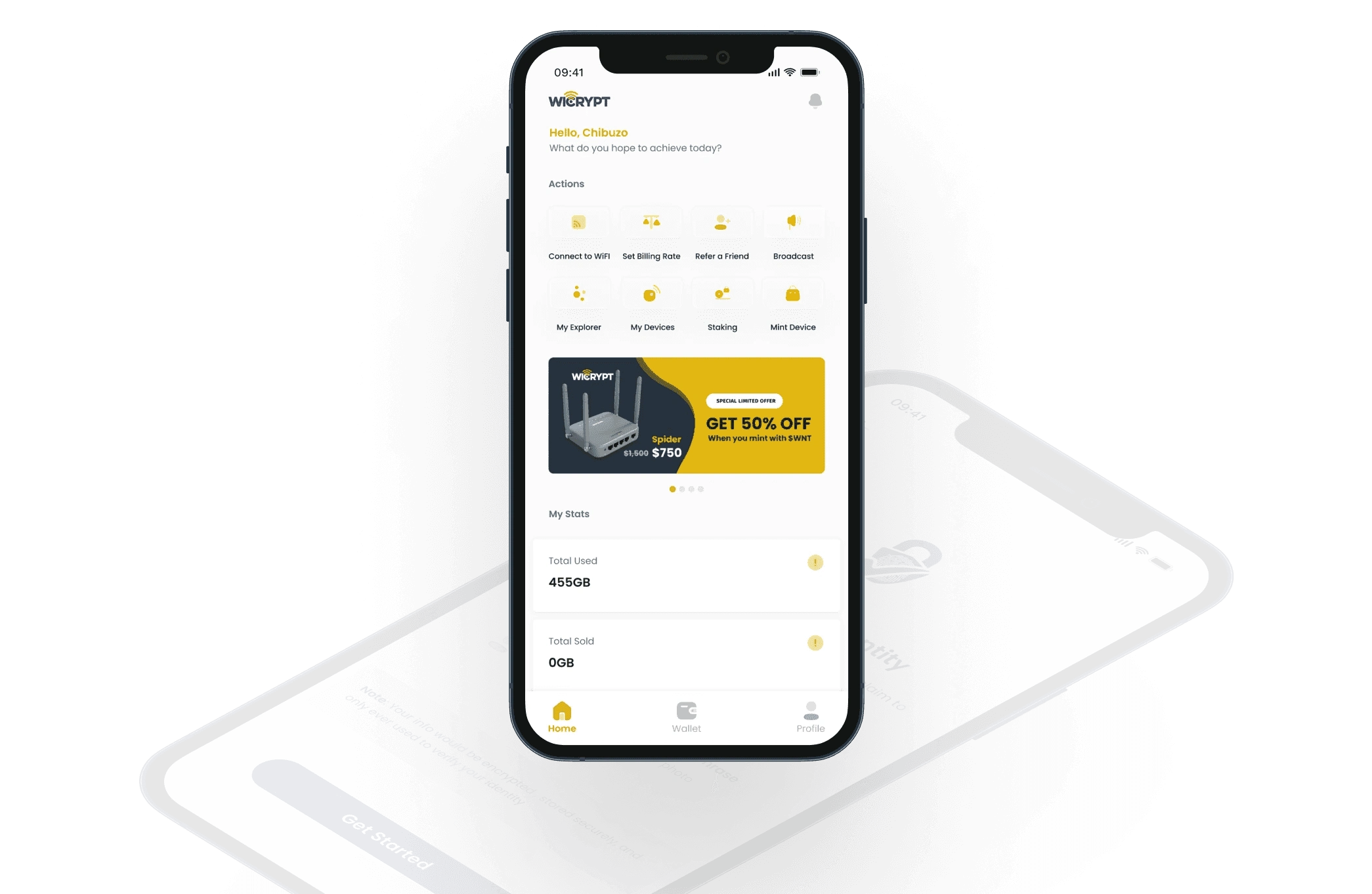
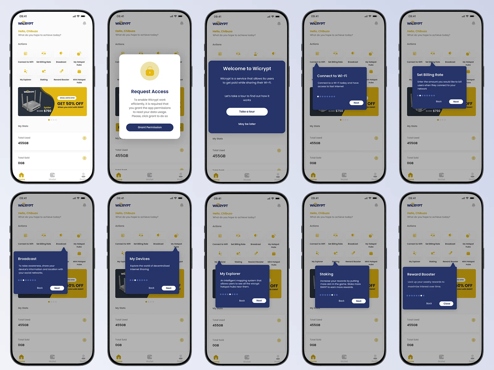
A Friendly Walkthrough for New Users
Instead of dropping people into the dashboard, I designed a visual onboarding experience that walks them through key actions. No more guessing what to do.
“Now I know where to start. That helped a lot.” – A user after the update
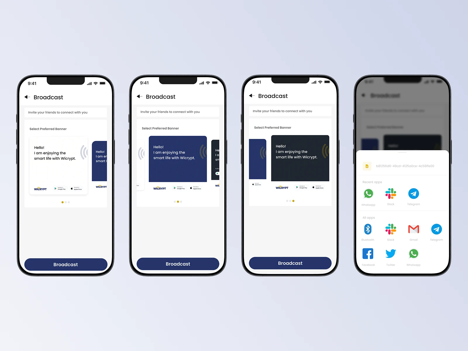
A Way to Share Their Service Proudly
I added a feature to broadcast your shared internet to contacts choose a message, pick a platform (like WhatsApp), and let your network know.
Sharing became one tap away.
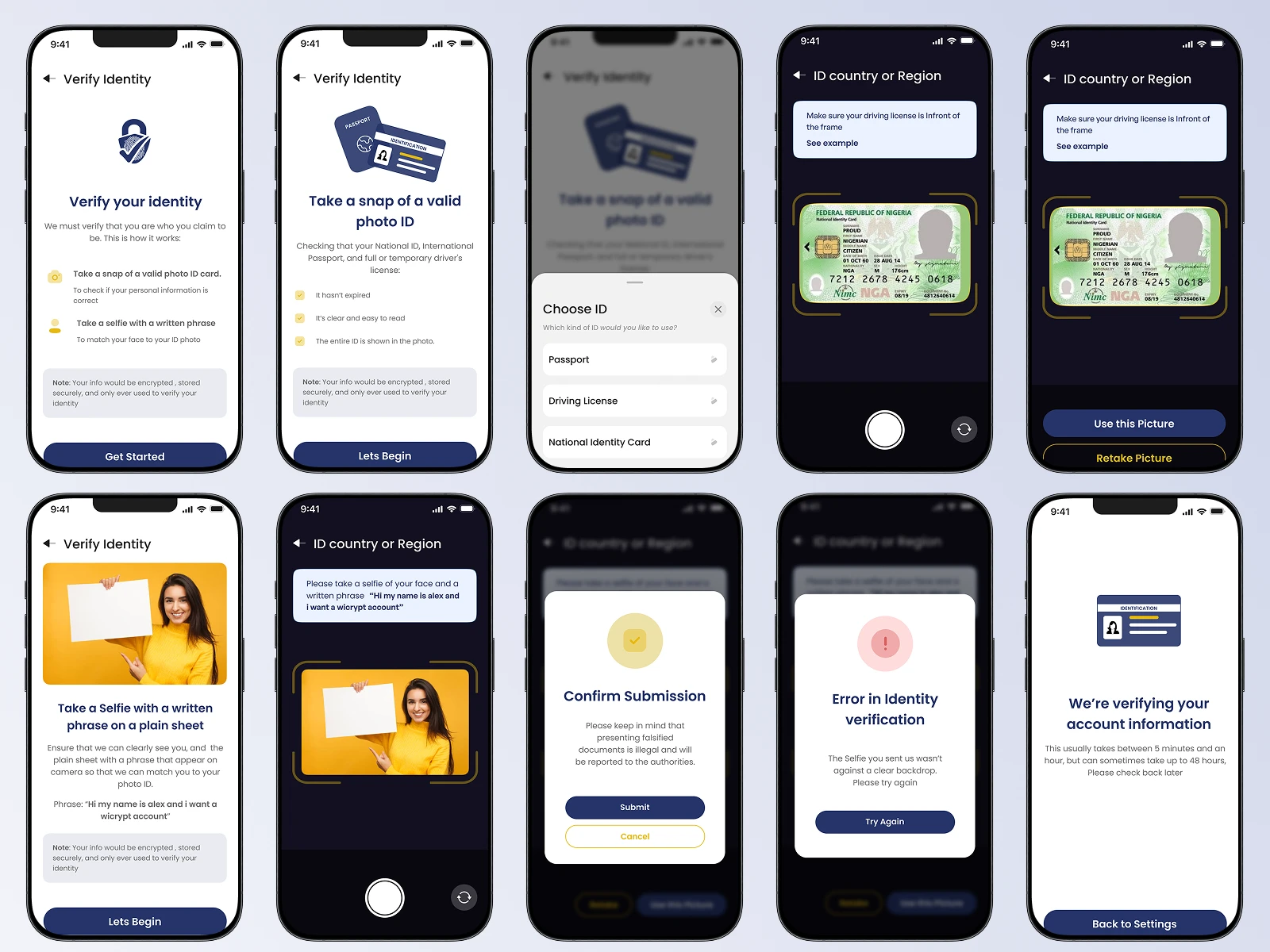
Simplified, More Human Verification
I redesigned verification screens to support multiple methods (ID, biometrics, etc.) with clear guidance at every step. It no longer felt like a bureaucratic hurdle it felt like part of the journey.
Before & After Highlights
Onboarding
Before: Blank screen, no guidance
After: Walkthrough with key action prompts
Sharing
Before: No easy way to tell others
After: Broadcast feature with social integration
Verification
Before: Confusing and limited
After: Accessible, guided, multi-option process
Impact – What Changed
After launching the redesign:
User retention increased by 70%
Total active users grew by 30%
Users reported feeling more confident, and more connected
What I Took Away
This project reminded me that good design is invisible but felt.
It’s not just about clean UI or clever flows. It’s about removing friction, building trust, and helping people feel capable.
Design isn’t just what you make it’s how people feel when they use it.
Team
Product Designer (Me)
Product Manager
4 Software Developers
QA Analyst
Like this project
Posted May 18, 2025
Redesigned Wicrypt to feel welcoming and intuitive guiding new users from sign-up to sharing. By simplifying key actions and making the platform more inclusive.
Likes
0
Views
14
Timeline
Nov 20, 2021 - Dec 31, 2021
Clients
Wicrypt