User Research, Design & Prototyping for E-commerce ( konga )
My role
I led the team in research, mobile interface design and prototyping. I also receive constructive criticism from stakeholders, product manager and the engineering team.
In addition, i worked alongside an illustrator, ui designer, content strategist, product manager, QA, and the engineering team.
The responsive design launched in June 2019.
My task include
Customer insights and ideation
Building the project vision
Planning and scope definition
User interface and Experience
Prototyping and Interactions
Introductions
Konga is the second largest e-commerce company in Nigeria, its a one-stop online store for everything you need, allowing merchants to advertise their inventory for customers, who then purchase these things and have them delivered to their home address.
Understanding the Problems
We noticed we had a big development expense managing KongaEZ (PWA) in 2018, and KongaEZ was formed in 2017. The goal was to help Nigerians with slow internet connections or low-end browsers (such as Opera Mini) navigate easily and swiftly, and it was a big success. But success brought another issue: the development team had to be split in half to manage Konga EZ changes, and because of the growth in users on the PWA, the engineering team had to manage two separate applications.
Gathering insights
We were able to gain critical insights on how to gratify this category of individuals without overspending after interviewing various Designers, Product manages, Engineers, and Stakeholders associated with the experience. We grouped these problems under common themes and features in the platform.
Below are list of pain points from the research.
The expense of maintenance has risen.
The user interface differs from the primary store.
The application generates only 5% of its income.
Our personas
We will use this personas as a guide throughout the project to assist with decision making, task prioritisation, and creating empathy among our customers and team.
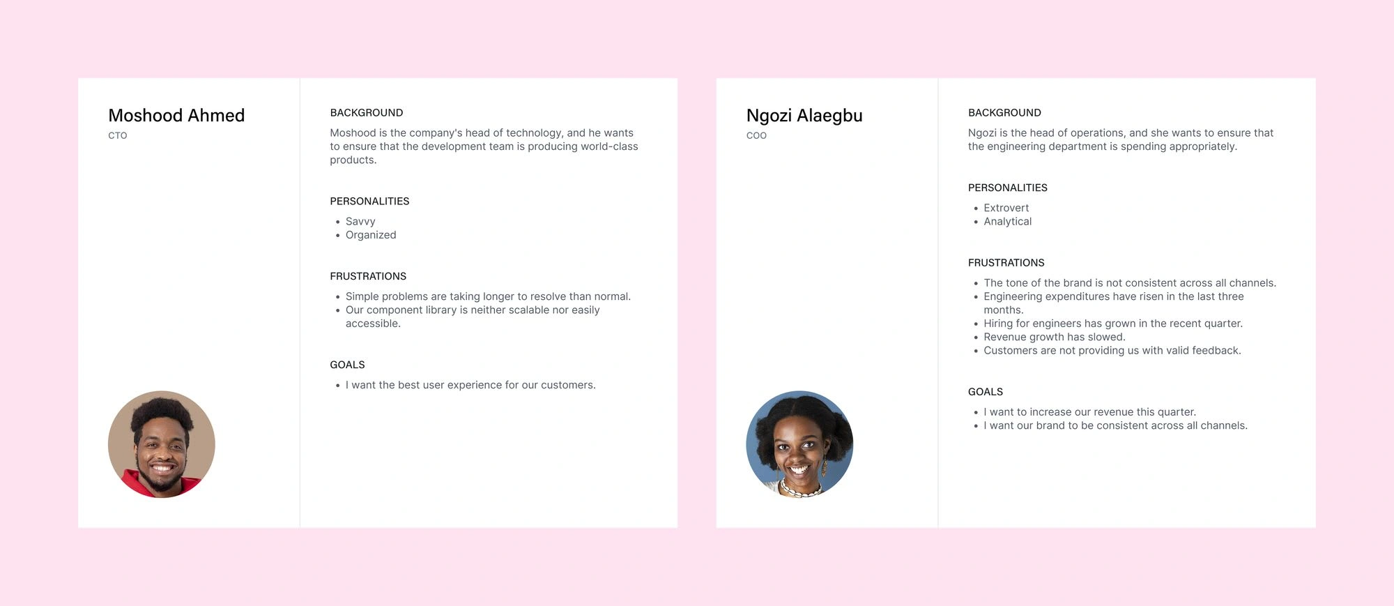
User persona
Defining the problem statement
The engineering and business teams are frustrated with the growing maintenance costs of Konga EZ and Konga Primary Store and are working on ways to unify the applications and increase revenue.
Storyboard solution
Consolidated all application into one.
Set brand tone.
Create a design system.
Design a seemless user experience from signup to checkout.
Include customer feedback
Product Vision
The primary goal is to create Konga a speedy and dependable e-commerce store with a consistent theme. Without having to maintain two applications, we want our engineering team to be able to build and ship faster on high- or low-end browsers or sluggish internet connections.
Defining version 3.0
II led a workshop with stakeholders, product managers, and the product and engineering teams involved to map out the information architecture, business needs, and engineering constraints for this version.
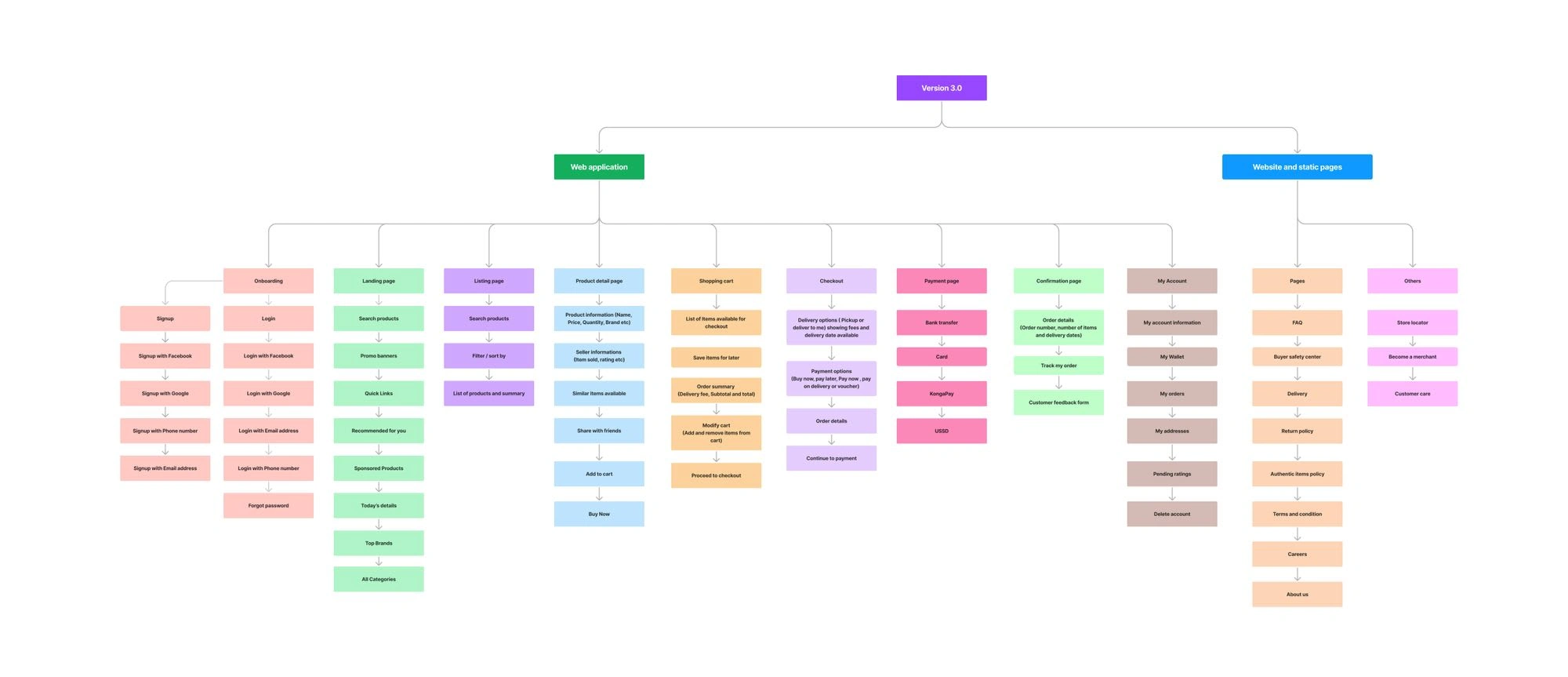
Information Architecture
Prioritisation of issues
I took the extra step of categorising these problems into broader Epics to provide the Product managers and engineers with visibility into the key areas of the platform that needed to be addressed from a usability standpoint. This not only helped to prioritise usability issues in order of need but also helped to shape the product roadmap for the quarter.
Designs
User testing was an iterative process that was conducted at every milestone of the project to identify the biggest pain point. Once feedback was gathered, i would revisit the prototypes, make changes and test again.
For this application, i wanted to create something minimalist and clean that conveyed trustworthiness and progression for future-oriented individuals.
Design system for developers and designers
Konga's brand identity was significantly revised by the Brand and Creative teams late in 2017. We wanted to integrate a new colour palette, a new typeface (Inter), and a slew of visual improvements into our apps. To do this, we assembled a fully-staffed team to develop a design system for Konga. We created everything from scratch and coded the design system once the structure was determined. Developers may now get design system guidelines and new upgrades on our dedicated private site.
In many aspects, the design system was a success. Konga's look and feel was overhauled, many of our components were standardised across mobile and desktop, and the team grew from a handful of people to 20+ full-time engineers and designers.
We saved a lot of time onboarding and training designers and engineers about Konga's mindset by using this new problem-solving technique.
The design system is still being maintained by the team.


Design system
HIFI design ( approved by stakeholders )
We performed many workshop sessions to discuss the design approach and usability testing, and we reviewed how long customers spend on a journey and how quickly they finish a task given to them.
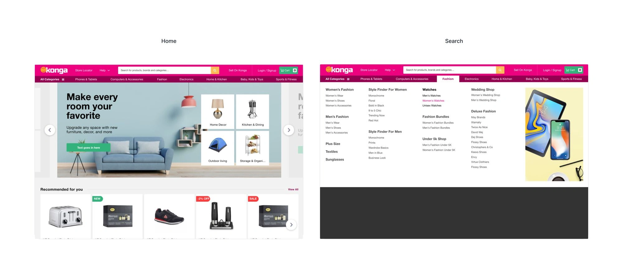
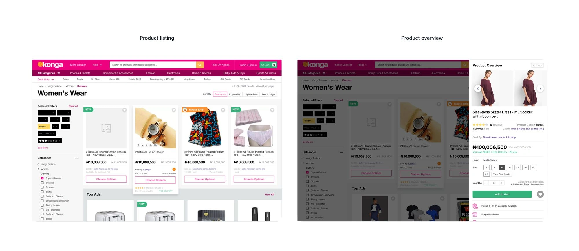
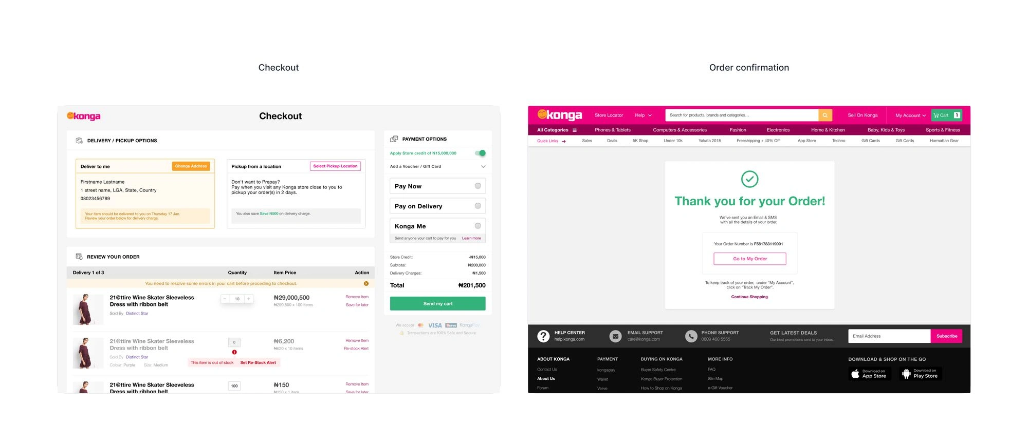
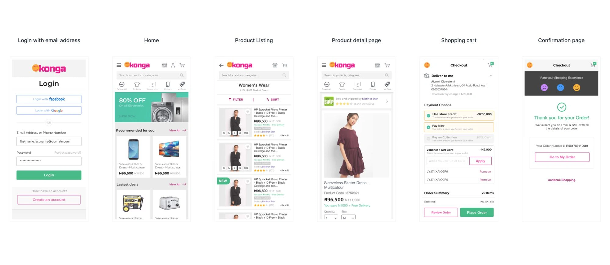
Some of the knowledge gained was applied to the redesign of significant interfaces such as the checkout, product detail page, landing page, and payment page. The features and their interfaces are listed below.
Web
These are some of the desktop view screens. To organise all of the screens required for this version, we established a design checklist on an Excel spreadsheet, and we utilise Jira to generate and assign design tasks.
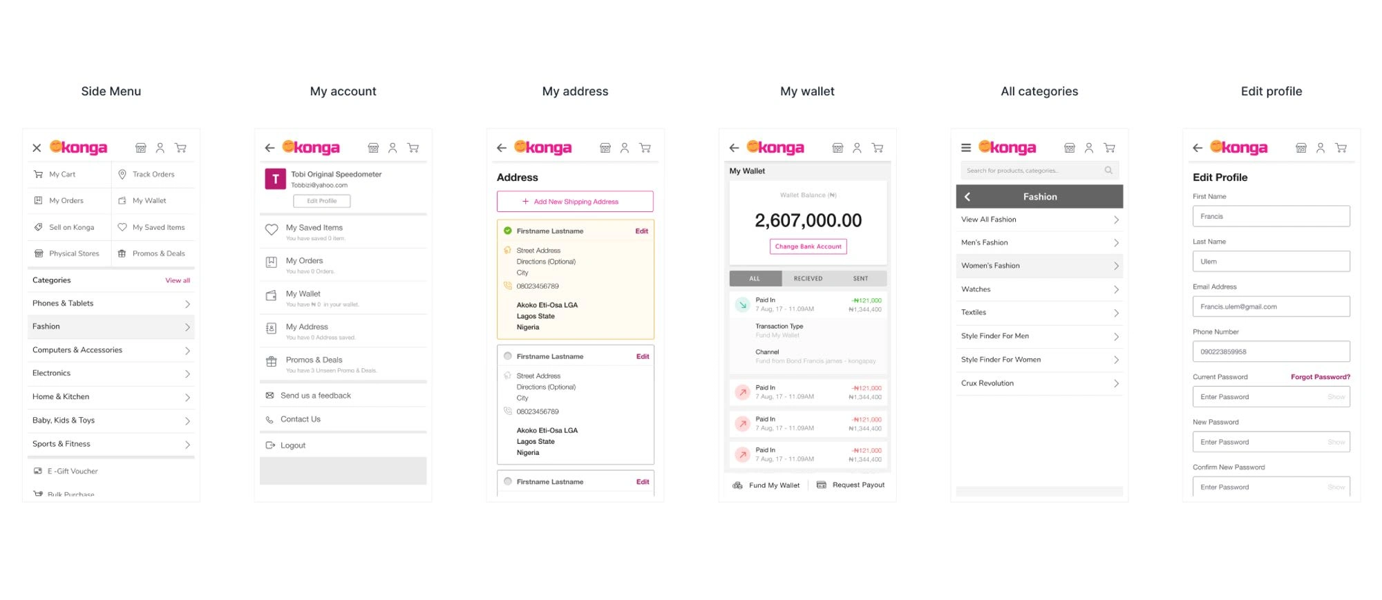
Mobile
These are some of the mobile view screens. To organise all of the screens required for this version, we established a design checklist on an Excel spreadsheet, and we utilise Jira to generate and assign design tasks.
Developing the prototype
We created the interface design in sketch and then prototyped the whole flow in sketch so that the stakeholders, product manager and development team can go through the flow and share their feedback.
Handoff
I worked very closely with the Front End team to spec out any missing interactions that were not covered in the high fidelity mockups. I conducted a UX review of each front-end ticket that was implemented to ensure it was aligned with the designs.
Results and takeaways
Best experience for our customers.
Increase in signups and revenue.
Saved more on building and maintenance cost.
A dedicated design system aided in the faster delivery of concepts.
Link to live project
Thank you for reading my case study 🥳
Like this project
Posted Sep 15, 2023
I led the team in research, mobile interface design and prototyping. I also receive constructive criticism from stakeholders, product manager and the engineerin
Likes
0
Views
24
Clients


KongaPay
Konga Travels and Tours
Konga

