Kids Sew Camps Website Redesign

Samson Bojesomo


Kids Sew Camps: Designing a Website Parents Trust Enough to Book
Client: Kids Sew Camps — premium sewing holiday camps for kids ages 9-14
Role: Website Redesign, UX Strategy & Brand/Visual Design
Result: Newly redesigned and launched — performance data pending
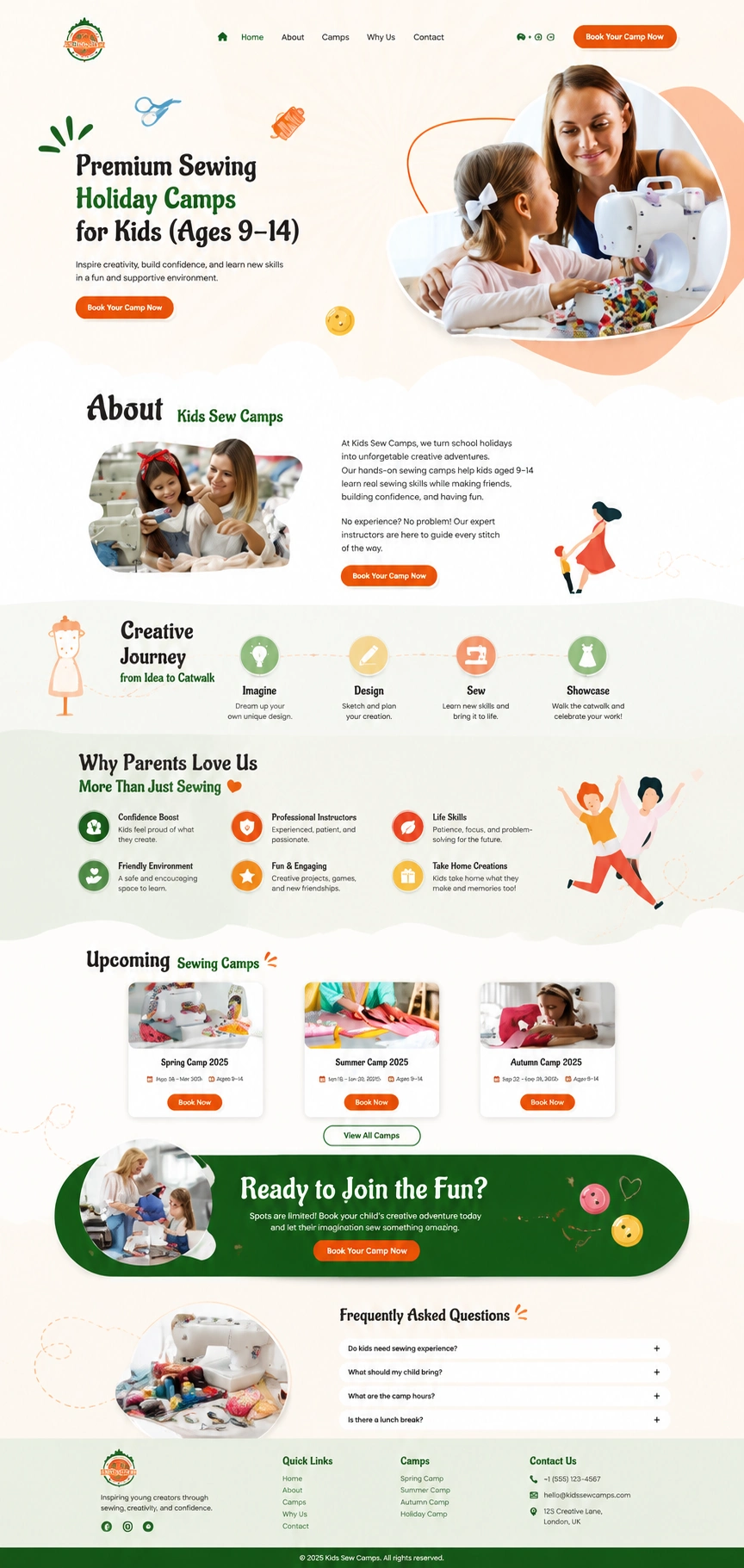
Kids Sew Camps: Designing a Website Parents Trust Enough to Book
The Challenge
Kids Sew Camps runs a premium, in-person program — which means the website carries almost all of the weight of the first impression. Before a parent ever meets the instructors or sees the studio, they're deciding, from the site alone, whether this feels safe, credible, and worth the investment for their child.
The existing site wasn't doing that job. It didn't visually match the warmth of what actually happens in the program — kids designing, cutting, and sewing their own creative projects — and it didn't make the path from "curious" to "booked" obvious. Parents browsing on their phones (the majority of this audience) had to work too hard to find upcoming camp dates, understand what a camp actually includes, or feel reassured before committing.
The brief was simple to state and harder to execute: make it look and feel as premium and trustworthy as the program itself, and make booking effortless once that trust is built.
Research & Discovery
Before touching any design, I looked at this from the parent's point of view rather than the brand's. A parent evaluating a kids' program is quietly running through a checklist: Is this safe? Is this legitimate? What will my child actually get out of it? Is this worth the price? What do other parents think?
That checklist shaped every decision below — the goal wasn't to make the site "prettier," it was to answer those questions in order, without the parent having to dig for them.
The Design Process, Section by Section
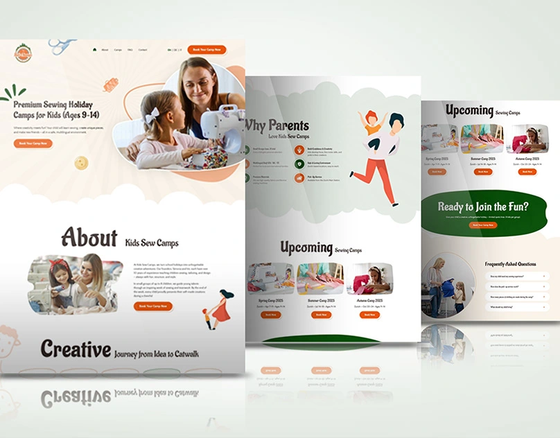
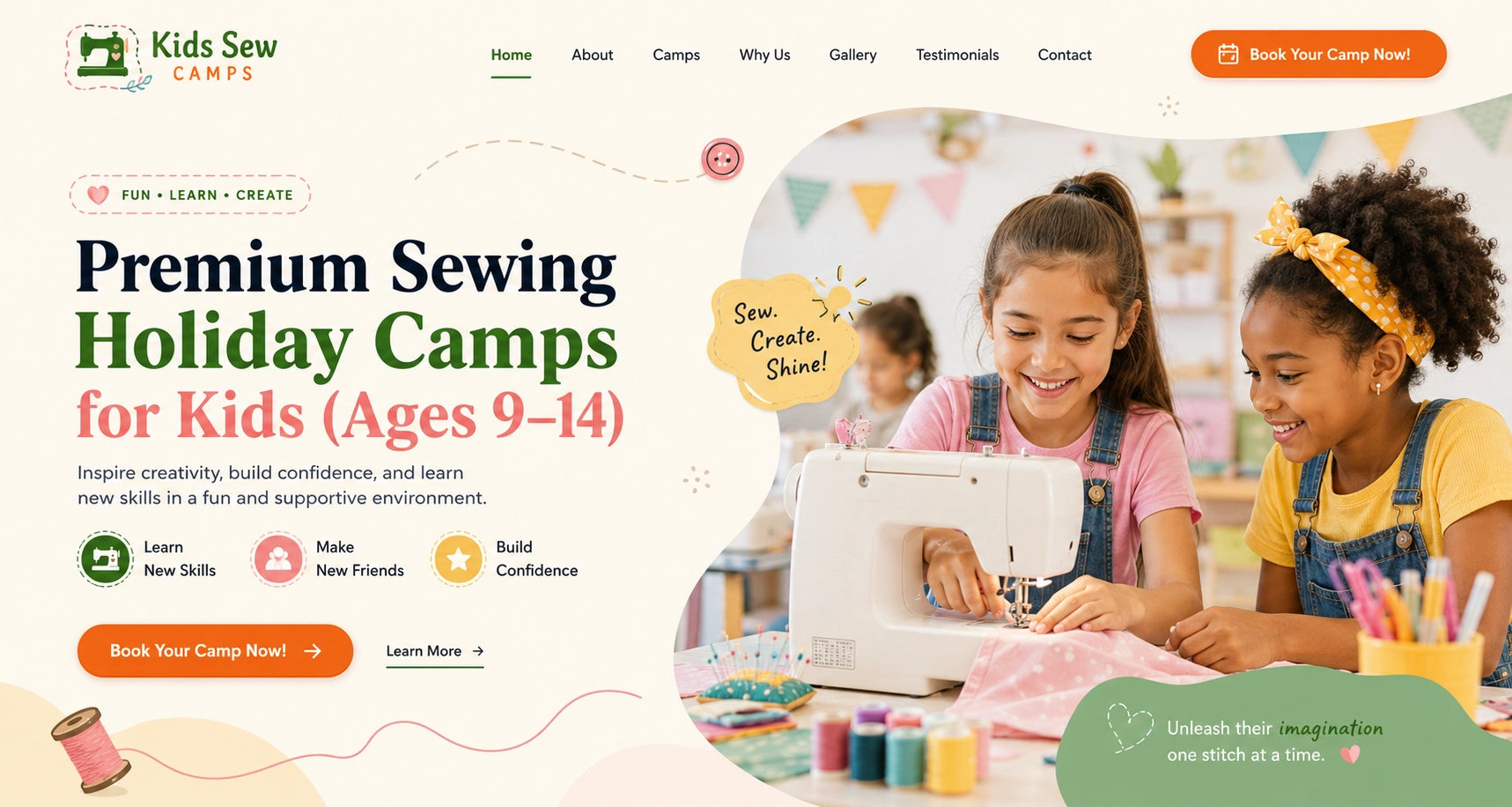
Hero Section — Leading With the Promise, Not the Product The homepage opens with "Premium Sewing Holiday Camps for Kids (Ages 9-14)" paired with a warm, genuine photo of a parent and child at a sewing machine together. This was deliberate: instead of leading with generic camp branding, the hero leads with the emotional outcome — a parent and child sharing a creative moment — because that's what's actually being sold. The age range is stated immediately so parents can self-qualify in the first three seconds, and the primary "Book Your Camp Now" CTA is placed directly in the hero, above the fold, so intent-driven parents never have to scroll to act.
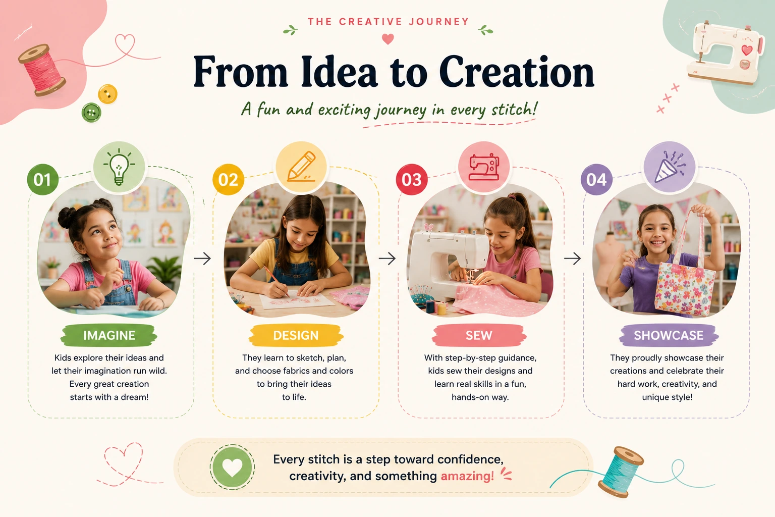
About Section — Building Credibility Before Asking for Anything Right after the hero, the "About Kids Sew Camps" section does the trust-building work: explaining who the program is for and what a "creative journey from idea to catwalk" actually looks like in practice. This section uses real photography of kids and instructors rather than stock imagery, because for a program built on hands-on trust, authenticity matters more than polish. The tagline "Creative Journey from Idea to Catwalk" was positioned here specifically — it reframes the camp from "craft class" to "a real creative outcome kids can be proud of," which matters to parents deciding if this is worth the investment.
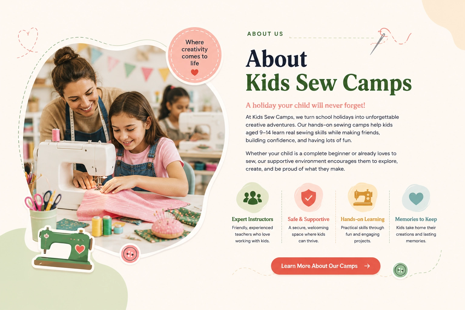
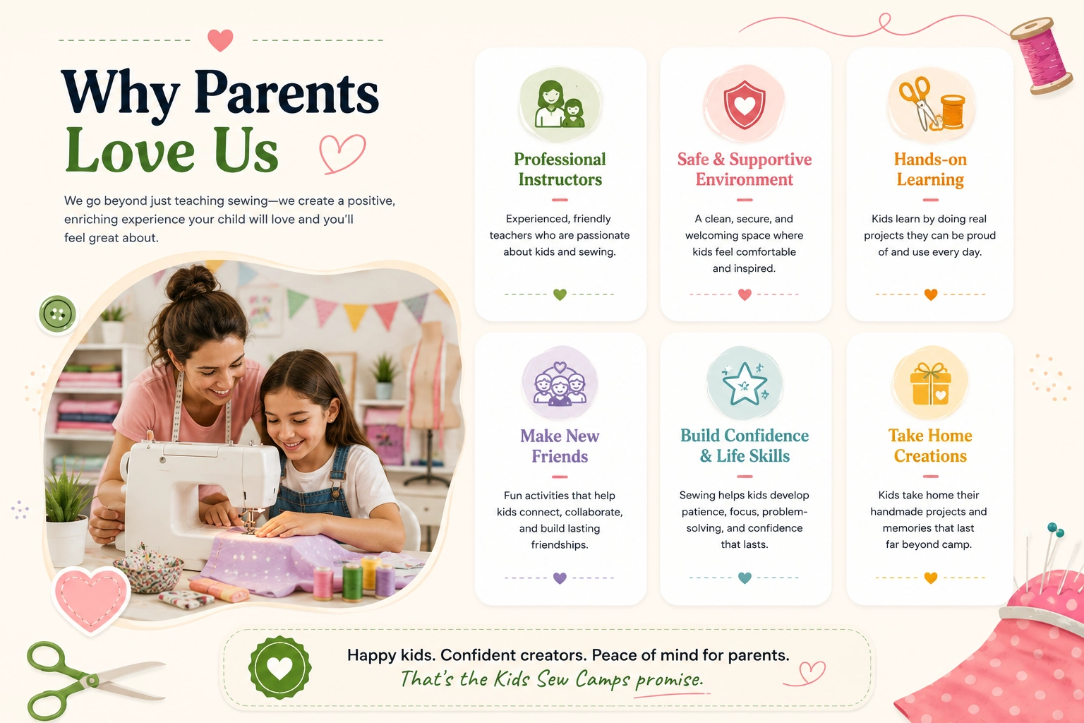
"Why Parents Love Kids Sew Camps" — Answering Objections Before They're Asked This section exists to pre-empt hesitation. Rather than a generic features list, it's built around parent-relevant reassurances — framed with simple icons and short, scannable statements so a busy parent can absorb the key points in a glance rather than reading dense paragraphs. Placing this section mid-page (after credibility is established, before the ask) follows a deliberate trust-then-convert sequence rather than a features-first layout.
Upcoming Sewing Camps — Making the Decision Concrete This is where browsing turns into a real decision. Spring, Summer, and Autumn camps are laid out with consistent visual treatment — photo, camp name, dates, and a "Book" CTA on each card — so parents can compare options side-by-side without needing to click into separate pages just to see what's available. Repeating the booking CTA on every camp card (rather than only once on the page) removes friction at the exact moment interest peaks.
"Ready to Join the Fun?" CTA Band — A Deliberate Second Conversion Moment Further down the page, a bold, high-contrast green CTA band re-prompts booking for parents who scrolled past the camp cards without converting. This kind of secondary CTA placement matters because not every parent is ready to commit on first pass — some want to read FAQs or see more first — so this band acts as a safety net for intent that builds gradually down the page.
FAQ Section — Removing the Last Objections Placed immediately after the second CTA, the FAQ section (covering things like drop-off/pick-up timing and what to bring) is there to handle the practical, logistical hesitations that emotional and visual design alone can't resolve. Positioning it late in the page, rather than early, respects the trust-building sequence — parents who are already sold skip past it, while parents on the fence get their last questions answered right before deciding.
Brand & Visual Identity The visual language — soft illustrated accents, a warm cream-and-orange palette, playful hand-drawn type touches, and rounded, friendly shapes — was chosen to feel handcrafted and joyful rather than corporate, mirroring the creative, tactile nature of sewing itself. This is a deliberate departure from the colder, more transactional look of a typical e-commerce or booking site, because the emotional register of "kids' creative camp" needed to come through visually, not just in copy.
Mobile Experience Since most parents research and book programs like this from their phones during small pockets of downtime, every section above was designed mobile-first rather than adapted after the fact — stacking cleanly, keeping CTAs thumb-reachable, and making sure camp cards and FAQs remain scannable without pinch-zooming or horizontal scrolling.
The Outcome
The redesigned site has just launched, so performance data isn't available yet. But structurally, it now does what the old site didn't: it builds trust in a clear sequence, keeps the booking action within reach at every stage of that sequence, and looks like the premium, creative program it's actually selling.
What the Client Said
"You're a HELP we love to help more of your service" — Kids Sew Camps
Tools & Skills Used
Website Redesign · UX Strategy · Brand & Visual Design · Conversion-Focused Layout · Mobile Optimization · Booking Page Design
Want a site that builds trust and books itself out? Let's talk.
Like this project
Posted Sep 1, 2026
Redesigned Kids Sew Camps website to enhance trust and ease of booking.