
If your bouquet looks premium but your brand still feels ordinary, customers will remember the flowers and forget who sold them.
That was the problem behind YOUR FLOWERS.
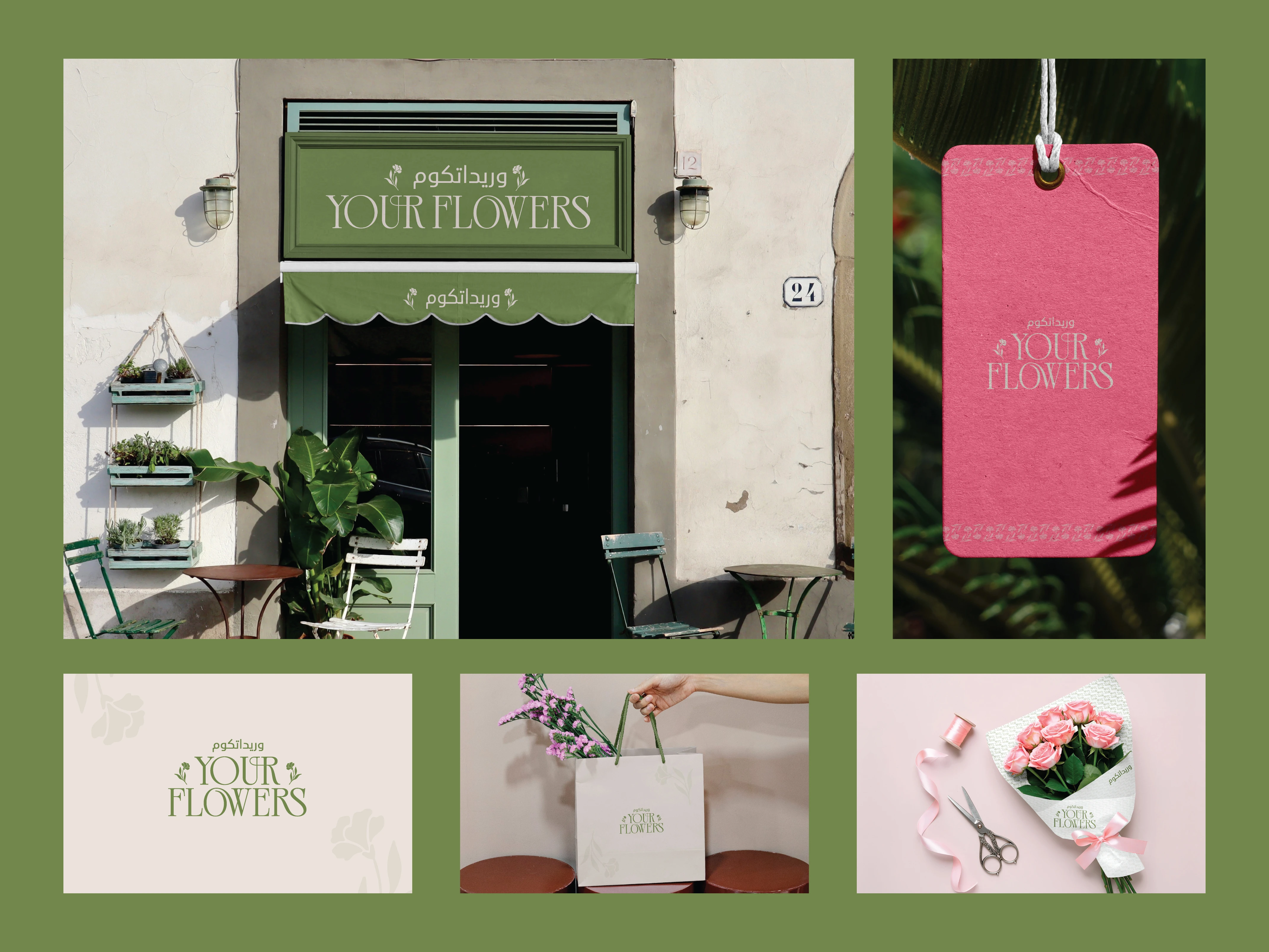
The identity was built to feel soft, elegant and memorable without falling into the usual overly romantic flower-shop aesthetic.
The system combines:
🌿 Muted green for freshness and calm
🌸 Soft pink for warmth and emotion
🤍 Cream neutrals for a refined, premium feel
🌷 Delicate floral details that support the brand without overwhelming it
🔤 Elegant typography designed to feel timeless
Then the identity was carried across:
Storefront signage
Packaging
Bouquet wrapping
Shopping bags
Tags
Brand applications
The goal was simple:
Make the entire experience feel considered, not just the flowers.
Because customers do not only buy bouquets.
They buy the feeling around them.
The wrapping.
The presentation.
The moment.
The memory.
That is where branding starts doing more than looking pretty.
YOUR FLOWERS
A softer identity built to leave a stronger impression.
What gives this brand the most character?
A. The green + pink palette
B. The typography
C. The packaging system
D. The overall calm, premium feel
Drop A, B, C or D below.
If you are building a floral, gifting, lifestyle or boutique retail brand and your visuals still feel generic, send me a message.
I help brands turn simple products into recognizable experiences people remember.
#BrandIdentity #FloralBranding #PackagingDesign #RetailBranding #VisualIdentity #LogoDesign #CreativeDirection #BoutiqueBranding
0 likes · 1 view · Oct 27, 2026
If your bouquet looks premium but your brand still feels ordinary, customers will remember the flowers and forget who sold them. That was the problem behind ...

