ACME Logo & Visual Identity
Alamgir Brands
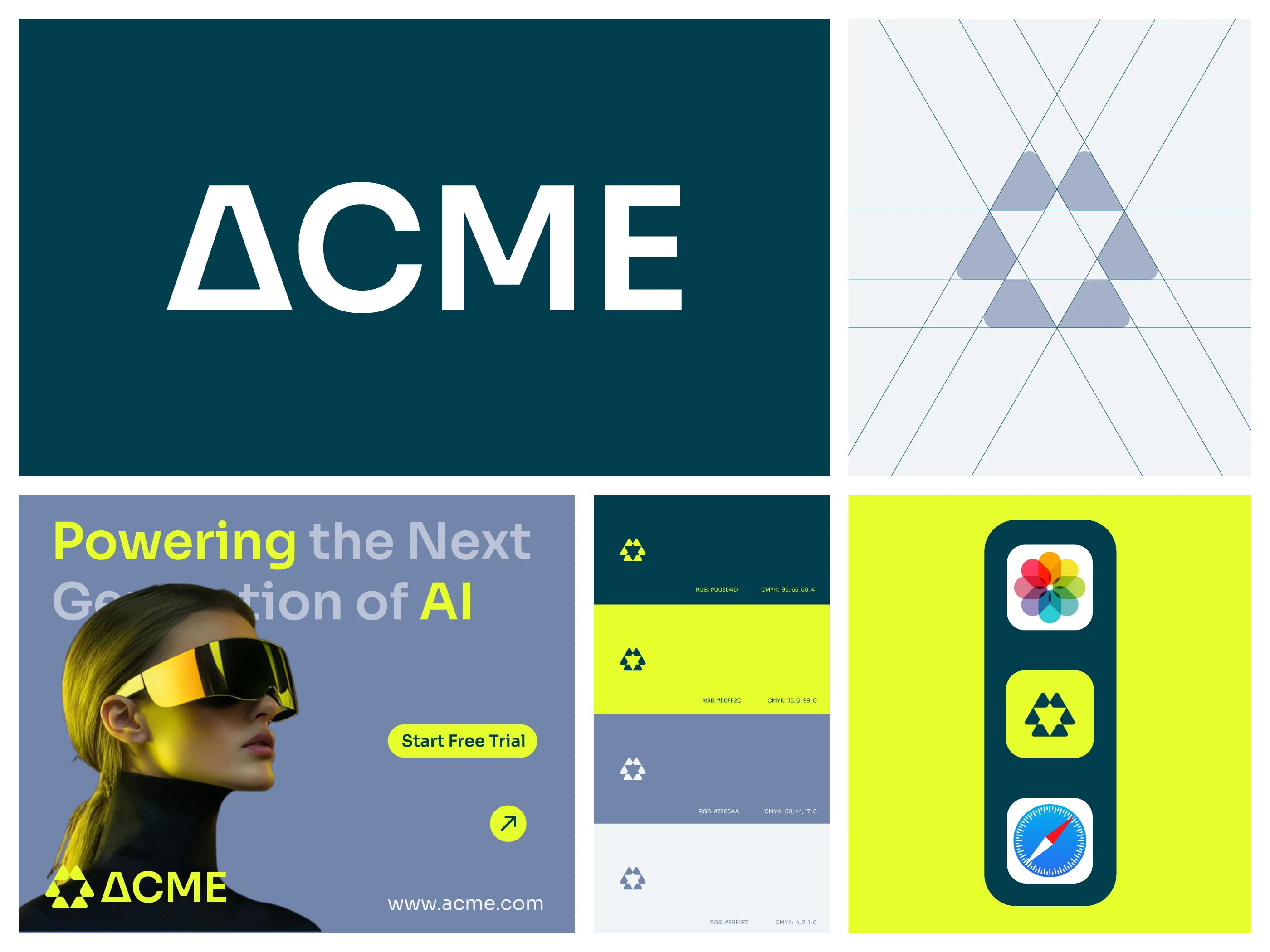
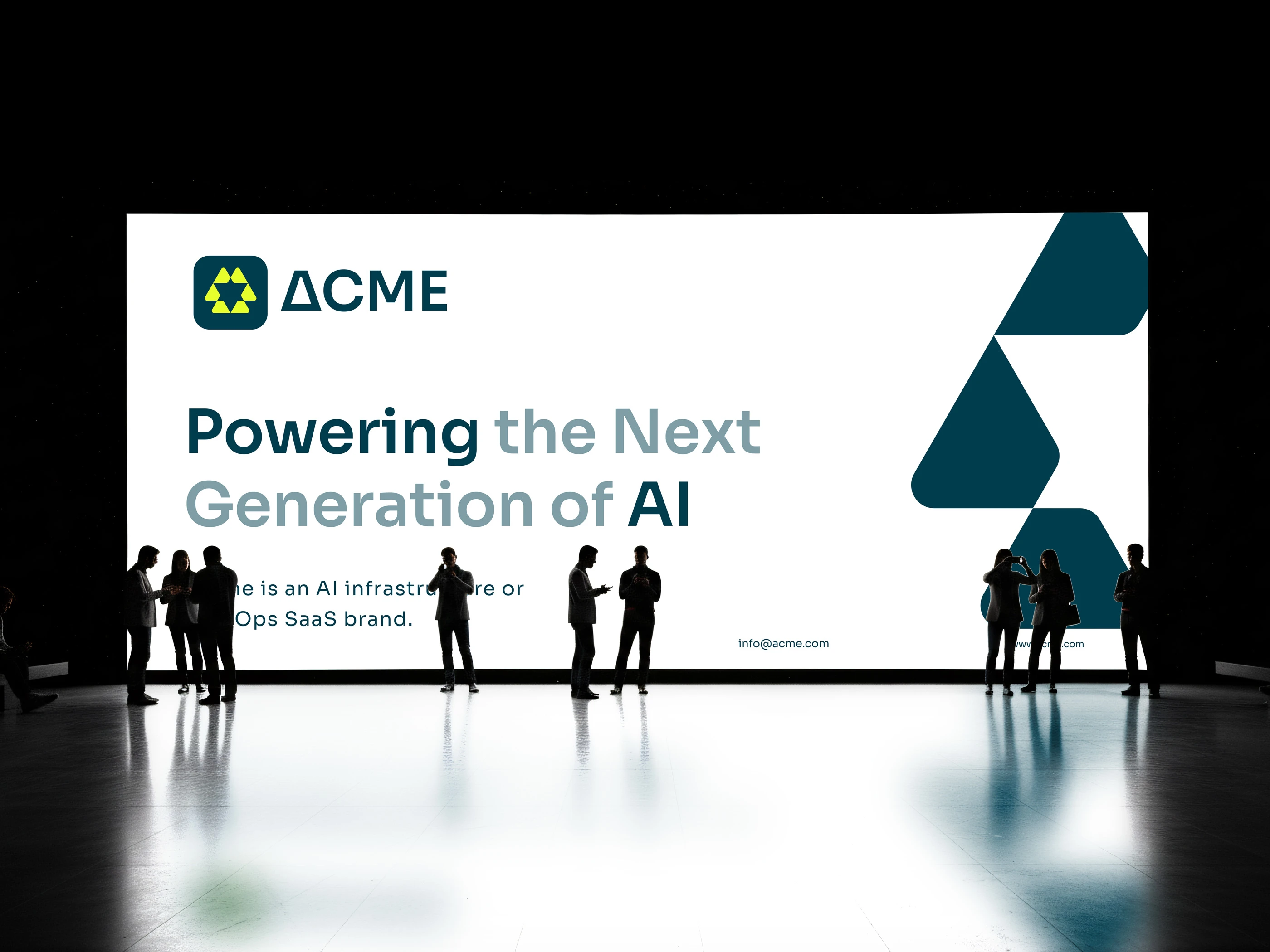
ACME — Brand Identity Case Study
Overview
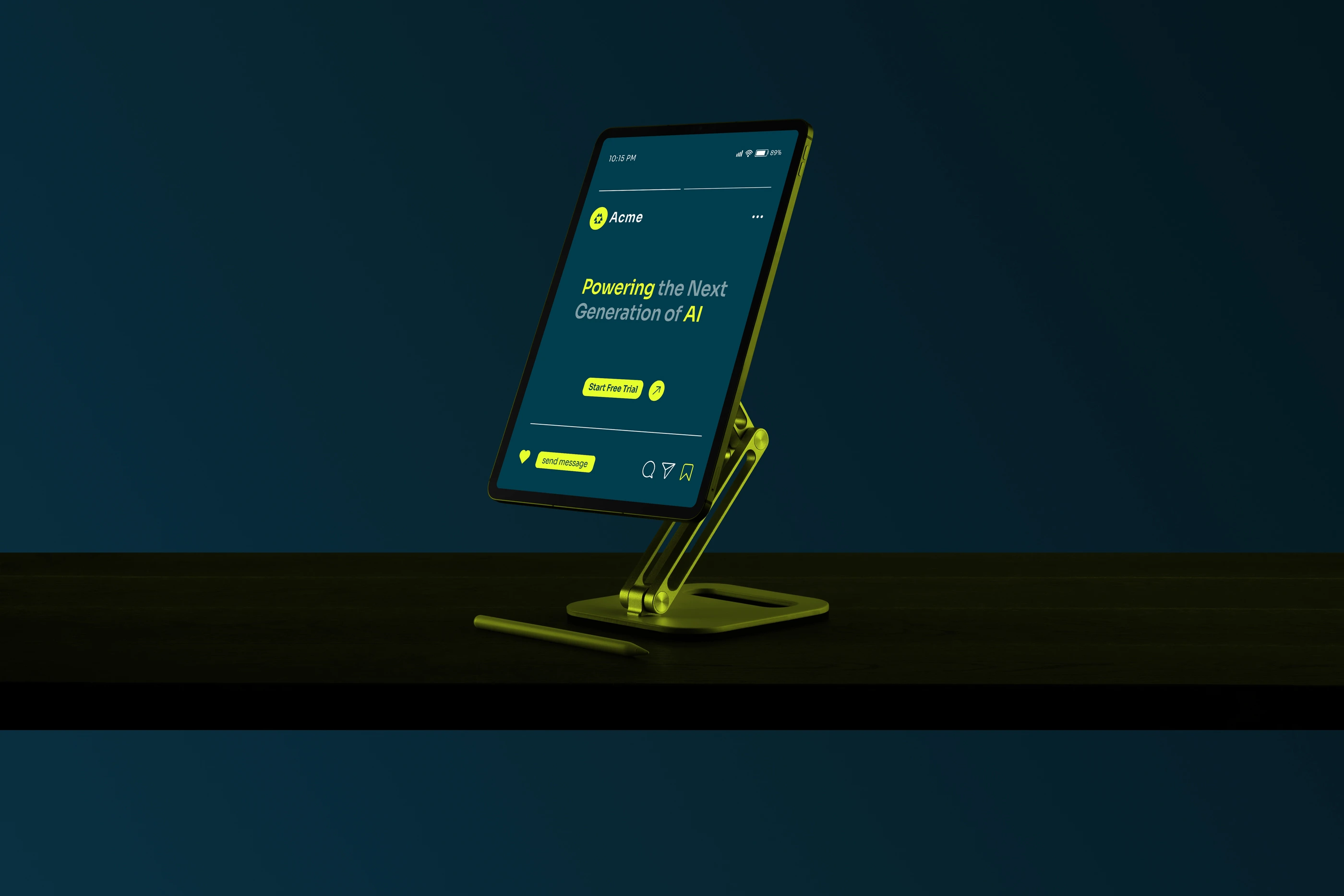
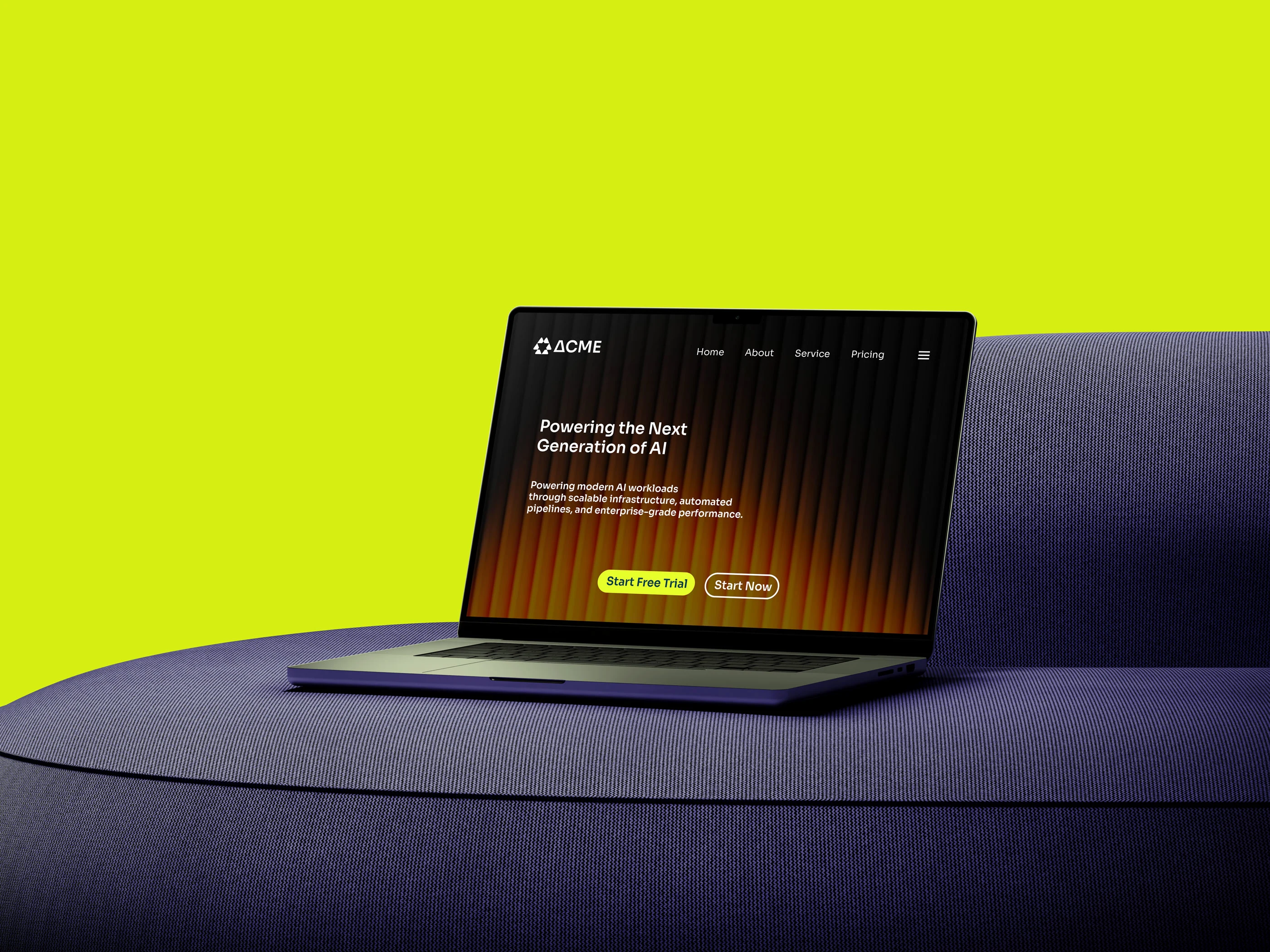
ACME is a conceptual AI infrastructure and DevOps platform built to power the next generation of intelligent systems. The company focuses on high-performance automation, scalable cloud architecture, and complex data pipeline management, helping organizations deploy and operate AI products faster and more efficiently.
The challenge was to create a visual identity that communicates intelligence, reliability, speed, and technical precision while remaining simple enough to scale across digital products, marketing materials, and future enterprise applications.
The Challenge
Most AI and infrastructure companies rely heavily on generic symbols such as circuits, brains, or abstract network nodes. ACME needed a distinctive identity that could stand apart in a rapidly growing technology market while still reflecting its technical foundation.
The brand required:
A memorable and scalable logo
A strong connection to AI infrastructure and automation
A visual system suitable for SaaS products
Modern enterprise appeal
Consistent application across digital platforms
The Solution
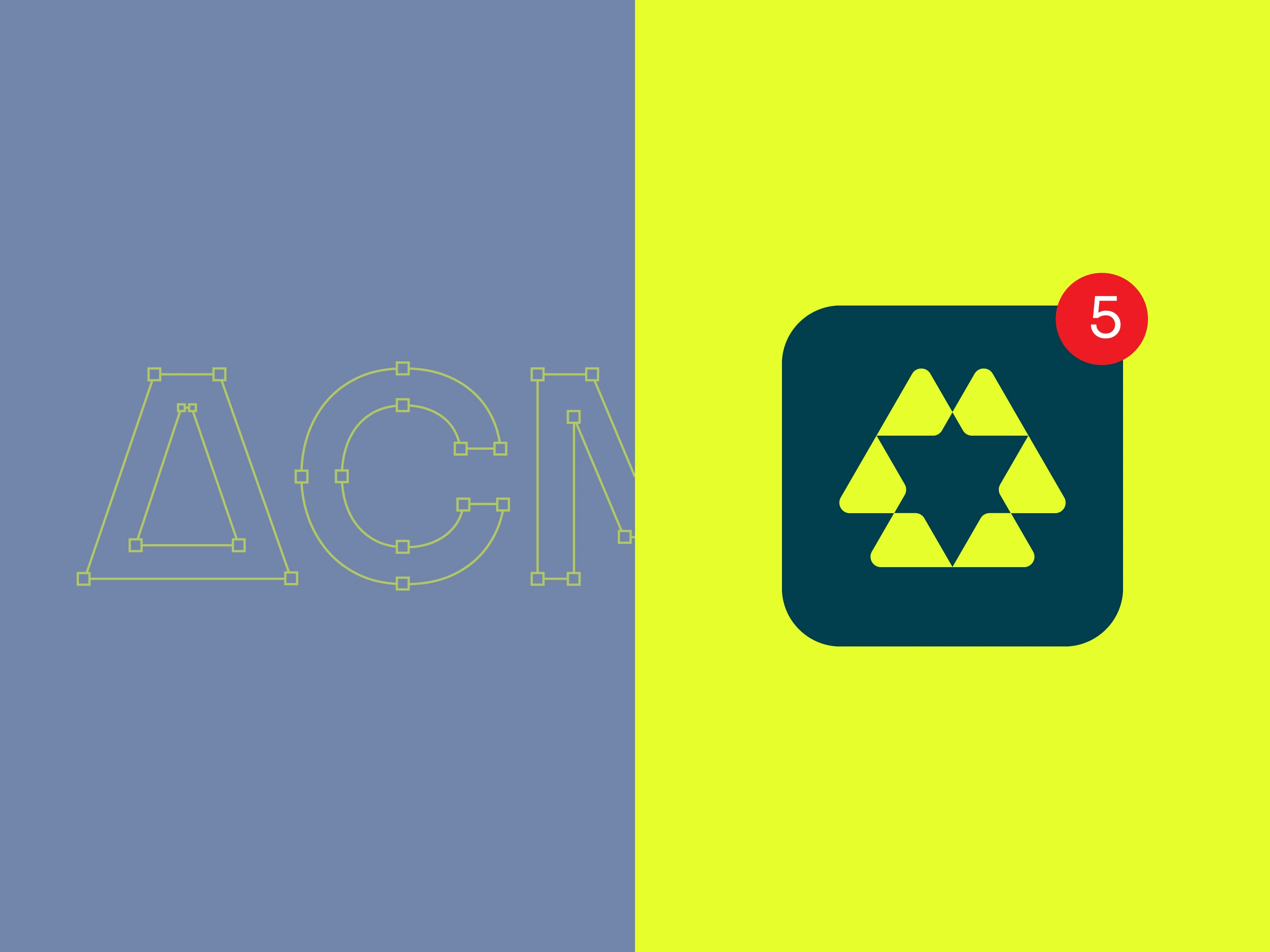
The final identity centers around a geometric symbol constructed from six interconnected triangular modules arranged around a central negative space.
This structure represents:
Distributed infrastructure
Connected data systems
Automation workflows
Continuous scalability
Intelligence at the core
The triangular forms create a balanced network that feels both engineered and innovative, reflecting ACME's role as the foundation behind modern AI operations.
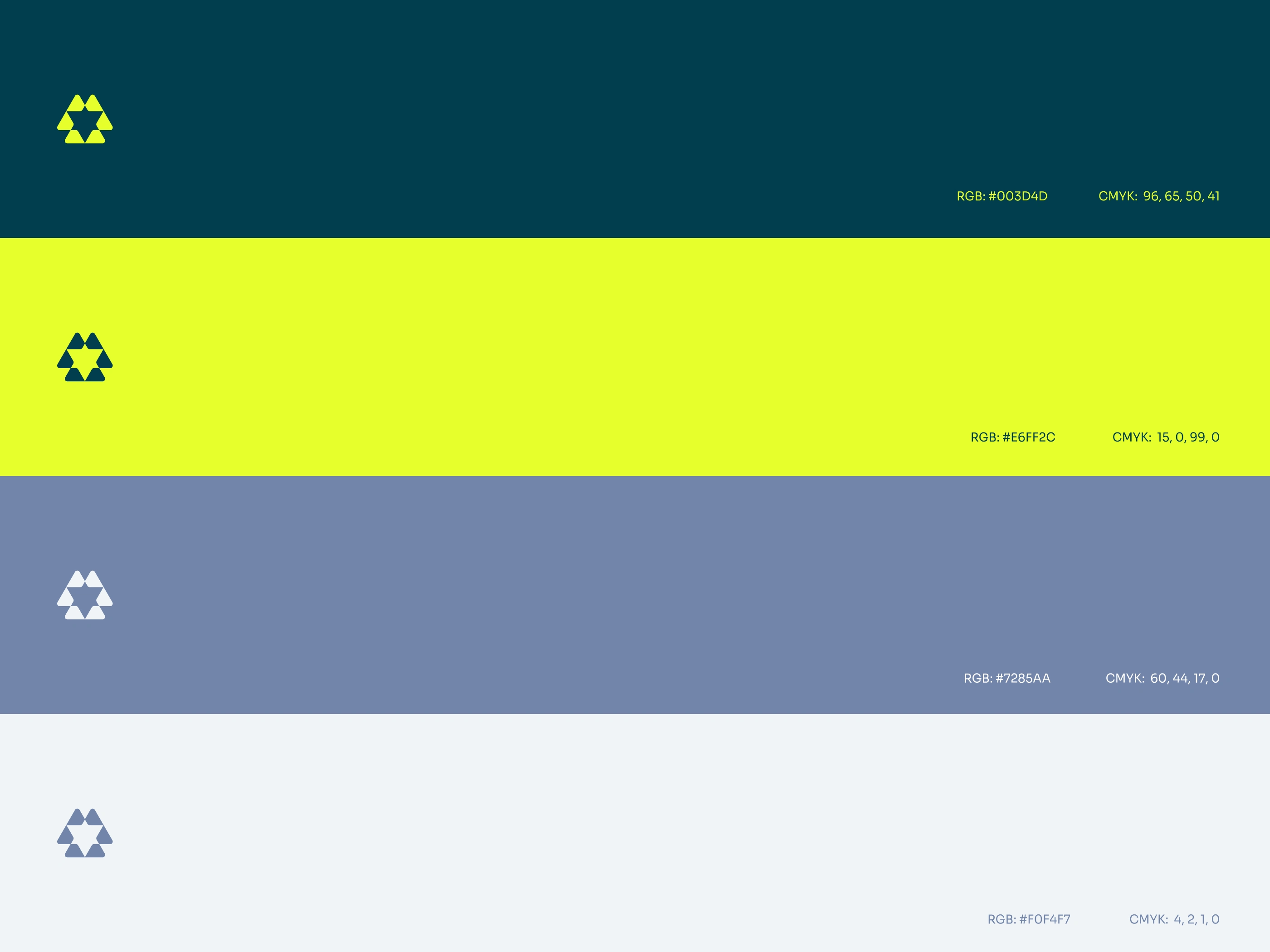
Color Strategy
The color palette combines enterprise trust with technological energy.
Primary Colors
Deep Teal
HEX: #003D4D
Represents stability, security, and infrastructure.
Electric Lime
HEX: #E6FF2C
Represents innovation, intelligence, and forward momentum.
Supporting Colors
Slate Blue
HEX: #7285AA
Adds balance and flexibility across brand applications.
Light Gray
HEX: #F0F4F7
Creates clarity and breathing room within interfaces.
Brand Personality
ACME is:
Intelligent
Reliable
Innovative
Scalable
Forward-thinking
The visual language balances technical sophistication with accessibility, allowing the brand to connect with both enterprise decision-makers and engineering teams.

Results
The final ACME identity delivers a modern visual system that reflects the company's mission of powering intelligent infrastructure at scale.
Through geometric precision, meaningful symbolism, and a bold color strategy, the brand communicates what ACME stands for:
Building the foundation that powers the future of AI.
Project Summary
Client: ACME (Concept Brand)
Industry: AI Infrastructure & DevOps Platform
Services: Brand Identity, Logo Design, Visual System, Brand Applications
Keywords: AI, Infrastructure, Automation, Scalability, Innovation, Enterprise Technology
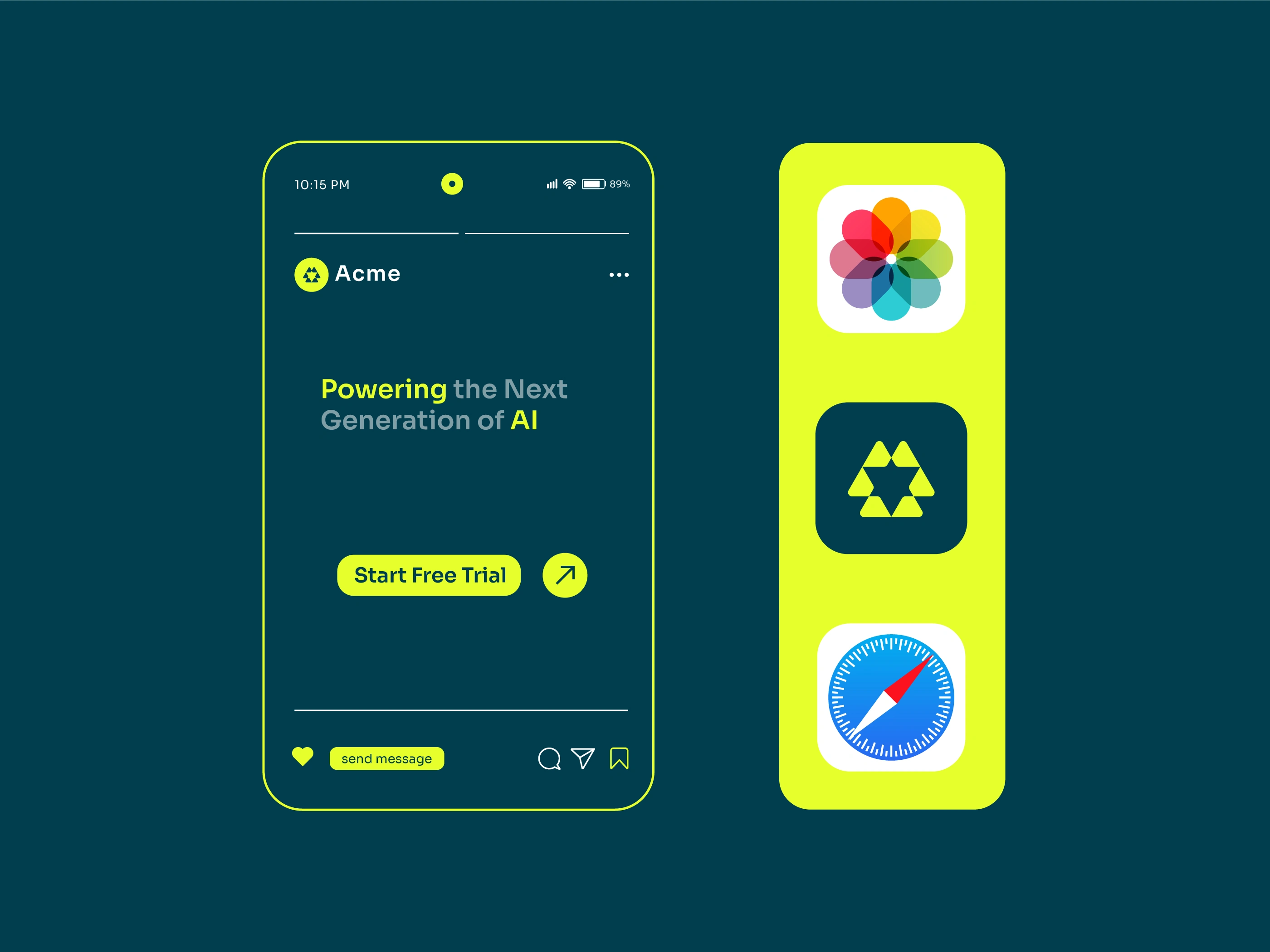
Tagline: Powering the Next Generation of AI.
Like this project
Posted Jun 12, 2026
ACME is a conceptual AI infrastructure and DevOps platform built to power the next generation of intelligent systems.
Likes
1
Views
13
Clients
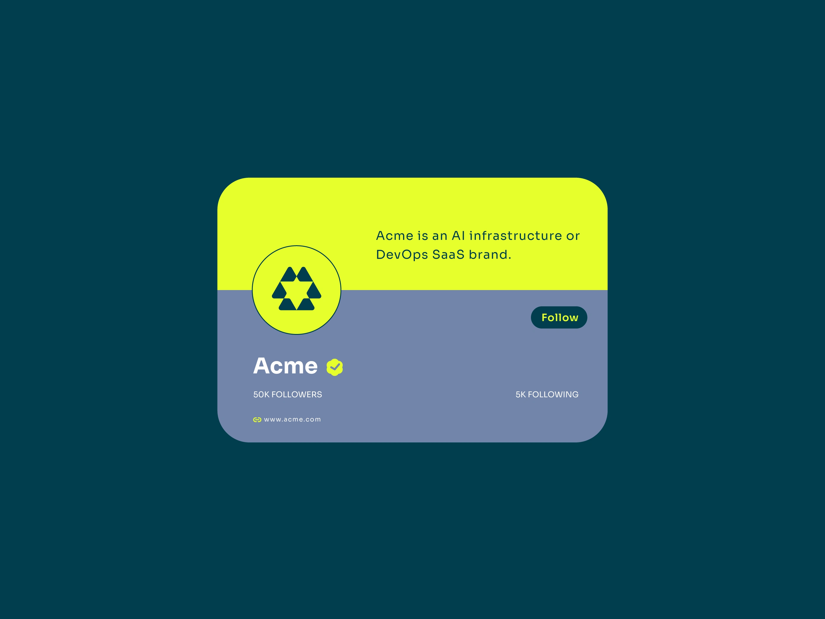
Acme