Bakul Hand Cosmetics Brand Identity Design

Alamgir Brands


Overview
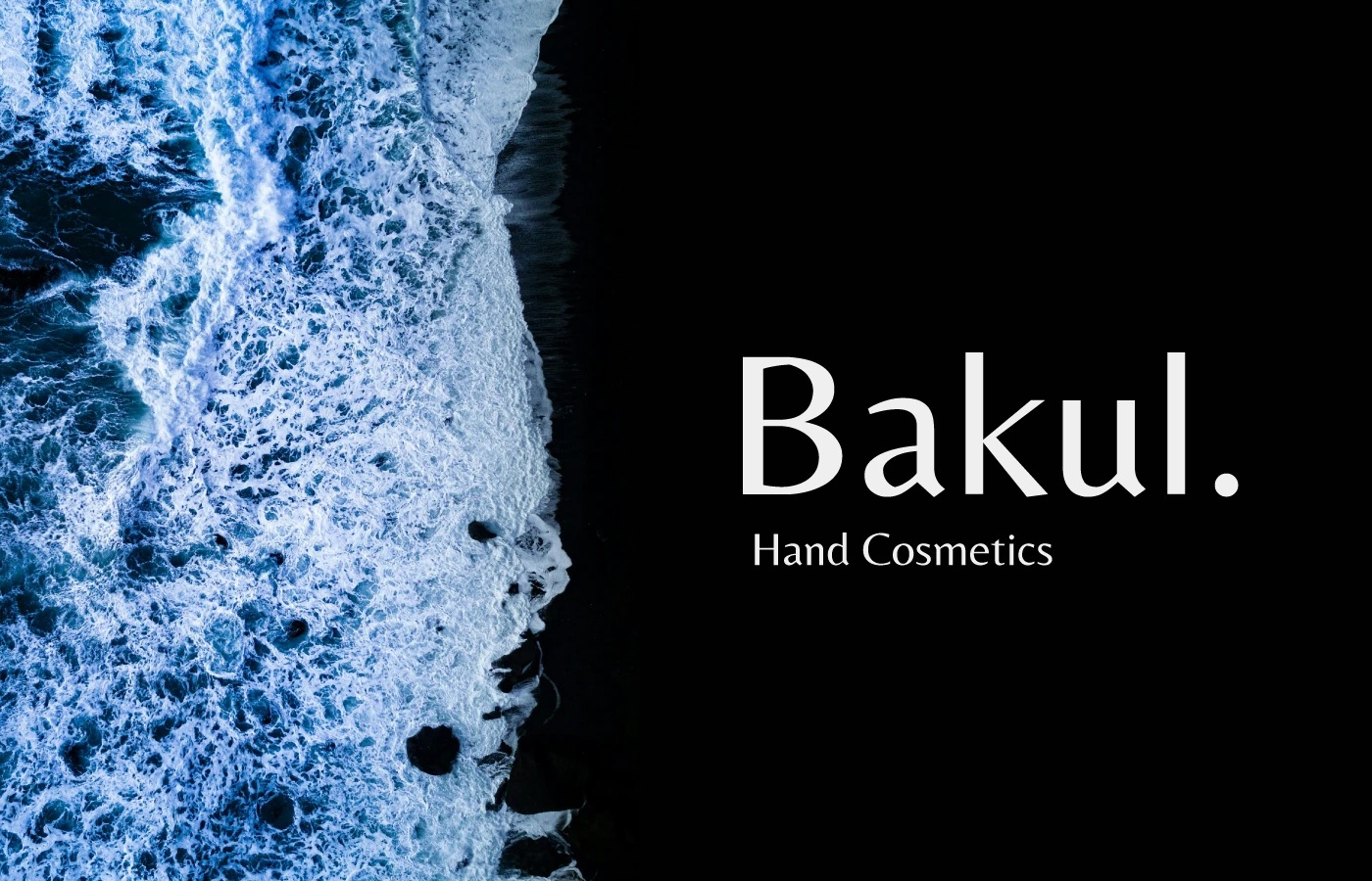
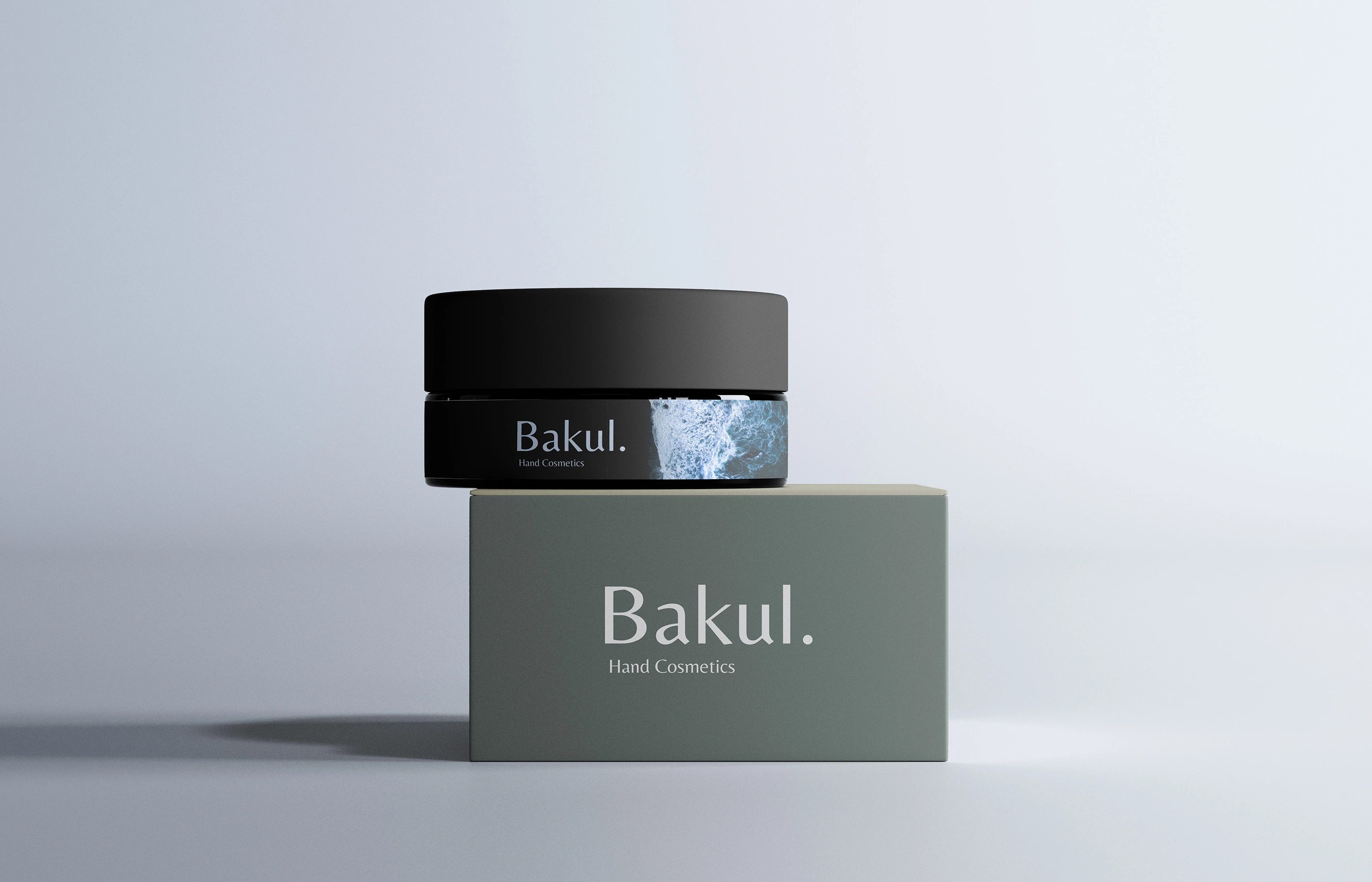
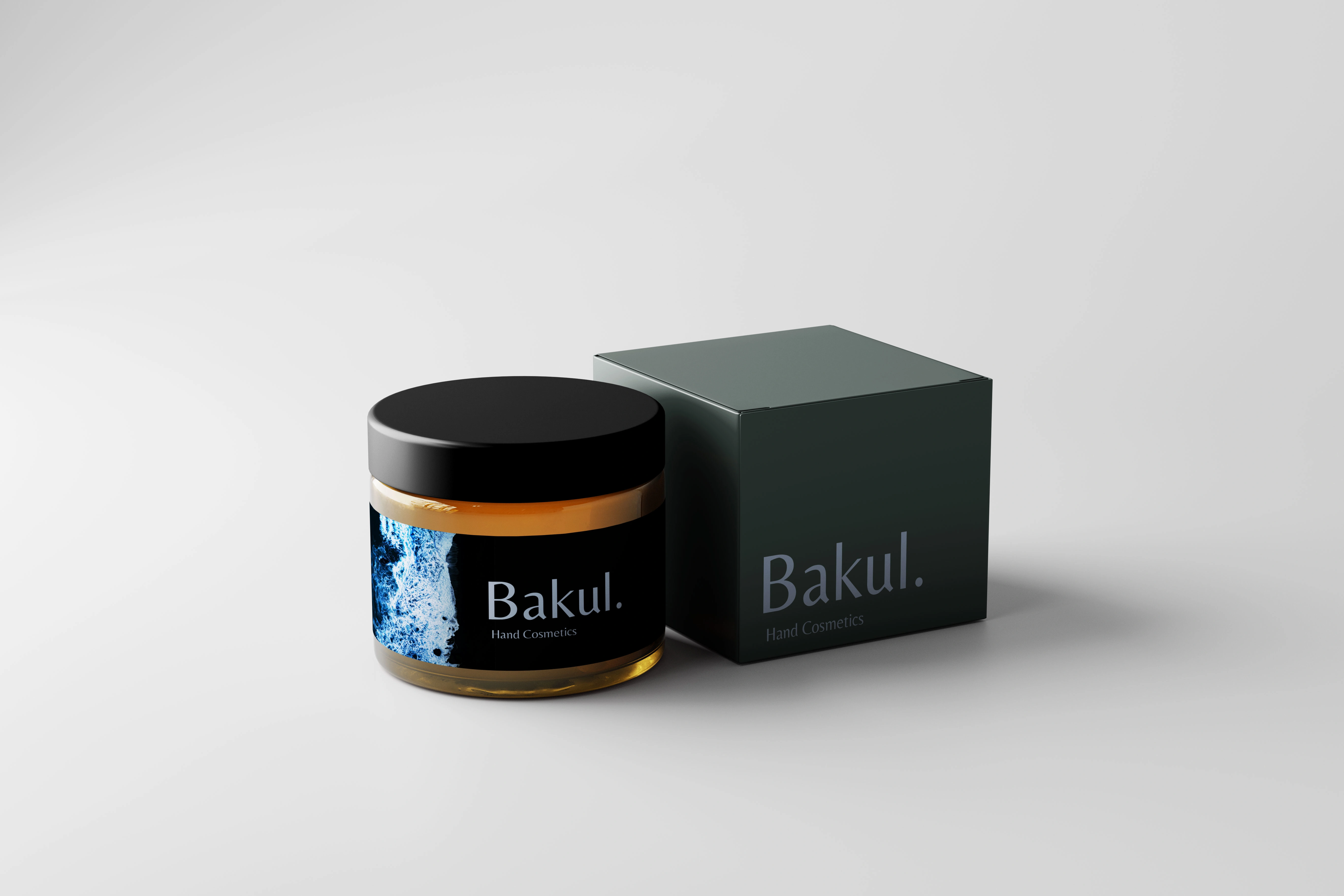
Bakul is a hand cosmetics brand built around a simple premise: care products inspired by the sea's raw, weathered textures. The identity translates that inspiration into a restrained visual language — deep charcoal, sage green, and a pale glacial blue — paired with a clean serif wordmark that feels more apothecary than beauty-aisle.
Brand Mark
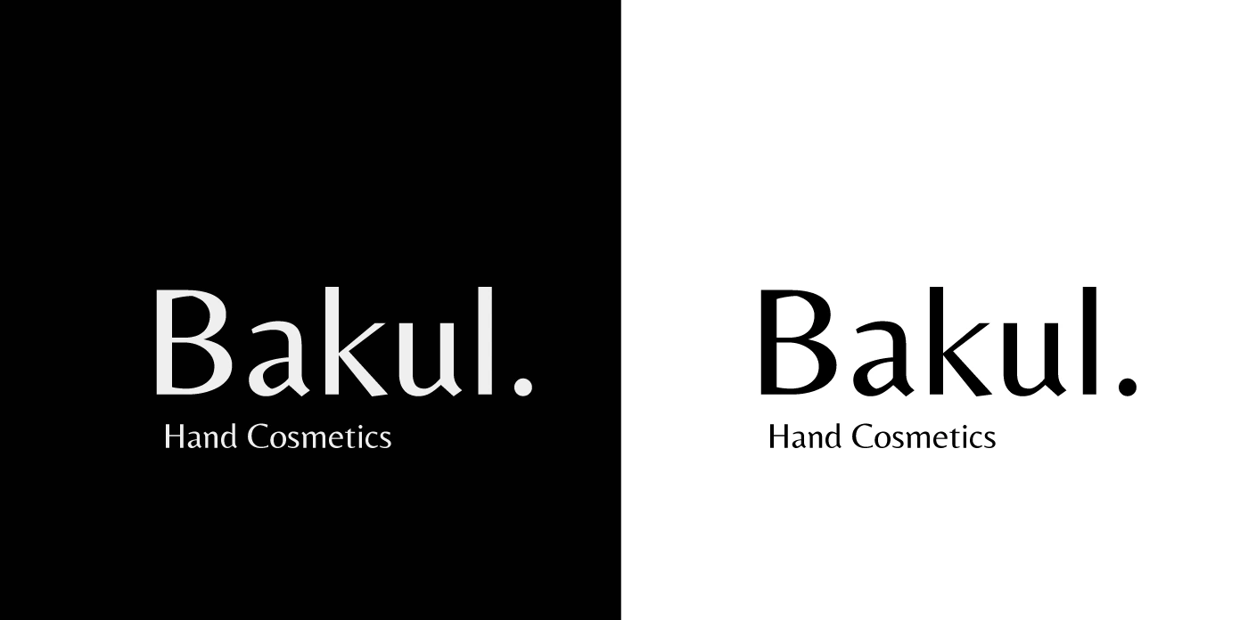
The logotype uses a classic serif with a single full stop after "Bakul" — a small, deliberate gesture that gives the name a sense of finality and confidence, like a label that doesn't need to say more.
The tagline "Hand Cosmetics" sits beneath in a light, wide-tracked sans, keeping the mark legible at both packaging scale and billboard scale. The wordmark holds up equally well reversed on black, sitting on white, or knocked out over photography — a key test for any mark expected to travel across a full packaging system.
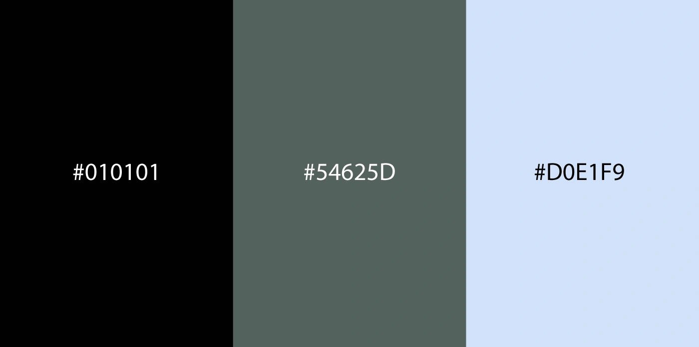
Color Palette
#010101 — near-black, used for primary packaging and high-contrast moments
#54625D — a muted, stormy sage green, the brand's signature secondary tone
#D0E1F9 — a pale, icy blue drawn directly from the wave photography
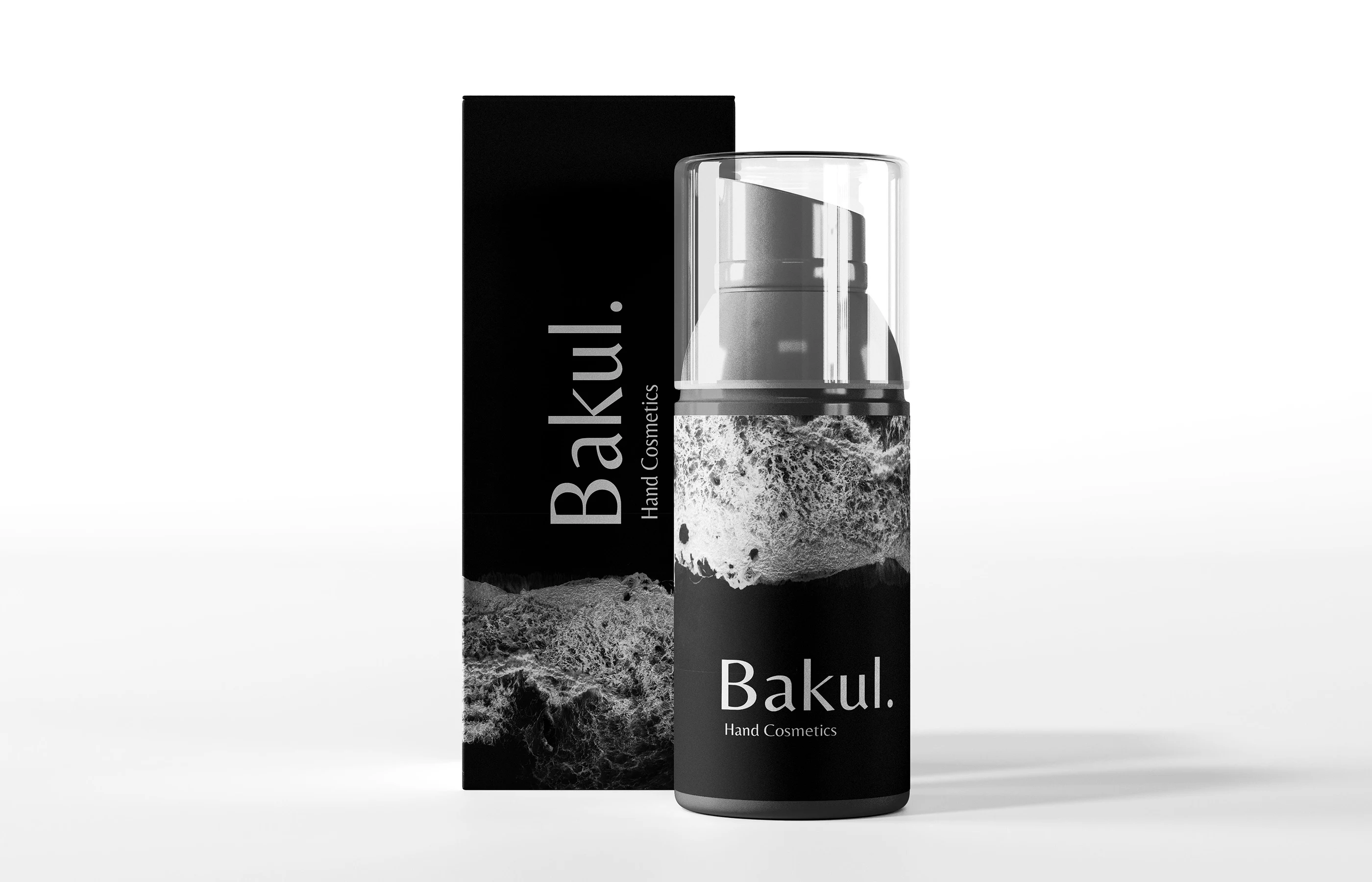
Packaging System
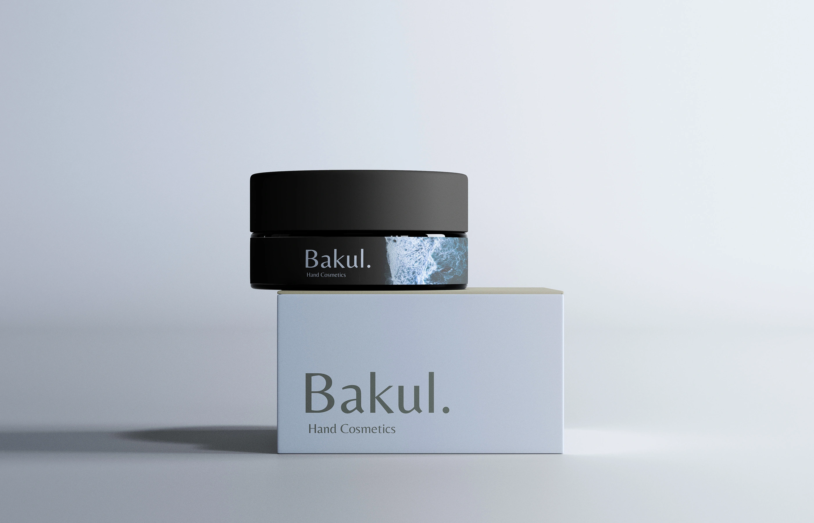
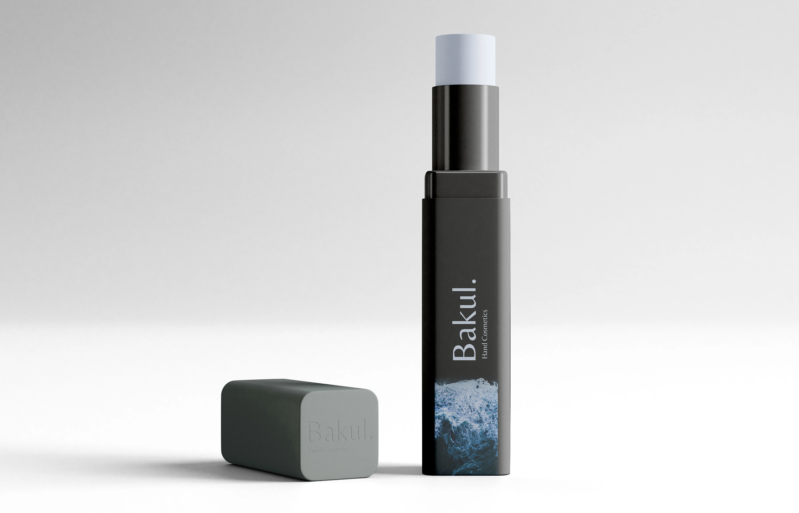
The product range — balm jar, lip stick/balm tube, pump bottle, and bar soap — shares a consistent label lockup and material language: matte black caps and closures, kraft-toned or frosted glass bodies, and labels that alternate between the wave photography and flat sage/black fields. The consistency across such different container shapes (jar, tube, pump, bar) is what makes the line read as one family on a shelf rather than disparate SKUs.
Like this project
Posted Aug 9, 2026
Bakul — a minimal hand cosmetics identity in black, sage green & glacial blue, anchored by a serif wordmark and a single striking wave motif.