AI-Generated PDP Imagery for Kiehl's × Nordstrom

Jeanette J 👀

AI-Generated PDP Imagery for Kiehl's × Nordstrom
First-ever generative AI content initiative at Kiehl's Scope: Above-the-fold PDP hero imagery for Nordstrom.com gift sets
Role:
Manager of Content Production, Kiehl's US (L'Oréal Luxe) Project type: First-ever generative AI content initiative at Kiehl's Scope: Above-the-fold PDP hero imagery for Nordstrom.com gift sets
Overview
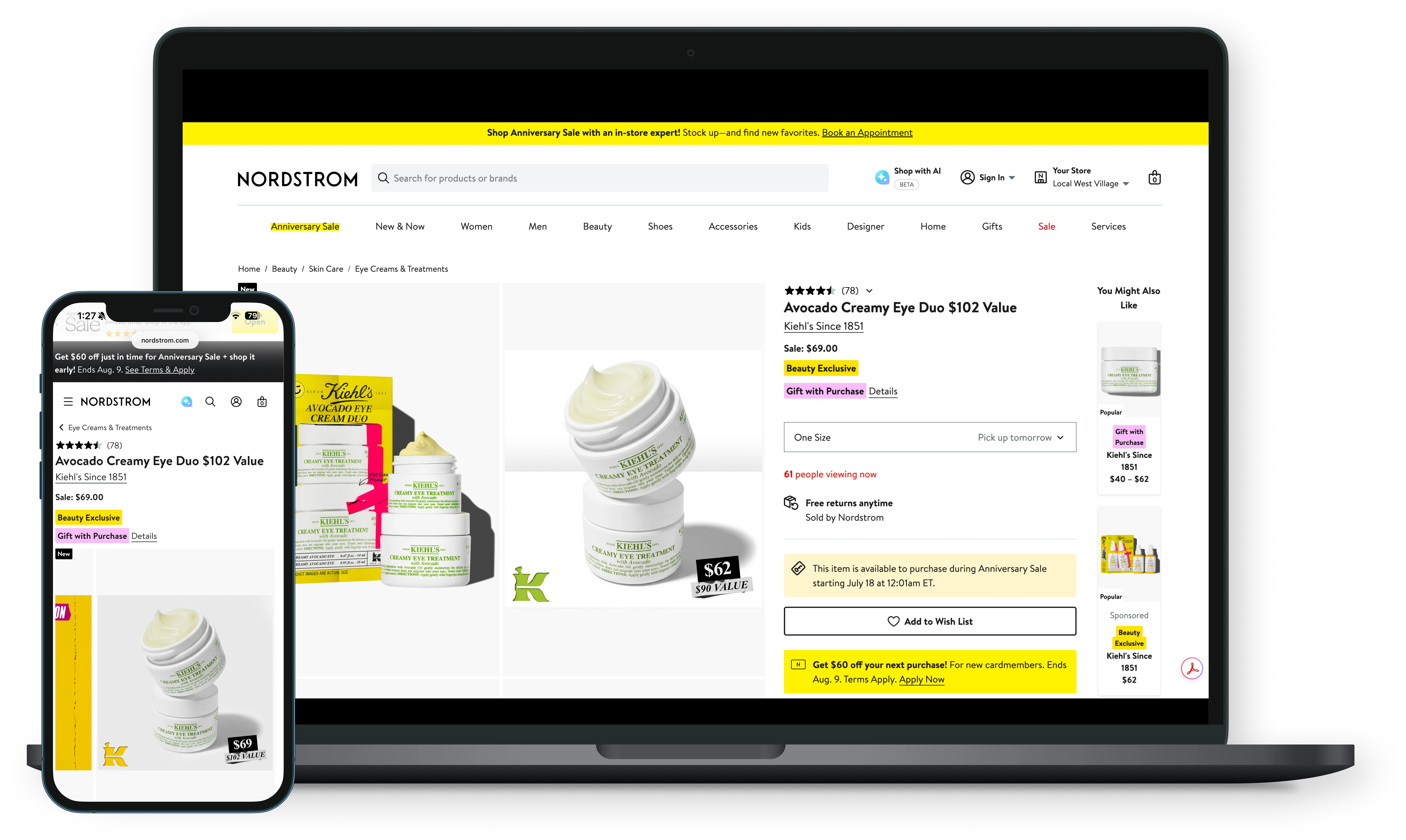
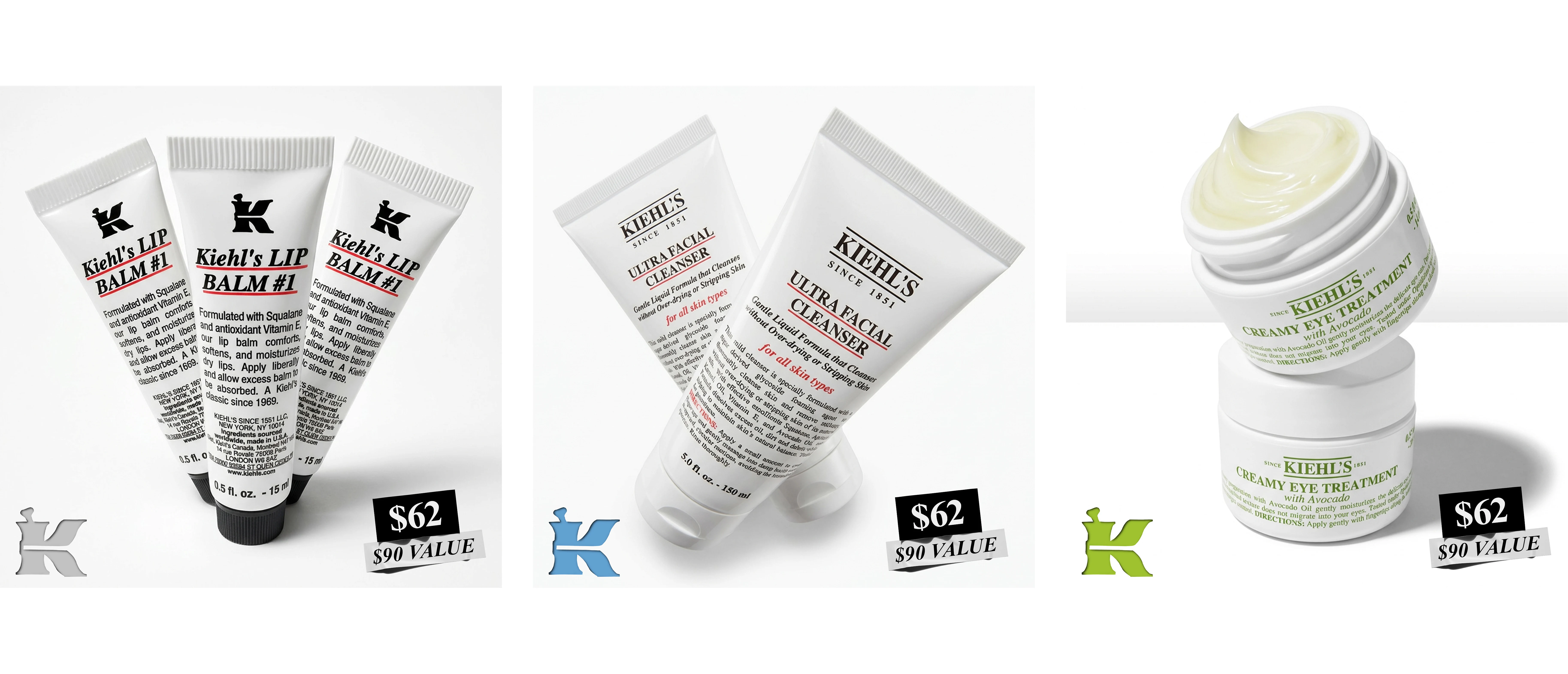
Nordstrom carries a set of Kiehl's holiday and value gift sets, but the product detail pages were relying on flat, single-SKU product shots, functional, but with none of the visual energy needed to stop a shopper mid-scroll on a competitive retailer page, so I identified this as an opportunity to pilot generative AI for commerce imagery at Kiehl's, and ended up spearheading the brand's first AI content project end to end: from tool evaluation to prompt architecture to final creative sign-off.
The Challenge
The original PDP image was a static, single-jar product shot: accurate, but generic. It didn't communicate value (these were gift-set/bundle SKUs with a real price advantage), didn't create visual hierarchy, and didn't hold up against the more art-directed hero imagery shoppers see elsewhere on a Nordstrom PDP grid. A traditional photo reshoot wasn't in scope for the timeline or budget, which made this the right test case for generative imagery, but only if the output could meet the same bar as photography: sharp, on-brand, legally sound packaging and typography.
My Role
I owned the project from concept through delivery:
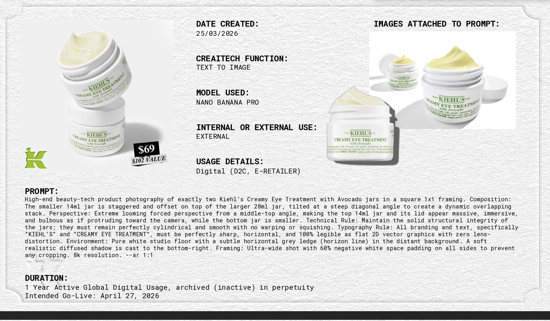
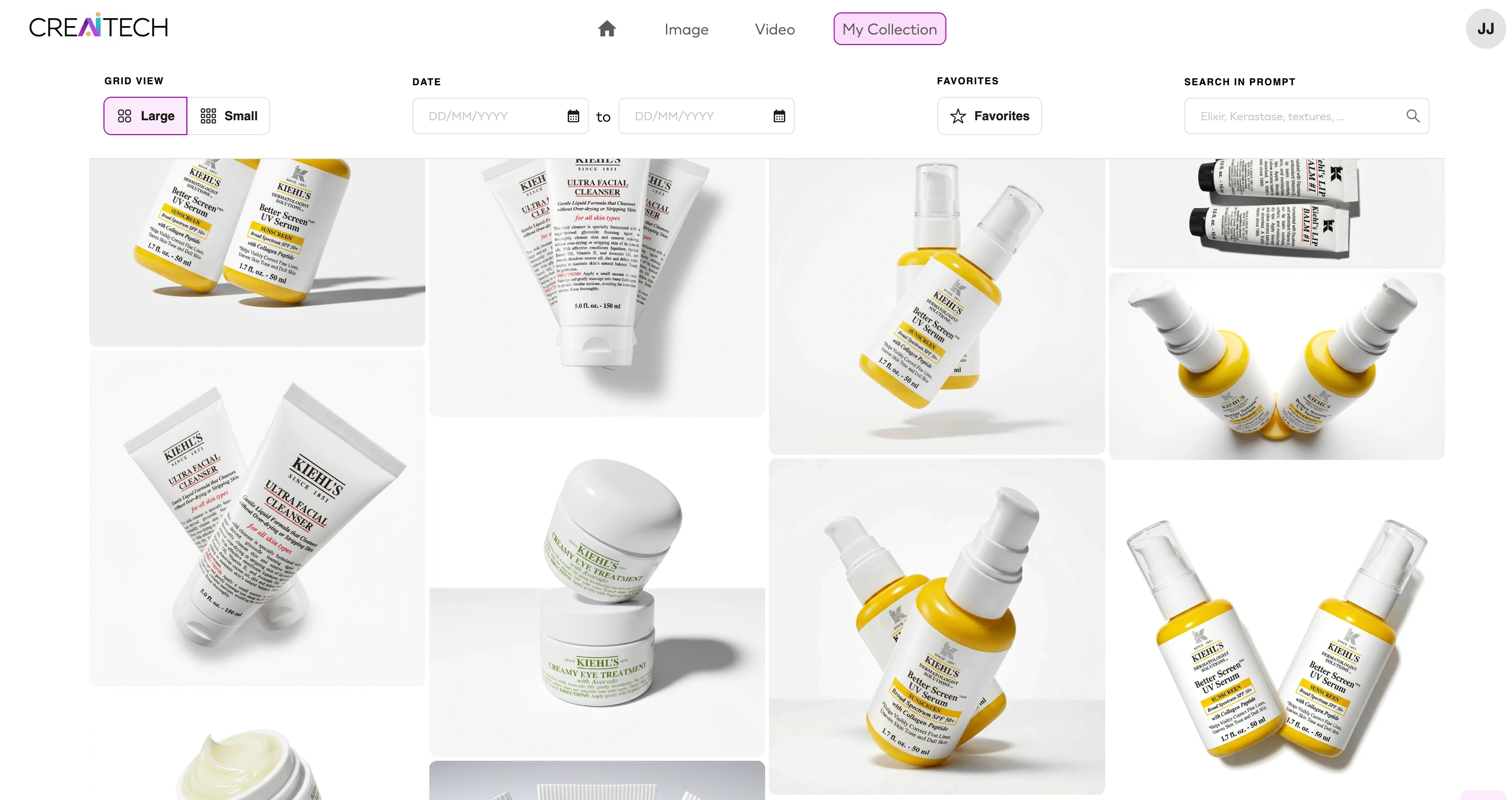
Tool selection & POV: Advocated for using CreaiTech, L'Oréal's internal generative image tool (built on a Nano Banana Pro-class model), as the first real production use case for the tool within Kiehl's, rather than stock AI generators, for data and brand-safety reasons.
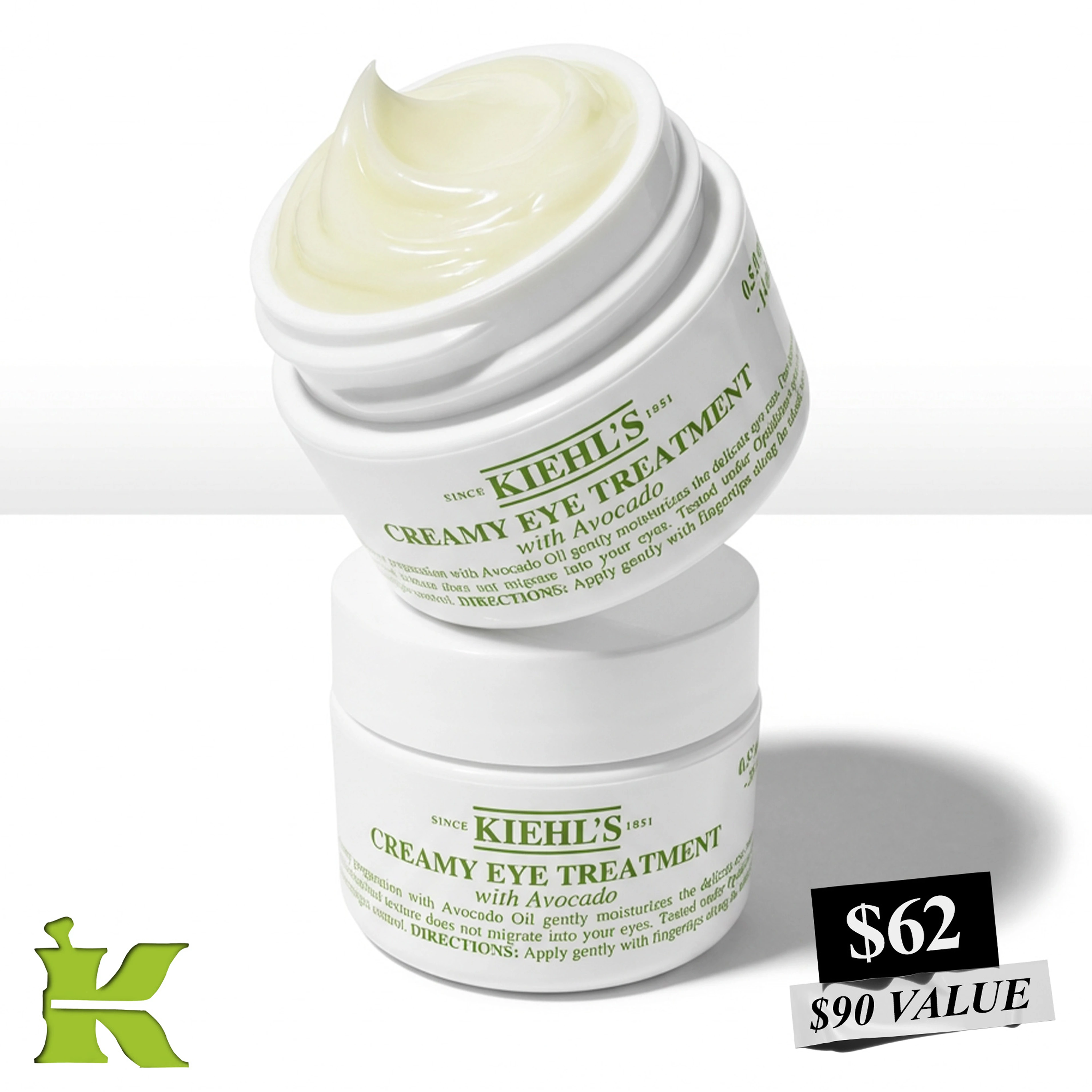
Creative direction: Defined the composition strategy: a staggered, overlapping two-jar stack (the 14ml and 28ml sizes) shot in an exaggerated forced perspective, to communicate scale, value, and product hierarchy in a single frame.
Prompt engineering: Wrote and iterated the generation prompts myself, treating prompt-writing as a design discipline rather than a one-shot input.
QA & brand governance: Set the bar for what "shippable" looked like: no packaging distortion, no warped labels, 100% legible typography, and iterated against that bar until the model cleared it.
Process: Prompt as Craft
The hardest part of this project wasn't getting an image; it was getting the right image, reliably, without introducing product inaccuracies a beauty brand can't afford to ship (a warped jar, illegible logo, or distorted cap reads as a legal and brand-integrity problem, not just an aesthetic one).
That meant treating the prompt itself as a design spec, with explicit rules for:
Composition: exact jar count, staggered stacking, diagonal tilt, size hierarchy between the two SKUs
Perspective: a specific looming, forced-perspective camera angle to make the hero jar feel immersive without breaking realism
Structural integrity: an explicit constraint that packaging remain perfectly cylindrical and smooth, with zero warping, since generative models will happily "melt" rigid objects if left unchecked
Typography fidelity: a hard rule that all brand copy ("KIEHL'S," "Creamy Eye Treatment") render as sharp, horizontal, 100% legible text, since logo distortion is an immediate no-go for any CPG brand
Environment & framing: studio-white backdrop, soft directional shadow, generous negative space to protect against retailer cropping requirements, shot at an 8k-equivalent 1:1 ratio built for Nordstrom's grid
Every one of those constraints came out of a failed generation first. Getting to a final, retailer-ready asset took multiple rounds of prompt refinement, adjusting language until the model consistently respected packaging geometry and text legibility instead of just approximating them.
Outcome
The final image replaced a flat single-product shot with a dynamic, value-forward hero image live on Nordstrom.com, delivered without a photo studio, a physical shoot, or the usual lead time, and it became the reference case internally for how Kiehl's could respsonsibly use generative AI in commerce content going forward.
Like this project
Posted Jul 14, 2026
AI content project at Kiehl's: reimagined a static Nordstrom PDP shot into a dynamic hero image using generative AI, iterative prompt engineering, and brand QA.
Likes
0
Views
12
Tags