MAC Cosmetics x Stranger Things 4 Netflix
Overview:
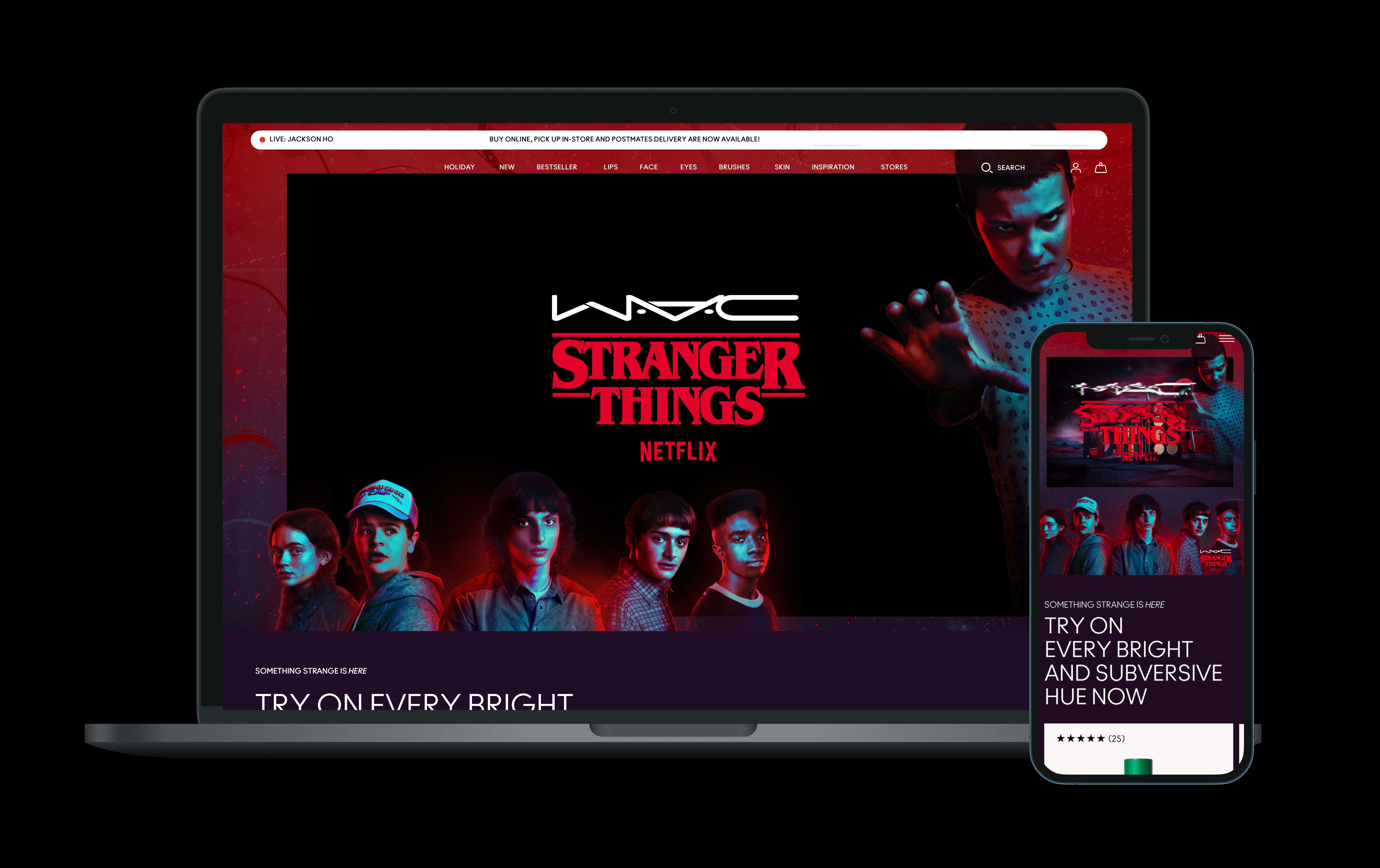
MAC Cosmetics collaborated with Netflix’s hit series Stranger Things creating a makeup collection that would launch with Stranger Things 4 season. The goal for this campaign was to create an immersive user experience that drove customers to shop product for both the upside down world and the human world across maccosmetics.com.
Business Goal:
Acquire new consumers, especially Gen-Z and young millennials, and align brand ethos with cultural phenomenon and record-breaking success of Stranger Things series.
Team:
Design Lead (me), Product manager, Global Product Marketing Manager, UX Writer, 2-3 Engineers
Timeline:
2-4 Months (2021-2022)
Process:
CREATIVE BRIEFING - Design meets with the Global Online team and Product Managers to review entire campaign and priorities/ what is being requested across brand.com
LOW FIDELITY WIREFRAMES - Design meets with global online marketing to review wireframes for enhanced landing pages, single product pages, and multiple product pages. This is a working session to build upon wireframes and implement which modules are to be used within MAC’s existing figma library, and to get alignment on key objectives.
UX STRATEGY - During this process the initial wireframes are optimized through reviewing past activation performances, feedback from regional partners, and feedback from engineers.
EDITORIAL KICKOFF - Design meets with the editorial team to walk through wireframes, design ideas and the consumer journey. Finding unique ways to drive user engagement through optimizing CTAs and hyperlinks.
INTERNAL REVIEW - Design presents concepts internally to VP and Director of Design.
ENGINEER / GLOBAL ALIGNMENT - After design approval, design then works closely with the Global Online Marketing team and engineers to ensure design is buildable. If any design restrictions occur, design iterates feedback and works closely with the dev team to come up with solutions.
Outcome:
After 2 -3 days of launching we leveraged real time learnings through content square and Google Analytics to optimize pages
On average, there is a 40% drop on the launch landing page for mobile and desktop with the trailer video living above the fold (mobile drop is slightly higher than desktop).
After releasing updated modules within 1 week of launching, there was a 50% conversion, and click rate
Design Process:
As the lead designer on this campaign I felt it was important to bring the duality that exists within Stranger Things and apply that concept to maccosmetics.com. I wanted to design an experience where the user would be able to choose the world in which they shop, the human world or the upside down world.
After analyzing interactive spaces living on current websites, I explored initial concepts that could portray these duel worlds.
CONCEPT 1:
A Supernatural Twist
A scrolling experience that transports the user from the human world to the upside down world. User initially lands on the human world and as the user scrolls in upward motion, the upside down world unfolds, creating a seamless transition between worlds.
CONCEPT 2:
The World That Lurks Beneath
An interactive experience that reveals the world that lurks beneath. As the user hovers over a module or element (or tilts their mobile device in a direction) displays a peak into the opposing world.
CONCEPT 3:
Witness The Transformation
An interactive storytelling experience that showcases the nuanced transformations between two dichotomous worlds. Users will be brought into a deep scrolling experience showing the transformation and movement from one world to the next with the use of video/ animation/ image sequence that scrubs forward or reverse according to the direction of the user scroll.
Problem:
Due to time constraints and lack of resources, we had to pivot our initial design from having an interactive landing page experience. A second idea I proposed was to have a toggle function, where we would have 2 landing pages instead of 1, and the user could toggle between which world they want to shop, whether that be the upside down world or the human world. Due to timelines and having to deliver final files to our regions on time, we had to opt for creating 1 landing page for this launch experience.
Initial Design:
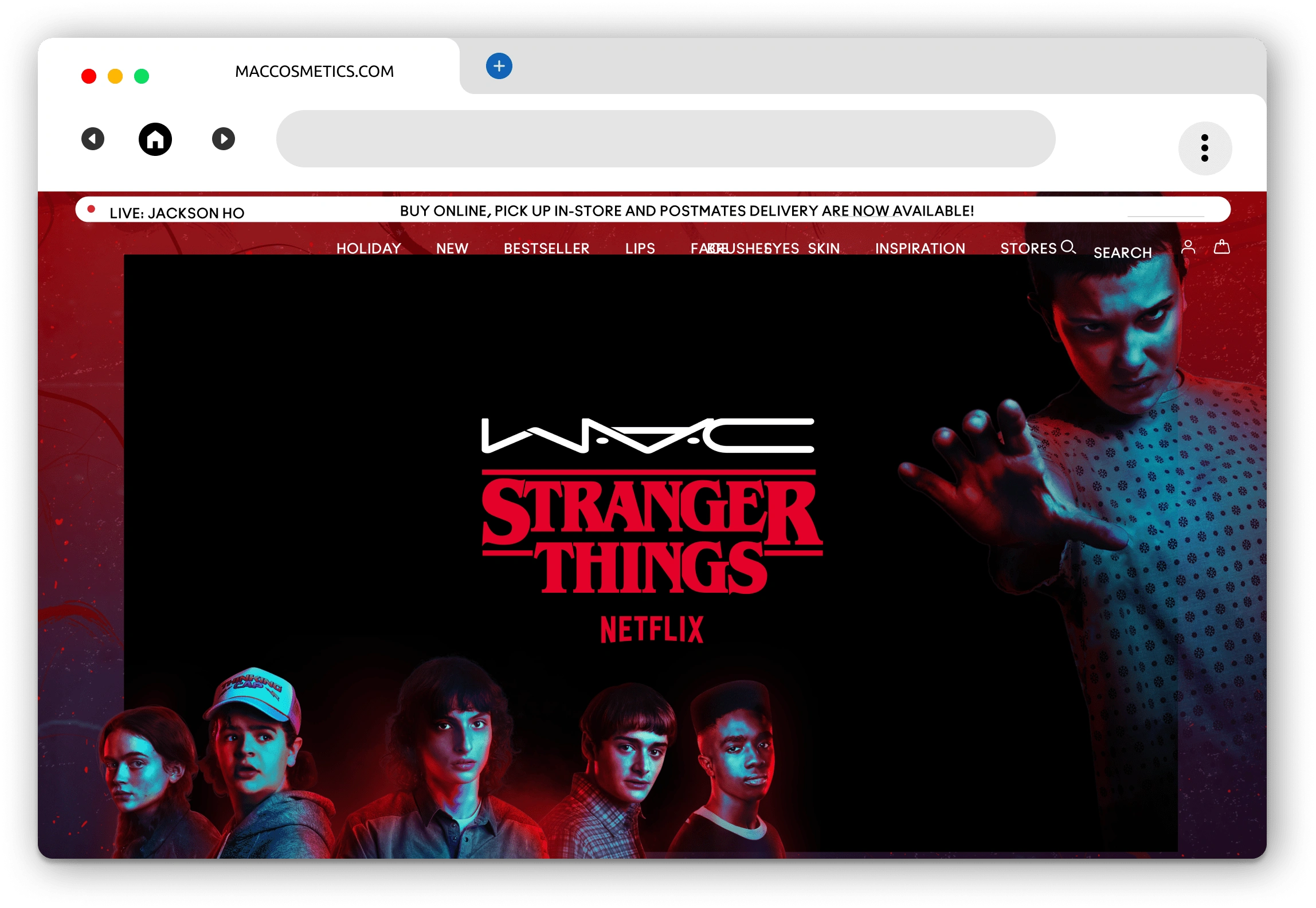
In order to acquire new customers, especially Gen Z, I felt it was important to showcase the characters in Stranger Things as well as having the trailer from the new season to play on the launch landing page. This would attract fans of the show to shop MAC x ST4 products.
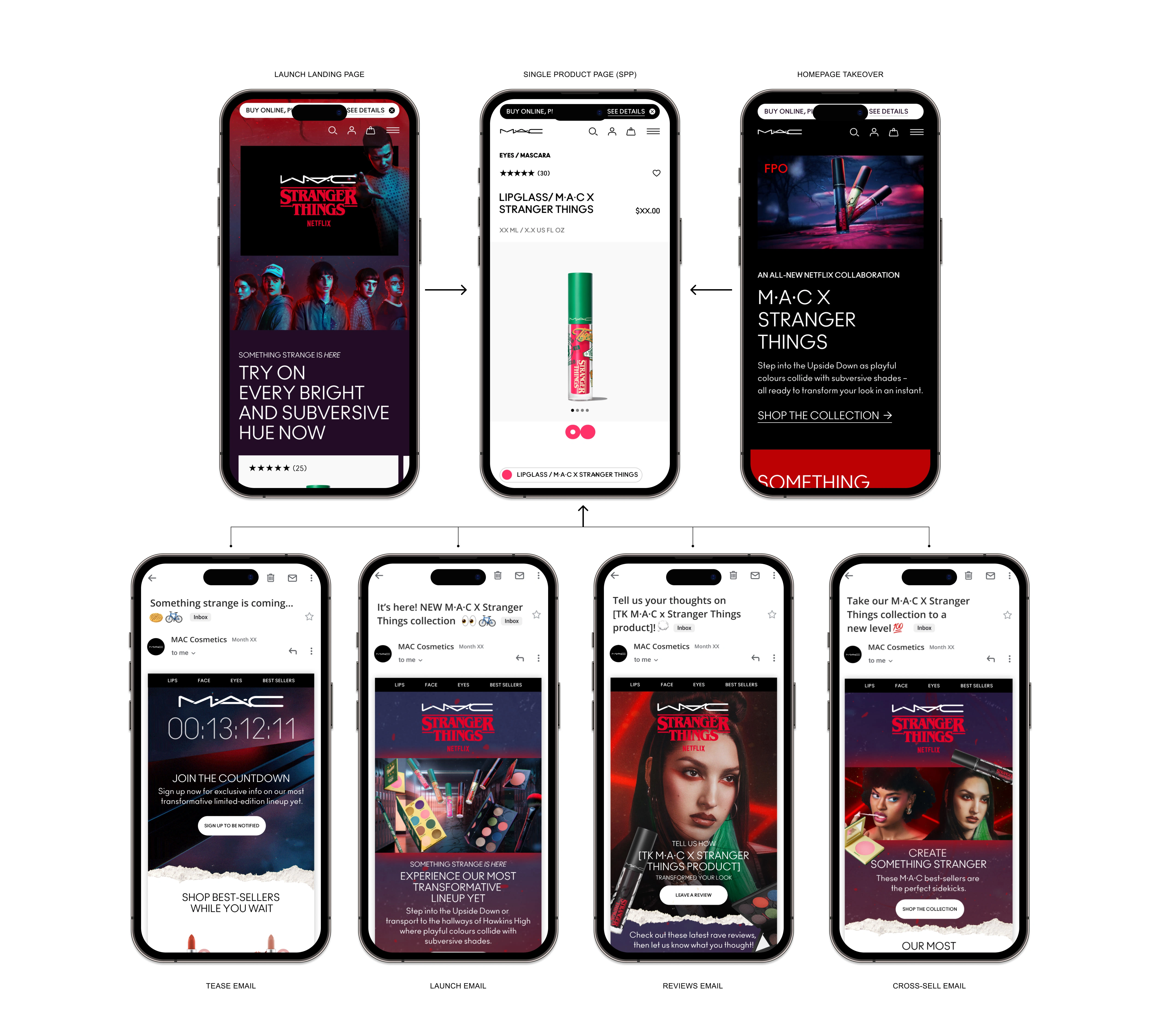
Customer Journey:
KEY LANDING PAGE LEARNINGS:
After 2 -3 days of launching we leveraged real time learnings through content square and Google Analytics to optimize pages.
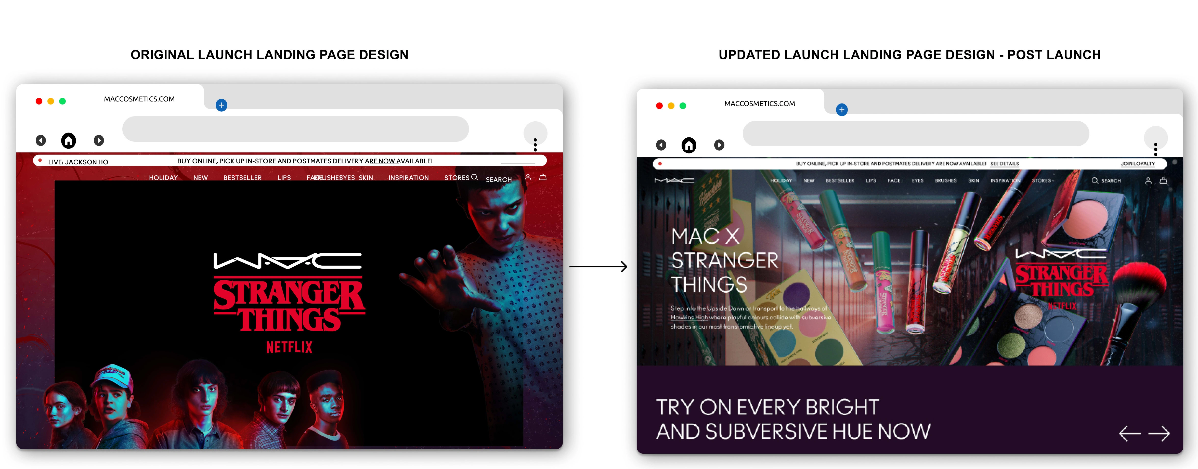
On average, there is a 40% drop on the launch landing page for mobile and desktop with the trailer video living above the fold (mobile drop is slightly higher than desktop). Since the trailer video took up a majority of the launch landing page above the fold, customers did not scroll past to shop the full collection.
SOLUTION:
My design solution was to create a hero module half the size of the original design, which would allow the modules below the fold to move up on the page. I also added in two hyperlinks on the hero module that would drive to each individual world MPP (multiple product page). I then moved the trailer video further down on the page using a smaller video component, which ultimately would allow a new customer to shop the actual products in the collection first before watching a video.
After releasing updated modules within 1 week of launching, there was a 50% conversion, and click rate.
STRANGER THINGS 4 QUIZ:
The strategy was to design an interactive quiz that was personality based. This would allow fans of the Stranger Things series to find out which Stranger Thing world (human world / upside down world) reflects their personality. Ultimately driving to the multiple product page that correlates to the responding world. The quiz would live directly within the launch landing page.
As I was designing this quiz I wanted to add a hover state to each button to make the game more enticing.
Interactive Quiz Outcome:
Quiz was completed 1.1M+ times
$1.8M+ in revenue
Observed a 4% Conversion Rate for anyone who completed the quiz (+3.4% vs US sitewide avg.)
Key Takeaways:
There needs to be CTAs at the top of a landing page driving the consumer to shop product instantly
Hero modules must live above the fold, and not take up the full screen
Having a video play at the top of a landing page does not entice the user the scroll further down the page, the user thinks there's nothing left to see, therefore exiting out of the page
Due to time constraints and lack of resources, future 3 star campaigns will need to use existing modules that live within our figma library
With these key insights, we can now optimize designs and existing modules that live within our Figma library for future collaborations.
Like this project
Posted Jul 25, 2023
An immersive user experience that drove customers to shop MAC Cosmetics collaboration with Stranger Things 4 Netflix.
Likes
0
Views
90
Clients


Netflix
M·A·C Cosmetics
The Estée Lauder Companies

