
Opeyemi Peter
Data Analyst | Business Intelligence Analyst
New to Contra
Opeyemi is building their profile!
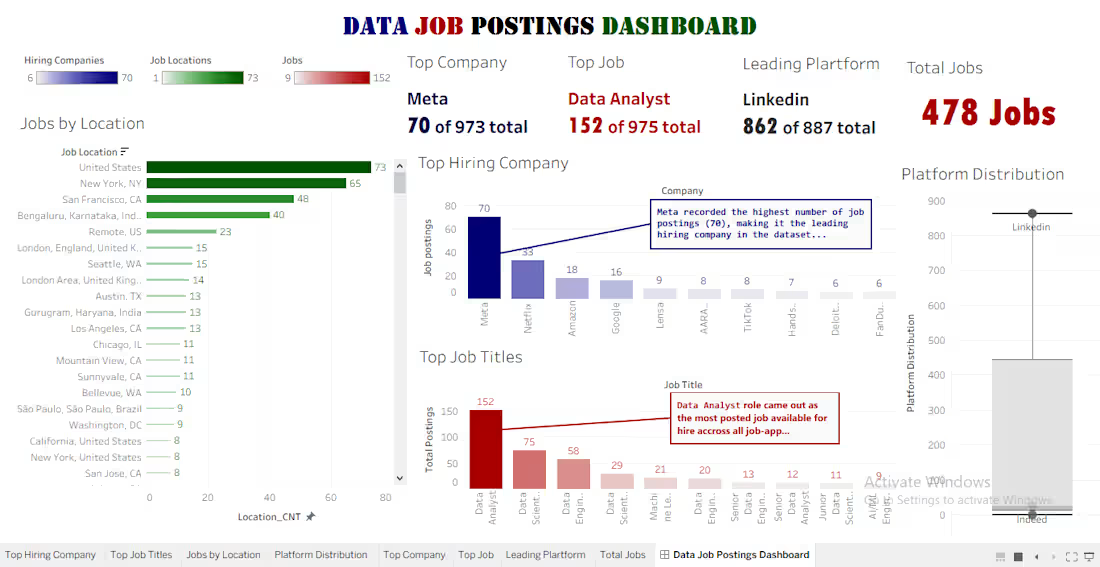
📑Every dataset tells a story. My latest project explores what data job postings can reveal about hiring trends, top employers, and where opportunities are concentrated.
Over the past few days, I worked on an end-to-end analytics project to better understand hiring trends in the data industry using real-world job posting data.
Starting with an unstructured dataset from Kaggle, I transformed it into meaningful business insights through data cleaning, exploratory analysis, and interactive dashboard development.
🛠️ Tools Used
Python (Pandas, NumPy)
Microsoft Excel
Tableau
Git & GitHub
📊 Key Insights
✅ Data Analyst was the most frequently advertised role in the dataset.
✅ Meta recorded the highest number of job postings among all companies analyzed.
✅ LinkedIn was the leading recruitment platform for data-related opportunities.
✅ The United States showed the highest concentration of available data job postings.
📈 Project Workflow
Kaggle Dataset →
Python (Data Cleaning) →
Excel (Validation & Structuring) → Python (EDA) →
Tableau Dashboard →
Business Insights
This project strengthened my skills in:
Data Cleaning
Exploratory Data Analysis (EDA)
Data Visualization
Dashboard Design
Business Storytelling
GitHub Documentation
I'm continuously building my portfolio and improving my ability to turn raw data into actionable insights. I'd love to hear your thoughts or feedback!
0
3
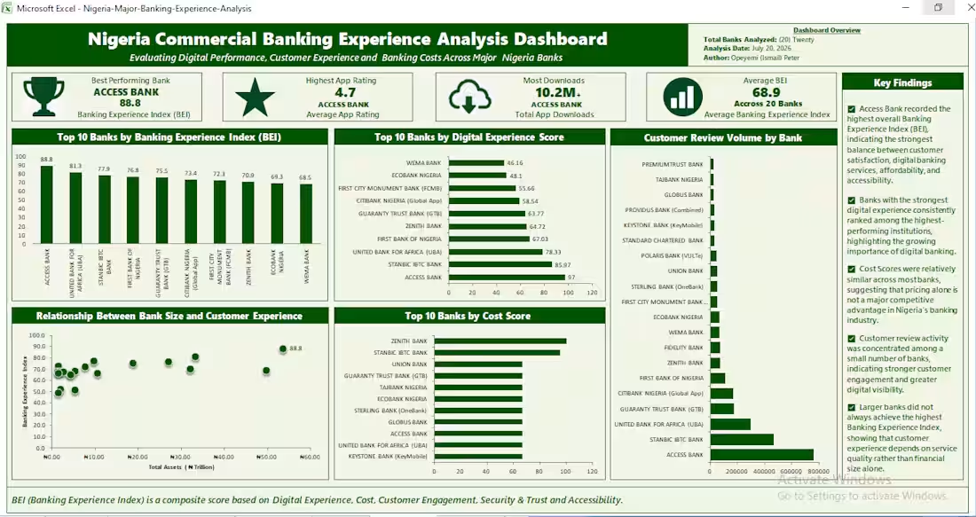
The country(Nigeria) Commercial Banking Experience Analysis : Over the past few weeks, I challenged myself to build something different.
Instead of downloading another popular dataset or recreating a dashboard that's already been done hundreds of times, I wanted to solve a real business problem using real-world data.
So I built a Nigeria Commercial Banking Experience Analysis project using Microsoft Excel 2007.
Rather than evaluating banks only by financial strength, I developed a custom Banking Experience Index (BEI) to measure customer experience across 20 major Nigerian commercial banks.
To make the analysis meaningful, I manually collected and combined data from multiple public sources, including official bank websites, the Central Bank of Nigeria (https://www.linkedin.com/company/central-bank-of-nigeria/) (CBN), the Nigerian Exchange Group (NGX),Google Play (https://www.linkedin.com/company/google-play-logo/) Store, Apple (https://www.linkedin.com/company/apple/) app store, NCC, and FIRS.
The project involved:
• Data collection from multiple sources
• Data cleaning and transformation
• Feature engineering
• Business analysis
• Pivot Tables & Pivot Charts
• Dashboard development in Microsoft Excel
Some of the insights uncovered include:
✅ Access Bank Plc (https://www.linkedin.com/company/access-bank-plc/) achieved the highest overall Banking Experience Index (BEI).
✅ Strong digital banking performance is closely associated with better customer experience.
✅ Financial size alone does not guarantee a better banking experience.
✅ Customer engagement is concentrated among a relatively small number of banks.
**One of the biggest lessons from this project is that meaningful business insights don't always require advanced tools. With a clear analytical approach, structured thinking, and well-prepared data, Excel remains a powerful tool for solving real business problems.**
I'd genuinely appreciate your feedback:
If you were a banking executive, what additional metric would you include to measure customer banking experience?
Your thoughts are welcome.
0
7
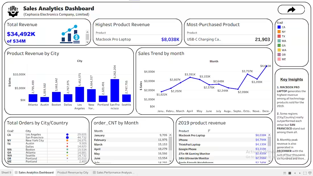
Sales Performance Analysis: In this project, I analyzed retail sales data to uncover trends and generate actionable business insights.
🔍 Key objectives:
• Analyze overall sales performance
• Identify top-performing products and categories
• Examine regional sales trends
• Discover opportunities to improve business performance
🛠️ Tools used:
• Python (Pandas, Matplotlib)
• Tableau
• GitHub
📈 Some key insights:
✅ Identified the highest-performing product categories
✅ Discovered regional differences in sales performance
✅ Revealed seasonal trends in customer purchasing behavior
This project strengthened my skills in:
0
8
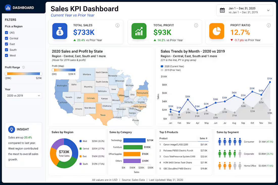
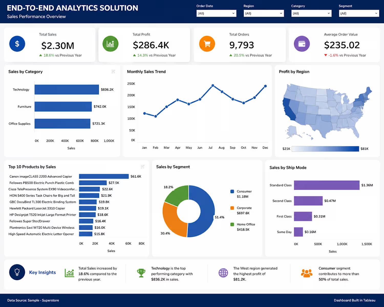
Sales KPI Dashboard | Data Analysis & Visualization : An interactive Sales KPI Dashboard designed to provide a clear view of business performance and support data-driven decision-making.
The analysis compares 2020 sales performance against the prior year across key metrics, including total sales, total profit, and profit ratio.
Key dashboard features include:
• Sales and profit performance by state and region
• Monthly sales trends compared with the previous year
• Sales distribution across regions and customer segments
• Sales performance by product category
• Top-performing products
• Interactive filters for region, profit range, and reporting period
• Automatically generated business insights highlighting key performance changes
The dashboard was designed to transform raw sales data into a clear and interactive reporting solution, making it easier to monitor performance, identify trends, and explore key business metrics.
Tools used: Data Analysis, Microsoft Excel, Data Visualization
1
17