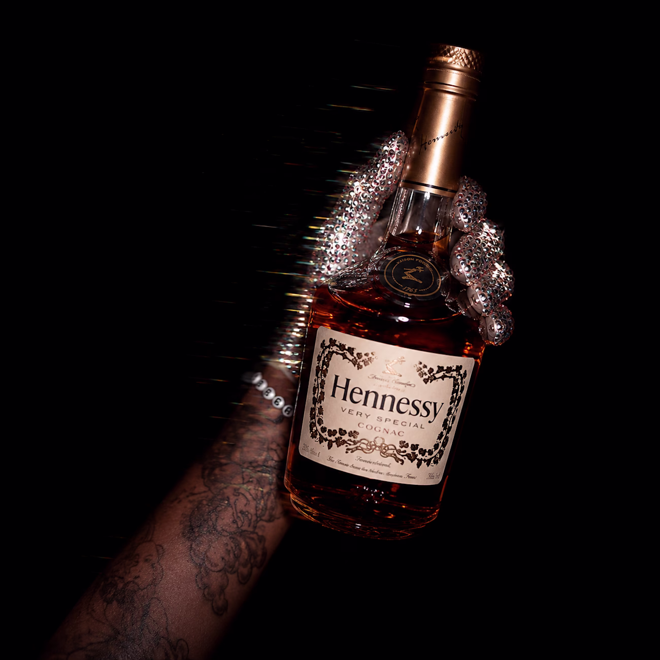
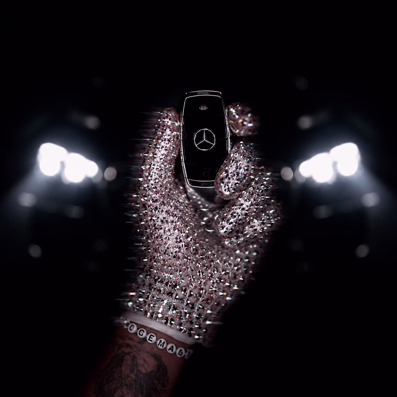
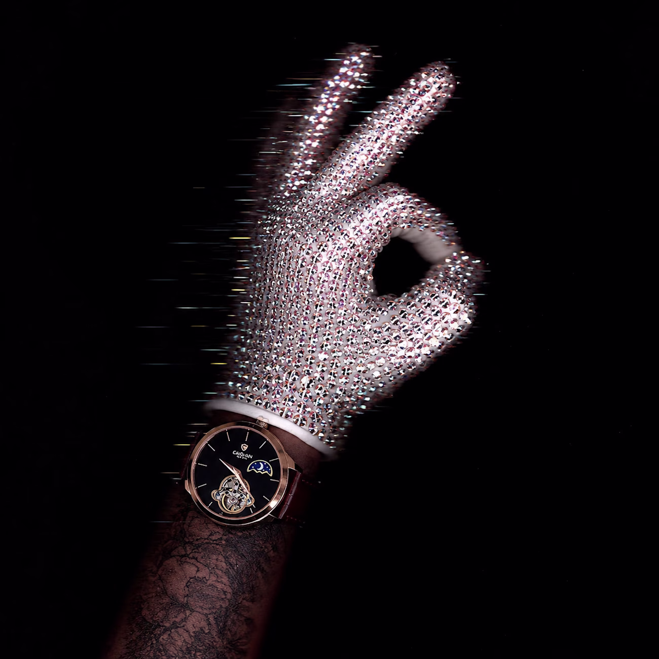
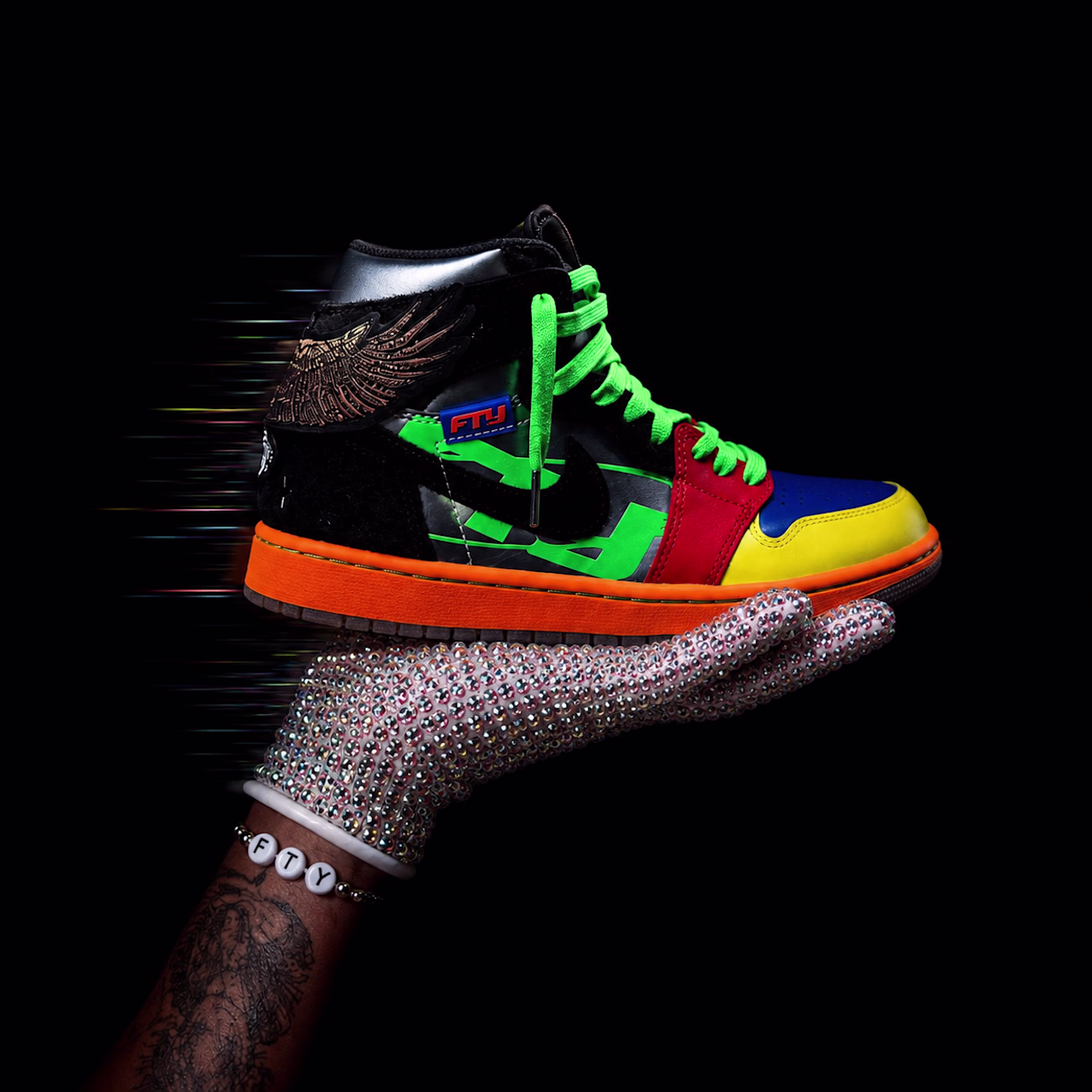
Reimagined Drake’s viral Iceman cover into luxury ad concepts for some of my favorite brands. ❄️✨
A creative exploration of luxury lighting, product storytelling, and art direction through one visual language.
Which concept is your favorite?
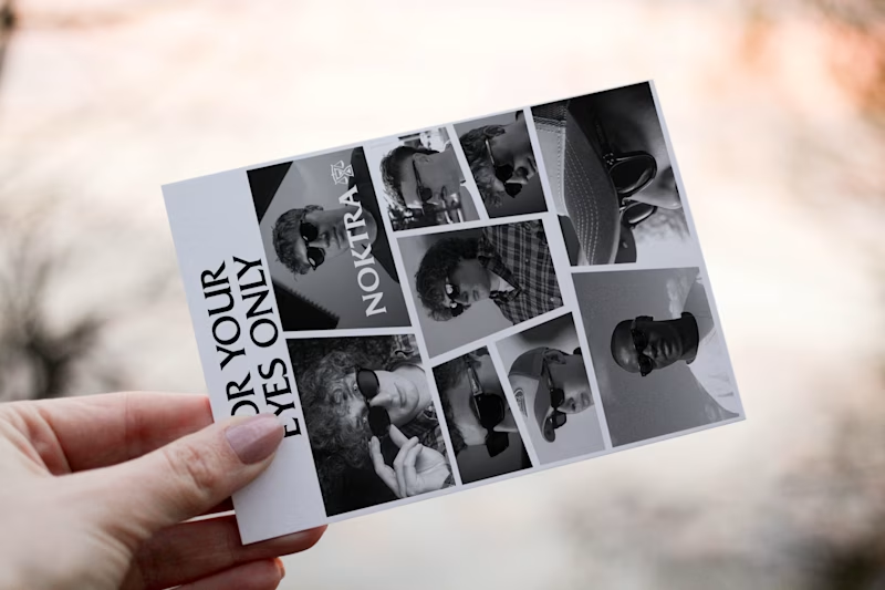
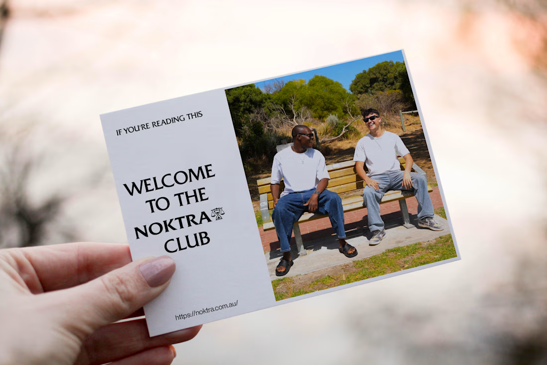
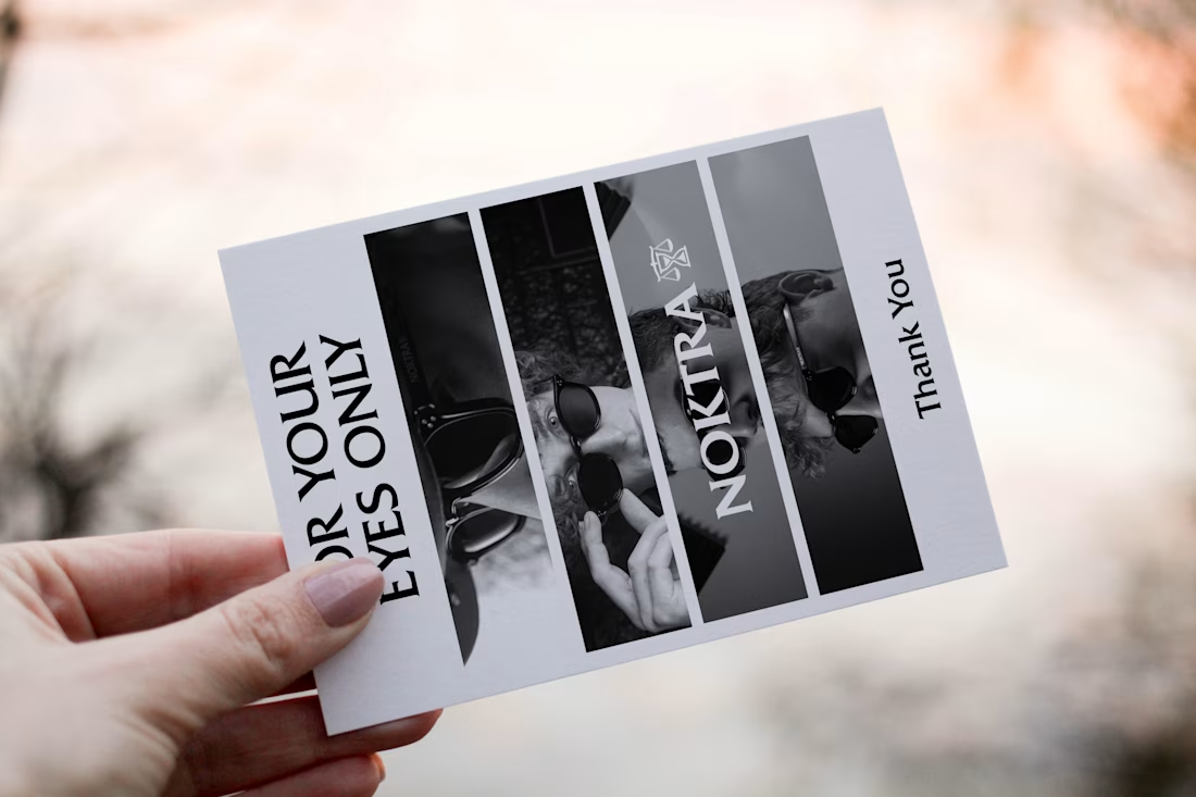
The Noktra brand I was designing for also selected this direction that was voted for, for its thank you card design, so I refined the concept. We have developed additional samples that build on the concept you loved most.
Which option is your favourite?
1 voted
33%

2 voted
67%
3 votes
Closed
I'm designing an A6 thank you card that will be included in every Noktra eyewear purchase in Australia, and I'd love your input.
Both concepts are designed to express appreciation while aligning with Noktra's premium eyewear identity.
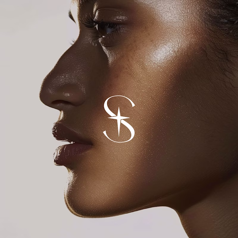
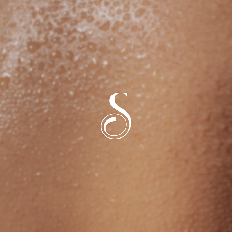
I designed a primary wordmark logo for a Skincare brand called SKYN, then explored two icon directions for scalability, packaging, social, and future brand touchpoints.
I’d love your perspective 👇
Which icon feels more premium, memorable, and on-brand?
2 voted
100%
0 voted
0%
2 votes
Closed
1/2
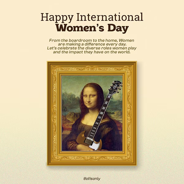
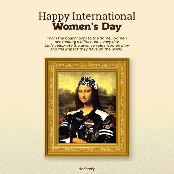
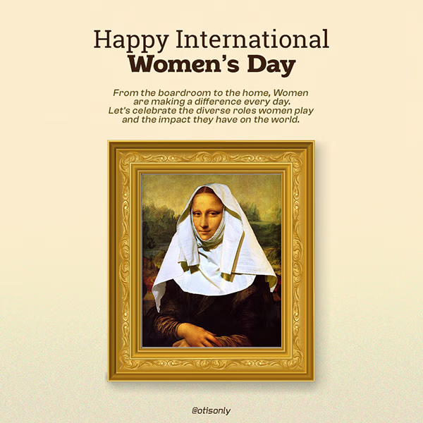
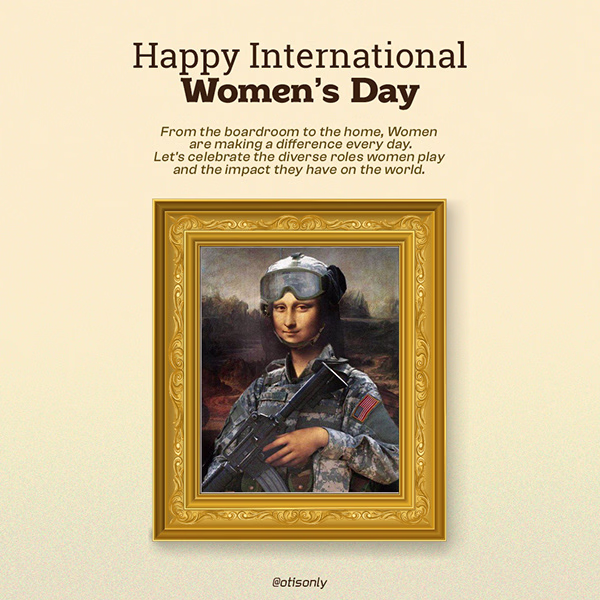
International Women’s Day deserved more than a template.
So I turned the Mona Lisa into a symbol of modern womanhood: fearless, professional, and powerful across every field she steps into.
This concept-driven visual campaign was designed to stop the scroll, tell a story,...