The network for creativity
Join 1.25M professional creatives like you
Connect with clients, get discovered, and run your business 100% commission-free
Creatives on Contra have earned over $150M and we are just getting started
Back to feedPost

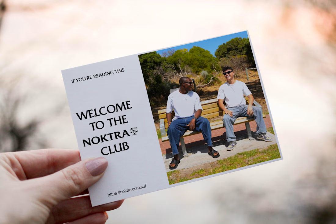
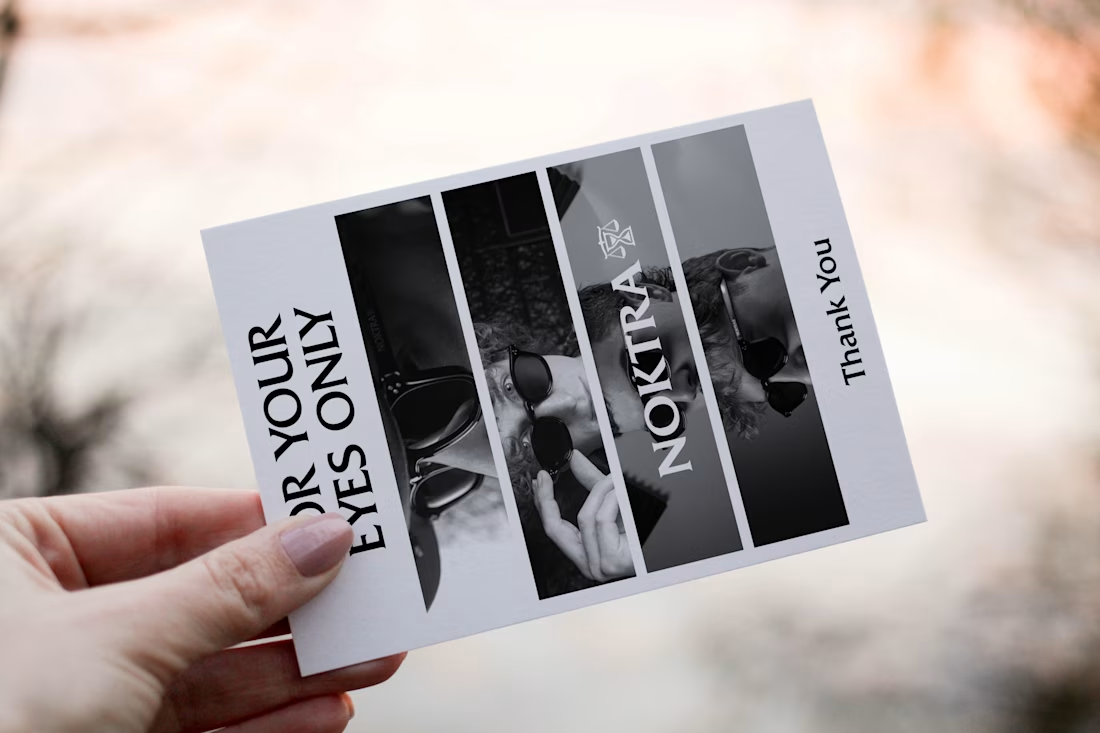
I'm designing an A6 thank you card that will be included in every Noktra eyewear purchase in Australia, and I'd love your input.
Both concepts are designed to express appreciation while aligning with Noktra's premium eyewear identity.
The network for creativity
Join 1.25M professional creatives like you
Connect with clients, get discovered, and run your business 100% commission-free
Creatives on Contra have earned over $150M and we are just getting started

Challenges
View all


Related posts

I'm working on a store concept mixing art supplies, gifts and tech. I presented two moodboards: one inspired by traditional art supply stores, and another cleaner, modern direction inspired by Japanese gift and tech stores. They chose option 2.
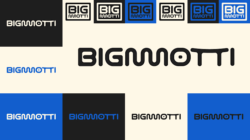
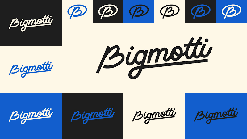
I presented four logo ideas. These two are my favorites and the ones the client liked most.
1_ Based on the second moodboard, with a more neutral and slightly futuristic feel. My favorite detail is the boxed version: its vertical weight balances with the I and O, making it feel tidy and visually appealing.
2_ Inspired by traditional art supply stores, but with a modern, clean style. Handwritten lettering adds a human touch and keeps it timeless.
Which one is your favorite and why?
Which one do you think the client chose?
3 votes
Ends in 1d

The second moodboard feels like the stronger direction for this mix of categories—it gives the products room to feel curated rather than crowded. I’m especially into the restrained palette paired with the more expressive wordmark options.


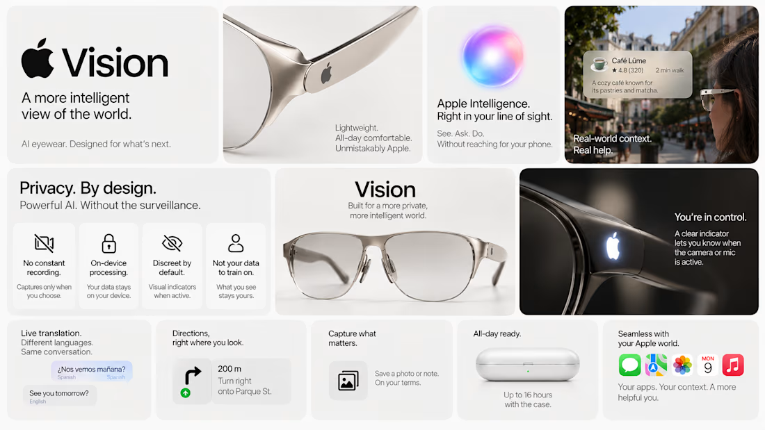
The latest Apple keynote sent me down a bit of a rabbit hole.
What if Apple made AI glasses?
Not another pair of glasses that happen to have AI in them.
What if they approached the whole thing the Apple way?
Beautiful. Context-aware. Ridiculously intuitive.
And ideally, not quietly documenting my entire existence. 🙃
So I designed my take on Apple Vision: privacy-first AI eyewear, with a few features I’d genuinely want to use.
Here’s the concept.



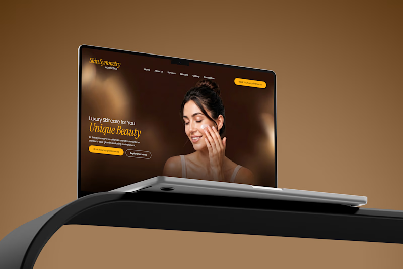
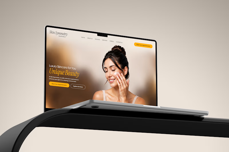
Exploring two visual directions for the same digital experience one warm & premium, the other clean & elegant.
Which one would you choose? 🤎🤍
#UIUX #WebDesign #LandingPage #WebDesignInspiration #DesignConcept #VisualDesign #CreativeDesign
6 votes
Ends in 18h

Great work