The network for creativity
Join 1.25M professional creatives like you
Connect with clients, get discovered, and run your business 100% commission-free
Creatives on Contra have earned over $150M and we are just getting started
Back to feedPost
Taste Test
I'm working on a store concept mixing art supplies, gifts and tech. I presented two moodboards: one inspired by traditional art supply stores, and another cleaner, modern direction inspired by Japanese gift and tech stores. They chose option 2.
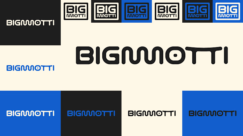
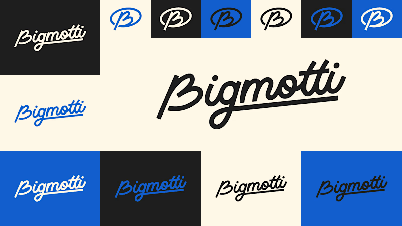
I presented four logo ideas. These two are my favorites and the ones the client liked most.
1_ Based on the second moodboard, with a more neutral and slightly futuristic feel. My favorite detail is the boxed version: its vertical weight balances with the I and O, making it feel tidy and visually appealing.
2_ Inspired by traditional art supply stores, but with a modern, clean style. Handwritten lettering adds a human touch and keeps it timeless.
Which one is your favorite and why?
Which one do you think the client chose?
1 voted
14%
6 voted
86%
7 votes
Closed

The second moodboard feels like the stronger direction for this mix of categories—it gives the products room to feel curated rather than crowded. I’m especially into the restrained palette paired with the more expressive wordmark options.

Thanks for commenting Rohan!
Yeah the second moodboard and first option in the post is the better one and the choice the client went to. The details in the wordmarks you like are part of the mascot that the brand has, details and stuff I will post as the project goes on.
I...

My favorite is the manuscript version, the loose brush strokes on Bigmotti give it warmth that fits an art supply store. My guess for the client is the boxed one though, once they picked the cleaner Japanese inspired moodboard the wordmark needed to match that same restraint.
Hi Rafee, I agree completely with you on the manuscript version it looks natural for an art supply store
Indeed they picked the modern one, but they debated a lot between the 2 options

Both are cool
Thank you Girum! Have a good week

I'll guess they picked #1, the boxed Bigmotti reads cleaner next to a gift-and-tech assortment than the handwritten route. That vertical weight balance on the I and O is the kind of detail that's invisible until someone points it out, was there a runner-up logo the client seriously debated before landing on this one?
Hello Maty!
Yes they picked the first one, its better for the general idea and style of the brand.
They have been building the store at the same time I'm developing the brand so there were some specifications for it to work along. I managed to present 4 logos in one week, but...
The network for creativity
Join 1.25M professional creatives like you
Connect with clients, get discovered, and run your business 100% commission-free
Creatives on Contra have earned over $150M and we are just getting started











Related posts

What does trustworthy finance look like to you?
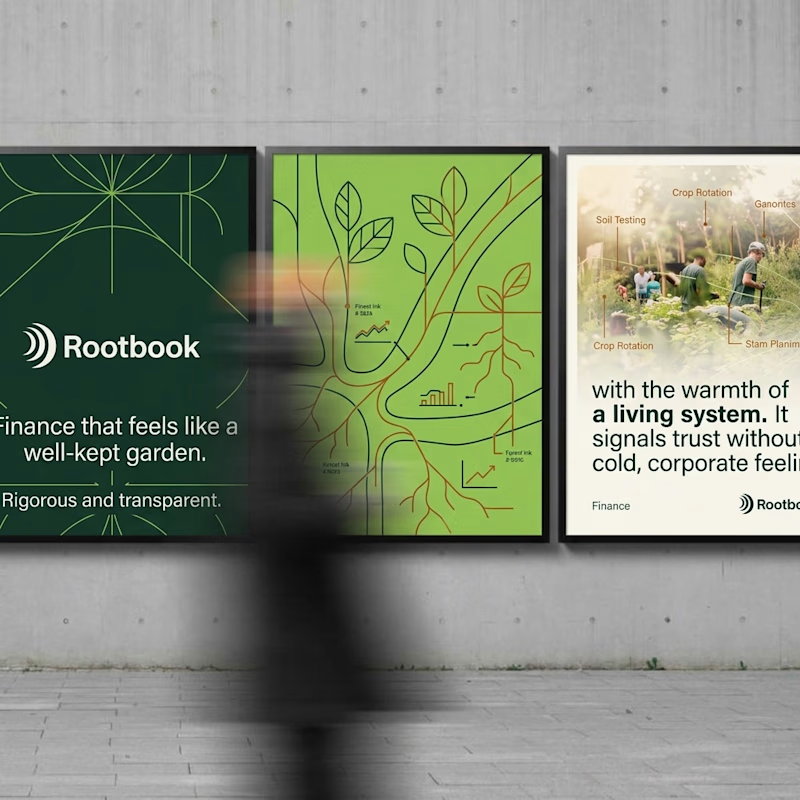
A) Rootbook: Finance that feels like a well-kept garden.
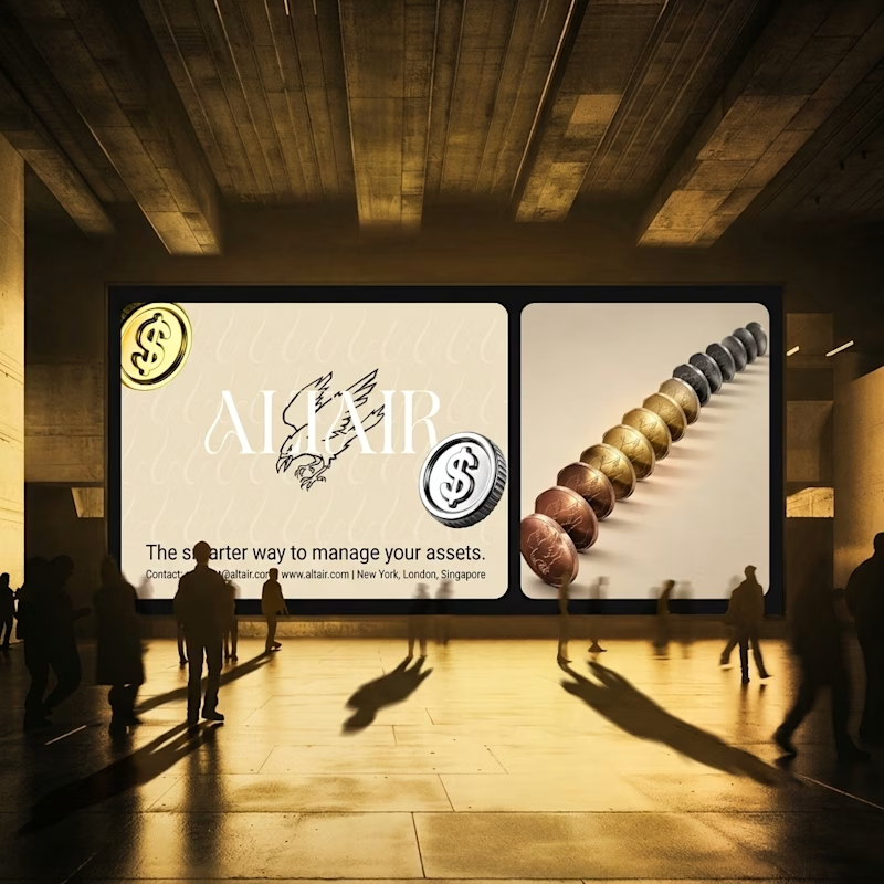
B) Altair: The smarter way to manage your assets.
Two finance brands I’m designing, two completely opposite worlds. Which one gets your money?
28 voted
61%
18 voted
39%
46 votes
Closed

Rootbook wins for me. A finance brand that feels like a well kept garden is such a refreshing idea.


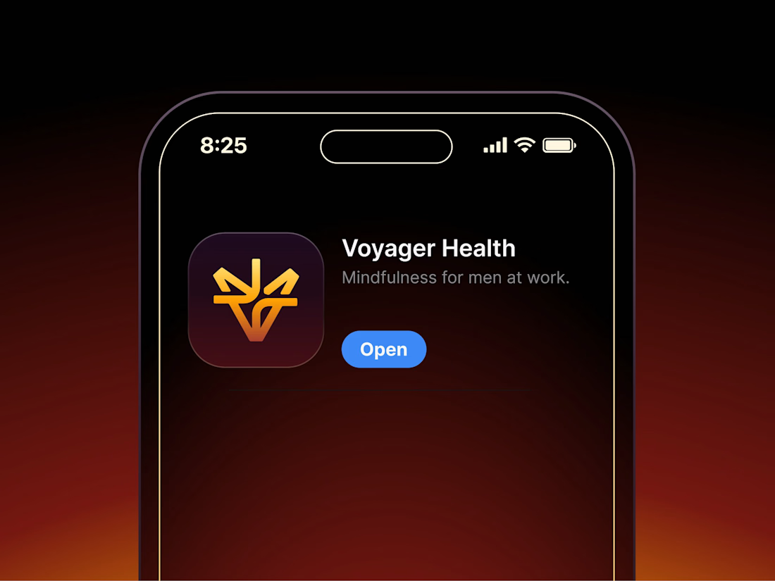

Aryna, that golden symbol pops so nicely against the plum background ✨

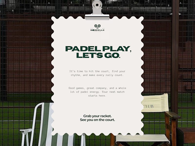
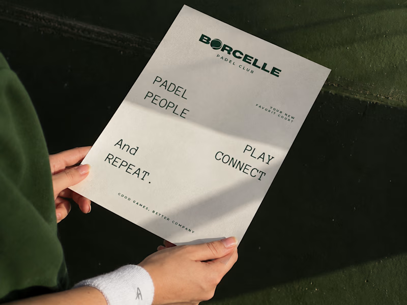
From the court to the little details, every touchpoint is an opportunity to bring the brand to life.
Good games, better company. 💚
What do you think of this direction?
11 voted
69%
5 voted
31%
16 votes
Closed
The green carries so nicely from the court to the small touchpoints. Feels sporty and friendly at the same time.