The network for creativity
Join 1.25M professional creatives like you
Connect with clients, get discovered, and run your business 100% commission-free
Creatives on Contra have earned over $150M and we are just getting started
Back to feedPost
Taste Test
Exploring two visual directions for the same digital experience one warm & premium, the other clean & elegant.
Which one would you choose? 🤎🤍
#UIUX #WebDesign #LandingPage #WebDesignInspiration #DesignConcept #VisualDesign #CreativeDesign
2 voted
33%
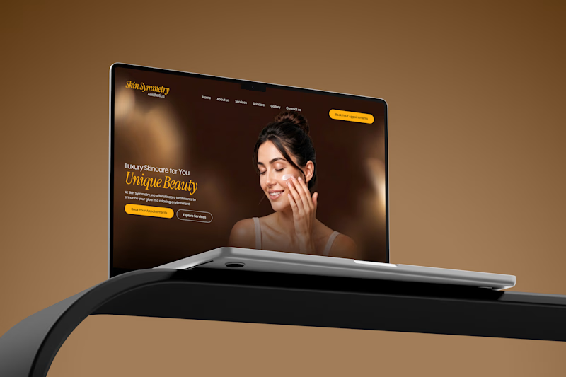
4 voted
67%
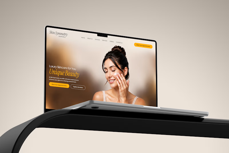
6 votes
Closed


Thank you! I’m glad you like Option 02. I’ll move forward with this warm, premium direction!

The split between warm and clean is especially clear in the restrained palettes and repeated laptop framing—the product stays constant while the mood shifts. I’d be curious to see the same test with the CTA treatment held equally consistent too.
Absolutely, great point! I’ll keep the CTA treatment consistent and test both directions for a clearer comparison.

option 2

Great work

Option 1
The network for creativity
Join 1.25M professional creatives like you
Connect with clients, get discovered, and run your business 100% commission-free
Creatives on Contra have earned over $150M and we are just getting started











Related posts


Your Hero Section Has One Job: Be Clear.
You don’t need huge headlines or long explanations. You need the right image + short headline + clear offer.
For the first version, we worked on the branding, the image and the copy together, so at first glance it’s clear: this is a makeup course, and here’s what you’ll get.
The second version is still beautiful and still feels like beauty. But what are you actually getting? A makeup course? Products? A store? That’s the problem with a Hero that looks good but isn’t thought through.
Your first screen doesn’t need to say everything. It just needs to say the right thing.

22 voted
61%
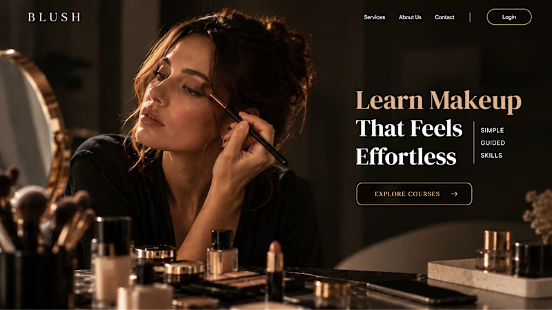
14 voted
39%
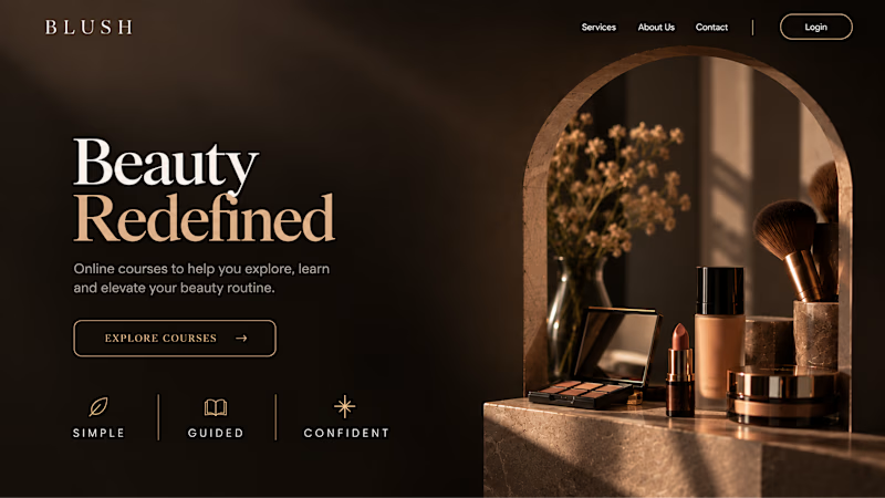
36 votes
Closed


Which colour palette would you choose for the banner design for a domain business? 🔥 Fiery or 🧊 Frosty?
20 voted
36%
35 voted
64%
55 votes
Closed

Frosty seems really cool for me!!


Working on a new brand project: Pace Theory. ✦
Exploring two different directions for the visual identity and brand presentation.
Which variation do you prefer — Left or Right? 👀
I’d love to hear your thoughts on the layout, composition, and overall brand feel.
Drop your pick in the comments 👇

5 voted
33%
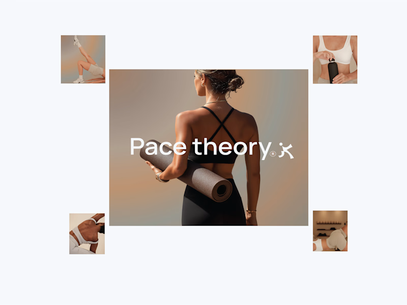
10 voted
67%
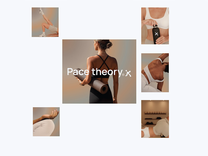
15 votes
Closed

Left variation is more practical ❤️
great job Shivan🔥🔥