The network for creativity
Join 1.25M professional creatives like you
Connect with clients, get discovered, and run your business 100% commission-free
Creatives on Contra have earned over $150M and we are just getting started
Back to feedPost
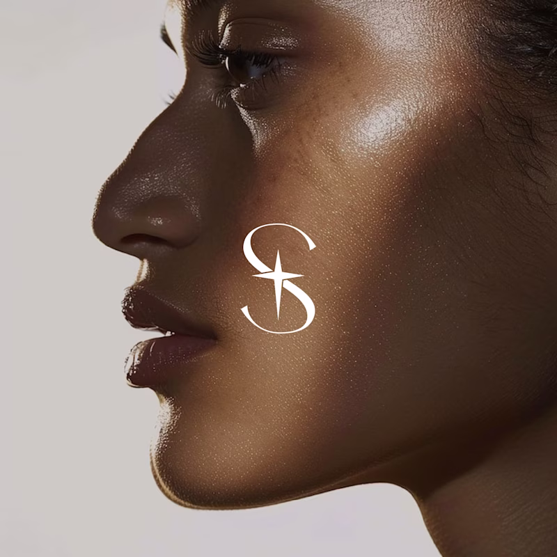
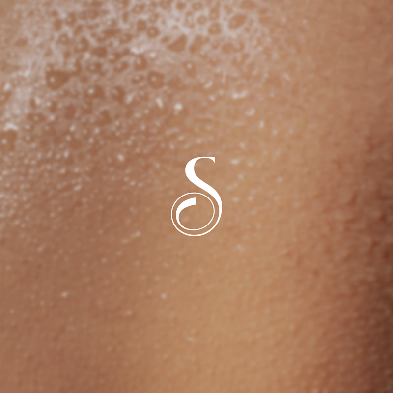
Taste Test
I designed a primary wordmark logo for a Skincare brand called SKYN, then explored two icon directions for scalability, packaging, social, and future brand touchpoints.
I’d love your perspective 👇
Which icon feels more premium, memorable, and on-brand?
2 voted
100%
0 voted
0%
2 votes
Closed
The Icon A direction feels significantly more premium😍
I'll stick with it. Thanks for sharing your opinion.
The network for creativity
Join 1.25M professional creatives like you
Connect with clients, get discovered, and run your business 100% commission-free
Creatives on Contra have earned over $150M and we are just getting started
Challenges
View allTrending
Claude
Claude has entered the design space. How are you using Claude Design?
Contra University
Learn from expert creatives how to earn more using next-gen AI tools.
fifaworldcup2026
The World Cup is here and the whole world's watching. How are you designing for the world stage?
creativeaiflow
Creative AI workflows are evolving. What tools do you use, and what are their strengths and weaknesses?
freelancerlife
Freelancer life is wins, pivots, and everything in between. What’s yours right now?