
nomi Designs
Designing premium SaaS experiences that actually convert.
- 14
- Followers






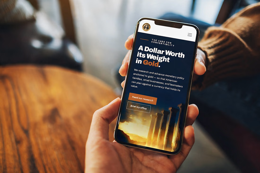
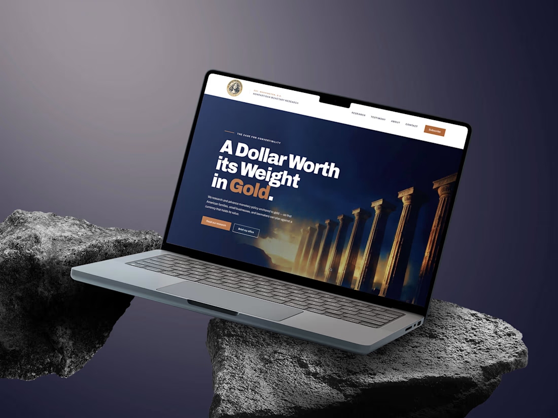
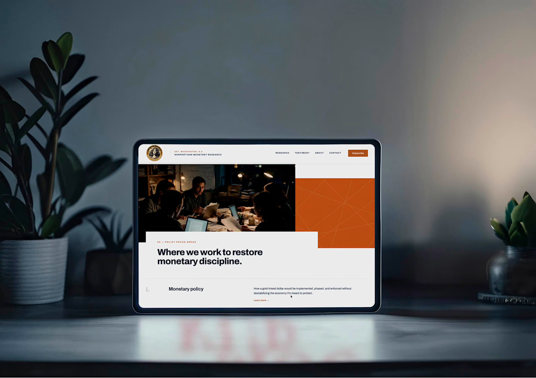
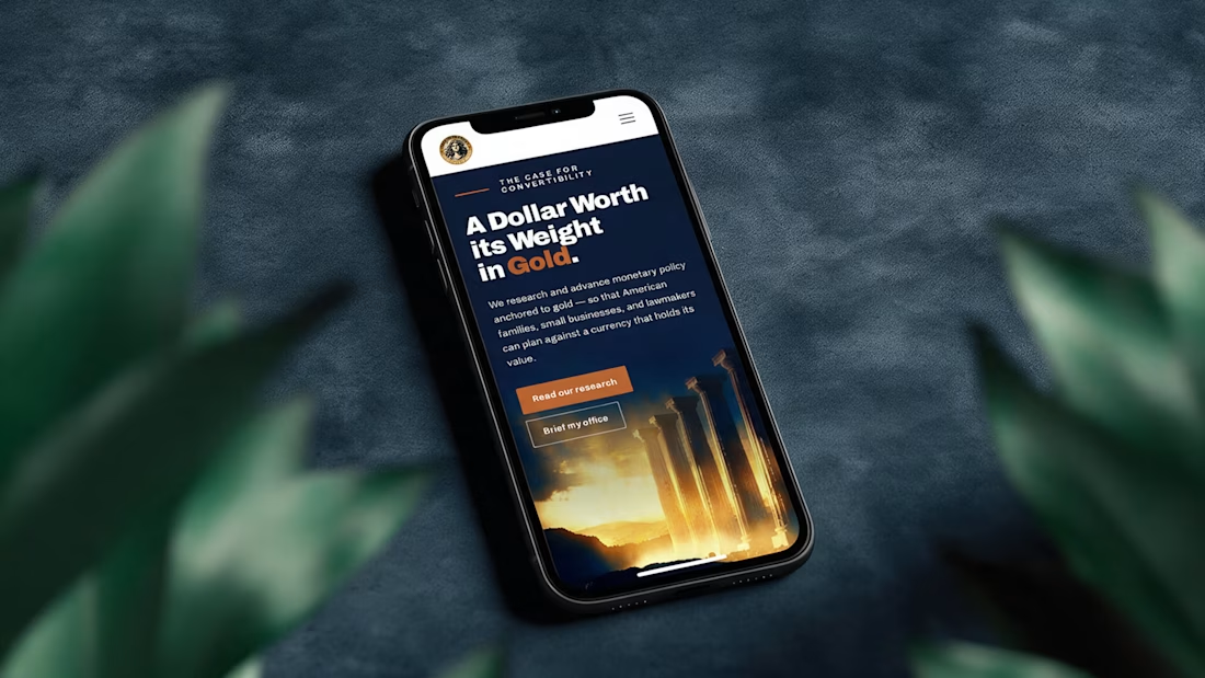
A digital presence designed for a subject where trust, authority and permanence matter.
The US Center for Gold Policy homepage combines deep navy, warm bronze accents, classical architecture and editorial typography to create an institutional experience that feels established...

Been busy updating my portfolio.
Stay tuned!


Claymation cartoons were my favorite type of animation when I was a kid.
There was something magical about seeing little handmade worlds come to life, frame by frame.
I still love that tactile, imperfect feeling, so I tried bringing a bit of it into this campaign.

