pro
Naomi Heyes

Branding, Packaging & Web Design, Award Winning | D2C Brands


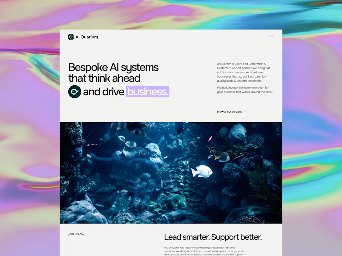
AiQuarium came to me as an AI agency and left with a brand people will trust, remember and gravitate towards.
They build tailored AI solutions for lead gen and customer support, drawing on the best tools available globally and configuring them around each client's business. The problem was that almost every brand in this space looks identical. Blue and white, sterile and interchangeable. For an agency whose entire value is bespoke thinking, that was working against them.
So I built the brand around the name. The aquarium is the business, the tools within it are the fish and coral and each client gets their own ecosystem assembled from resources gathered worldwide.
The mark came from the wordmark itself. I rotated the "Q" letterform 90°, let its natural typographic tail become a fish tail, added an eye - and taadaa, the letterform turned into a fish. I wanted it to be recognisable, playful and entirely their own.
For colour I moved away from the black and white category default - instead, I went for a luminous mint and light lavender for energy and intelligence, anchored by a deep teal green that reads as water, rather than tech cliché.
Full brand strategy, identity and website, designed and built in Framer.
They now look like the only agency doing what they do, rather than one of hundreds. In a category this crowded, that's usually a total game-changer.
0
100
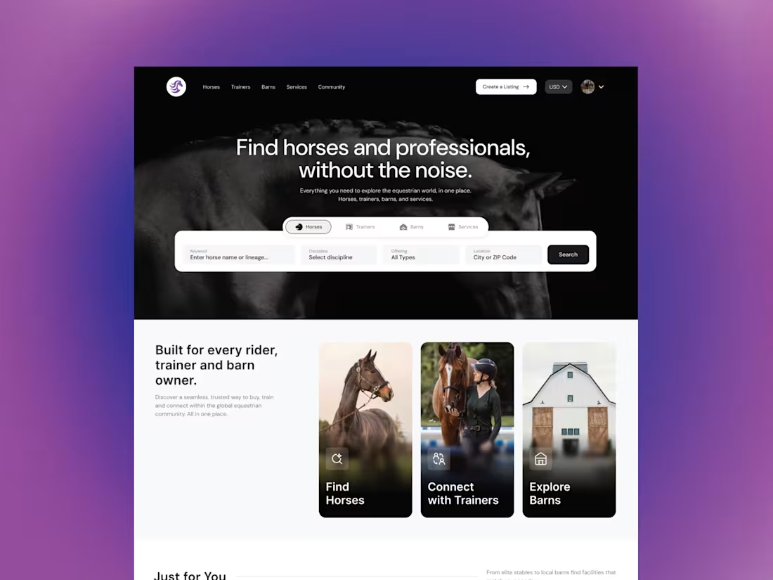
EqHarmony came to me as a marketplace brief. The real problem was trust.
Buying a horse or finding a trainer still happens through word of mouth and patchy listings - the founder wanted to bring professionalism and transparency to that space. Her aim was to create a platform credible enough for a first-time buyer to trust with a significant purchase and serious enough for professionals to want their name on.
I designed 25 screens across 2 phases. The homepage & search experience with advanced filtering, portfolio & public profiles, listing creation for trainers & horses, onboarding, dashboards for every user type, messaging, and an endorsement system built for a professional community rather than a ratings-driven one. All of it as a reusable design system, so the platform can grow without being rebuilt in 6 months time.
Four different user types, a lot of genuine complexity underneath - all built without overwhelming someone just browsing or ready to dive in.
The founder moved from a concept she was explaining to something she could showcase globally. On final delivery, her feedback was "you nailed it!!!".
If you're building something with real complexity behind it, the design is what makes that complexity feel simple. That's usually why I'm brought in.
1
139
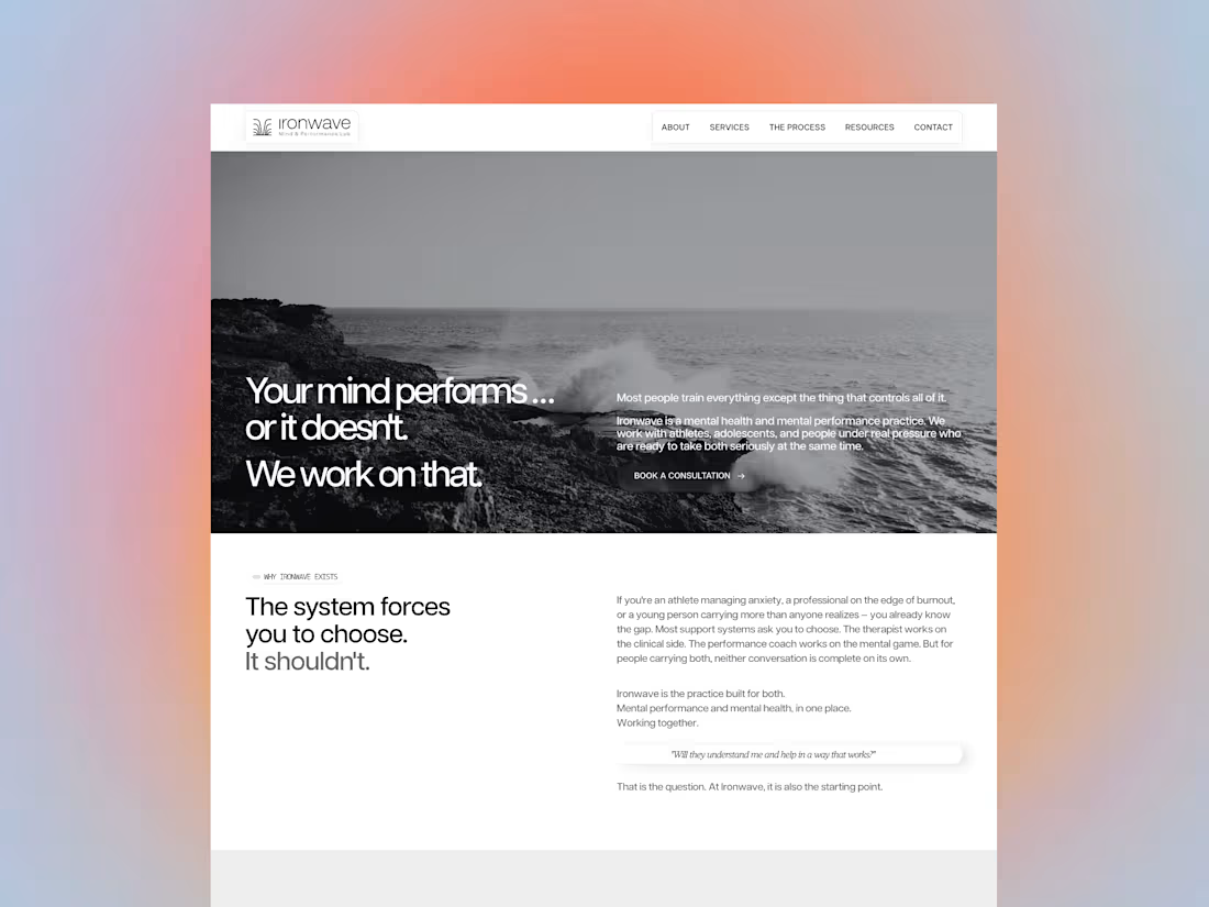
Website Design UI/UX - mental performance practice
2
382
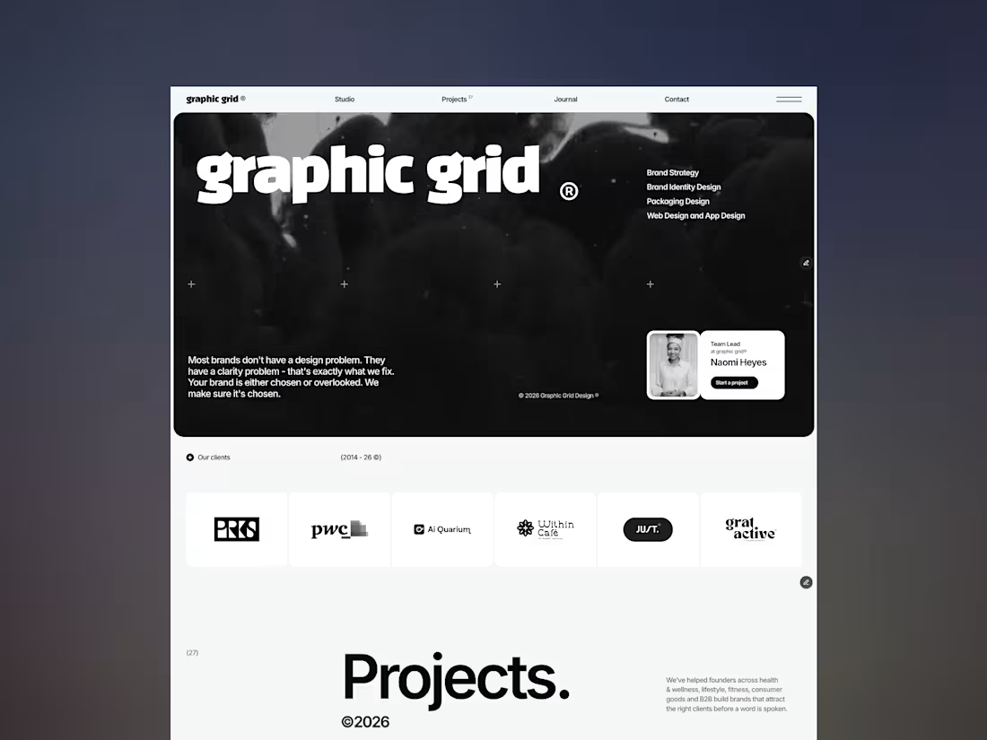
Graphic Grid came to me with the problem most growing studios eventually hit: the work was strong, but the brand didn't say so clearly enough. They knew what they did - they just needed people to feel it in seconds, before reading a word.
So I built the whole identity around one idea: most brands don't have a design problem, they have a clarity problem. Every decision, from the confident wordmark to the stark black-and-white system, was made to earn attention and hold it.
1
3
239