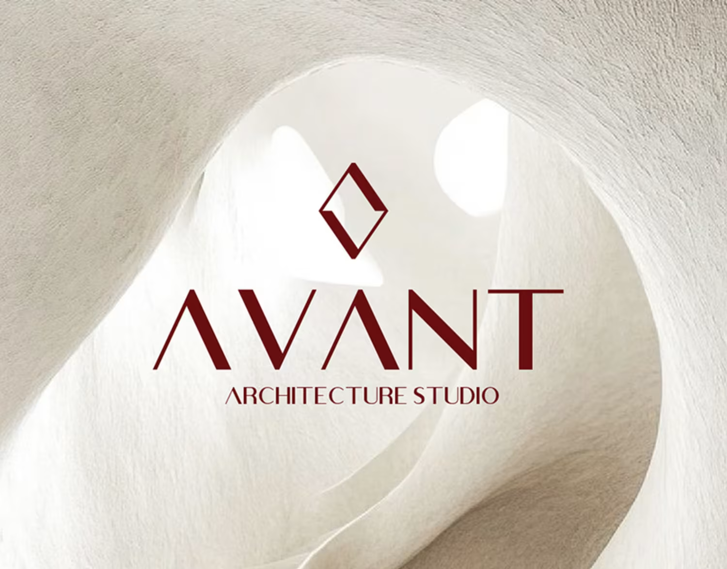
Naeema Raashid
Unique Branding & Graphic Design Solutions
Ready for work
Naeema is ready for their next project!



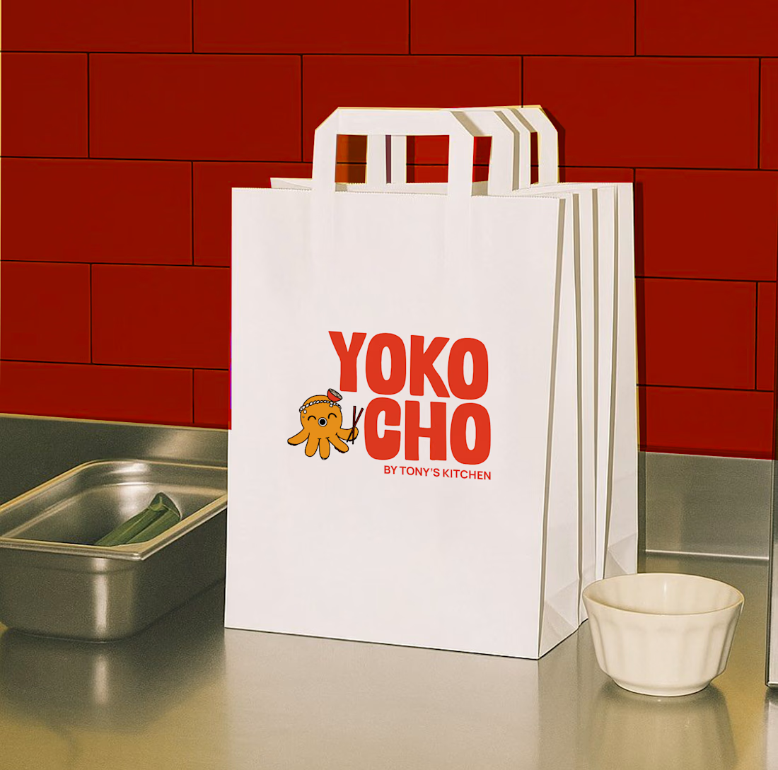
Inspired by the Japanese word "Yokocho (横丁)", meaning the lively side streets lined with small eateries and hidden food spots, this identity was designed to capture the warmth, energy, and charm of Asian street food culture.
The visual identity combines bold typography, a playful...


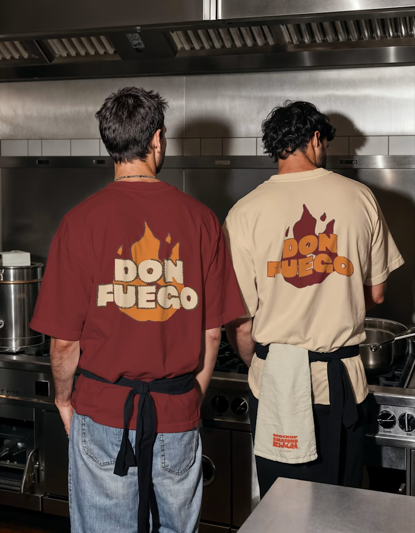
Meet Don Fuego.
The whole brand started with one simple idea, making fire feel like the experience, not just the cooking method.
I wanted it to stand out from a distance, but still feel rich and indulgent when you look closer.
So the approach was pretty intentional. Strong...
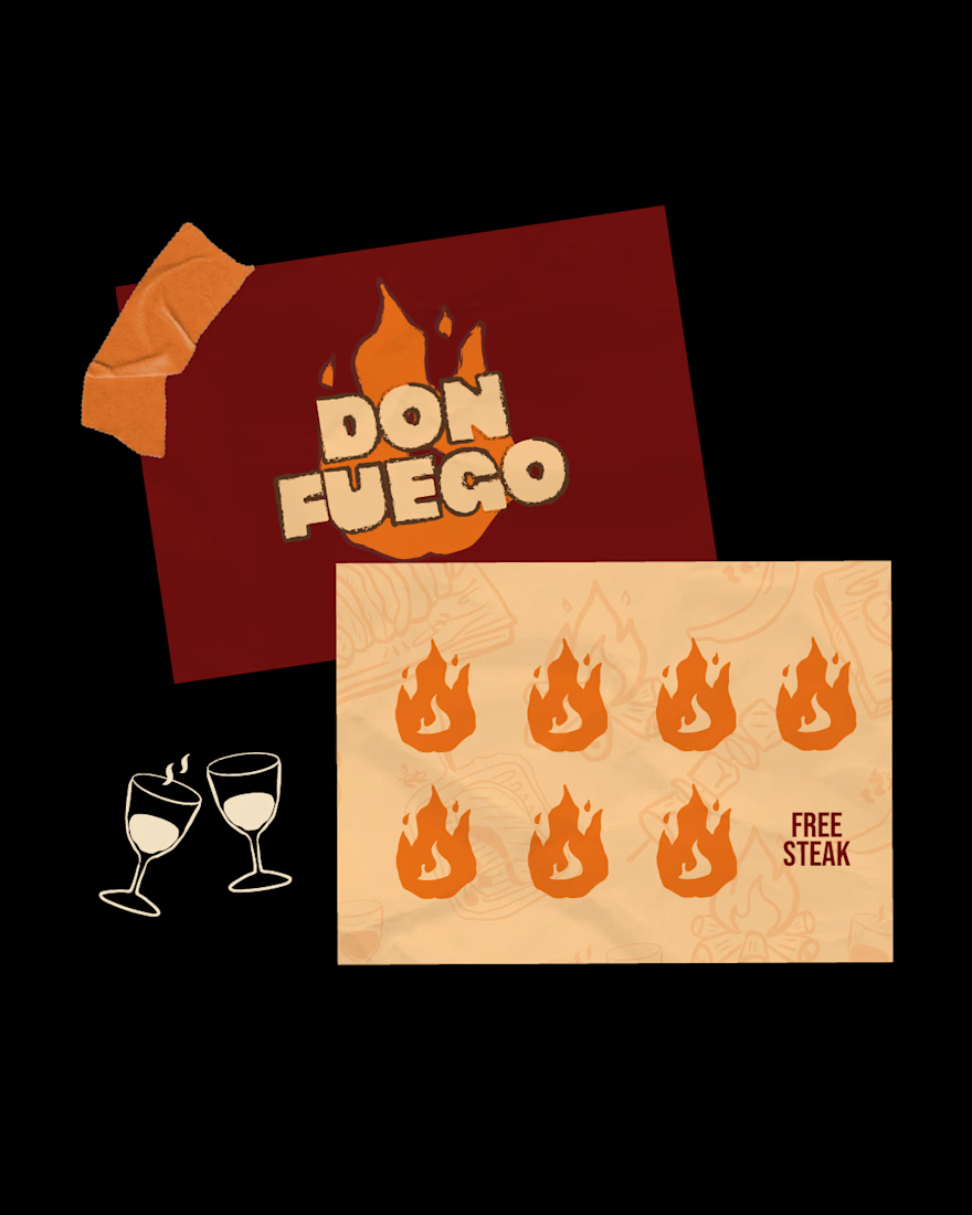
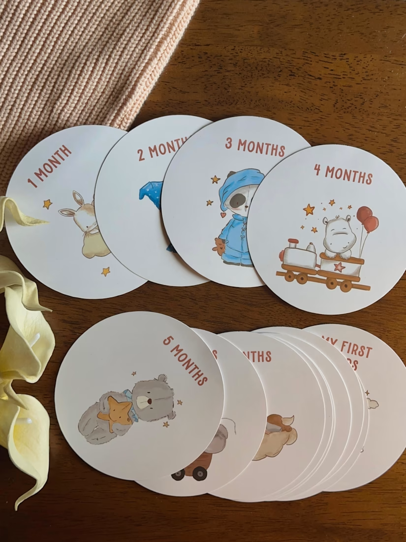
worked on these milestone card illustrations!