
Naeema Raashid
Unique Branding & Graphic Design Solutions
- 10
- Followers


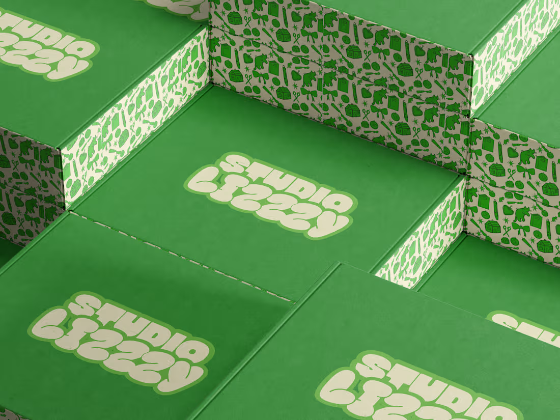
studio lizzzy
0
3
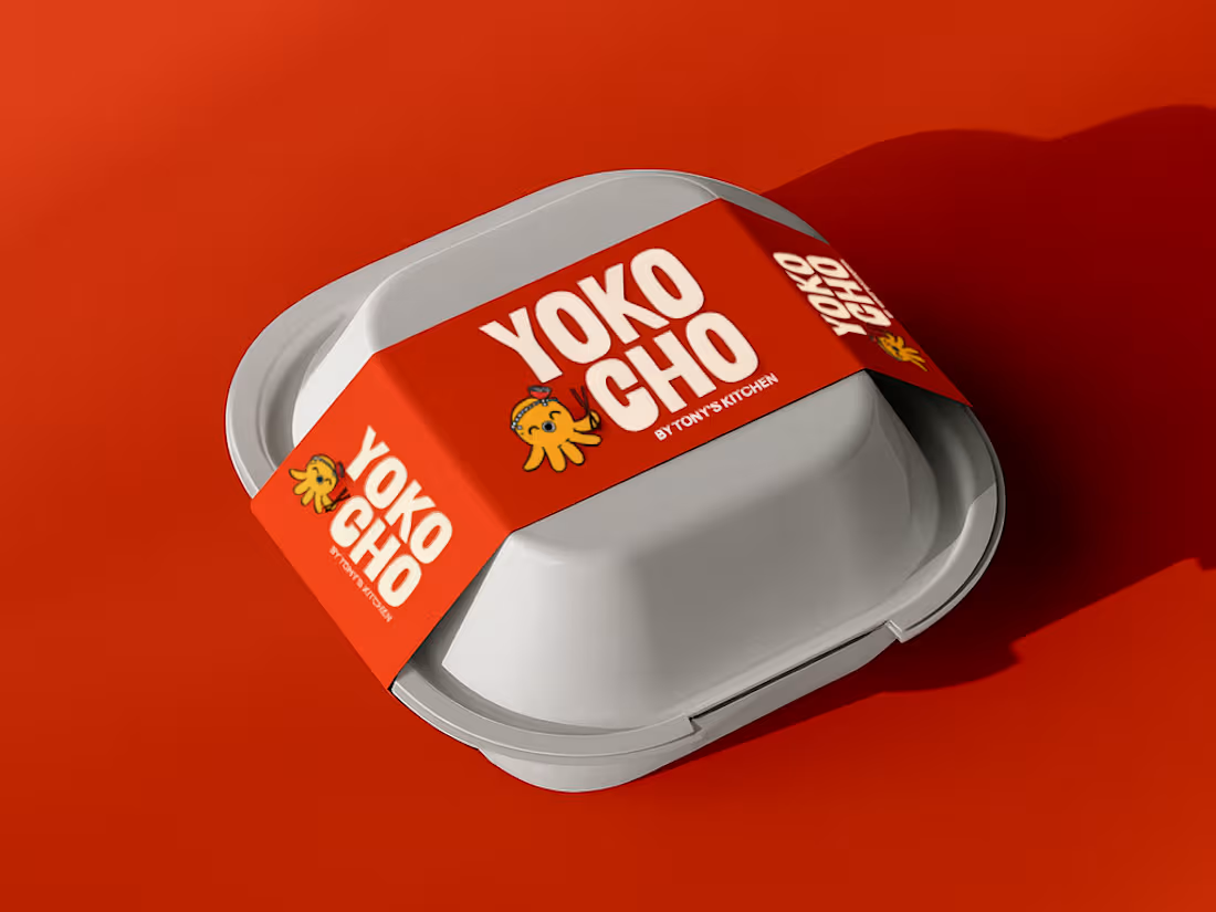
Inspired by the Japanese word "Yokocho (横丁)", meaning the lively side streets lined with small eateries and hidden food spots, this identity was designed to capture the warmth, energy, and charm of Asian street food culture.
The visual identity combines bold typography, a playful octopus mascot with a ramen bowl hat, and vibrant colors to create a brand that's approachable, memorable, and full of personality.
Every element was crafted to make Yokocho feel like more than just a place to eat, it's an experience that brings people together over comforting food and bold flavors.
5
4
531
Meet Don Fuego.
The whole brand started with one simple idea, making fire feel like the experience, not just the cooking method.
I wanted it to stand out from a distance, but still feel rich and indulgent when you look closer.
So the approach was pretty intentional. Strong type, high contrast visuals, and keeping the copy minimal so the food can do its thing.
Everything comes back to the same feeling, heat, depth, and that intensity you expect from a fire-grilled brand.
With Don Fuego, the fire isn’t just part of the process. It’s the whole story.
#branding (https://www.linkedin.com/search/results/all/?keywords=%23branding&origin=HASH_TAG_FROM_FEED) #donfuego (https://www.linkedin.com/search/results/all/?keywords=%23donfuego&origin=HASH_TAG_FROM_FEED)
2
1
119

worked on these milestone card illustrations!
1
95