The network for creativity
Join 1.25M professional creatives like you
Connect with clients, get discovered, and run your business 100% commission-free
Creatives on Contra have earned over $150M and we are just getting started
Back to feedPost
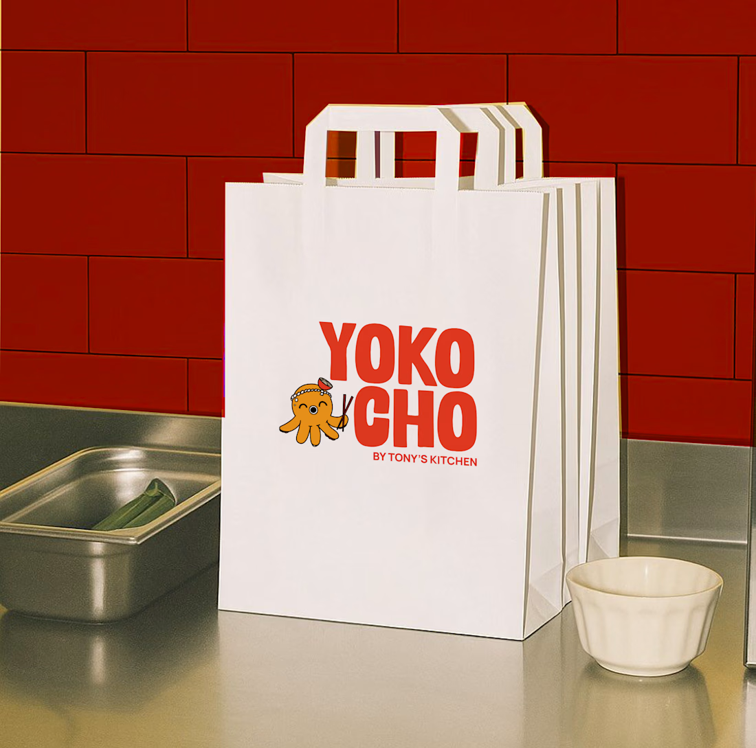
Inspired by the Japanese word "Yokocho (横丁)", meaning the lively side streets lined with small eateries and hidden food spots, this identity was designed to capture the warmth, energy, and charm of Asian street food culture.
The visual identity combines bold typography, a playful octopus mascot with a ramen bowl hat, and vibrant colors to create a brand that's approachable, memorable, and full of personality.
Every element was crafted to make Yokocho feel like more than just a place to eat, it's an experience that brings people together over comforting food and bold flavors.



so fun!

Top work!!

thank youu

Stunning minimalism, Naeema! The typography hierarchy is incredibly strong and clean. It’s the perfect balance between bold brand identity and production-ready clarity. Love this layout!
thank you so much!
The network for creativity
Join 1.25M professional creatives like you
Connect with clients, get discovered, and run your business 100% commission-free
Creatives on Contra have earned over $150M and we are just getting started
Related posts

🍔 BITE BOX — Where Every Bite Brings a Smile! 🧡
A fun, fresh, and memorable logo concept designed for a modern fast-food brand. The smile icon represents happiness, while the bold typography creates a friendly and recognizable identity. 🍟✨
#LogoDesign #FoodBranding #GraphicDesign #BrandIdentity #LogoDesigner

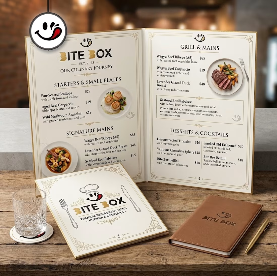
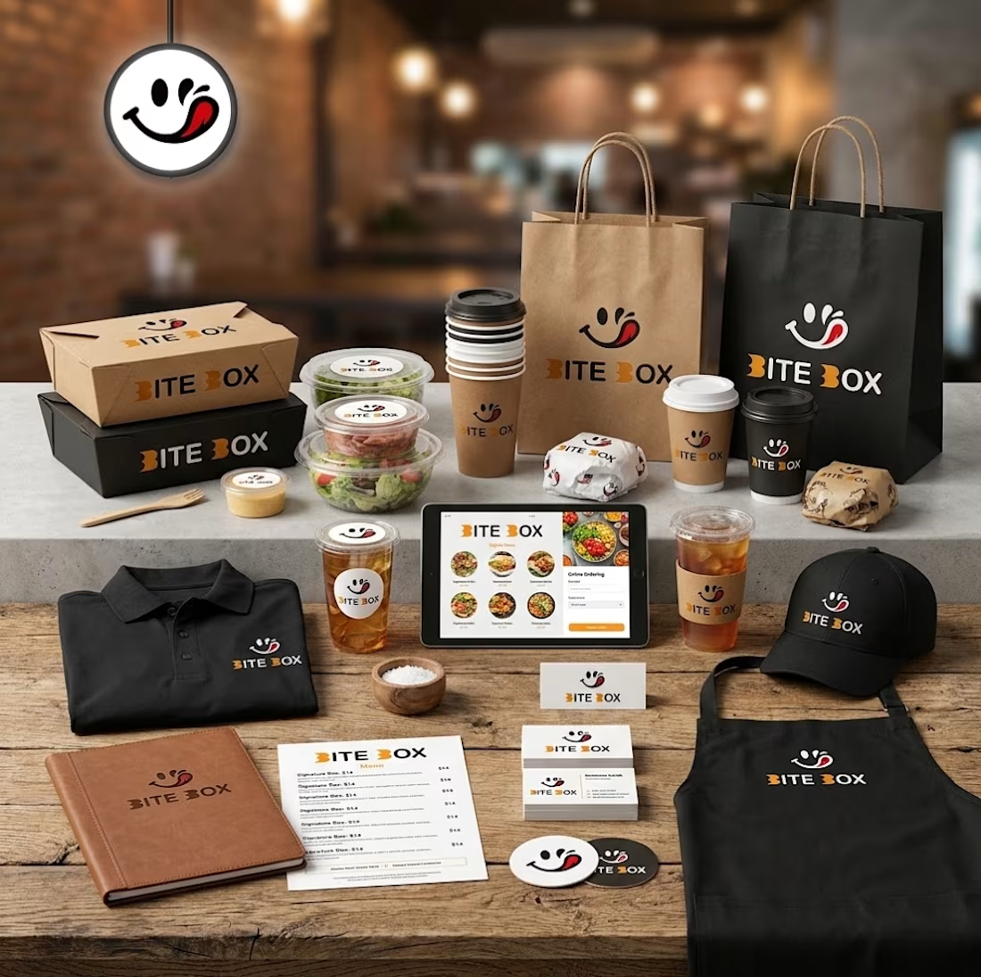
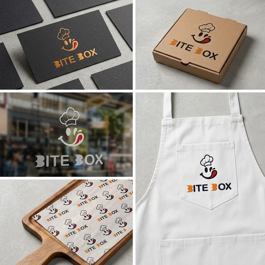
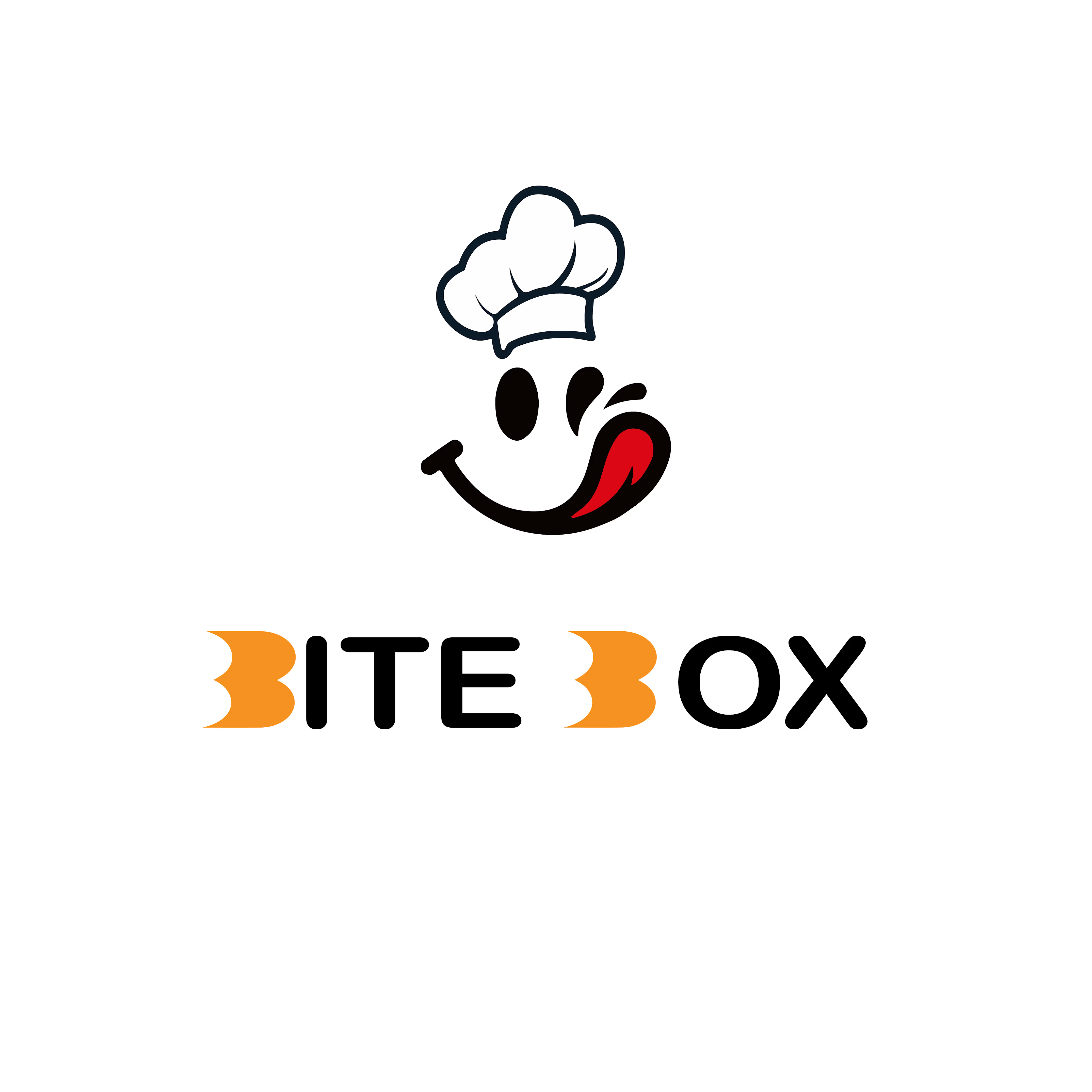


the little chef smile on the box is doing a lot of the work here

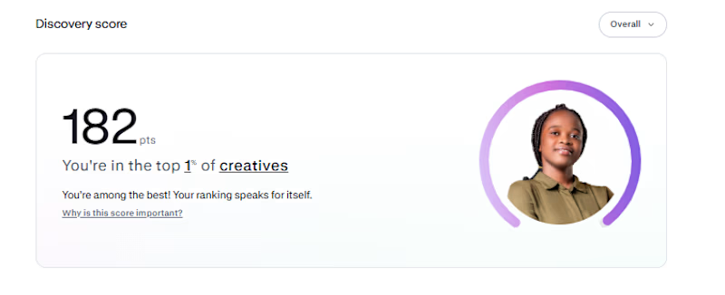
My Contra discovery score is now 182, putting me in the top 1% of creatives.
Funnily enough, I haven't gotten a job on Contra yet. 😂 I'm just here, posting my work, building my portfolio, and hoping the right clients find me
One thing I've learned is that you have to keep showing up, even when the results aren't coming yet.
Hopefully, something good comes out of it...

Congrats buddy

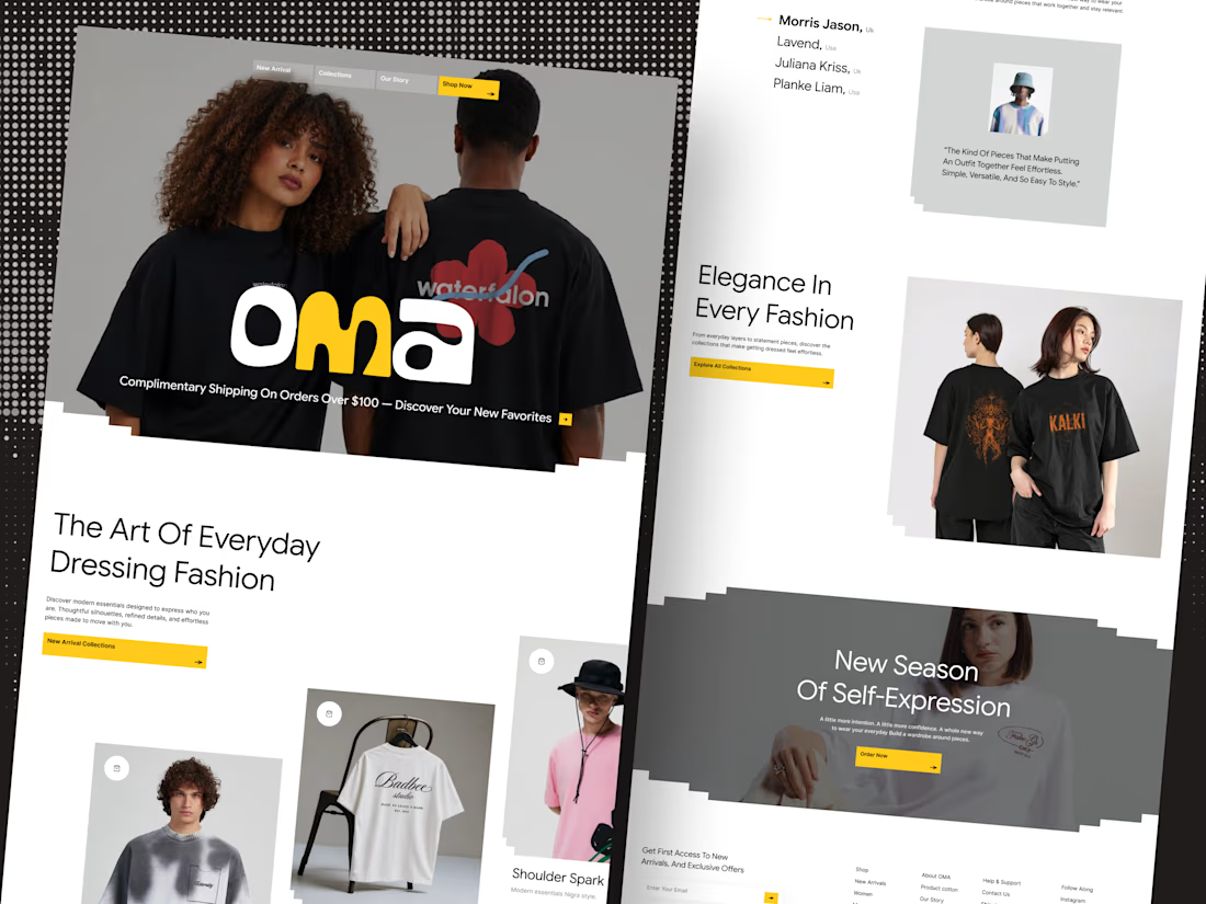
🛍️ Shopify based fashion E-commerce website Landing page
Your fashion brand deserves a storefront that sells style.
Introducing OMA — a modern fashion e-commerce website designed to make every collection stand out.From bold editorial visuals to a clean shopping experience, every detail is crafted to help fashion brands create a stronger first impression and turn browsing into buying.
✨ Premium fashion-focused design
🛒 Conversion-focused shopping experience
🎨 Modern, editorial art direction
📱 Designed for a seamless online shopping journey
Building a fashion brand? Let’s design a storefront your customers will love.
Available for Shopify store design projects and custom e-commerce website design.
💬 DM me to discuss your next project.



Nice work