Nabeel M
Senior UI/UX & Web Designer | 10+ Years
- $1k+
- Earned
- 1x
- Hired
- 5.00
- Rating
- 84
- Followers
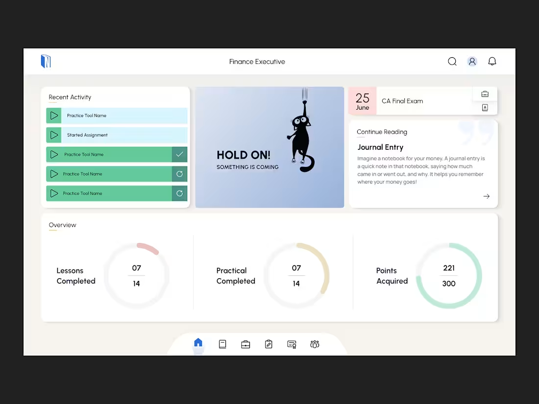
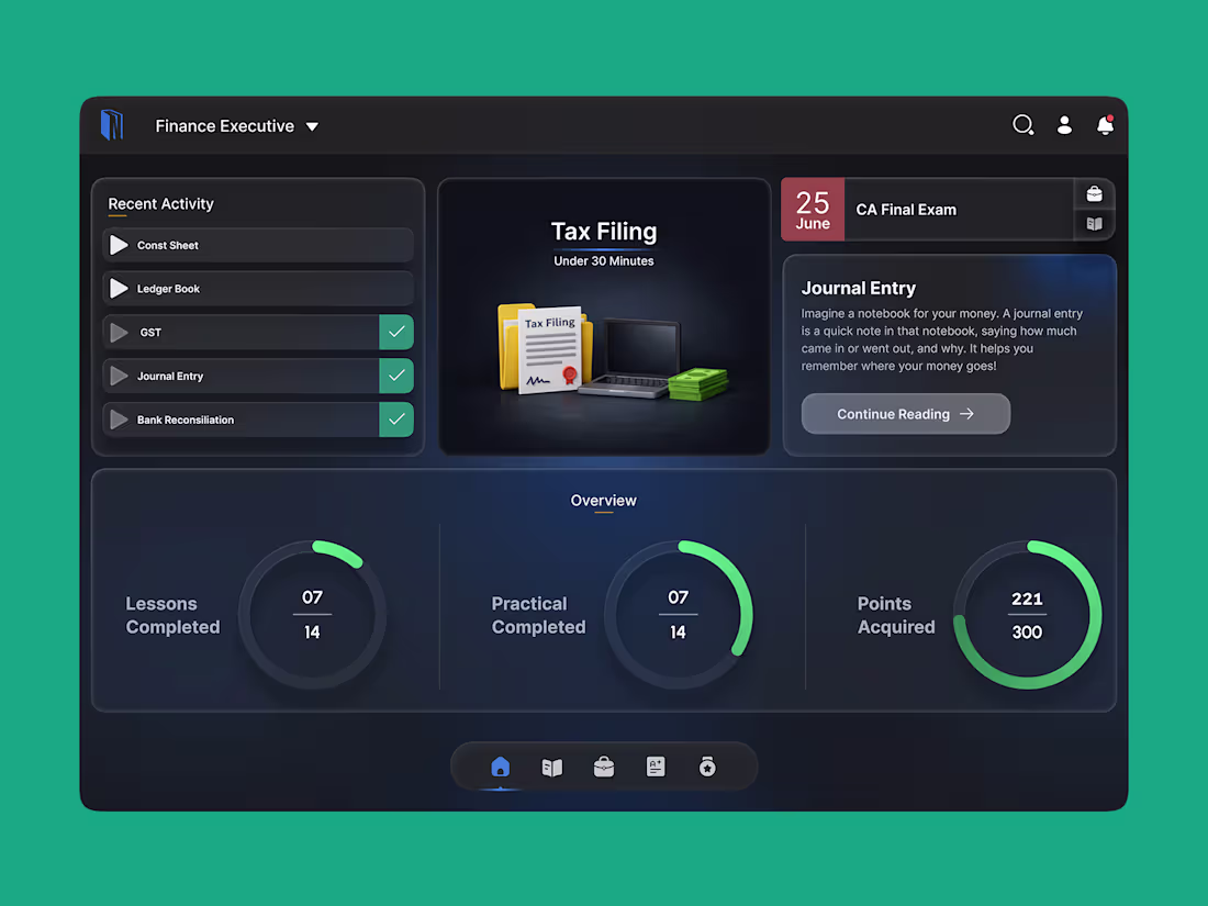
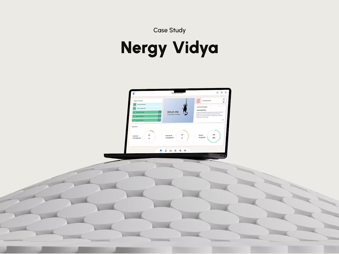
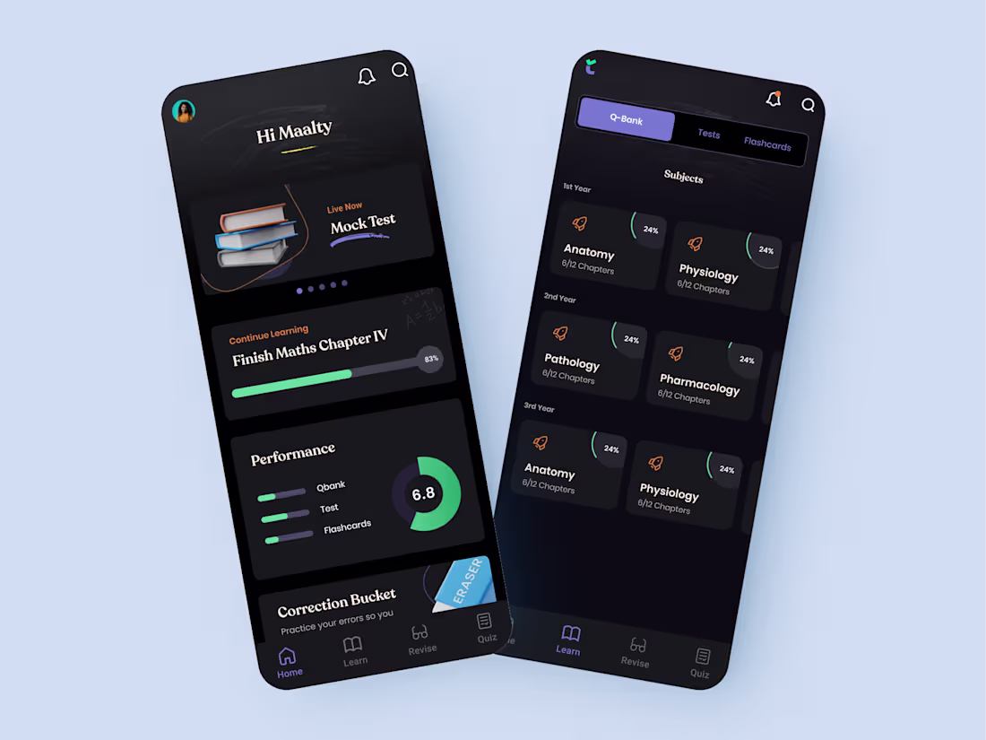
Nergy - Commerce Learning Platform
0
3
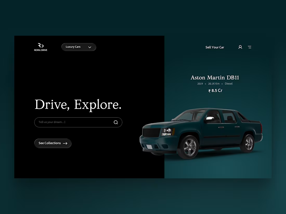
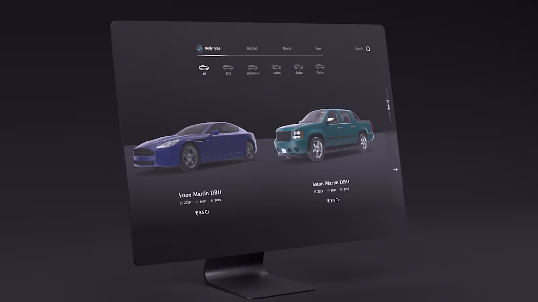
Royal Drive: Luxury Car Discovery Concept
0
5
The whole idea was simple:
What if the brand were honest enough to say
where the wool really came from? 🧶
We left him the hat, though.
5
3
296
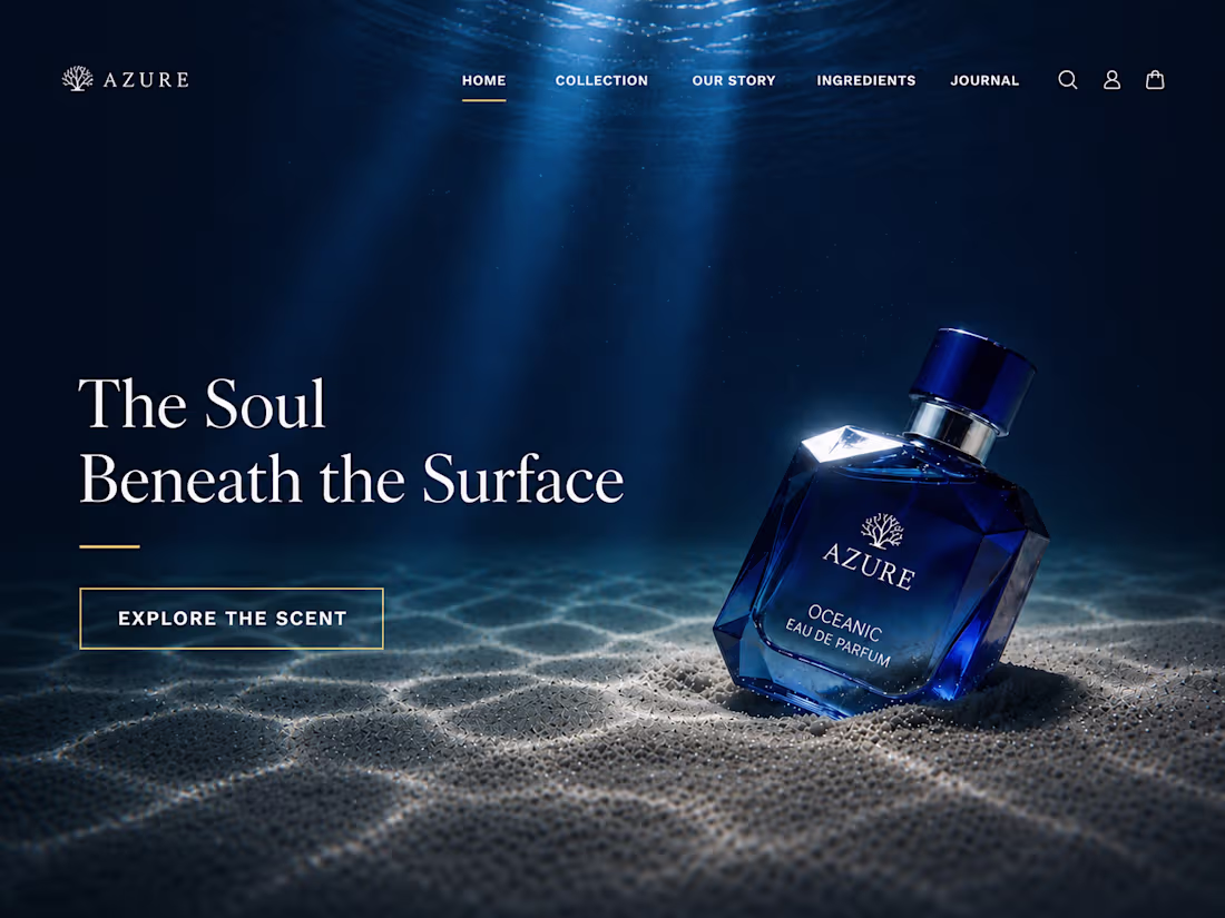
A concept exploration for a premium perfume brand.
The idea was to make the interface feel calm, immersive, and slightly cinematic without losing clarity. I focused on restraint, depth, and atmosphere so the product remains the hero throughout the experience.
9
10
503
Tastes like a soft secret. A design exploration for a premium ice cream brand.
2
2
264
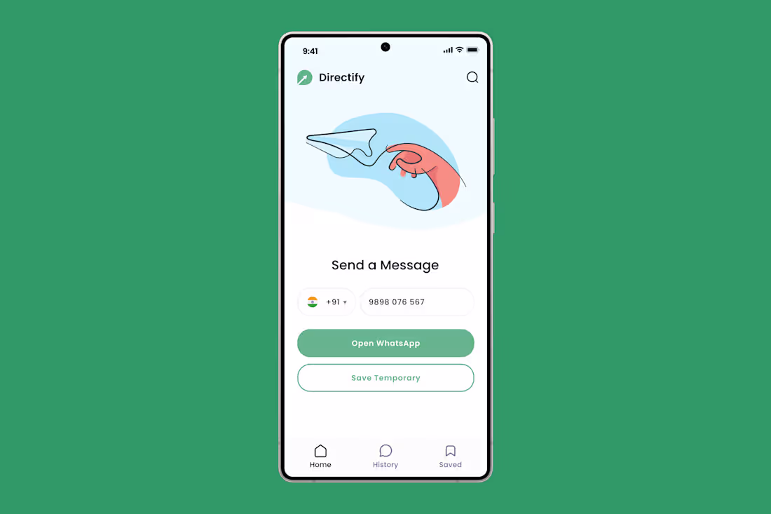
Directify: Temporary Contact Utility App
0
2
Made some changes to the website. Still WIP.
Suggestions are welcome. 2 things I'm gonna change in this design - The three journal entry panels. Need to find a better solution than that to show. Secondly, the third images in the Commerce Education Infrastructure section.
1
323
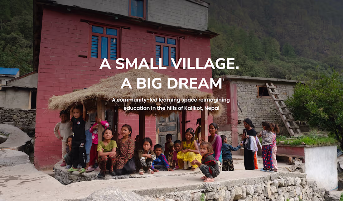
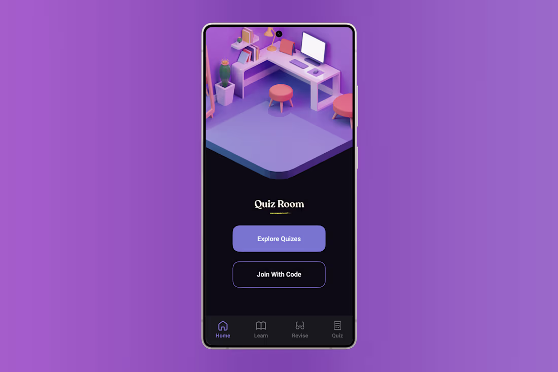
Flow Open School: Community Education Website
1
3
Soft light. Slower evenings. 🕯️
2
4
176
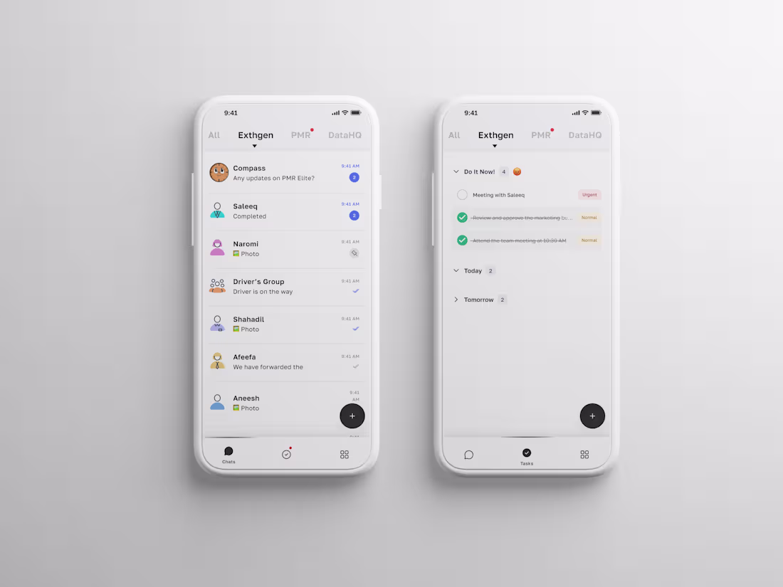
Exthgen: Service-Based Tech Company Website
0
0
A quiet nod to where design comes from.
2
4
237
Updated the illustration. Made it feel more grounded. Reduced the noise. Let the interface lead. Feels more balanced now.
2
228
when you create something and it serves its purpose, then it has a soul. Let's create souls.
3
333
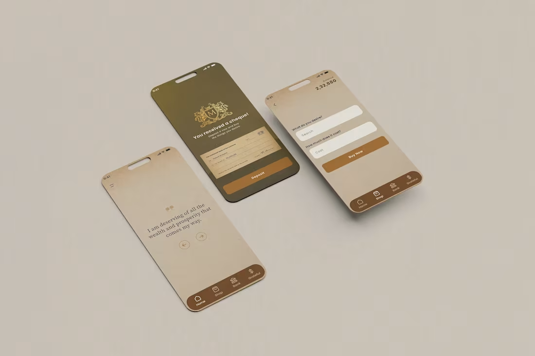
A UI exploration from a client project I worked on.
The brief was a mobile app around affirmations and financial mindset. My role was to design a calm, minimal interface that keeps the experience simple and focused. I used a warm neutral palette, clear hierarchy, and straightforward flows so the content stays central.
The goal here was not to overwhelm the user with features, but to create a quiet space where the message, the interaction, and the visual tone feel consistent.
Design and interaction by me.
2
366
Nergy - Commerce Learning Platform
1
6
Some scents feel like memory before they become words.
2
410
And something died
Within a soul
Left the eyes to rust
3
414
...?!
1
253
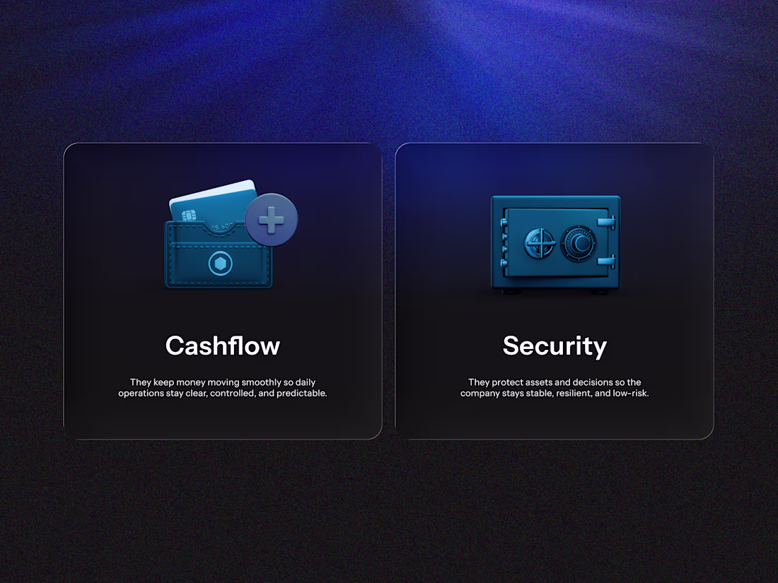
Every business needs both.
2
4
433
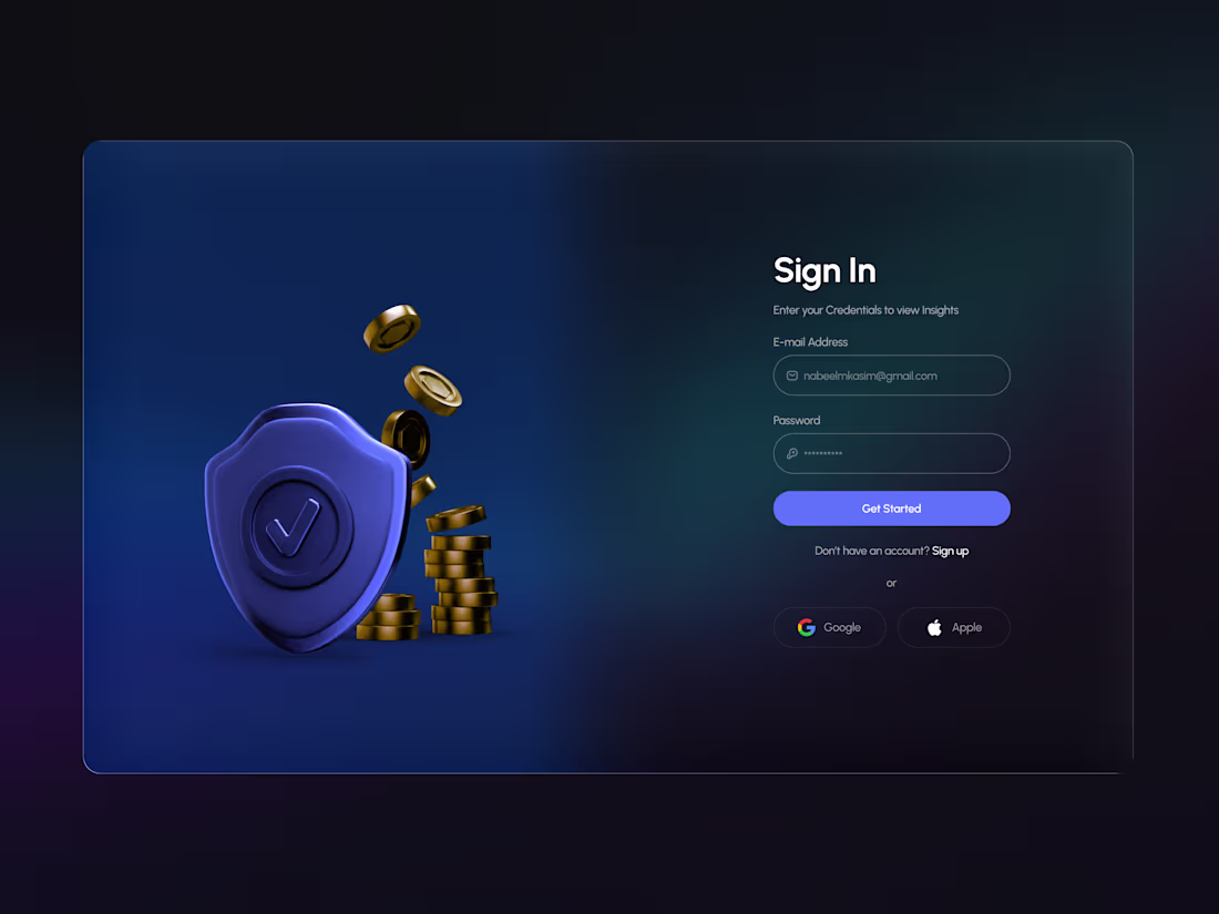
Login screen of a fintech web app.
2
3
408
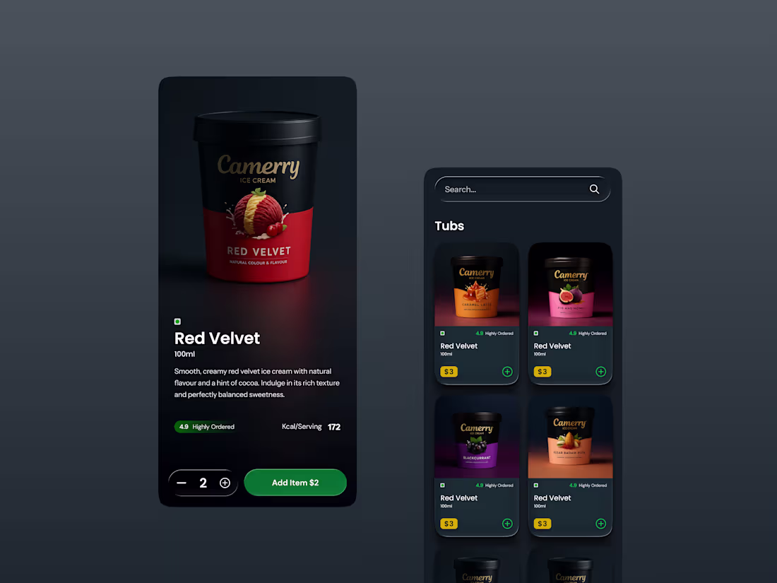
Ever heard about Camerry Ice Cream? No?
2
5
366
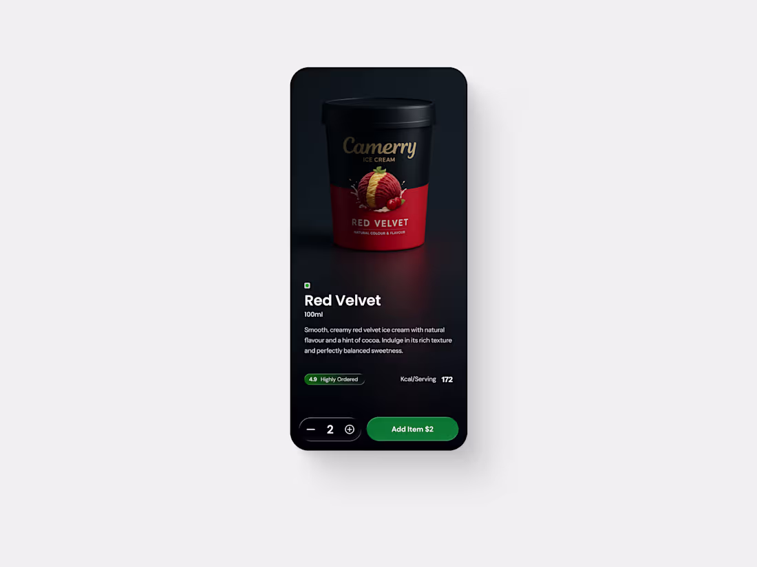
Camerry Ice Cream
3
329
It is a very old project. The name is Tackl.
3
4
254
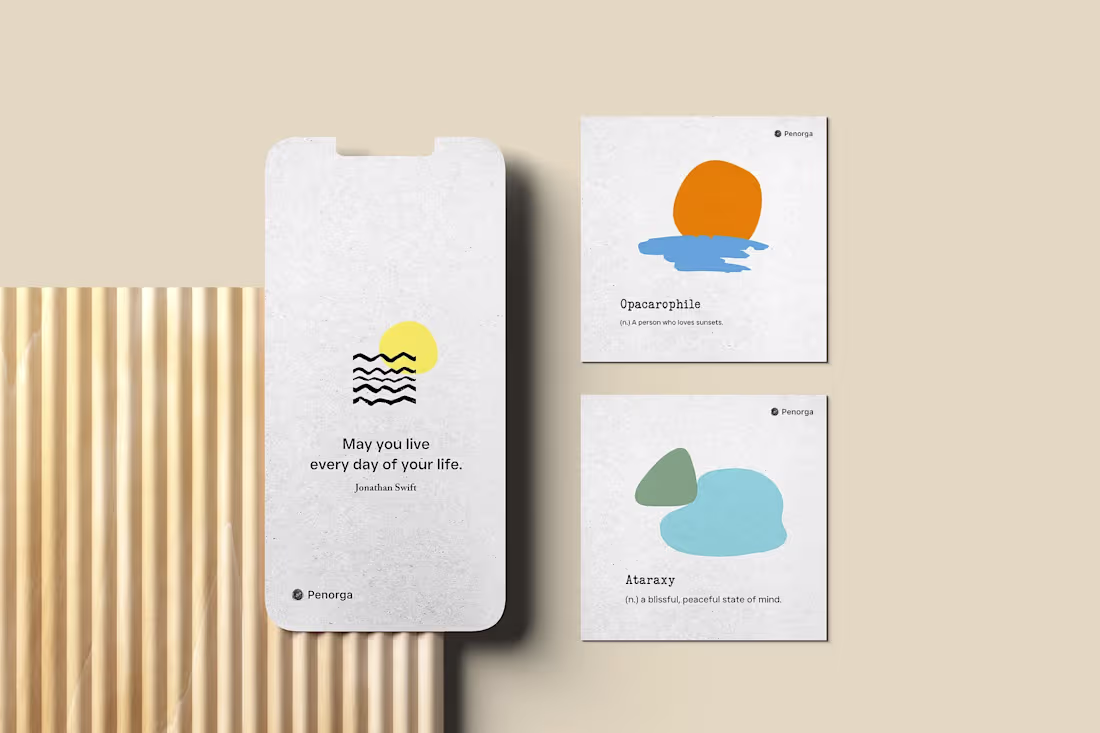
Something close to my heart.
Penorga isn’t just design, it’s personal.
Stillness, sunsets, the quiet art of living.
2
4
264
An old build that still teaches me humility. Every pixel reminds me how much I didn’t know
3
244
From one of my favourites project
3
224
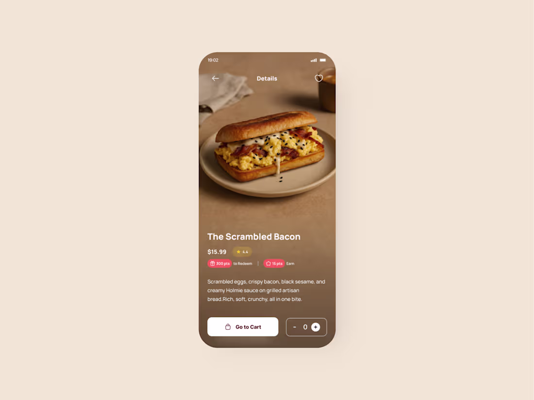
Food App for a Kuwaiti Company
4
3
287
One of the projects from the archives.
1
264
Something personal and very close to my heart. Will be launched in 3 years.
1
2
257
I was bored the other day.
2
219
Designed this website for Royal Drive about three years ago. An old project, but still a memorable part of my early design days.
3
3
222