
Mwanahamisi Juma
Healthcare Data Analyst | Claims,Operations & Readmission
New to Contra
Mwanahamisi is ready for their next project!
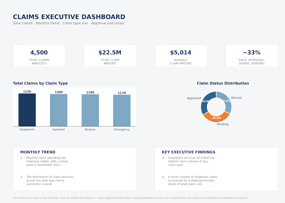
I ran statistical tests on 4,500 healthcare insurance claims worth $22.5M, half-expecting patient demographics to explain at least some of the cost variation.
They didn't. Age, income, gender, provider specialty, even claim type — none of it came back statistically significant against claim amount or status.
What actually stood out was Pediatrics. $4.9M in claims, the highest average claim amount of any specialty. Not a "who's filing the claim" problem — a specialty-specific one.
I built four Power BI dashboards (Executive, Patient Insights, Provider Performance, Claims Analysis) so this kind of pattern shows up as it happens, not just in a one-off report six months later.
If your team is still reviewing claims by demographic segment, this might be worth a second look.
0
11
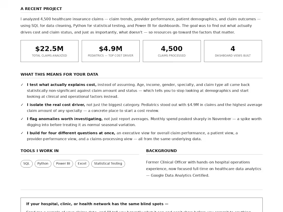
Where is the money going — and what is actually driving healthcare claim costs?
I analyzed 4,500 healthcare insurance claims worth 22.56M using SQL, Python, and Power BI to identify cost drivers, provider performance patterns, and inefficiencies in claims processing.
A few things stood out. Pediatrics accounted for 4.9M in claims, making it the largest expenditure driver among provider specialties. Outpatient services had the highest claim volume, while a small number of diagnosis codes accounted for a disproportionate share of total costs. Claim spending also peaked in November 2023.
I then tested whether patient demographics, provider specialty, and claim type were actually driving claim amounts or claim outcomes. The statistical tests found no significant associations, suggesting that clinical and operational factors may matter more than demographics alone.
Based on the findings, I recommended monitoring high-cost diagnoses and specialties, investigating the November spending spike, improving the handling of pending and denied claims, increasing electronic claim submission, and incorporating clinical and operational variables into future predictive models.
I built interactive Power BI dashboards covering executive KPIs, patient demographics, provider performance, and claims activity — giving healthcare teams a clearer view of where costs are concentrated and where operational problems need investigation.
Tools: SQL · Python · Power BI · Excel
0
50
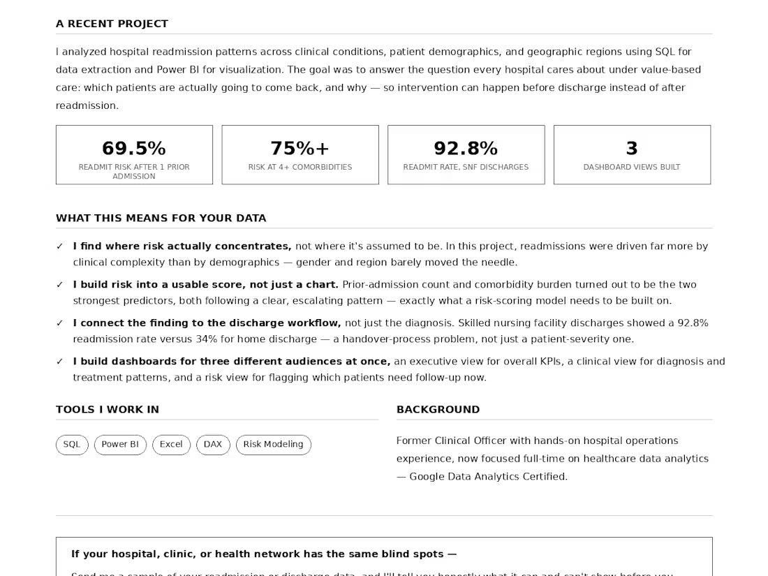
Which patients are most likely to be readmitted — and where should a hospital focus its limited follow-up resources?
I analyzed hospital readmission patterns using SQL, Power BI, and DAX, looking at diagnoses, prior readmissions, comorbidity burden, discharge disposition, insurance, demographics, and seasonal trends to identify where readmission risk was concentrated.
A few things stood out. Patients with no prior readmissions had a 27.79% readmission rate, compared with 69.50% after just one prior readmission. Patients with 4+ comorbidities reached 75.05%+, while high-risk conditions such as sepsis, COPD, heart failure, stroke, and kidney disease showed the highest readmission rates. Skilled nursing facility discharges were also particularly high at 92.80%.
The bigger opportunity was turning those patterns into action. I used the findings to define a practical high-risk flagging approach — prioritizing patients with previous readmissions, high comorbidity burden, high-risk diagnoses, or post-acute care needs for earlier follow-up, medication reconciliation, and stronger discharge coordination.
I built an interactive Power BI dashboard with executive, clinical, and risk-focused views, turning hospital readmission data into something healthcare teams could actually use to prioritize patients and target intervention where it matters most.
Tools: SQL · Power BI · DAX · Excel
0
67
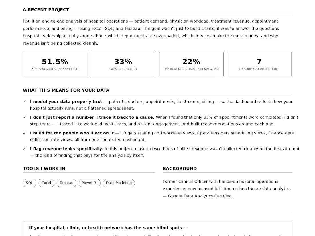
I analyzed a hospital's full operations picture — patient demand, physician workload, treatment costs, appointment performance, and billing — using Excel, SQL, and Tableau, to help hospital leadership see where things were quietly going wrong before the losses added up.
A few things stood out. Pediatrics and Dermatology carried the highest patient volume and physician workload — meaning a small group of doctors were absorbing most of the pressure, which is a staffing risk if any of them become unavailable. On the revenue side, Chemotherapy and MRI were the top earners (11.6% and 10.5% of total revenue), driven by cost and case complexity rather than sheer demand.
The bigger problems were in the pipeline itself: only 23% of appointments were actually completed, with 26% no-shows and 25.5% cancellations — nearly half the appointments never happened. And on the billing side, only 32% of revenue was cleanly collected; 34% sat pending and 33% failed outright. That's close to two-thirds of billed revenue not coming in on the first try.
So what does a hospital actually do with this? Based on the data, I recommended: investigating what's driving the near-50% no-show/cancellation rate and testing fixes like reminders or flexible rebooking; reviewing the billing workflow behind the pending/failed payments, since documentation and payer communication were the likely starting points; adding block scheduling or dedicated clinics for high-cost services like Chemotherapy and MRI to raise equipment utilization; and rebalancing appointment volume away from the Central branch, which was absorbing most of the demand while Eastside and Westside sat underused.
I built interactive Tableau dashboards so HR, Operations, and Finance could each track the KPIs relevant to their team in real time — turning a pile of scattered hospital data into something leadership could actually act on.
0
68