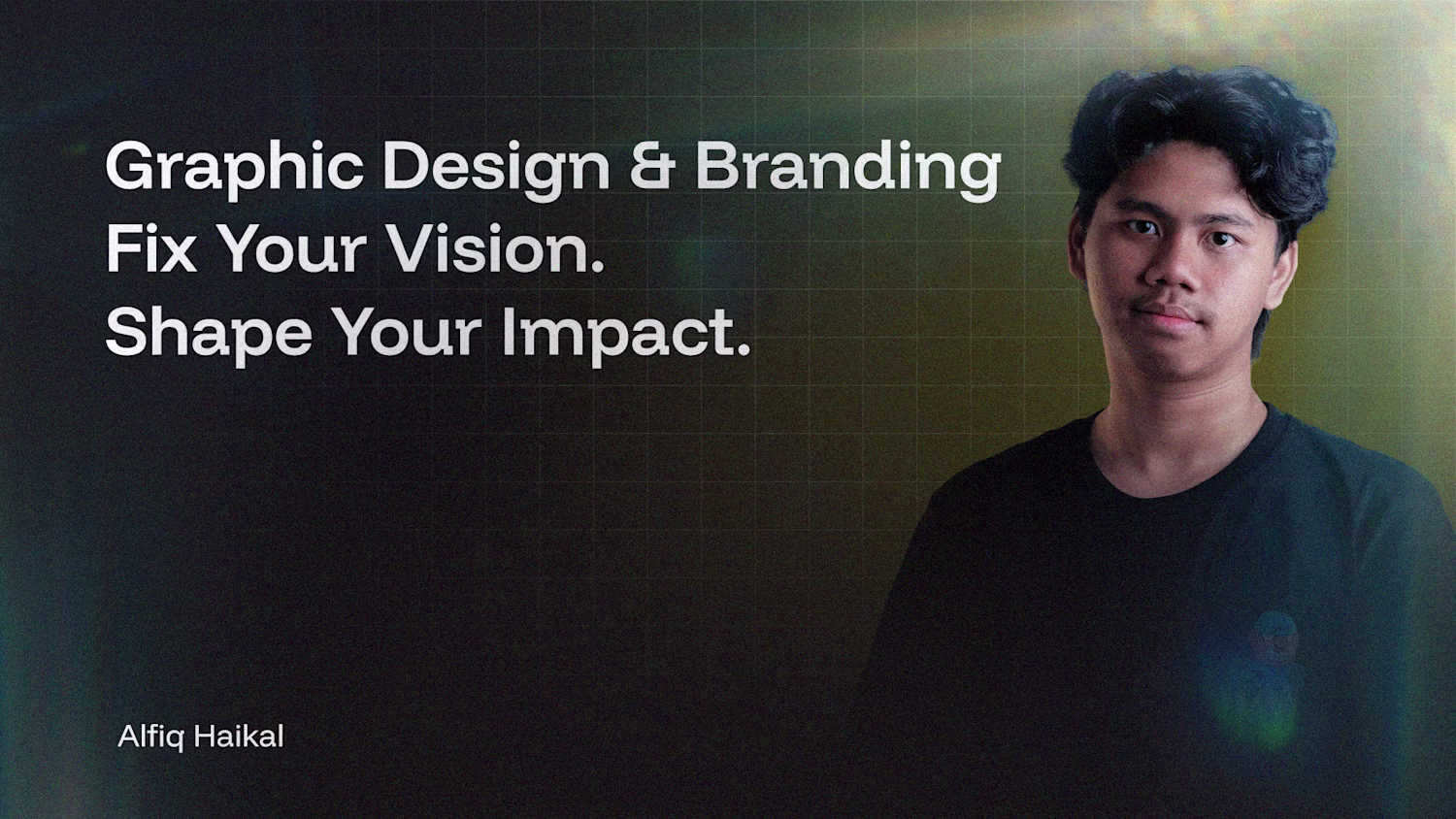
Alfiq Haikal
Graphic Design | Branding for Businesses
New to Contra
Alfiq is ready for their next project!
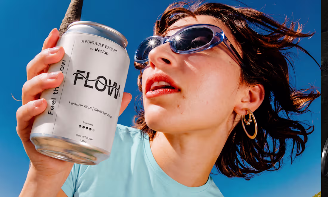
CTRL & FLOW is a visual identity and packaging design concept for an RTD coffee brand developed within the Erion Space ecosystem. The project explores two distinct consumer mindsets: CTRL, representing focus and productivity, and FLOW, representing creativity and relaxation.
The challenge was creating two contrasting personalities while maintaining a cohesive brand system. Through typography, visual hierarchy, and packaging applications, the identity was designed to ensure consistency across touchpoints while giving each product its own recognizable character.
Services:
• Brand Identity Design
• Packaging Design
• Art Direction
• Visual System Development
0
12
Can design do more than just look good?
Fixive was created as a platform for exploring graphic design beyond aesthetics. Through visual content, insights, and creative discussions, Fixive aims to help people understand how design influences communication, perception, and decision-making.
The project focuses on making design knowledge more accessible by sharing practical insights, visual principles, and strategic thinking behind effective communication. Every piece of content is designed to encourage curiosity, reflection, and a deeper appreciation of design as a meaningful tool.
The result is a growing creative space where designers, business owners, and curious learners can discover how visual communication shapes the way we understand the world.
https://www.instagram.com/fixive.id/
1
159
How do you build excitement for a music event before the first performer even takes the stage?
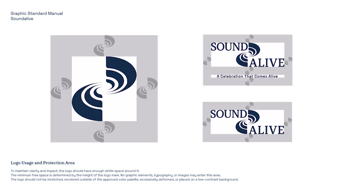
Soundlive is an annual music event by Erion that brings together audiences, performances, and nationally recognized headline acts in a single live experience. The challenge was to create a visual identity capable of capturing the energy of live music while remaining adaptable across multiple event touchpoints.
My role covered the development of the event's visual identity, from logo design and brand system to promotional materials, social media assets, stage visuals, and event applications. Every element was designed to create a cohesive experience that audiences could recognize before, during, and after the event.
The result is a distinctive event identity that strengthens brand recognition, enhances audience engagement, and supports a memorable live music experience on a larger scale.
1
166
How can a recurring event create a stronger sense of community?
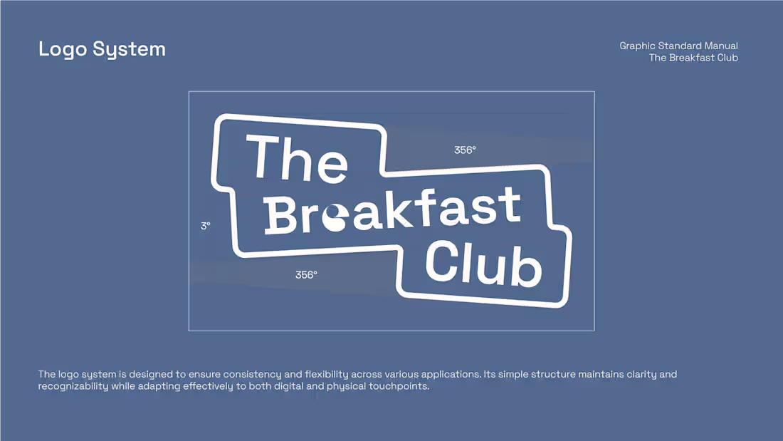
The Breakfast Club is a signature event series by Erion, designed to bring people together through meaningful conversations and shared experiences in a relaxed breakfast setting.
The visual identity was developed to capture the warmth, friendliness, and social energy that define the event. Through a combination of approachable typography, vibrant visual elements, and consistent branding, the identity helps distinguish The Breakfast Club while remaining connected to the broader Erion ecosystem.
The result is a recognizable event brand that strengthens community engagement and creates a memorable experience beyond the gathering itself.
1
167
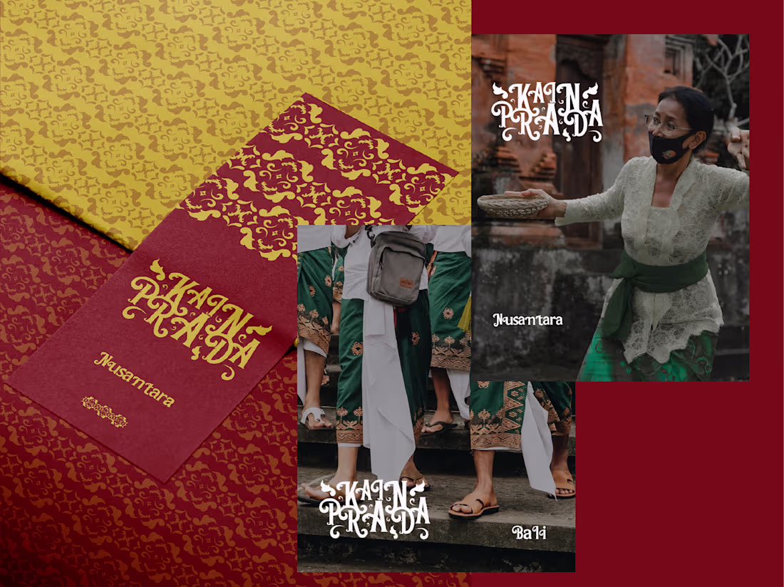
What happens when traditional textiles become typography?
Kain Prada explores the intersection of cultural heritage and type design. Inspired by the ornamental patterns found in Nusantara textiles, this custom display typeface transforms traditional visual elements into expressive and contemporary letterforms.
Rather than simply replicating cultural motifs, the project reinterprets them through typography, creating a distinctive visual system that celebrates heritage while remaining relevant in modern design contexts.
The result is a typeface that balances tradition, craftsmanship, and visual expression allowing culture to be experienced through letters.
1
215