pro
Monodeep Samanta
Web and Mobile App UX/UI Designer 🇬🇧
Ready for work
Monodeep is ready for their next project!

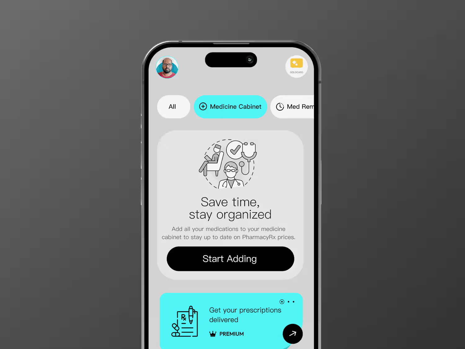

I’ve been working on a concept called Respira, focused on making breathing and recovery data feel easier to understand and less clinical.
The main challenge was not the visuals. It was deciding what the user should understand first. So I structured the experience around three...


I created this cancellation and retention workflow in Figma to explore one simple question:
How do you reduce churn without making cancellation frustrating?
Instead of designing just the screens, I mapped the full flow, user decisions, retention points, fallback options, and final...

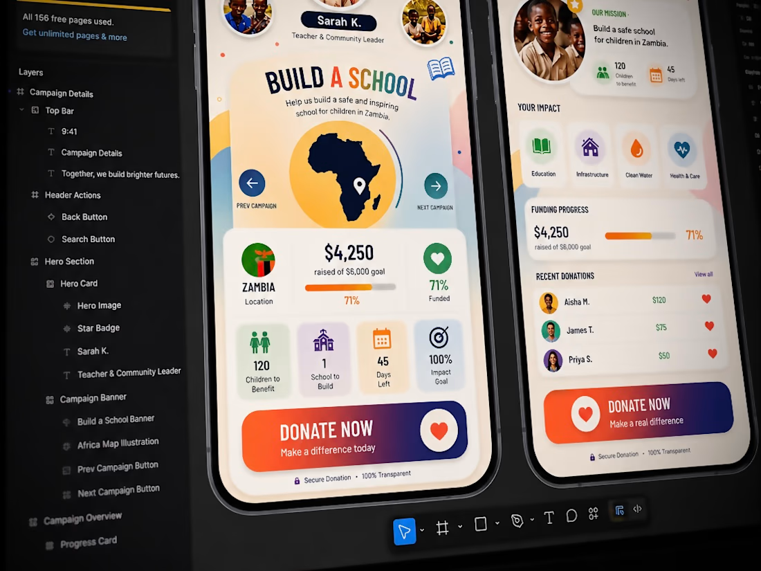
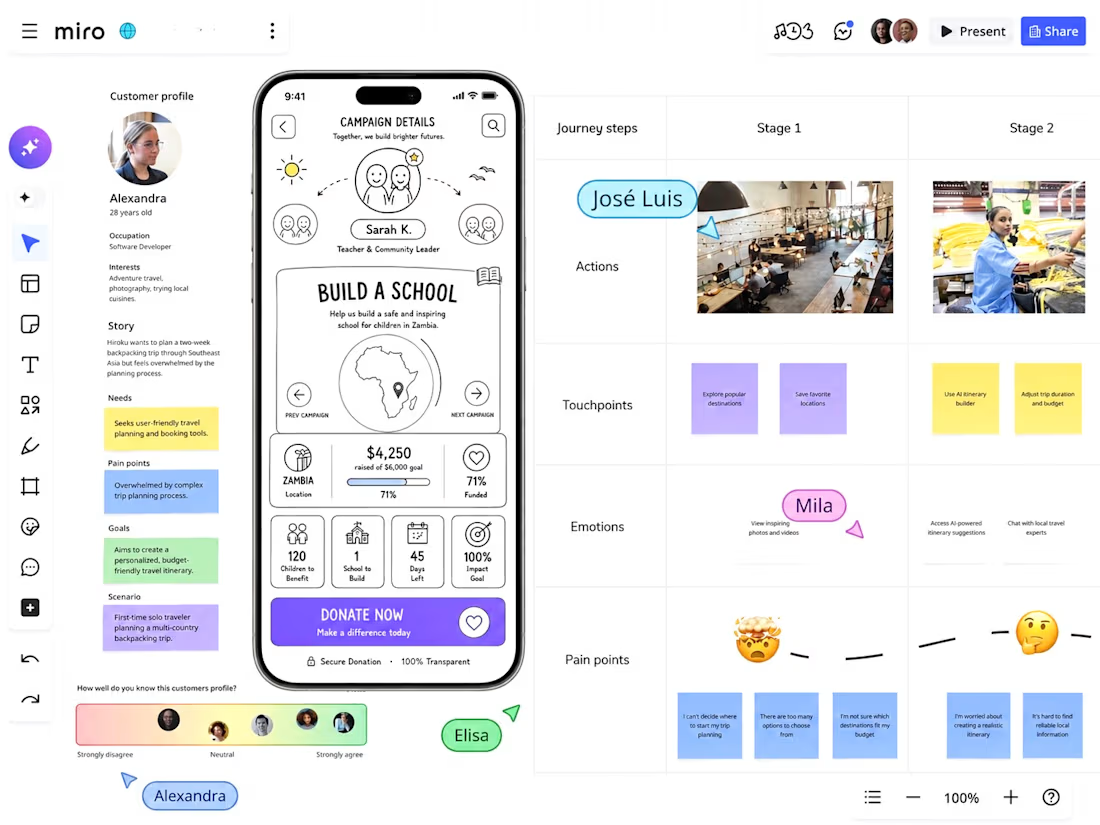
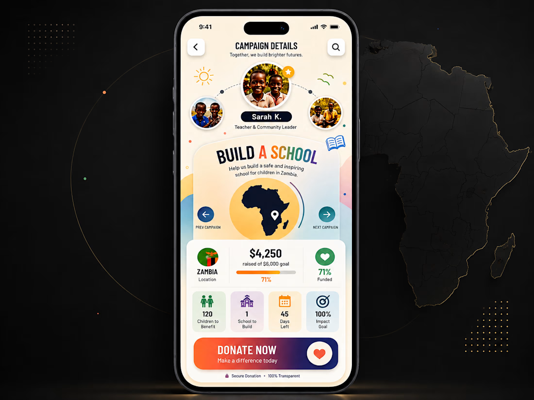
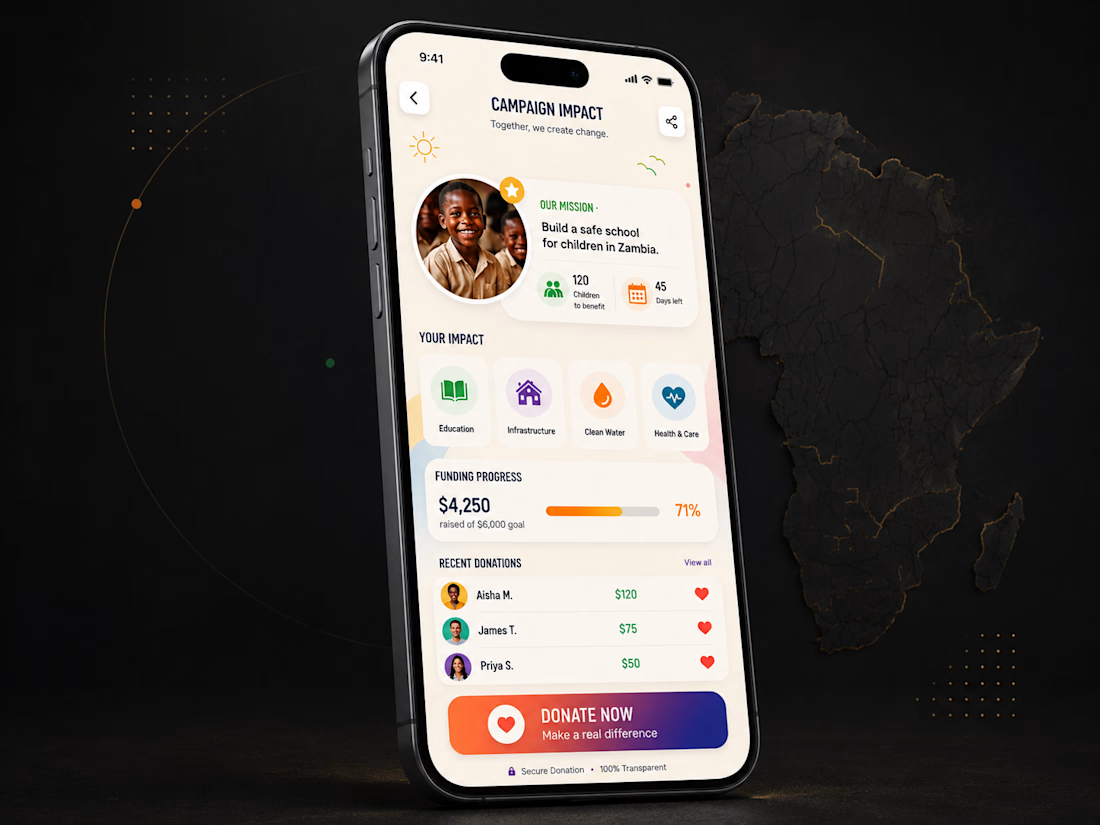
Turning a complex donation journey into a simple, emotional experience.
From early wireframes to polished UI, the challenge was balancing storytelling, impact data, trust, and a clear donation action without overwhelming the user.
Less noise. Clearer hierarchy. Stronger purpose