Matea Raić
Startup-focused product designer using AI to move fast.
- 1x
- Hired
- 5.00
- Rating
- 36
- Followers
I am a product designer. I have never shipped a solo app before. I built Zorya anyway.
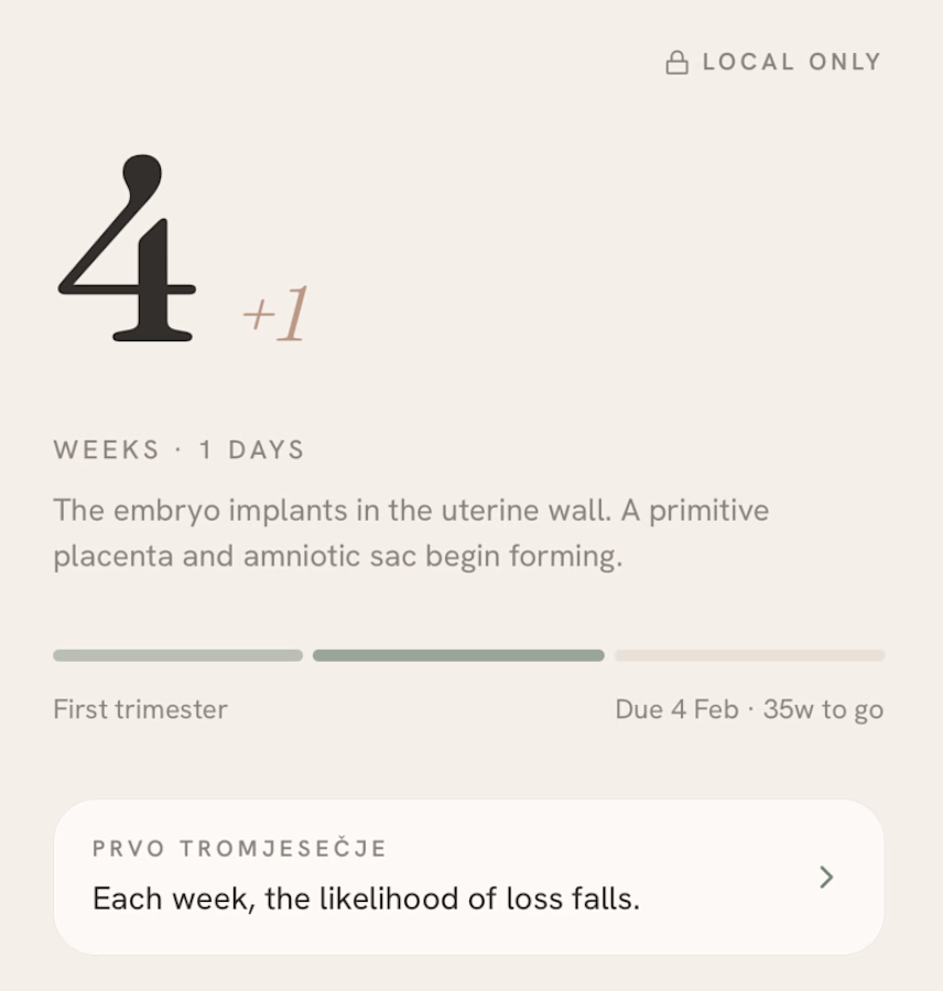
It started during my own pregnancy. I went looking for a tracker and found the same thing everywhere: apps that required an account, uploaded your data to a server, and charged you every month...
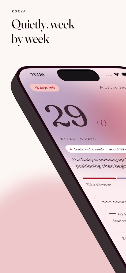
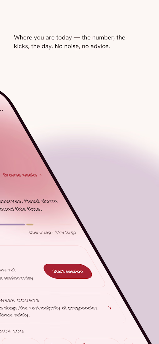
Pregnancy apps are cluttered, US-centric, and tell you what to think instead of just tracking what you log.
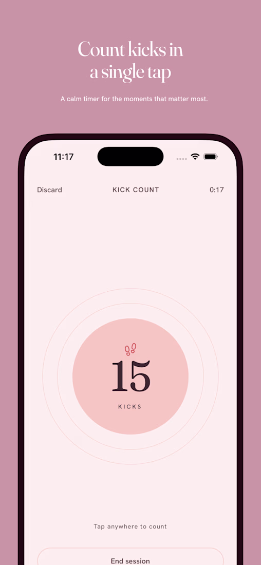
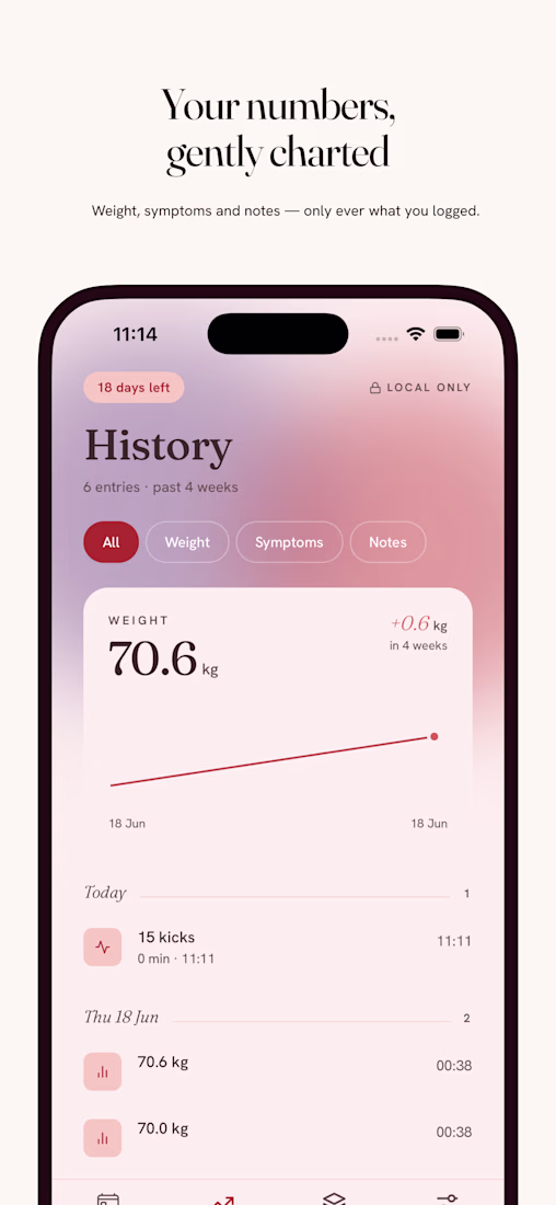
I'm building an alternative, local-first, no accounts, no backend. Your data stays on your phone. No ads, no algorithms, no unsolicited advice.
Just a calm, private space to...
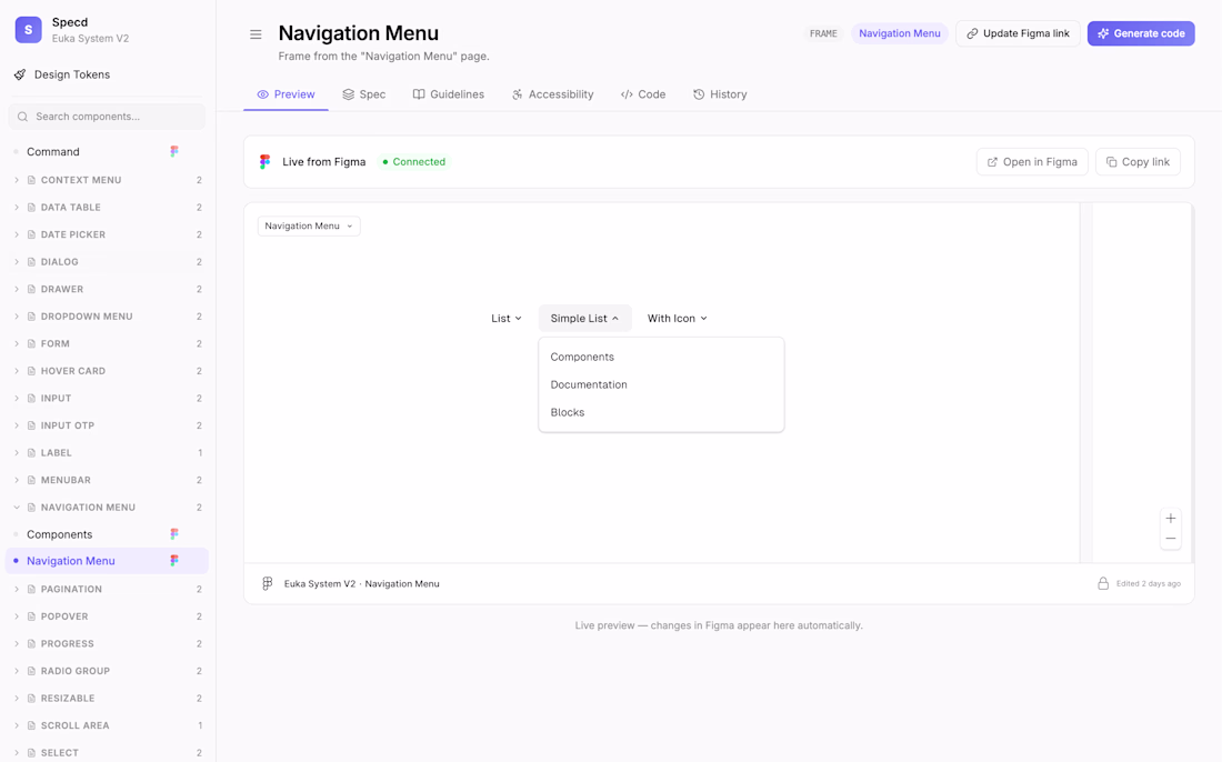
How do you currently document your design system?
So this happened.
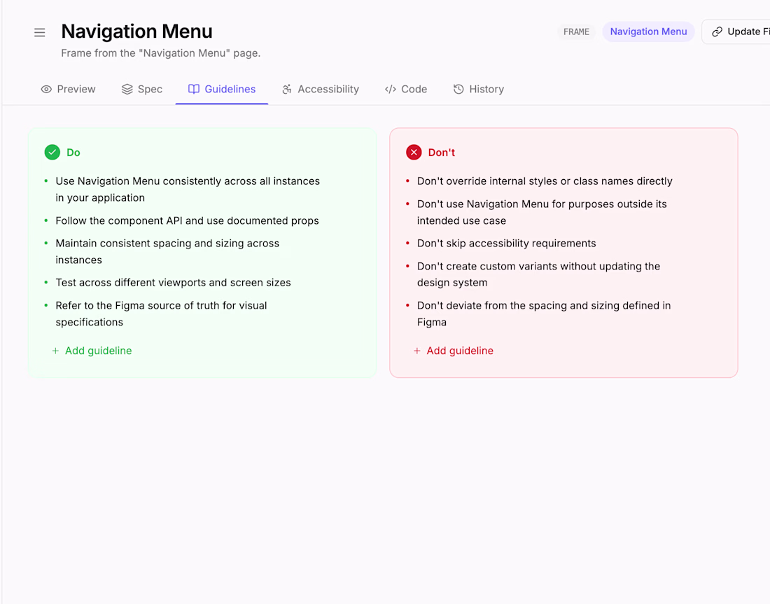
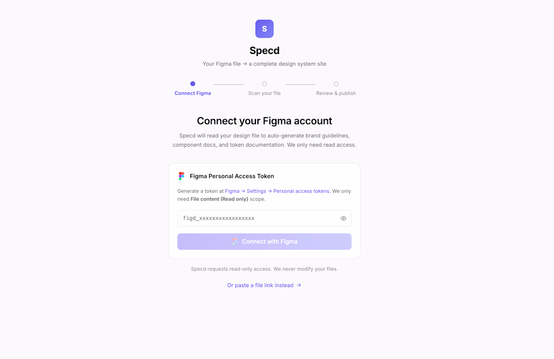
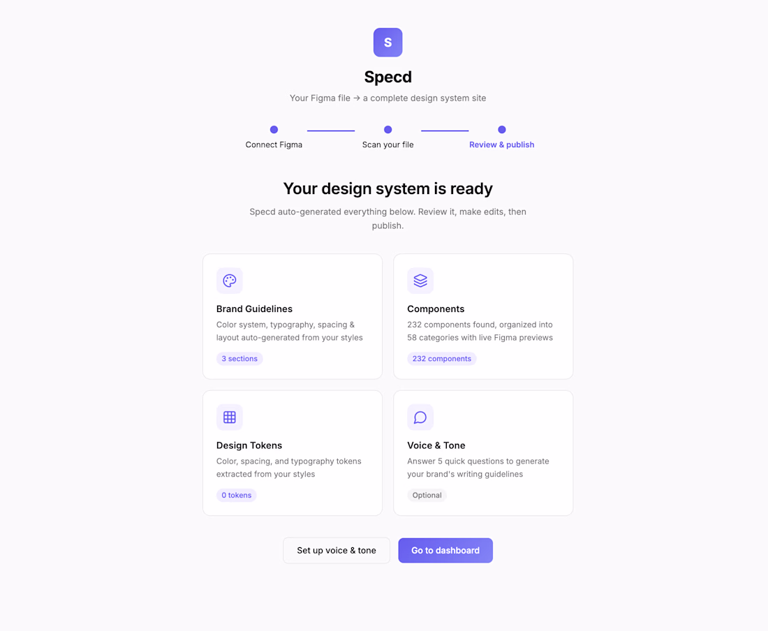
Designers connect their Figma file once and Specd auto-generates brand guidelines, component specs, and token documentation. Developers get their own side of each component page to add real code, TypeScript types, and implementation notes. Every component shows...
I'm building a custom design system for a client and realized, once I hand this off, their devs and stakeholders need to understand it. Not just the Figma file, but the reasoning, the rules, the specs.
Tired of that cycle: build in Figma, then explain it over Slack.
So I'm...