pro
Matea Raić
Startup-focused product designer using AI to move fast.
- 1x
- Hired
- 5.00
- Rating
- 32
- Followers
So this happened.
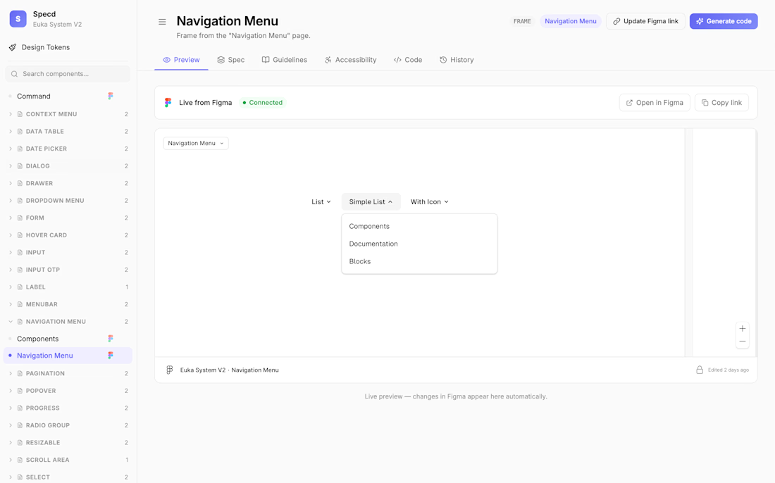
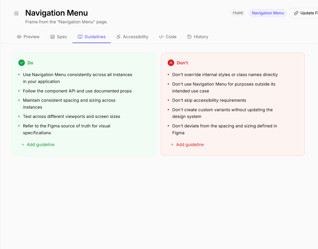
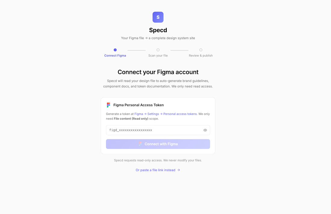
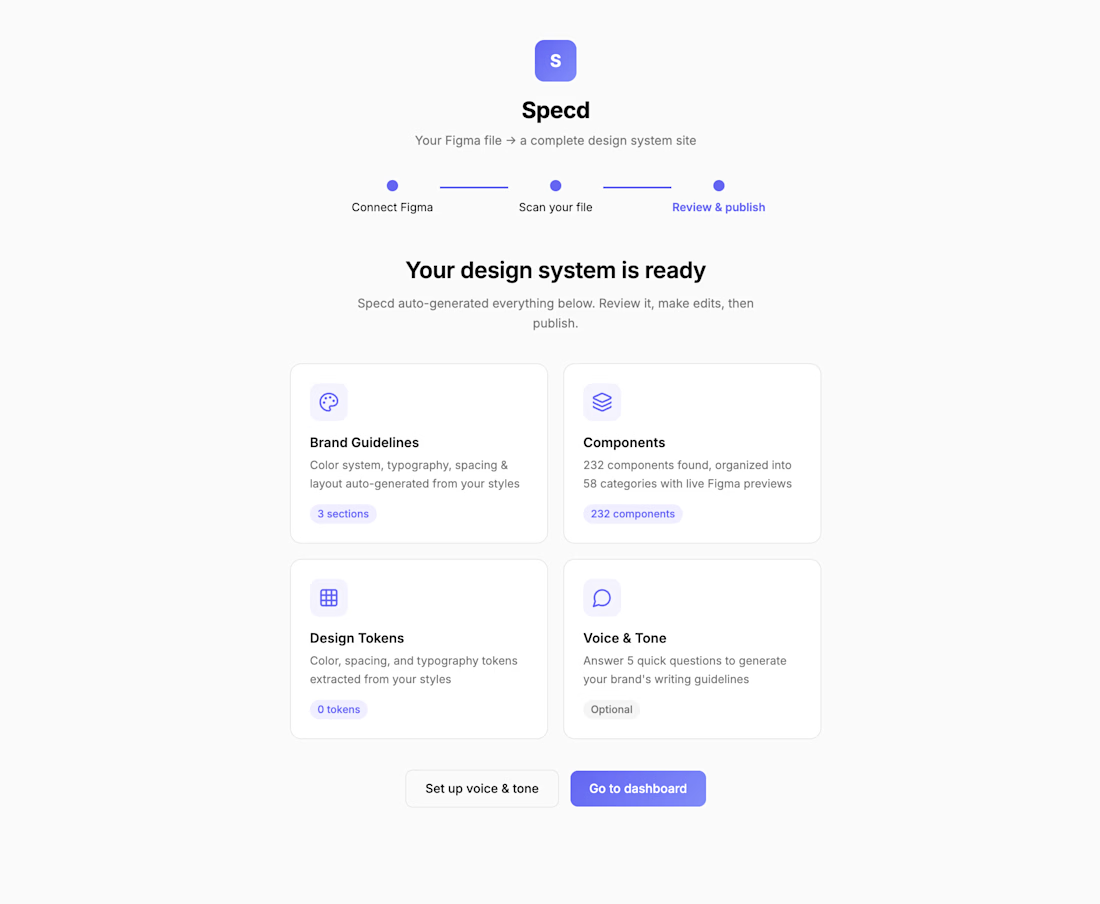
Designers connect their Figma file once and Specd auto-generates brand guidelines, component specs, and token documentation. Developers get their own side of each component page to add real code, TypeScript types, and implementation notes. Every component shows...
How do you currently document your design system?
I'm building a custom design system for a client and realized, once I hand this off, their devs and stakeholders need to understand it. Not just the Figma file, but the reasoning, the rules, the specs.
Tired of that cycle: build in Figma, then explain it over Slack.
So I'm...
AI has become my go-to for eliminating repetitive tasks. Instead of spending hours on something tedious, I just build a quick tool to handle it for me.
Latest example: I made a thumbnail and mockup generator for my Etsy shop. Upload an image, get ready-to-use mockups and PDFs in...
