


The average app loses 77% of users within the first 3 days.
Not because the app is bad.
Because onboarding is broken.
Here's what broken onboarding does:
→ Asks for permissions before showing value
→ Forces sign-up before letting users explore
→ Dumps features instead of guiding one action
Here's what great onboarding does:
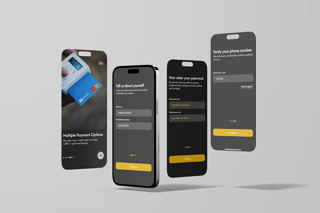
→ Shows the core value in 30 seconds
→ Asks for only what's needed, when it's needed
→ Guides the user to their first "win"
The first session is the most important session.
If users don't feel value in 3 minutes, they're gone.
Design the "aha moment", then design backwards from it.
Below is my design for an Uber-style app, with the simplest possible onboarding.
🚀 What app has the best onboarding you've ever seen? Drop it below
0
86
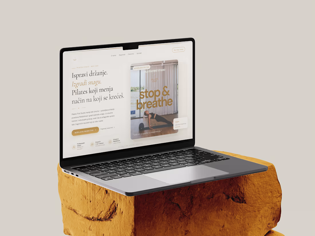
Project: Digital Brand Launch – Pilates First Studio
The Brief: Transform a service-based business with no prior web presence into a high-end digital brand.
I delivered a professional, modern website tailored to a premium audience. The project focused on:
Solving the Visibility Gap: Creating a professional online anchor for a previously offline business.
Aesthetic Excellence: An elegant, minimalist design focused on the wellness industry.
User-Centric UX: Tailoring the flow for women seeking a high-end, supportive fitness environment.
Technical Performance: A mobile-first build to ensure accessibility and high conversion rates on all devices.
8
8
240
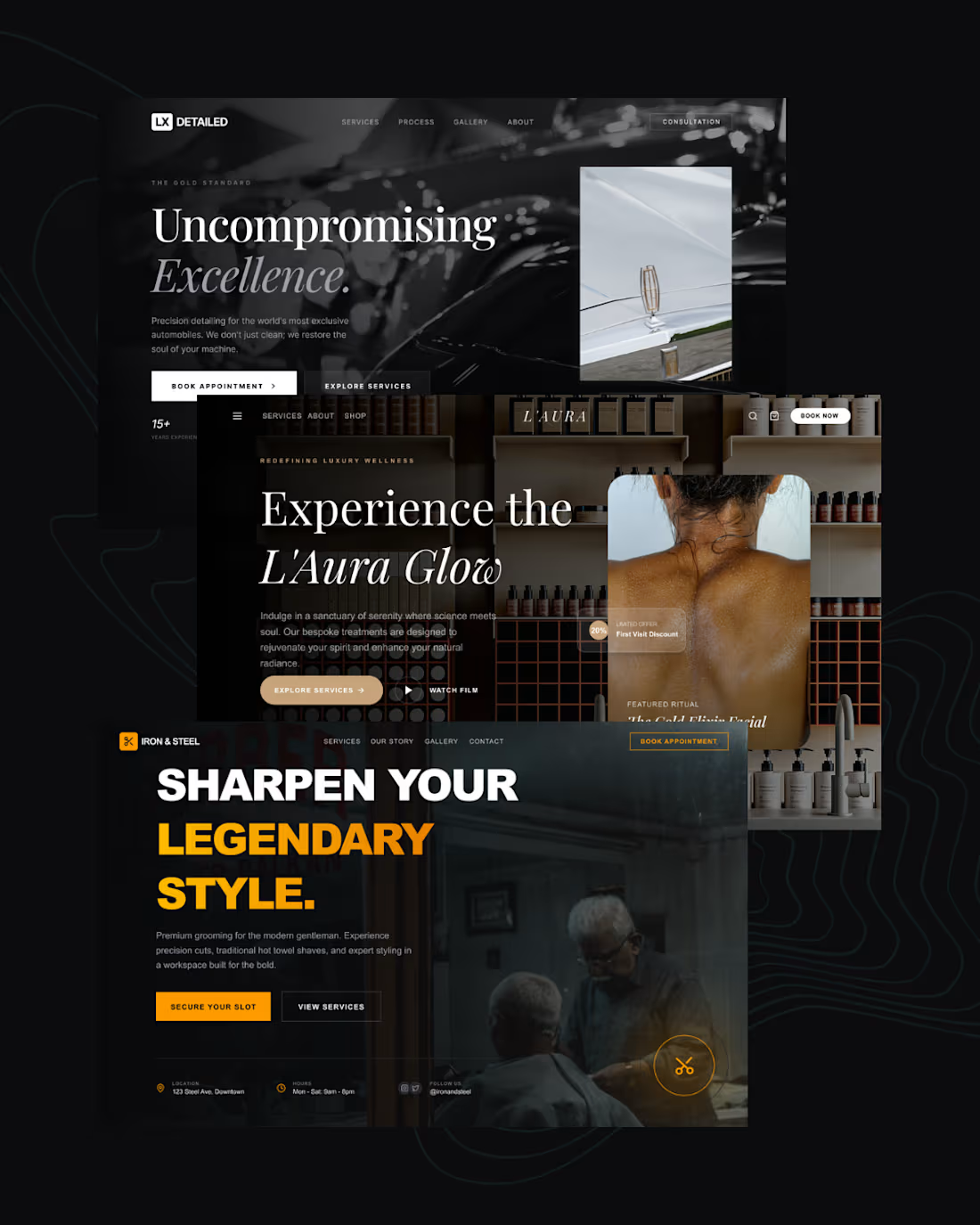
🖤 3 landing pages. 3 different industries. One design system that converts.
I just wrapped up three high-converting landing pages - and I want to break down exactly how I approached each one.
The secret? Every decision was intentional.
Here's what went into each build:
LX Detailed (Luxury Auto Detailing)
Dark, cinematic, editorial. I used a near-black base with white serif typography to signal premium positioning. The CTA hierarchy was clear - one primary action, one secondary. No noise.
L'Aura (Luxury Wellness & Spa)
Warmth over sharpness. I leaned into soft contrast, earthy tones, and generous whitespace to make the visitor feel relaxed before they even read a word. Trust is built before the scroll.
Iron & Steel (Men's Grooming)
Bold, unapologetic, high-energy. Heavy black backgrounds, oversized type, and a punchy amber accent color. This one had to feel like the barbershop itself - confident and no-frills.
What these three have in common:
→ A single, dominant headline that speaks to identity - not just features
→ One clear CTA above the fold
→ Color psychology matched to the target audience
→ Imagery that sells the feeling, not the product
Most landing pages fail because they try to say everything. These work because they each say one thing louder than anything else.
4
114
Designing beyond search.
For the Figma × Contra Makeathon, I created AURA — Travel by Feeling, an interactive prototype that replaces filters with emotion-driven discovery.
Users don’t scroll or search.
They move through mood, intensity, and atmosphere — and the interface transforms with them.
Built entirely in Figma Make, this project explores how freelancers and designers can push digital experiences beyond traditional UI patterns.
Would love to hear your thoughts.
Try it out here, responsive for both desktop and mobile:
🔗https://auratravelguide.figma.site/
LinkedIn: https://shorturl.at/eLZZ2
Community file: https://shorturl.at/lpkWj
6
15
493