The network for creativity
Join 1.25M professional creatives like you
Connect with clients, get discovered, and run your business 100% commission-free
Creatives on Contra have earned over $150M and we are just getting started
Back to feedPost
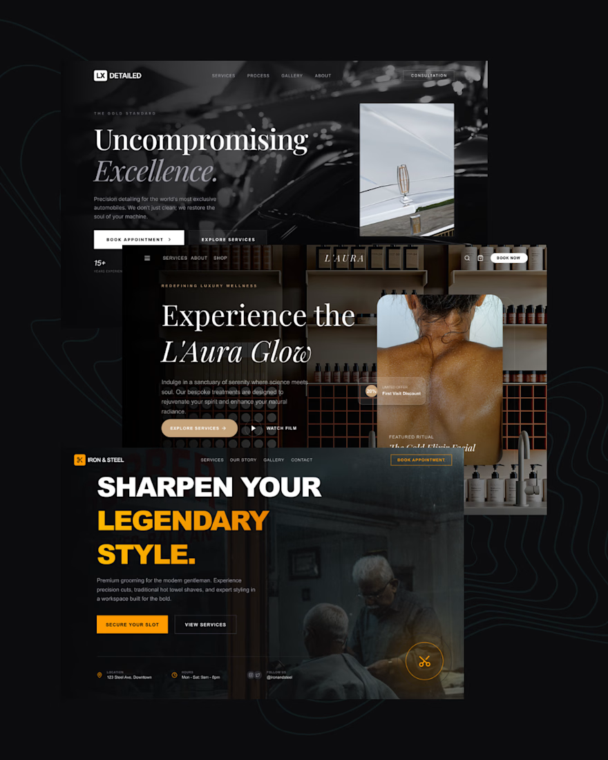
🖤 3 landing pages. 3 different industries. One design system that converts.
I just wrapped up three high-converting landing pages - and I want to break down exactly how I approached each one.
The secret? Every decision was intentional.
Here's what went into each build:
LX Detailed (Luxury Auto Detailing)
Dark, cinematic, editorial. I used a near-black base with white serif typography to signal premium positioning. The CTA hierarchy was clear - one primary action, one secondary. No noise.
L'Aura (Luxury Wellness & Spa)
Warmth over sharpness. I leaned into soft contrast, earthy tones, and generous whitespace to make the visitor feel relaxed before they even read a word. Trust is built before the scroll.
Iron & Steel (Men's Grooming)
Bold, unapologetic, high-energy. Heavy black backgrounds, oversized type, and a punchy amber accent color. This one had to feel like the barbershop itself - confident and no-frills.
What these three have in common:
→ A single, dominant headline that speaks to identity - not just features
→ One clear CTA above the fold
→ Color psychology matched to the target audience
→ Imagery that sells the feeling, not the product
Most landing pages fail because they try to say everything. These work because they each say one thing louder than anything else.
The network for creativity
Join 1.25M professional creatives like you
Connect with clients, get discovered, and run your business 100% commission-free
Creatives on Contra have earned over $150M and we are just getting started
Related posts
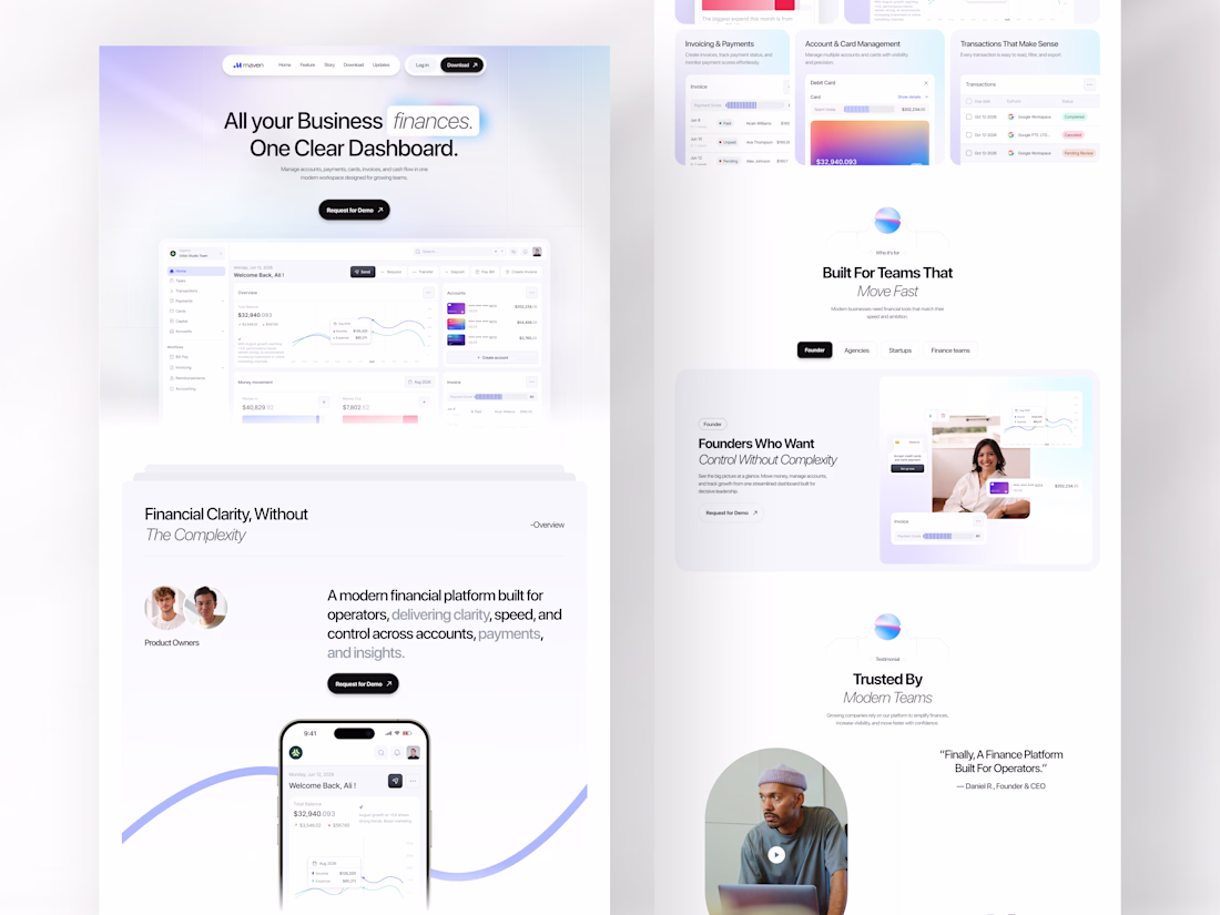
Every growing business has the same problem: finances spread across too many tools, too many tabs, and too much noise.
Maven was designed to end that. A finance SaaS landing page built for operators, founders, agencies, and startups who need one clear dashboard where accounts, payments, invoicing, card management, and cash flow all live together without fighting for attention.
All your business finances. One clear dashboard. The headline says everything, and the design proves it.
This is what a SaaS landing page looks like when it respects the intelligence of the people it's selling to.
Does this feel like a dashboard your finance team would actually trust? 👇
Tools: Figma , Jitter
#SaaSDesign #LandingPage #WebDesign #FintechUI #UIDesign #ContraFreelance #ProductDesign #DashboardDesign
Nice use of whitespace. It keeps everything focused.
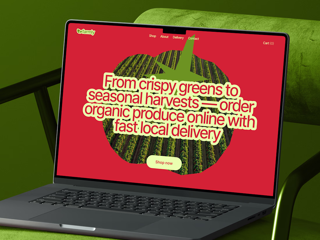
New concept of grocery store website. Excited to hear your feedback! 🚀
Such a vibrant and refreshing take on grocery e-commerce! The bold color choice, heavy typography, and clever tomato image mask create an incredibly memorable hero section. Love this! 🥦🍅
Working on A NEW PROJECT
So we are exploring the Hero Section, which of these will make you stay in the site and buy the product
- Static Hero
- Motion Hero
13 voted
34%
25 voted
66%
38 votes
Closed
For conversion, I'd vote static
Trending
Claude
Claude has entered the design space. How are you using Claude Design?
Contra University
Learn from expert creatives how to earn more using next-gen AI tools.
fifaworldcup2026
The World Cup is here and the whole world's watching. How are you designing for the world stage?
creativeaiflow
Creative AI workflows are evolving. What tools do you use, and what are their strengths and weaknesses?
freelancerlife
Freelancer life is wins, pivots, and everything in between. What’s yours right now?