
The average app loses 77% of users within the first 3 days.
Not because the app is bad.
Because onboarding is broken.
Here's what broken onboarding does:
→ Asks for permissions before showing value
→ Forces sign-up before letting users explore
→ Dumps features instead of guiding one action
Here's what great onboarding does:
→ Shows the core value in 30 seconds
→ Asks for only what's needed, when it's needed
→ Guides the user to their first "win"
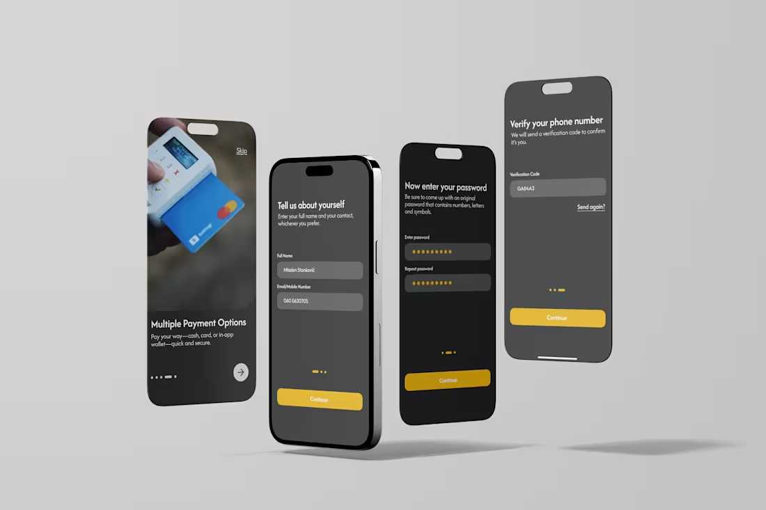
The first session is the most important session.
If users don't feel value in 3 minutes, they're gone.
Design the "aha moment", then design backwards from it.
Below is my design for an Uber-style app, with the simplest possible onboarding.
🚀 What app has the best onboarding you've ever seen? Drop it below
0
58
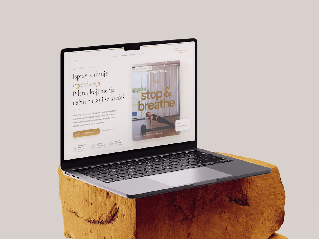
Project: Digital Brand Launch – Pilates First Studio
The Brief: Transform a service-based business with no prior web presence into a high-end digital brand.
I delivered a professional, modern website tailored to a premium audience. The project focused on:
Solving the Visibility Gap: Creating a professional online anchor for a previously offline business.
Aesthetic Excellence: An elegant, minimalist design focused on the wellness industry.
User-Centric UX: Tailoring the flow for women seeking a high-end, supportive fitness environment.
Technical Performance: A mobile-first build to ensure accessibility and high conversion rates on all devices.
8
8
190
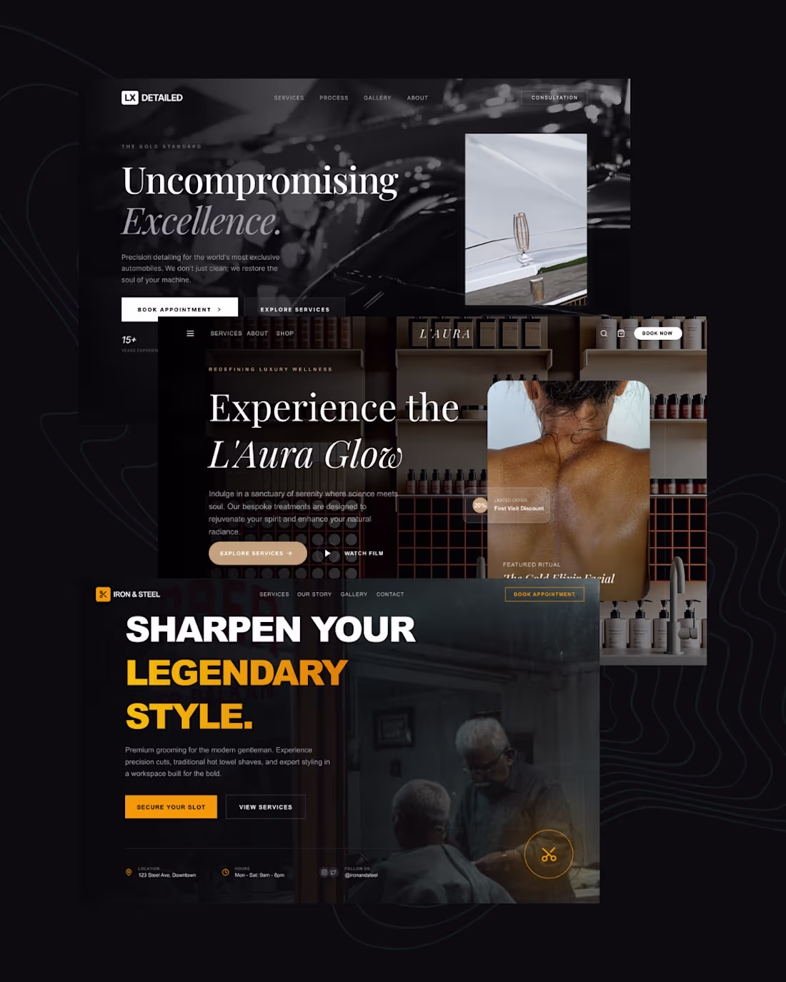
🖤 3 landing pages. 3 different industries. One design system that converts.
I just wrapped up three high-converting landing pages - and I want to break down exactly how I approached each one.
The secret? Every decision was intentional.
Here's what went into each build:
LX Detailed (Luxury Auto Detailing)
Dark, cinematic, editorial. I used a near-black base with white serif typography to signal premium positioning. The CTA hierarchy was clear - one primary action, one secondary. No noise.
L'Aura (Luxury Wellness & Spa)
Warmth over sharpness. I leaned into soft contrast, earthy tones, and generous whitespace to make the visitor feel relaxed before they even read a word. Trust is built before the scroll.
Iron & Steel (Men's Grooming)
Bold, unapologetic, high-energy. Heavy black backgrounds, oversized type, and a punchy amber accent color. This one had to feel like the barbershop itself - confident and no-frills.
What these three have in common:
→ A single, dominant headline that speaks to identity - not just features
→ One clear CTA above the fold
→ Color psychology matched to the target audience
→ Imagery that sells the feeling, not the product
Most landing pages fail because they try to say everything. These work because they each say one thing louder than anything else.
4
87
Designing beyond search.
For the Figma × Contra Makeathon, I created AURA — Travel by Feeling, an interactive prototype that replaces filters with emotion-driven discovery.
Users don’t scroll or search.
They move through mood, intensity, and atmosphere — and the interface transforms with them.
Built entirely in Figma Make, this project explores how freelancers and designers can push digital experiences beyond traditional UI patterns.
Would love to hear your thoughts.
Try it out here, responsive for both desktop and mobile:
🔗https://auratravelguide.figma.site/
LinkedIn: https://shorturl.at/eLZZ2
Community file: https://shorturl.at/lpkWj
6
15
462
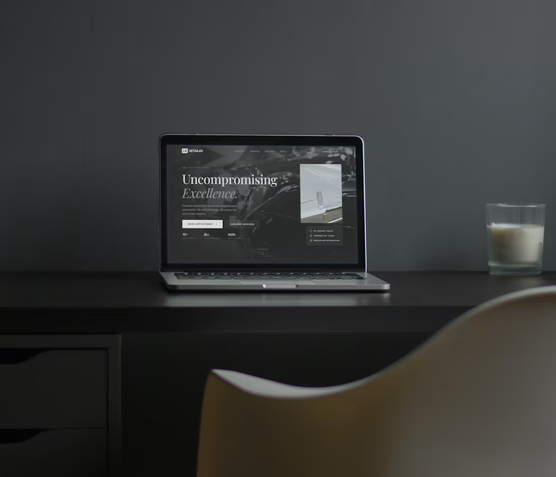
Just started working on a new website for a car detailing brand, what do you think of the Hero section? Let me know!
Lately I really focused on providing high converting landing pages to service-based businesses.
2
2
146
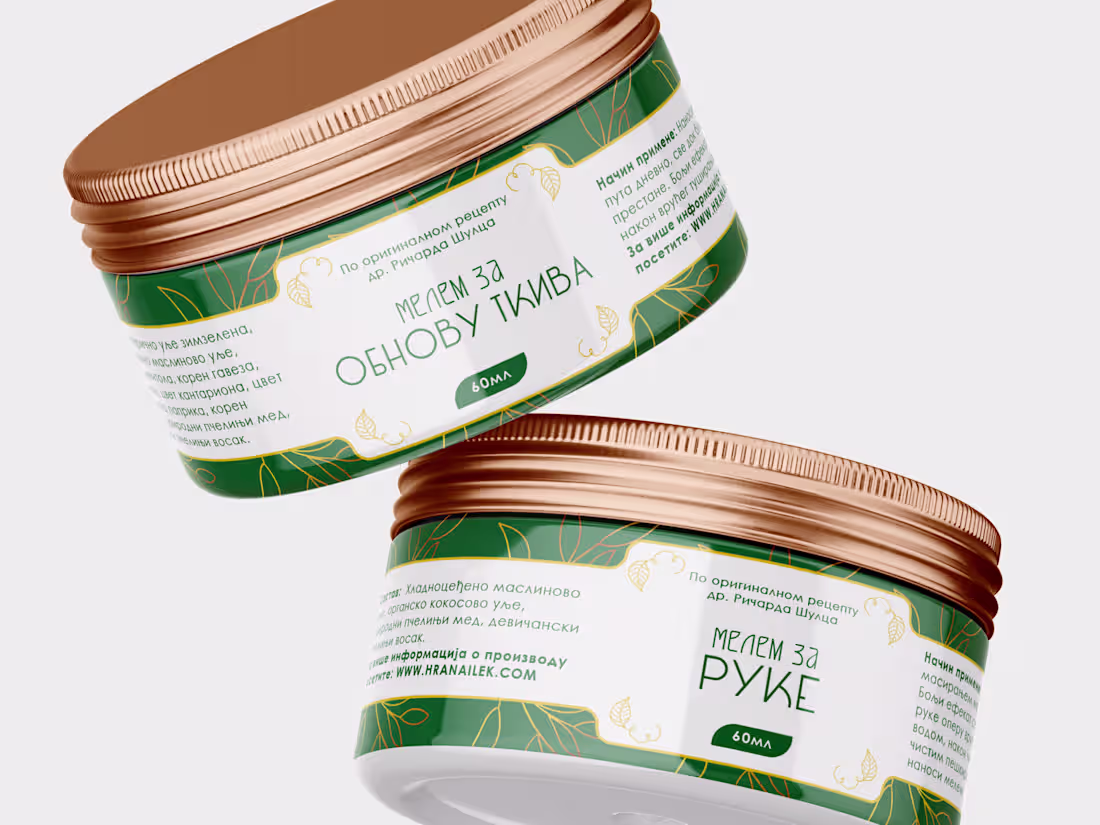
I am exited to share this presentation of a recent project I worked on. The scope was big - the results even bigger! After delivering almost 70 new packaging designs for a wide variety of organic and bee-based products, the sales spiked up to 40% more! Once again we have proven that when you have a quality product with premium looking design - exceptional results are inevitable. The project is not done however, the next stage is completing a new logo/brand identity and a new web shop. If you wish to hire me to make your product sell more, don't hesitate to contact me.
2
144
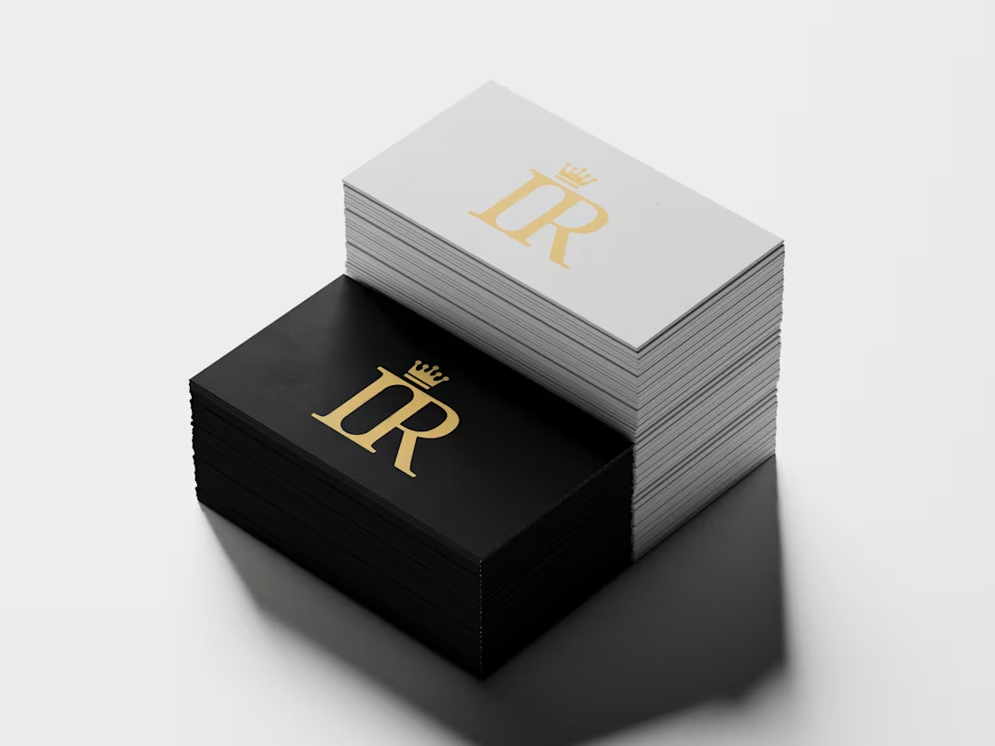
The Imperium Relax visual identity is a masterclass in symbolic precision, designed to convey both authority and serenity through a sophisticated monogrammatic system. The logo is anchored by a custom "IR" monogram where the letters are expertly merged to create a unified, regal mark. A key innovation of the design is the intentional use of negative space within the "I," which reveals a "Relax capsule" silhouette—a direct nod to the brand's anti-stress product. This geometric relationship is further refined through strict proportional guidelines, ensuring the width of the internal capsule dictates the scale of the crowning element.
2
132
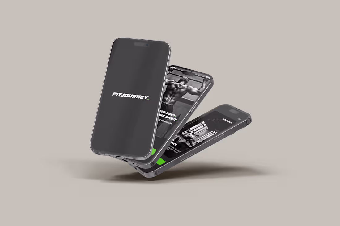
FitJourney App!
FitJourney offers a sleek and energizing interface designed to motivate users at every step of their fitness journey. The UI emphasizes visual clarity with bold progress bars, intuitive icons for workout categories, and a dynamic dashboard that highlights daily activity and goals. UX-wise, the app makes it easy to plan routines, track nutrition, and monitor performance with minimal taps. Transitions between screens are smooth, and features like workout reminders and post-session summaries are clearly prioritized to reduce cognitive load while keeping users engaged.
19
235
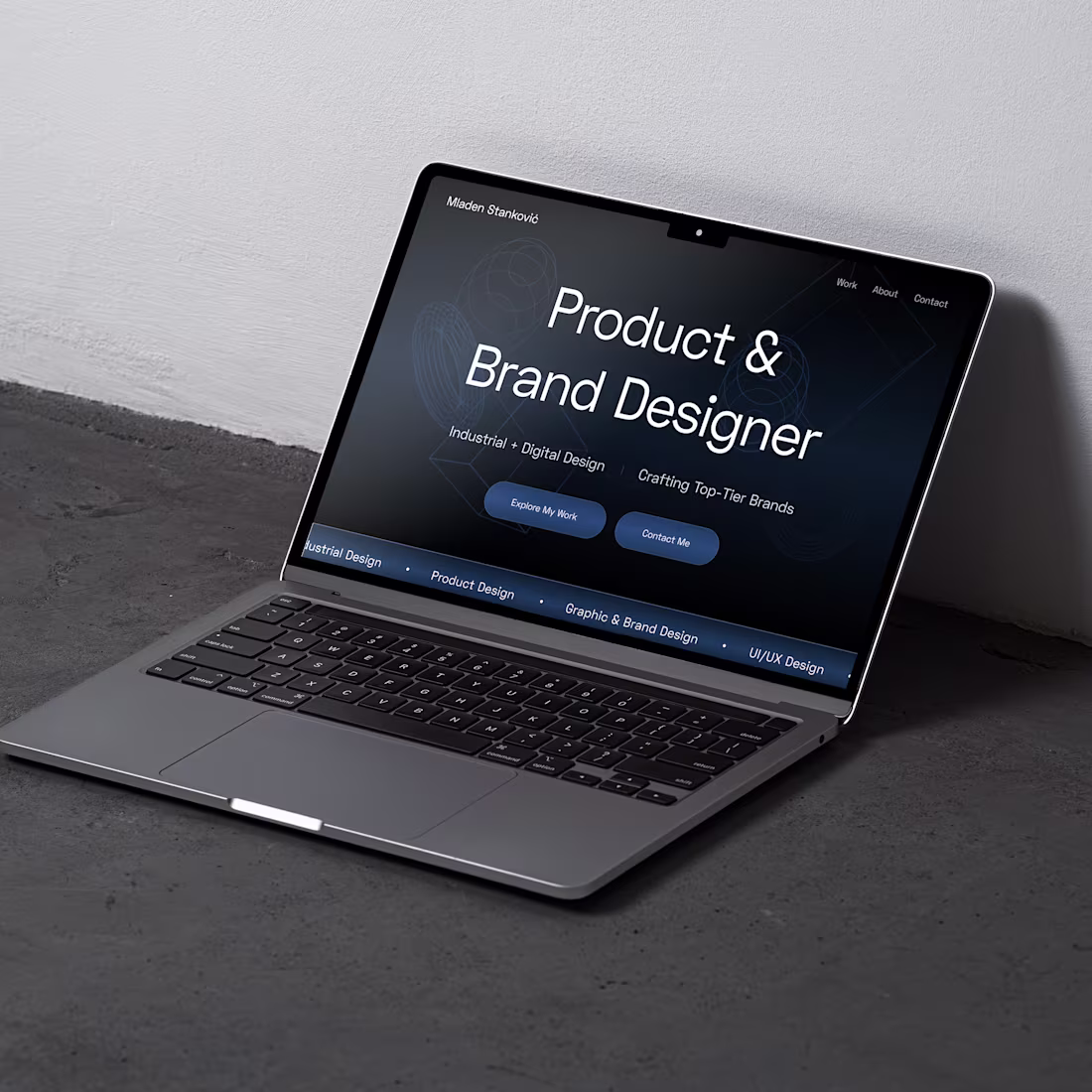
Currently developing a personal portfolio website. Here is a little sneak-peak!
1
116