
Michael Zeb
Book Cover Designer, Eye-Catching Covers That Sell
New to Contra
Michael is ready for their next project!


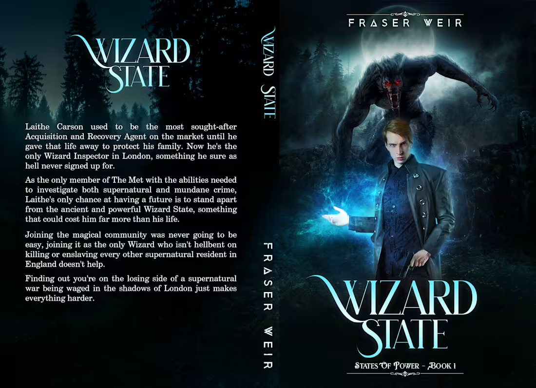
For this cover design of Wizard State by Fraser Weir, my goal was to capture the dark, action-packed energy of an urban fantasy thriller. I used visual compositing to place the stoic protagonist, armed with both a gun and glowing cyan magic, against a misty, moonlit backdrop. To immediately establish the supernatural stakes, I positioned a massive, red-eyed werewolf looming menacingly behind him. The cool blue color palette ties the magic and nighttime setting together. For the typography, I chose a sharp, elegant font with a subtle magical glow, keeping the back cover layout clean for the synopsis.
🙂What do y'all think about this design?
1
65
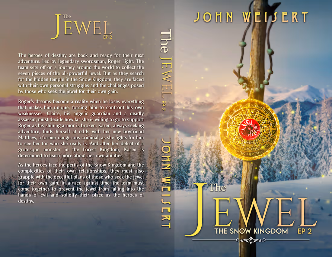
For this full-wrap cover design of The Jewel EP 2: The Snow Kingdom by John Weisert, my goal was to create an epic and inviting high fantasy atmosphere. I used detailed visual compositing to blend a sweeping, snow-covered mountain landscape with a warm, glowing sunrise. To anchor the scene, I placed an ornate, glowing wooden staff holding the titular jewel in the foreground. For the typography, I selected an elegant serif font in a rich gold to complement the magical artifact, ensuring the back cover text remains legible across the scenic winter wrap.
How does it look?
2
1.3K
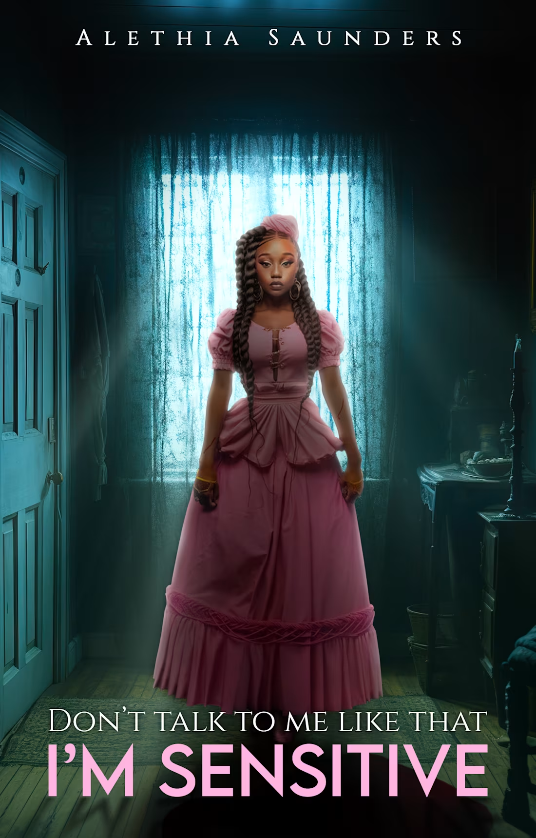
For the cover design of "Don't Talk To Me Like That I'm Sensitive" by Alethia Saunders, I aimed to create a striking contrast that beautifully captures a moody yet delicate vibe. Through thoughtful visual compositing and cinematic lighting, I made the protagonist's vibrant pink vintage dress stand out against the cool, shadowy teal backdrop of the softly lit room. For the typography, I paired an elegant serif with a bold, modern sans-serif in a matching pink for the title, ensuring the design feels both grounded and highly readable.
What do y'all think about this design?
1
3.1K
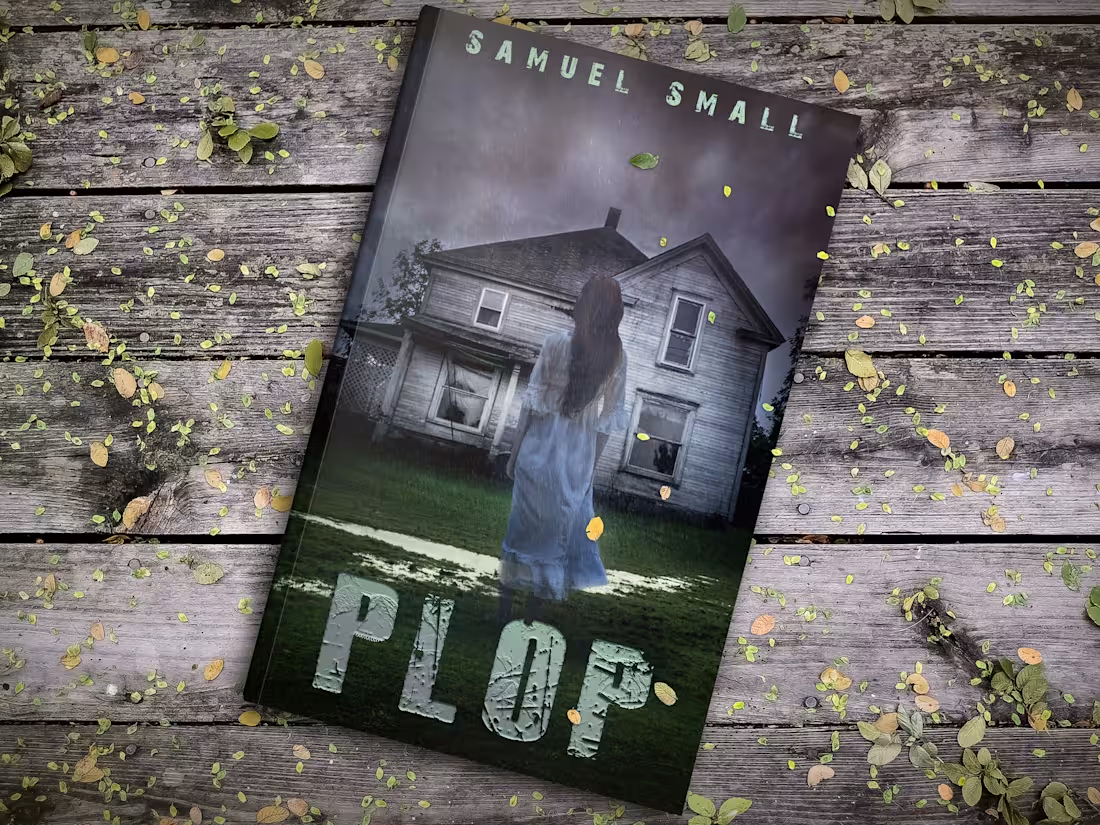
For this cover design for Plop by Samuel Small, I wanted to capture a deeply atmospheric, eerie tone right from the first glance. I focused on building a haunting narrative scene, combining dynamic photocompositing with subtle environmental details like the pouring rain, soft mist, and damp textures on the grass.
To set the mood, I leaned into a muted, cold color palette, letting the ghostly silhouette in white stand out starkly against the weathered, shadowy house. For the typography, I opted for a heavily distressed, peeled-paint texture for the main title to mirror the decay of the house and give it a grounded, tactile horror feel.
🙂What do you think?
1
774