pro

I’ve been working on a few mobile apps recently. Looking for some beta testers. Anyone interested?
Just found out that I'm in the top 1% of creatives on Contra! 🎉
Thank you all for being so supportive of my work and my freelancer journey!
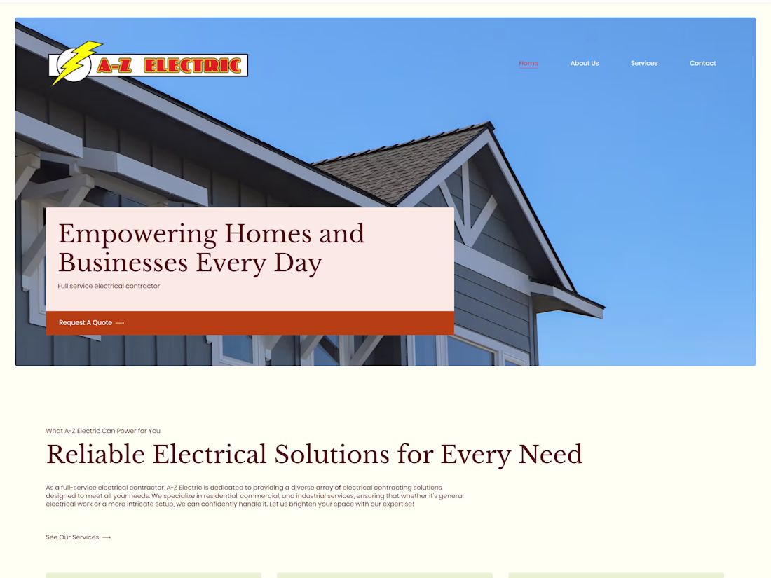
Loving the colors and flow of this redesign I worked on for A-Z Electric
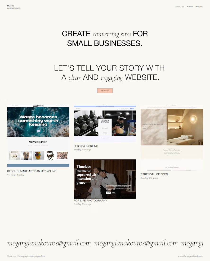
My new portfolio and bookings page is launched!
I wanted to create something simple yet conversion-focused, and I've already doubled my reach since launching.
Check it out! www.megangianakouros.com
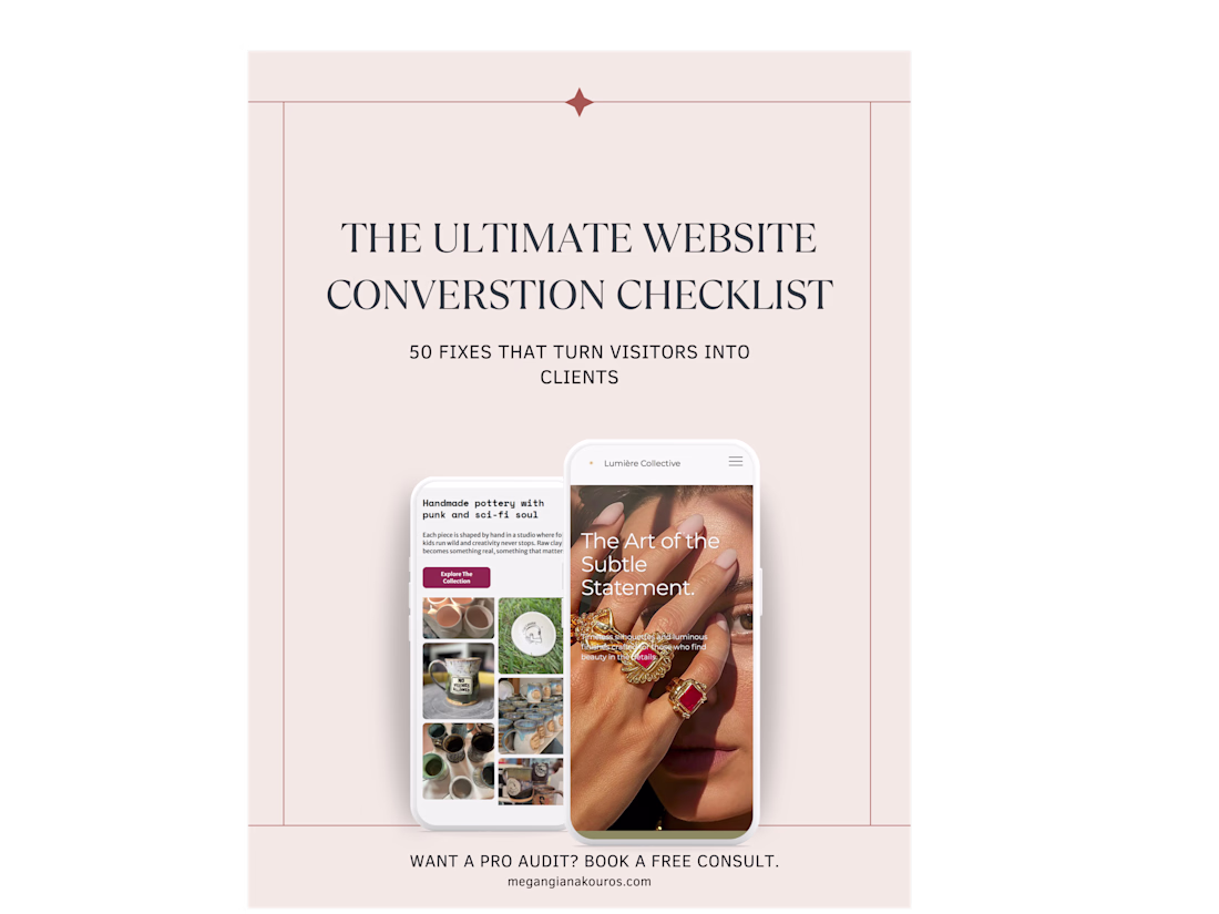
🔥 ATTN: ALL SMALL BUSINESSES, WEB DESIGNERS, AND MARKETERS🔥
I'm super excited to launch my new guide:
The Ultimate Website Conversion Checklist: 50 Fixes That Turn Visitors Into Clients 🎉
The guide is available as a FREE DOWNLOAD for anyone interested! If you'd like to...