pro

I’ve been working on a few mobile apps recently. Looking for some beta testers. Anyone interested?
Just found out that I'm in the top 1% of creatives on Contra! 🎉
Thank you all for being so supportive of my work and my freelancer journey!
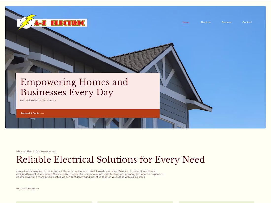
Loving the colors and flow of this redesign I worked on for A-Z Electric
busy busy busy this month