MD SAIDUL ISLAM
Logo & Brand Identity Designer
Ready for work
MD SAIDUL is ready for their next project!

Hitech – Brand Identity Design
Full Project Here: https://www.behance.net/gallery/247193283/Hitech
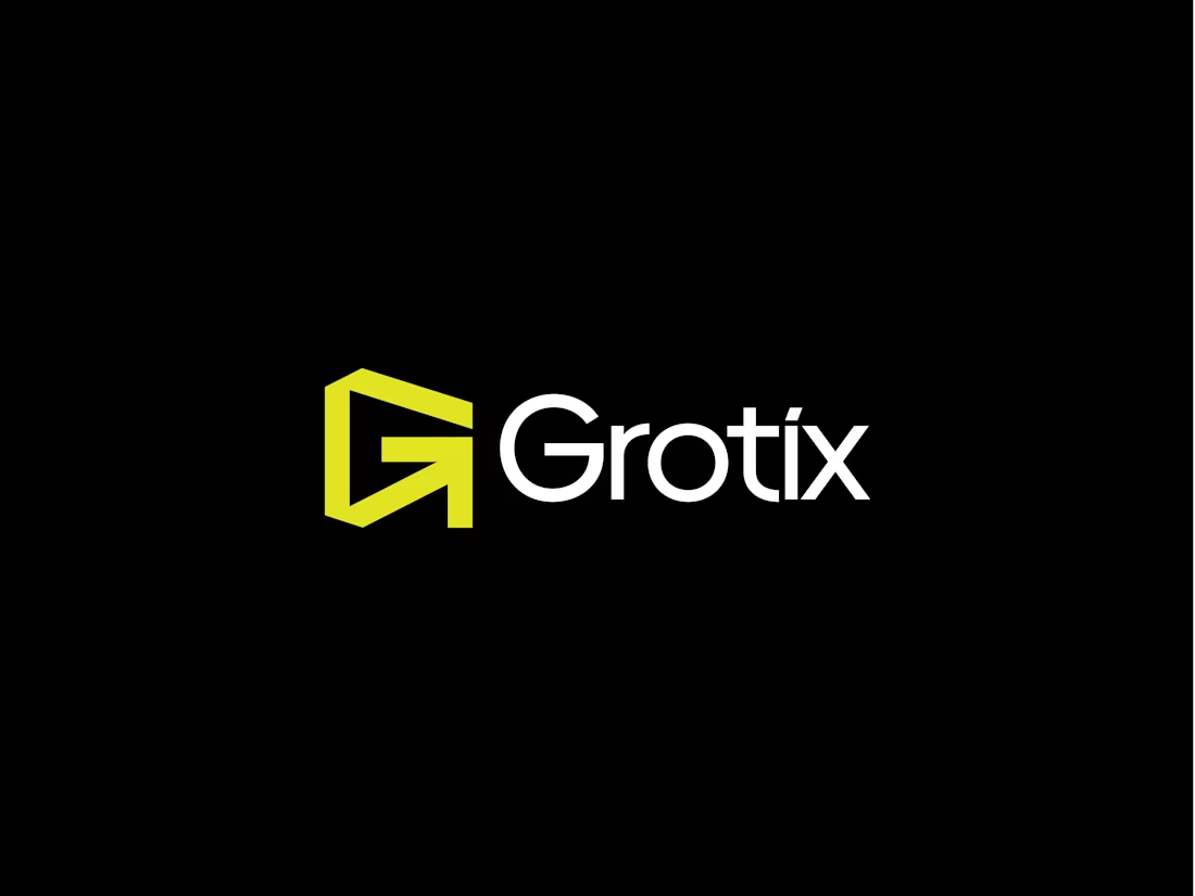
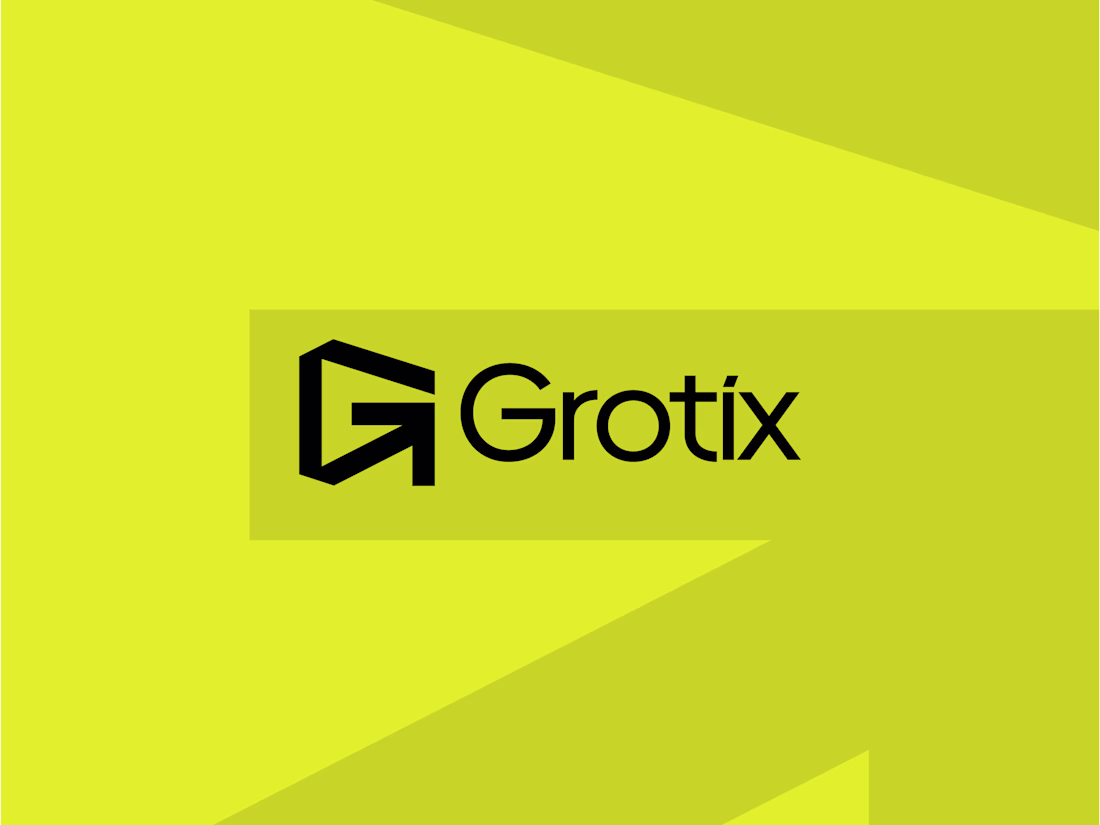
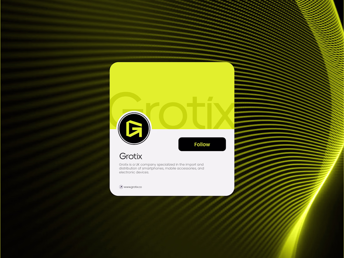
Grotix — Brand Identity 🟡
The idea behind this mark was to make two things speak as one.
The letterform "G" and an arrow were merged into a single, clean geometric shape. The arrow isn't just decorative; it lives inside the "G", making the whole mark feel like it's always...
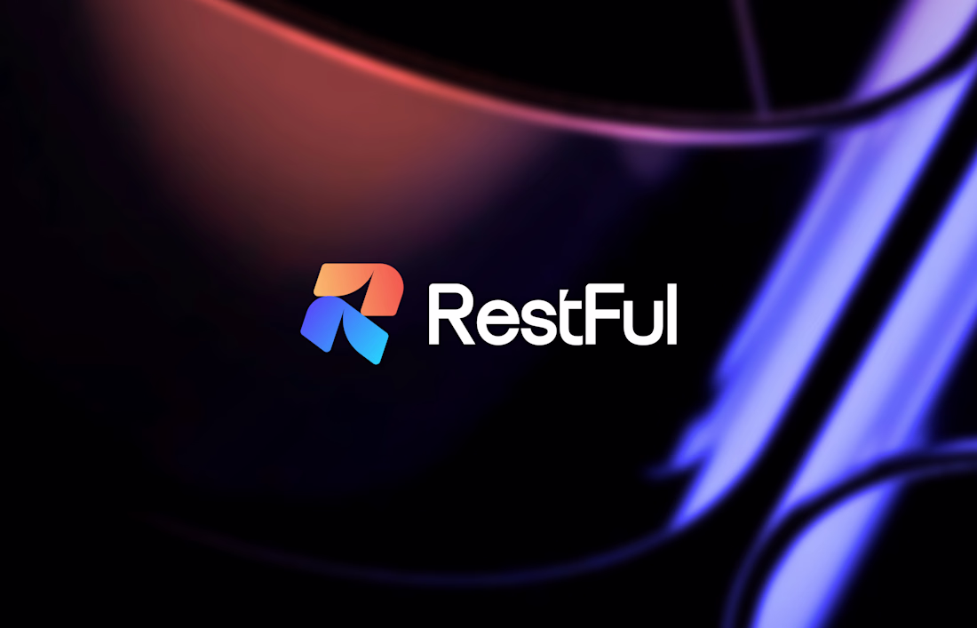
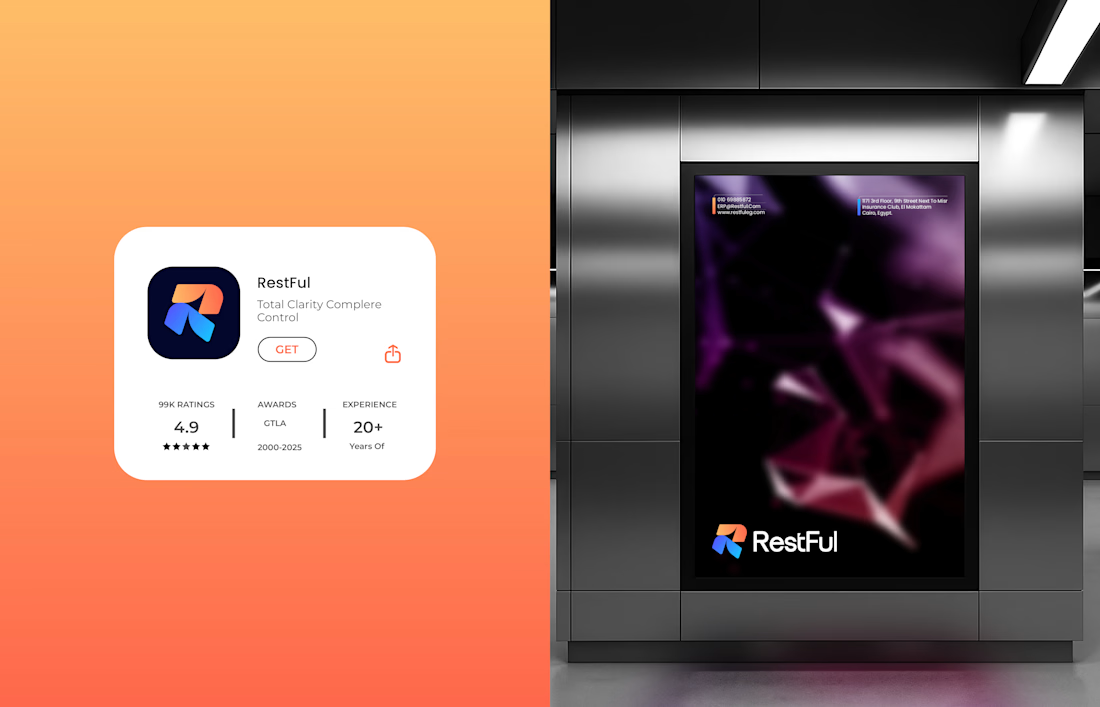
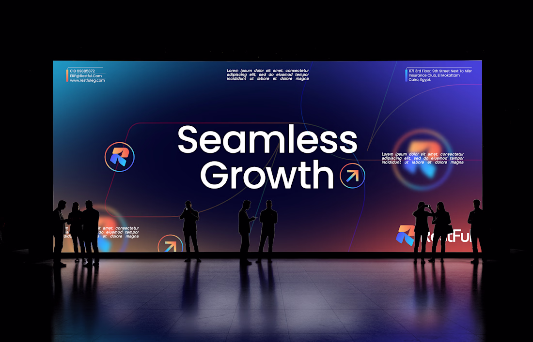
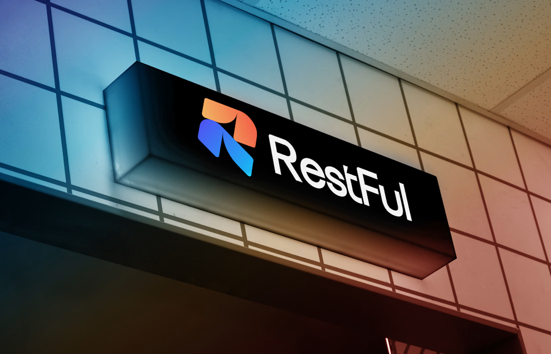
RestFul™ Logo & Brand Identity Design.
Full Project here
Brand DesignbrandidentitysaaslogoerplogoAdobe IllustratorGraphic DesignLogo DesignAdobe PhotoshopFigma
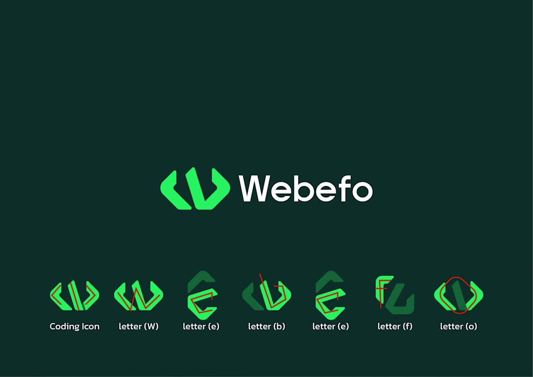
Minimalist Logo Design.
Logo breakdown
Coding + W + e + b + e + f + o
minimalistlogodesignBrand DesignLogo DesignGraphic DesignAdobe PhotoshopFigmaAdobe Illustratorlogobrandlogodesigning
Shukria Group® Brand Logo Design