The network for creativity
Join 1.25M professional creatives like you
Connect with clients, get discovered, and run your business 100% commission-free
Creatives on Contra have earned over $150M and we are just getting started
Back to feedPost
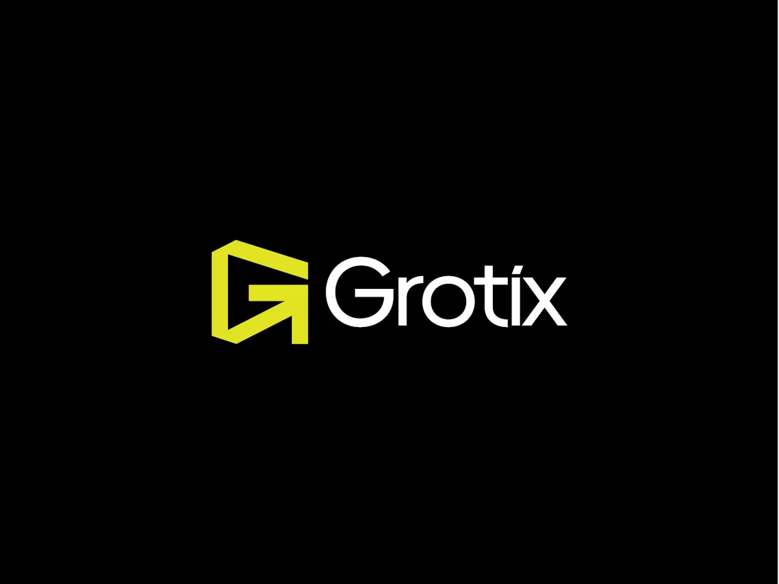
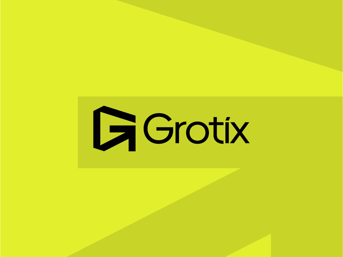
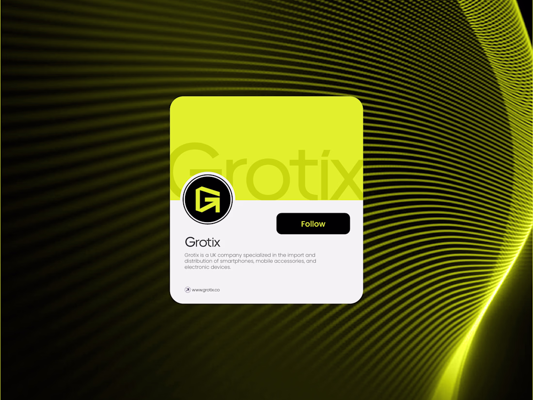
Grotix — Brand Identity 🟡
The idea behind this mark was to make two things speak as one.
The letterform "G" and an arrow were merged into a single, clean geometric shape. The arrow isn't just decorative; it lives inside the "G", making the whole mark feel like it's always pointing somewhere.
Always moving. This is what a tech brand identity should feel like — sharp edges, strong contrast, zero fluff. The electric yellow-green does the heavy lifting on energy, while the black keeps it grounded and bold. When a logo can say "growth" and "direction" without a single word, that's the goal.
The network for creativity
Join 1.25M professional creatives like you
Connect with clients, get discovered, and run your business 100% commission-free
Creatives on Contra have earned over $150M and we are just getting started
Related posts
Presenting - Silver Line 🌥️
https://silverlinespace.figma.site
My Config Makeathon Submission!
A helpline for hearts that can't quite see the bright side today.
🌥️ The Problem
We all carry small struggles around with us. A rejection email, a plan that fell through, a rough day at work, a friend who didn't text back. None of them are the end of the world, but they pile up. And on the wrong day, even the little things feel heavy. Most of us weather them alone and in silence, scrolling past everyone else's highlight reel while quietly having a hard time.
There are apps for big crises and apps for vanity metrics, but very little for the everyday, low-grade cloud that just needs a kind word from a stranger.
☀️ The Solution
Silver Line is a communal sky where strangers help strangers spot their silver lining.
Share your cloud. Sign in, step into the sky, and post the little problem weighing you down. Set how heavy it feels, then send it up.
Be someone's silver line. Open any cloud and leave a message of encouragement, a kind word, or a bit of perspective.
Loved someone's comment? Send a ray of sun to show you appreciate it.
Watch clouds turn happy. When you can finally see the bright side, tap "I see the silver lining" and watch your cloud become a happy cloud.
The goal is simple: make every cloud in the sky a happy one!
Because no one should face their problems alone.
Safety rails (community flagging + admin moderation) keep the sky a kind place.
🛠️ The Process & Figma Tools Used
The whole thing was built predominantly in Figma, powered by Figma Make.
Planning: Mapped the idea and concept with an AI agent before touching design.
Figma MCP: Built the entire design system and variables directly in Figma, fast and clean.
Figma Design Agent: Spun up the major screens in minutes.
Figma Weave + Figma Draw: Generated the cloud assets and visuals; Draw was a joy for the finishing touches.
Figma Make: The heart of it. Prompted my vision and watched it come to life, iterating across versions. Used Figma Make's Select Edits for precise manual tweaks (images, text, padding) to save AI credits.
Supabase:Connected for persistence, so clouds, messages, and rays of sun are saved between visits.
A real end-to-end Figma workflow, from design system to a live, interactive product.
🔗 Link - Try it out yourself!
🚀 Live Working Prototype: https://silverlinespace.figma.site
*** Cannot provide figma community link as this project is connected to Supabase! ***
👤 Built by
Arjun Haridas, Product Designer, Bangalore, India.
Originally designed and built during the Config Makeathon period.
Huge thanks to Figma for the makeathon and to Contra for hosting. And to everyone who's ever been the silver line to someone else's cloud you're the reason this exists. 😊🌤️
#FigmaMakeathon #ConfigMakeathon
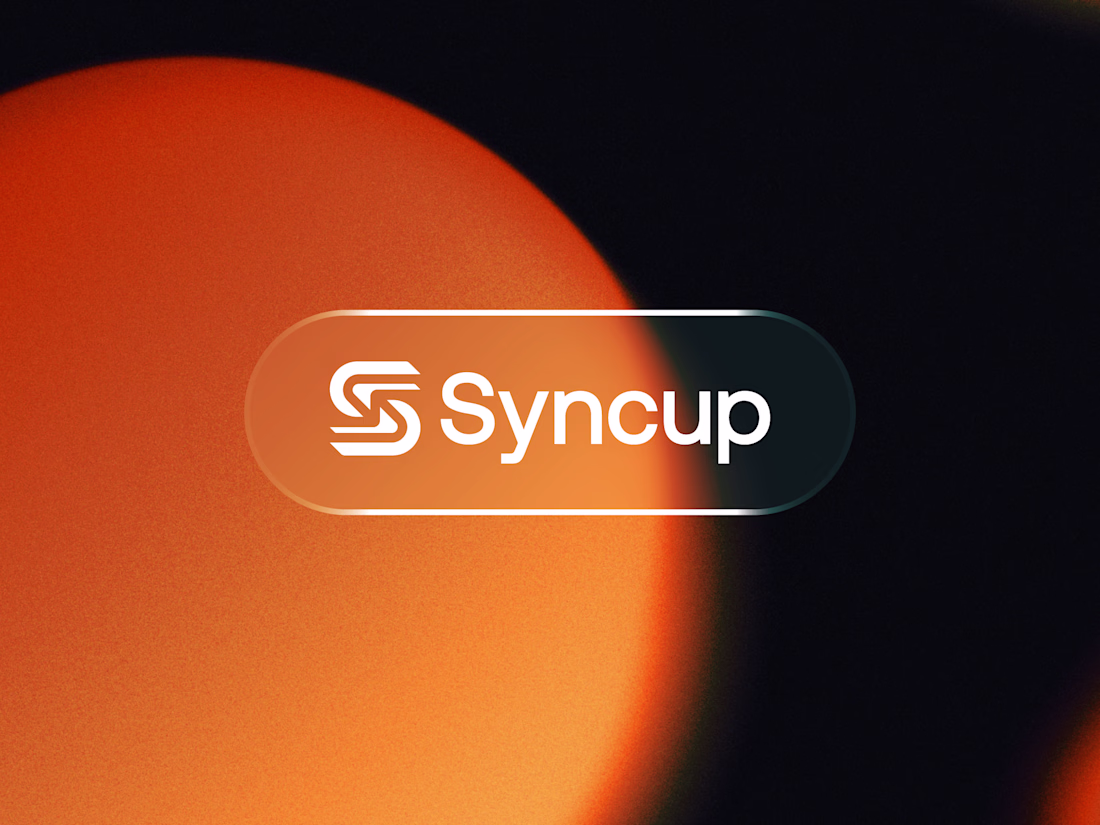
Syncup — Modern "S" Lettermark Logo & Brand Identity
A clean, modern logo and brand identity for Syncup, featuring a bold geometric "S" lettermark built from interlocking rounded forms — symbolizing connection, flow, and synchronization. Paired with a confident, friendly wordmark and presented on a glassmorphism pill badge against a warm gradient backdrop for a fresh, energetic feel.
This identity is designed to feel approachable yet tech-forward, making it versatile across app icons, websites, and digital products.
🛰️ I just shipped Remora for the Figma Config Makeathon "a space debris cleanup game", built entirely in Figma and Figma Make with help of Sites.
PLAY NOW 💯 Remora - Let's Clean our Space 🚀
Right now, more than 27,000 pieces of debris are orbiting Earth. Broken satellites, lost bolts, leftover rocket stages and nobody's cleaning it up. It sounds distant, but it isn't: this debris threatens the satellites our GPS, communications, and weather systems depend on, and could eventually block our access to space entirely.
I named the project Remora; a small fish that swims alongside sharks, cleaning their surroundings. We're the remoras. Space is our ocean.
The Makeathon brief was "design something that improves the world," and I wanted my answer to be playable, not just a poster.
Some of what's under the hood:
🎮 Two game modes: a free-flying drone collector with zero-G physics and a station-based sorting game where you triage incoming debris into recycling shipments
🤖 Three AI-controlled drones compete alongside you on a live leaderboard, each with its own personality and skill level
✨ Particle bursts, thruster trails, and docking animations — built frame-by-frame on canvas, no game engine
🌍 An animated Earth companion that reacts with rotating messages as you play
📡 Satellites cross your flight path on real trajectories — hit one and you lose cargo and hull integrity
🔼 A milestone-based upgrade system (Speed Boost, Cargo+, Magnet Field, Shield) that triggers mid-flight without pausing the game
It won't clean the orbit. But if it makes one more person think about the mess we're leaving up there — it did its job.
🔗 Try it live: Remora - Let's Clean our Space
🎨 Figma file: Project File
Can we tag NASA here? 🧠
Trending
Claude
Claude has entered the design space. How are you using Claude Design?
Contra University
Learn from expert creatives how to earn more using next-gen AI tools.
MagicPath
The canvas is infinite, and exploration is becoming the workflow. How are you using MagicPath?
creativeaiflow
Creative AI workflows are evolving. What tools do you use, and what are their strengths and weaknesses?
freelancerlife
Freelancer life is wins, pivots, and everything in between. What’s yours right now?