
MD SAIDUL ISLAM
Logo & Brand Identity Designer
Ready for work
MD SAIDUL is ready for their next project!

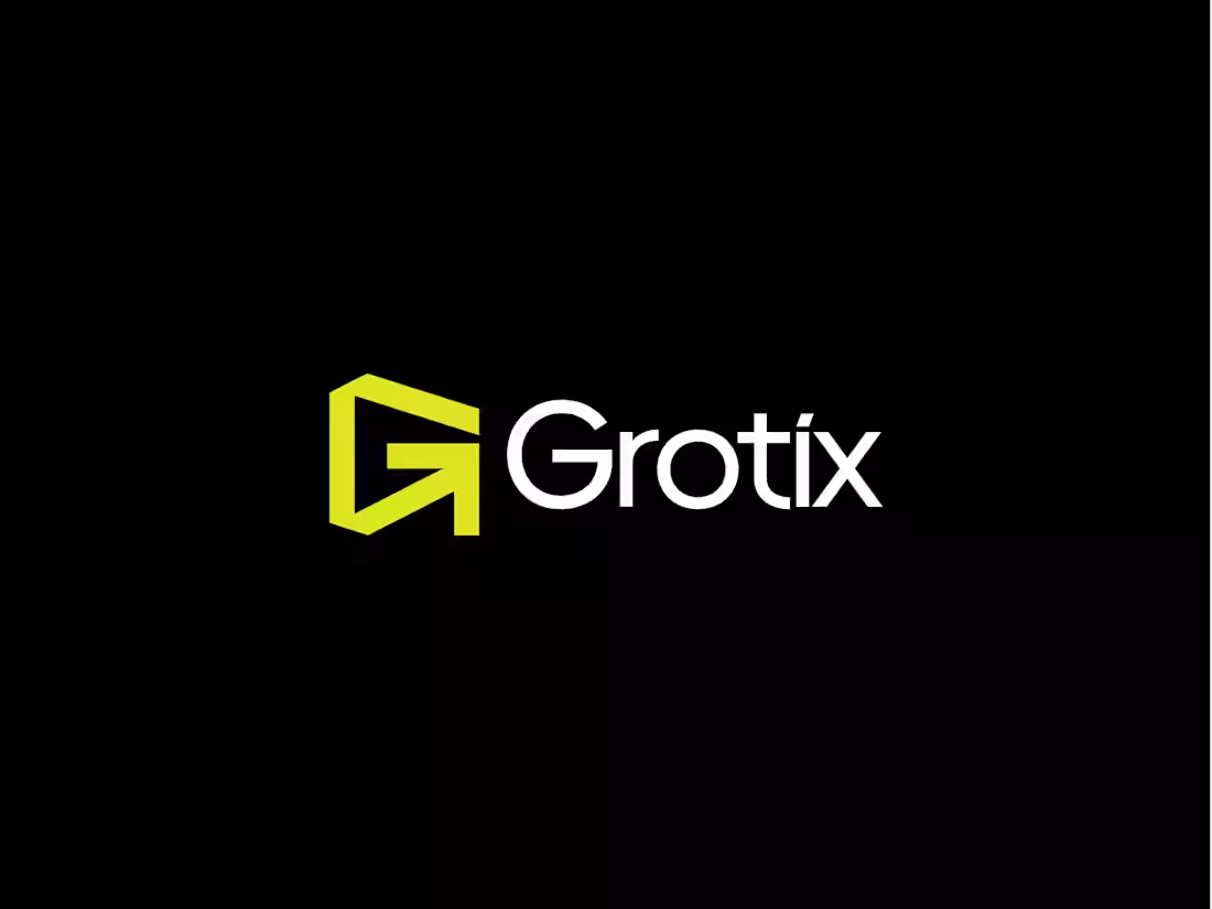
Grotix — Brand Identity 🟡
The idea behind this mark was to make two things speak as one.
The letterform "G" and an arrow were merged into a single, clean geometric shape. The arrow isn't just decorative; it lives inside the "G", making the whole mark feel like it's always pointing somewhere.
Always moving. This is what a tech brand identity should feel like — sharp edges, strong contrast, zero fluff. The electric yellow-green does the heavy lifting on energy, while the black keeps it grounded and bold. When a logo can say "growth" and "direction" without a single word, that's the goal.
4
71
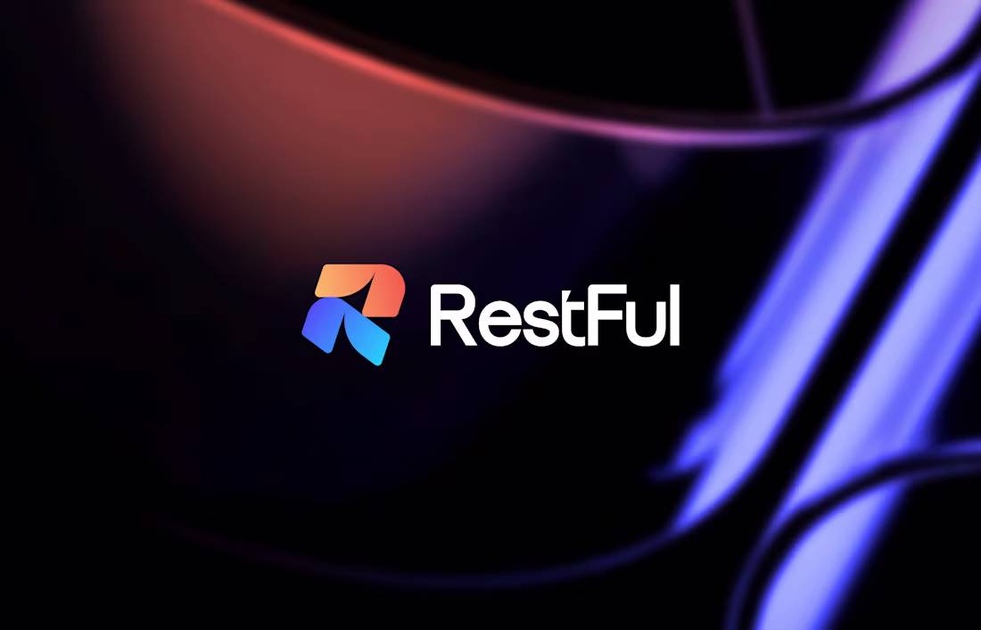
RestFul™ Logo & Brand Identity Design.
Full Project (https://www.behance.net/gallery/241606177/RestFul) here
(https://www.behance.net/gallery/241606177/RestFul)
6
95
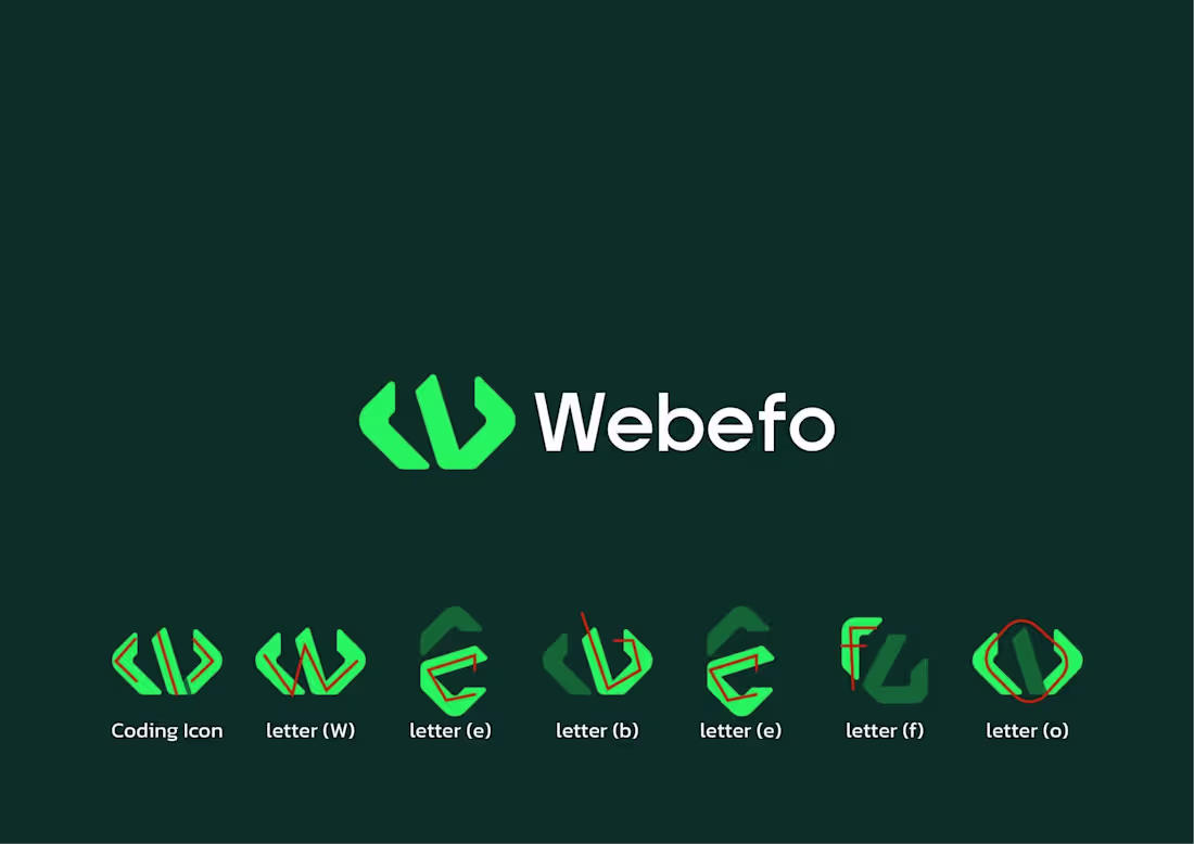
Minimalist Logo Design.
Logo breakdown
Coding + W + e + b + e + f + o
1
2
101
Brand Identity, Logo Design, Brand Guidelines
Click Here For Full View (https://www.behance.net/gallery/224862685/Brand-Identity-Logo-Design-Brand-Guidelines)
3
105
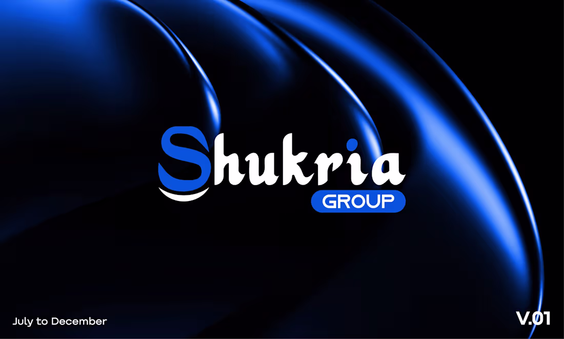
Shukria Group® Brand Logo Design
3
111
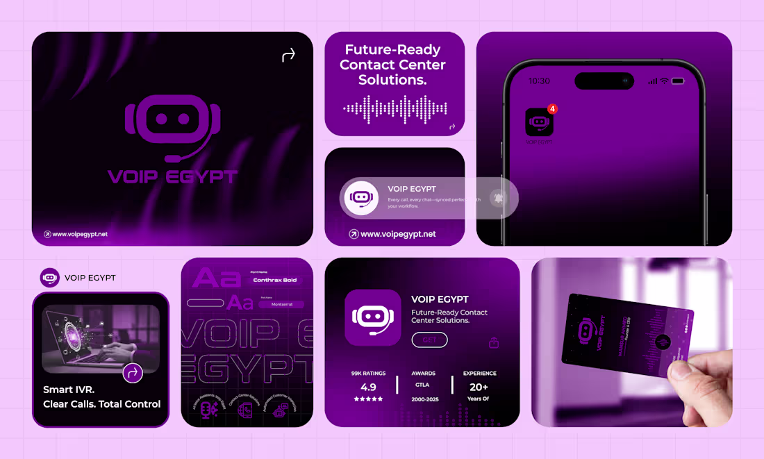
VOIP EGYPT — Brand Identity Design
Click Here For Full Project
(https://www.behance.net/gallery/241150413/VOIP-EGYPT-Brand-Identity-Design)
3
128