One more Happy Client!!
RECOMMENDED
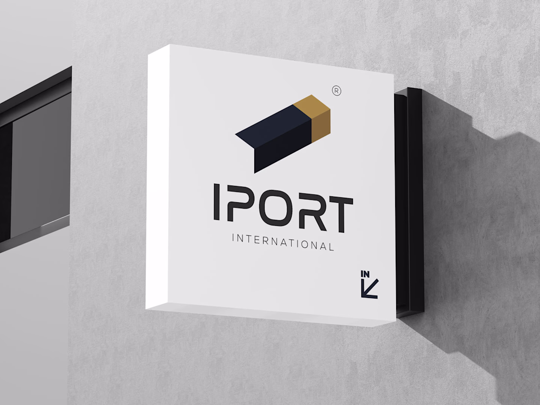
“⭐⭐⭐⭐⭐ Safwan delivered an exceptional brand identity for IPORT International. The logo — a container, letter I, and arrow in one mark — is creative and precise. Professional process, premium result. Highly recommend!”
Shihab Chatteerakath
Educational Reels Editing,
Before and After
Sharing two options, which style is best? Left one is A, middle one is Raw, and right one is B.
Comment Below...!
🙌 🙌 🙌
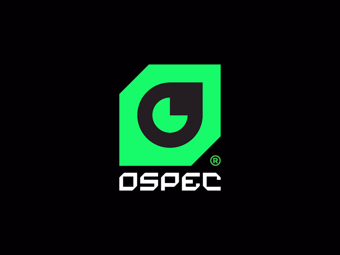
Cybersecurity Meets Sleek Design: The Ospec Identity 🛡️💻
In a world of data, trust is built through visuals. For Ospec—specialists in Data Analysis, Cyber Security, and Digital Innovation—I designed a brand identity that balances technical precision with modern aesthetics.
🛠️...