IPORT International Brand Identity Project
AHAMED SAFWAN
Verified
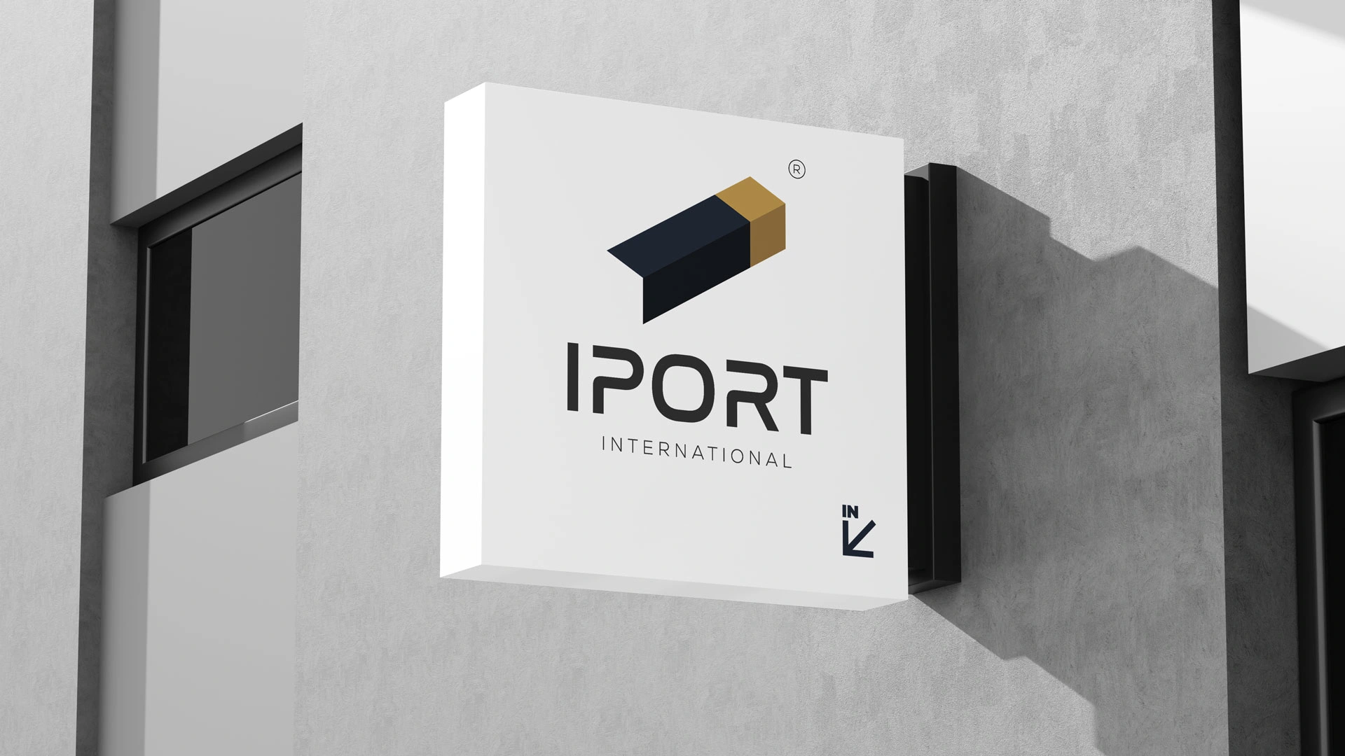
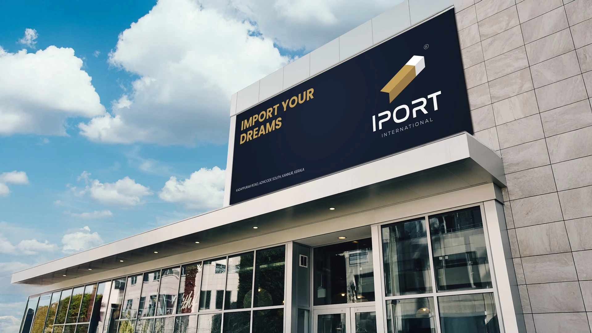
IPORT International — Brand Identity
IPORT International is a full brand identity project built for an international import company. The brief required a mark that communicated the company's core business instantly — without complexity.
The result is a single isometric form that reads four ways simultaneously: a shipping container, the letter I, a directional arrow, and a carton. Built on precise geometric proportions, the mark carries meaning at every angle.
The identity system spans a complete brand book including logo construction, primary and secondary logo variants, colour palette, and typography — all designed to perform consistently across digital and print applications.
Deliverables: Logo Design · Brand Guidelines · Typography System · Colour Palette
Tools: Adobe Illustrator · Adobe InDesign
Complete Logo
The full logo system uniting the isometric mark with the IPORT wordmark. Designed for clarity and authority across every application.
Complete Logo
Logo Construction
Three-stage construction breakdown — from raw geometry to outline to final colour. Every face of the mark is intentional.
Logo Construction
Logo Inspirations
The mark draws from four real-world references: a shipping container, the letter I, a carton box, and a directional arrow — all resolved into one geometric form.
Logo Inspirations
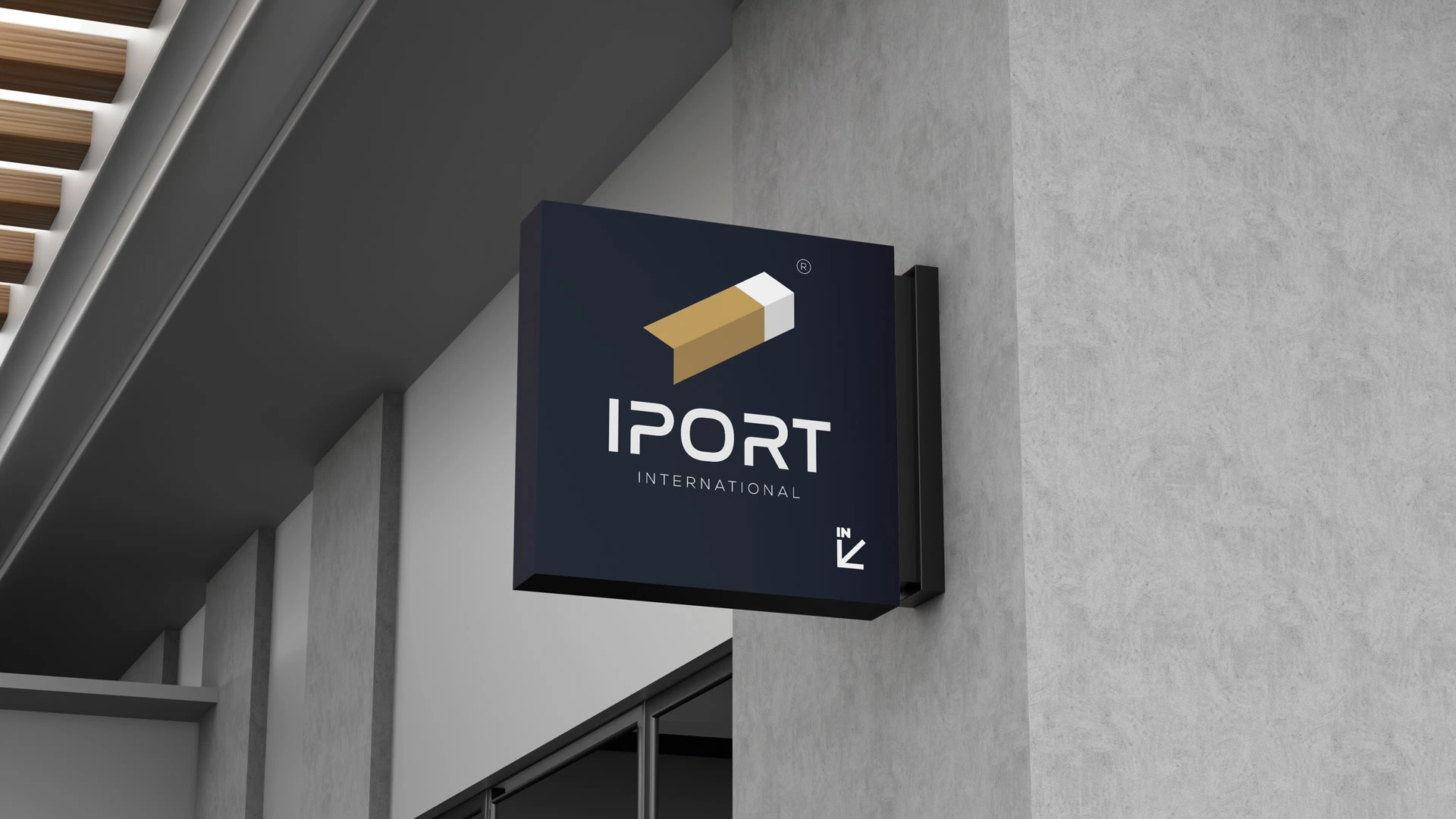
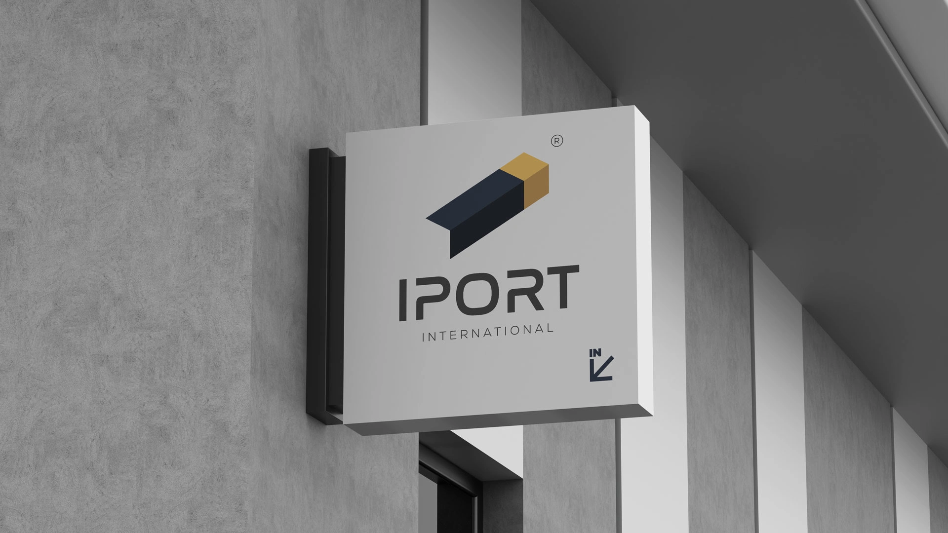
Logo Primary
The primary logo on a clean white background. The default version for all official, print, and digital use.
Logo - Primary
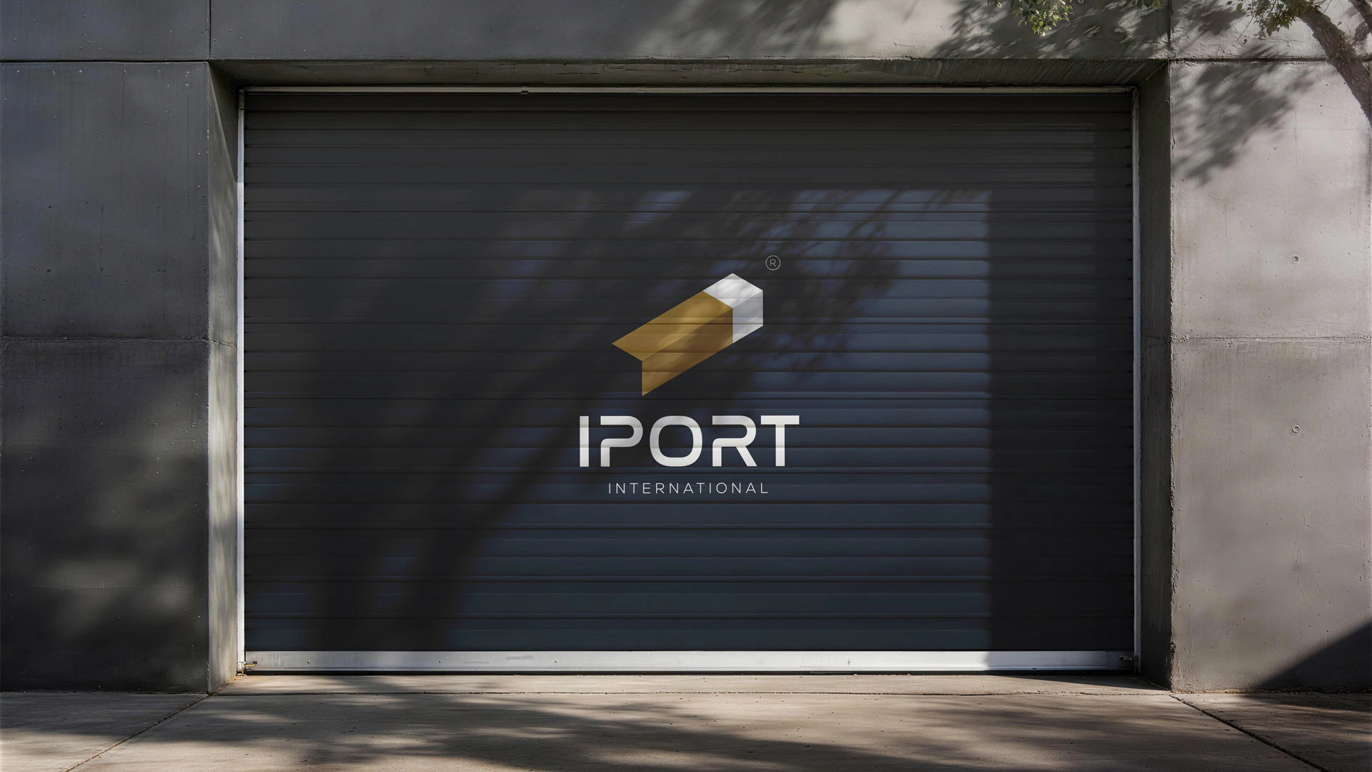
Logo Secondary
The inverted version on deep navy. Used for dark backgrounds, packaging, and premium contexts.
Logo Secondary
Logo Design Overview
The thinking behind the mark — how the geometry, colour, and typography work together to build a complete brand language.
Logo Design Overview
Typography
Poppins as the brand typeface, paired with a structured Roboto type scale from H1 through to body and description text.
Typography
Colour Palette
Primary palette of gold tones and deep navy, supported by a secondary range of whites, greys, and black — a palette built for versatility and premium appeal.
Color Palette
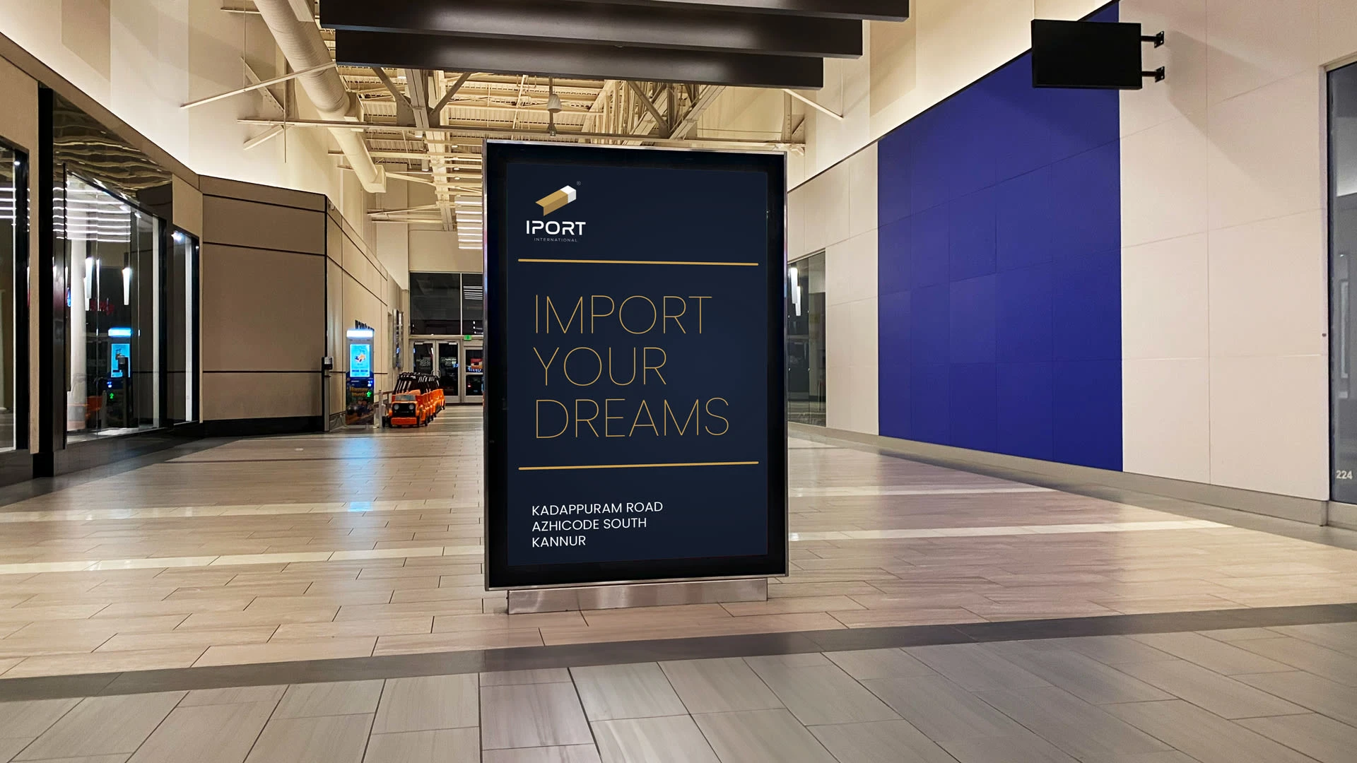
Mockups
Like this project
What the client had to say
⭐⭐⭐⭐⭐ Safwan delivered an exceptional brand identity for IPORT International. The logo — a container, letter I, and arrow in one mark — is creative and precise. Professional process, premium result. Highly recommend!
Shihab Chatteerakath
Apr 28, 2026, Client
Posted Apr 28, 2026
Branding for IPORT International — an import company. Isometric mark reading as a container, letter I, arrow & carton. Navy & gold identity system.
Likes
1
Views
8
Timeline
Apr 27, 2026 - Apr 28, 2026