


This is really amazing!!!


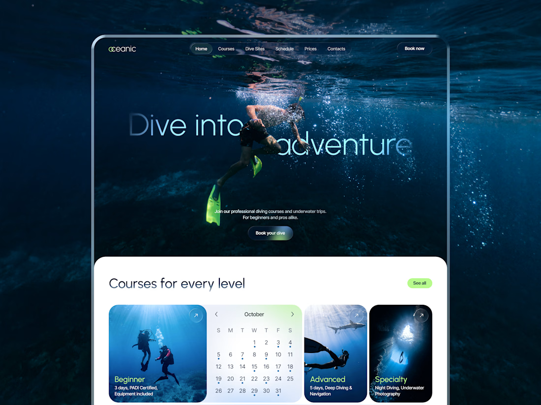
New concept for diving center 🌊
What do you think?
Congratulations Jen 🥰
Please could you share how to go about getting clients in the streets in contra as a newbie??

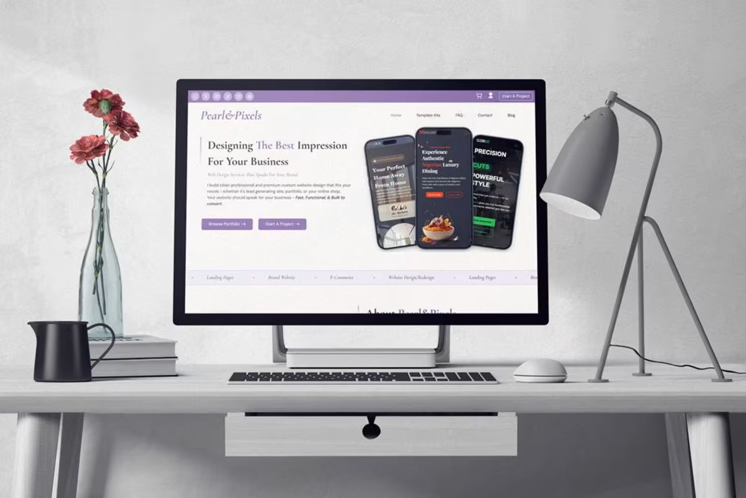
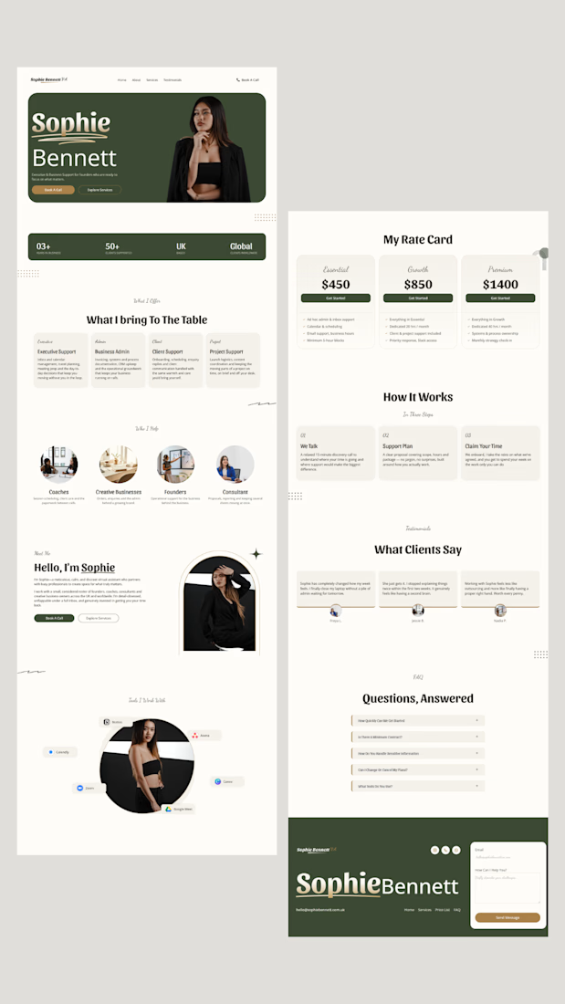
I designed a website for a virtual assistant let me know what you think 🥰☺️


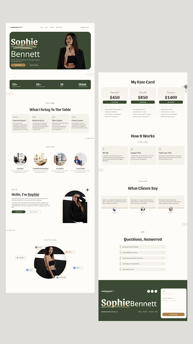
I designed a website for a VA, but the goal wasn't simply to make it “pretty.”
I wanted her ideal client to land on the site and think:
“She looks professional.”
“I can trust her.”
“She understands what I need.”
“She could actually give me my time back.”
I deliberately avoided the...
Currently working on this for myself soon🥰🥰
Congratulations to you 🥰