Maryam Akande || Pearl&Pixels
Web designer building conversion focused websites for brands


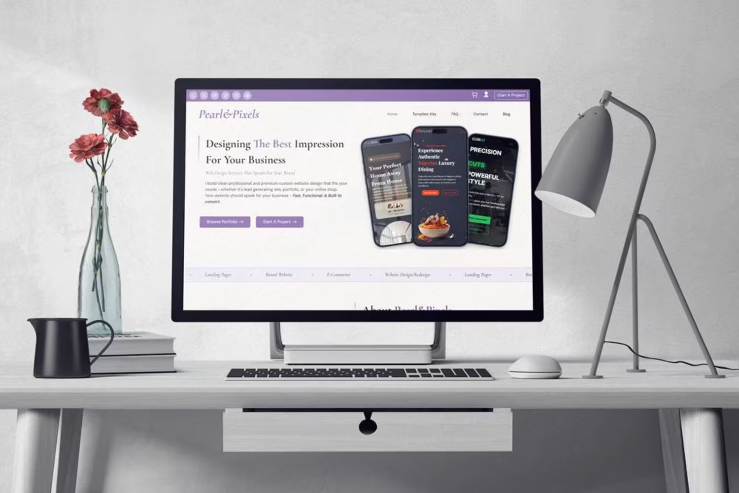

SolaceHall - Event Centre/Venue Website
Meet SolaceHall - a clean, elegant and fully responsive WordPress website template designed for event venues, wedding halls, and hospitality brands.
Featuring a modern minimal layout, built in pricing tiers, photo galleries, and an easy enquiry form.
Perfect for: Event planners, Venue owners and Hospitality brands. #websitedesign (https://www.pinterest.com/search/pins/?q=websitedesign) #websites (https://www.pinterest.com/search/pins/?q=websites) #websitetemplate (https://www.pinterest.com/search/pins/?q=websitetemplate) #webdesigners (https://www.pinterest.com/search/pins/?q=webdesigners)
Premium Website . Minimal Website . Clean Design
0
26
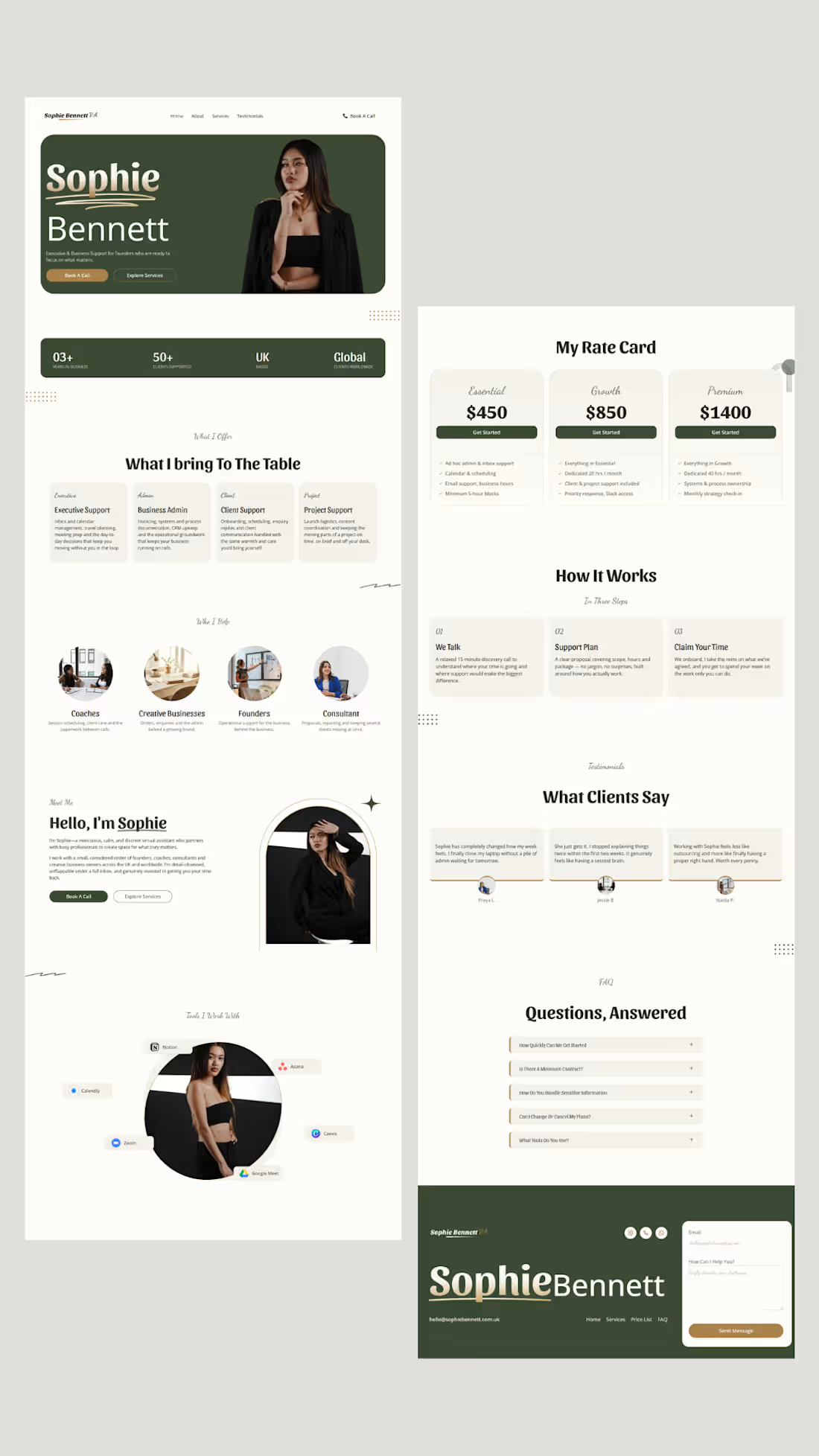
I designed a website for a VA, but the goal wasn't simply to make it “pretty.”
I wanted her ideal client to land on the site and think:
“She looks professional.”
“I can trust her.”
“She understands what I need.”
“She could actually give me my time back.”
I deliberately avoided the typical VA aesthetic and went for something warm, editorial, calm and premium.
And because the main goal was conversion, the page was designed as a focused landing page rather than a complicated multi-page website.
Everything leads back to one action:
Book a Discovery Call.
She needs them to understand her value and book a call.
1
106
I designed a website for a virtual assistant let me know what you think 🥰☺️
2
182
Before you spend another penny on ads, make sure your website can actually convert the traffic you're paying for.
You spend money on an ads.
Someone clicks.They land on your website…
…and something feels off.
The website looks outdated.
They can't figure out what you actually offer.
The page takes forever to load.
They can't figure out what you actually offer.
It's difficult to use on mobile.
The CTA is nowhere to be found.
Or there's so much information on the page that they don't even know what they're supposed to do.
So they leave.
You paid for the ads
You got the click
You got the visitor
But you didn't get the customer.
And that's why before increasing your ads budget, you need to make sure your website is ready for the traffic you're paying for.
Your website should be:
1. Clear — people should immediately understand what you do and who it's for.
2. Easy to navigate— it should be easy to navigate so they can quickly find the information they need.
3. Optimised - it should be fast and mobile friendly cos most of your visitors are browsing from their mobile
And most importantly there should be a clear next step. If someone is interested make it obvious what they should do next.
Book, buy, enquire, call or whatever the goal is.
And don't forget your trust.
Testimonials, reviews, previous work, before and afters and whatever makes your client confident enough to trust you and give you their money.
1
181