
Marvellous Pinima
Business branding | Brand Style guidelines | Brand identity


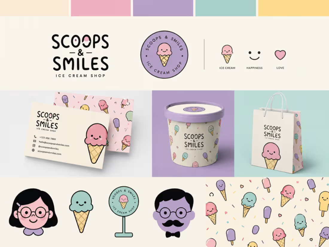
🍦 A playful identity built to make people smile
I’ve been exploring a visual identity for Scoops & Smiles, an ice cream shop built around one simple idea: ice cream should feel joyful.
Rather than stopping at a logo, I explored how that personality could become a complete and recognizable brand system — from the logo and color palette to supporting icons, illustrations, patterns, packaging and printed materials.
The goal was to create something that feels:
Playful • Friendly • Wholesome • Memorable
I particularly enjoyed exploring how the illustrated ice-cream characters and soft pastel palette could become recurring brand assets rather than simply decorative elements.
Now I’m curious about something:
If you were taking this identity further, what would you develop next?
Would you push the illustration system, refine the typography, introduce more packaging applications, or take the visual language in a completely different direction?
And for the designers here:
What makes a playful brand identity feel distinctive rather than simply “cute”?
I'd genuinely like to hear different perspectives.
1
10
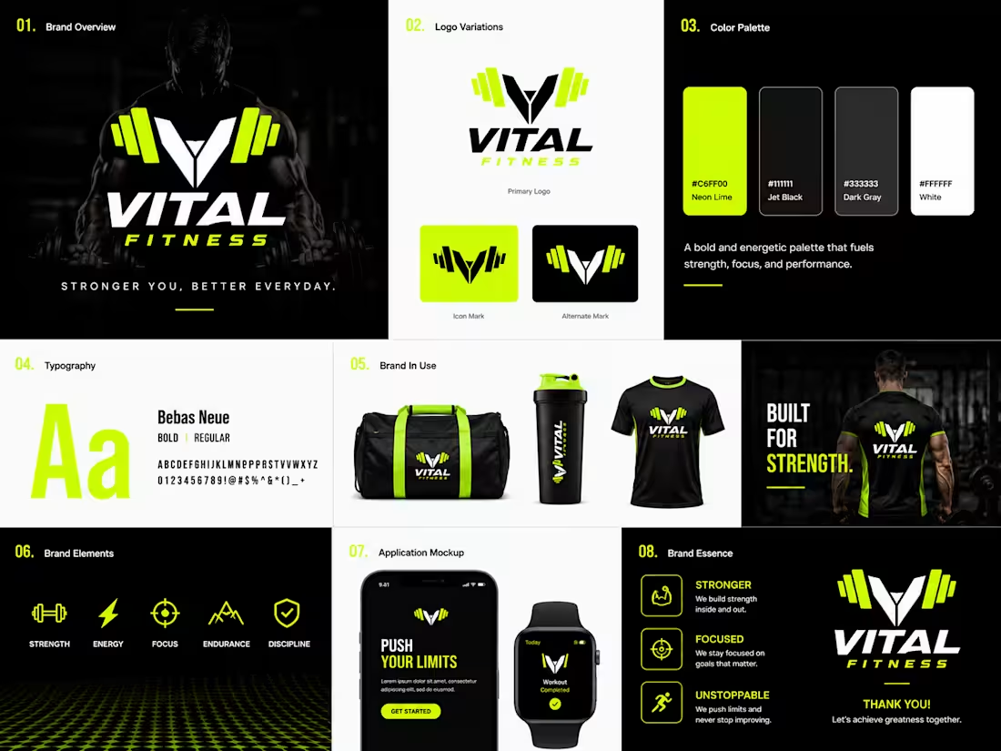
Still practicing and exploring different ways brand personality can completely change the visual direction of the same industry.
For this experiment, I chose a fitness/gym brand and started exploring four different brand personalities:
Corporate & Professional
Modern & Bold
Luxury & Premium
Trust, Modernity & Amplified Energy
This is the first direction: a bold, high-energy fitness identity. ⚡
I focused on strong contrast, performance-driven visuals, sharp typography, and an energetic neon accent to create a brand that feels powerful, focused, and built for action.
Over the next few days, I'll be sharing the other visual directions for the same gym brand.
What personality do you think this direction communicates first? And which of the remaining directions would you like to see next?
#BrandIdentity #BrandDesign #FitnessBranding
0
52
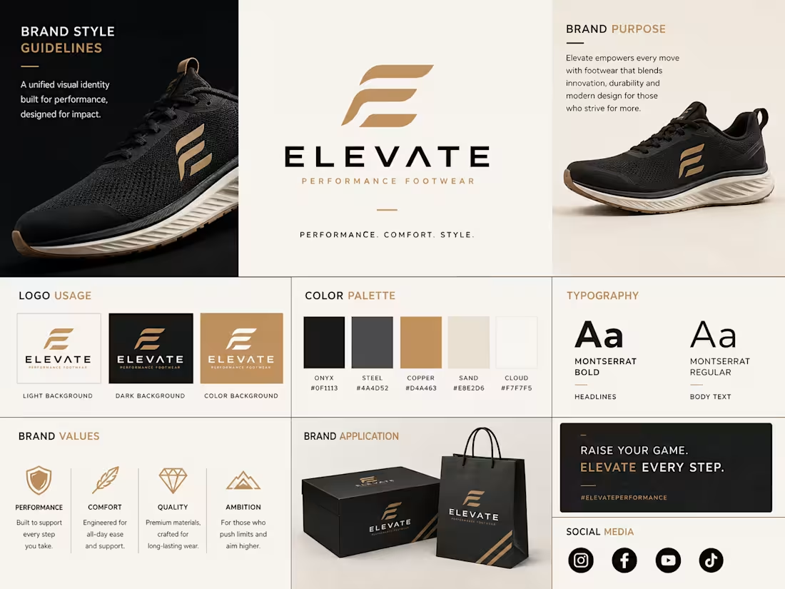
🚀 Exploring a complete brand identity system for a performance footwear brand.
I've been experimenting with taking a brand beyond just the logo and building an identity that works across every customer touchpoint.
The first board focuses on the Brand Guidelines logo usage, color palette, typography, brand values, and the core visual system that keeps the identity consistent.
The second board applies that system across social media creatives, advertising assets, packaging, and digital marketing to see how the brand performs in real-world scenarios.
As brand designers, I think the real challenge isn't creating a logo it's creating a system that stays recognizable across every platform.
👀 I'd love your thoughts:
1️⃣ Which presentation tells the brand story better he structured Brand Guidelines or the more application-focused Brand Kit & Marketing Assets?
2️⃣ If you were presenting this to a client, which board would give you more confidence in the direction?
I'm also experimenting with AI-generated mockups for concept presentations. I used ChatGPT for many of the mockups, but I still feel some of them look a little off proportions, perspective, and realism could definitely be better.
💡 For those who create branding presentations, what tools or workflows do you recommend for generating higher-quality product and packaging mockups? I'd love to hear your recommendations.
Always learning. Always refining.
#BrandIdentity #BrandGuidelines #VisualIdentity
0
105
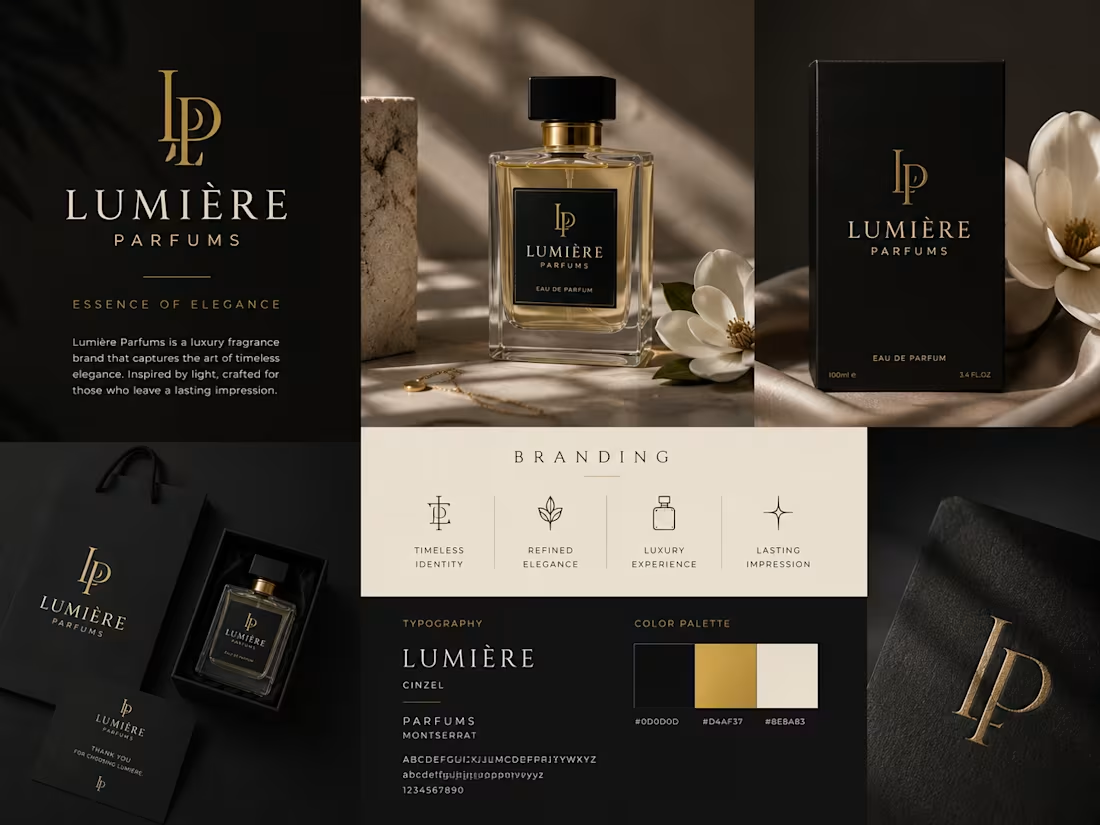
Professional branding for parfums brands
0
94