The network for creativity
Join 1.25M professional creatives like you
Connect with clients, get discovered, and run your business 100% commission-free
Creatives on Contra have earned over $150M and we are just getting started
Back to feedPost

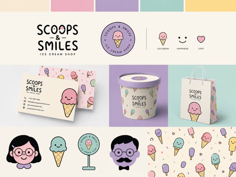
🍦 A playful identity built to make people smile
I’ve been exploring a visual identity for Scoops & Smiles, an ice cream shop built around one simple idea: ice cream should feel joyful.
Rather than stopping at a logo, I explored how that personality could become a complete and recognizable brand system — from the logo and color palette to supporting icons, illustrations, patterns, packaging and printed materials.
The goal was to create something that feels:
Playful • Friendly • Wholesome • Memorable
I particularly enjoyed exploring how the illustrated ice-cream characters and soft pastel palette could become recurring brand assets rather than simply decorative elements.
Now I’m curious about something:
If you were taking this identity further, what would you develop next?
Would you push the illustration system, refine the typography, introduce more packaging applications, or take the visual language in a completely different direction?
And for the designers here:
What makes a playful brand identity feel distinctive rather than simply “cute”?
I'd genuinely like to hear different perspectives.


The network for creativity
Join 1.25M professional creatives like you
Connect with clients, get discovered, and run your business 100% commission-free
Creatives on Contra have earned over $150M and we are just getting started
Trending
retrofuturism
Share your favorite designs from the past exploring the distant future. Or your own take on the aesthetic 🚀
halftone
Dots. Texture. Grain. Let's see your designs using the halftone technique.

Midjourney
Creatives are showing off what they're making with Midjourney.
colorgrade
Video editors sound off: How do you enhance the mood of your video in color grading?





Related posts

A self-initiated brand identity concept for Lunara, a premium wellness brand. The project explores logo design, color, typography, patterns, packaging, and brand applications to create a sophisticated and nature-inspired visual identity.


Jugnu is an inclusive clay-play concept designed for neurotypical and neurodivergent children.
The project explored how a product could make creative play more engaging, tactile, and inclusive through its sensory experience. Inspired by the firefly, or jugnu, the brand represents the light and individuality within every child. The clay itself glows in the dark, adding an element of surprise and playfulness to the experience while reinforcing this idea of finding and expressing the light within.
I developed the brand identity, kit materials, packaging, and brand photography, with the packaging designed to transform into an interactive board game, giving it a second life as part of the play experience.
Designed across: Branding · Packaging · Visual Identity · Product Experience · Photography
A project where I fell in love with brand identity design. JUGNU has a piece of my heart.


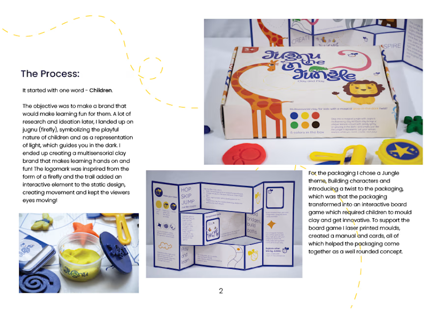
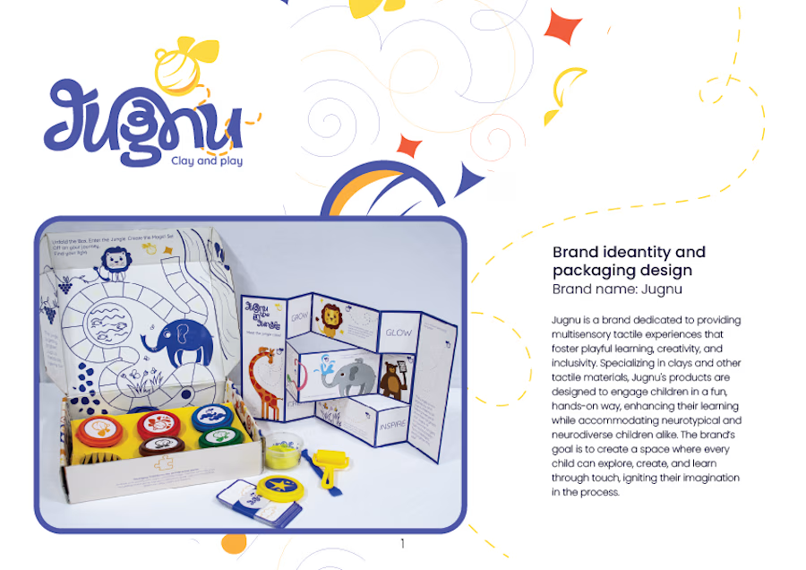
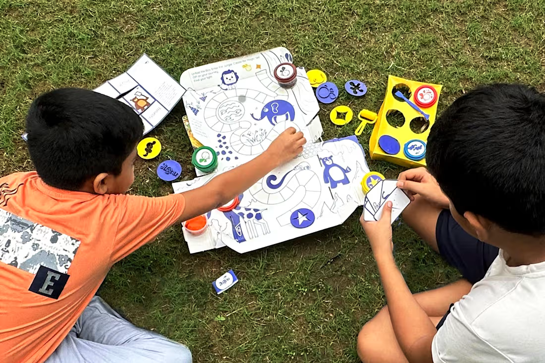

The packaging turning into a board game might be the strongest branding decision here - the identity keeps working after the unboxing instead of ending up in the bin. Did the glow-in-the-dark clay come first, or did the firefly metaphor lead you to it?

Clayful Spirit - Brand Identity & Logo Design
Clayful Spirit is a Bangalore-based pottery studio built around the idea of shaping clay with intention and joy. They came to me needing a visual identity that felt as tactile and human as the craft itself - something that didn't look like a generic "handmade" brand, but actually captured the rhythm of hands on wet clay.
The concept
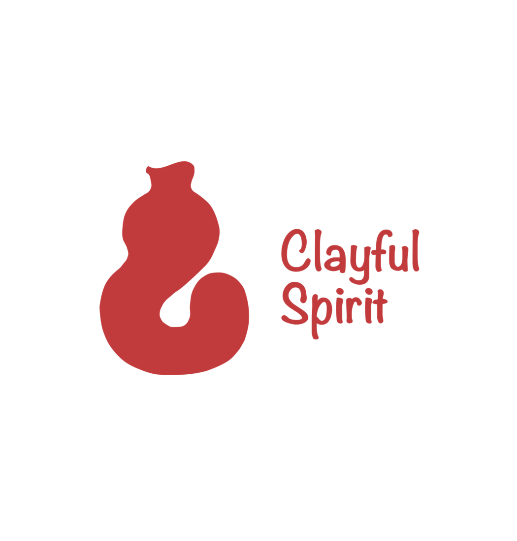
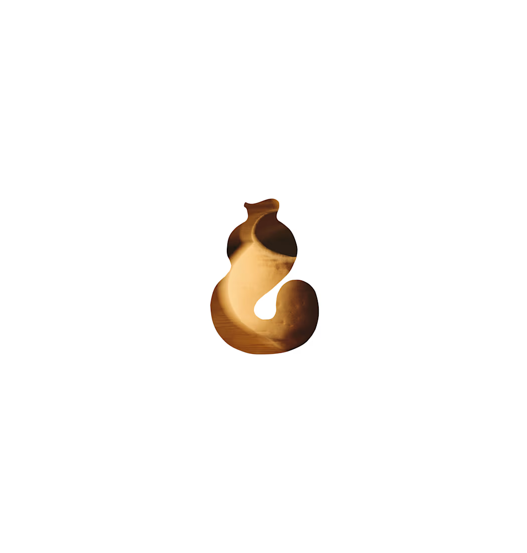
The core mark is a symbol that reads two ways at once - an abstract clay pot mid-throw on the wheel, and the ampersand-like curve of the number/letter "8," nodding to the infinite, looping motion of the potter's wheel. It's playful without losing craft-forward warmth, and simple enough to work as a stamp, an embosser, or a tiny favicon.
What I delivered
Primary logomark + wordmark lockup, paired with a custom hand-lettered logotype that mirrors the organic, slightly imperfect edges of thrown pottery
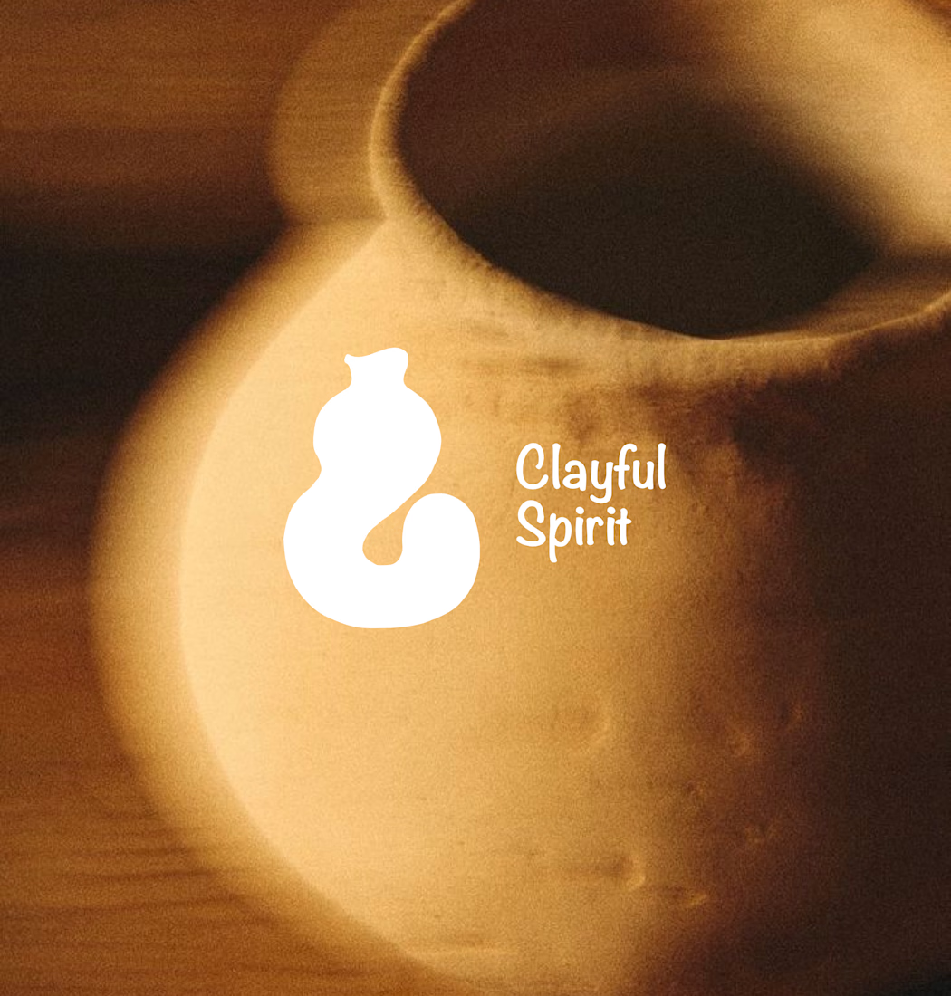
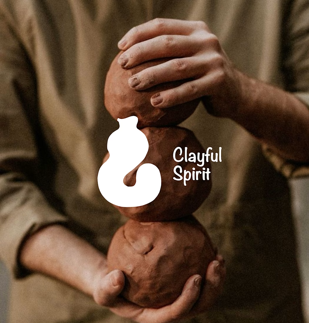
A flexible one-color mark that holds up in reverse (white on terracotta, red on cream) so it can live on packaging, clay stamps, and photography alike
A warm, earthy color direction (terracotta, clay red, cream) pulled directly from the studio's own materials
Real-world mockups against studio photography - raw clay, hands at work, pots on the wheel - to show how the mark behaves in-context, not just on a white background
Why it works
The mark was designed to disappear into the brand's own textures - sitting naturally on unglazed clay, catching studio light, holding up small on a hangtag or large on a shopfront. It gives Clayful Spirit a identity that feels less "designed" and more grown out of the craft itself.
Tools: Illustrator, Figma

Making the mark work as a physical clay stamp is the quiet constraint doing all the work here - relief printing kills thin strokes, so the fat one-color silhouette was probably decided for you. Have you pressed it into actual clay yet, or is that still living in the mockups?