The network for creativity
Join 1.25M professional creatives like you
Connect with clients, get discovered, and run your business 100% commission-free
Creatives on Contra have earned over $150M and we are just getting started
Back to feedPost

Clayful Spirit - Brand Identity & Logo Design
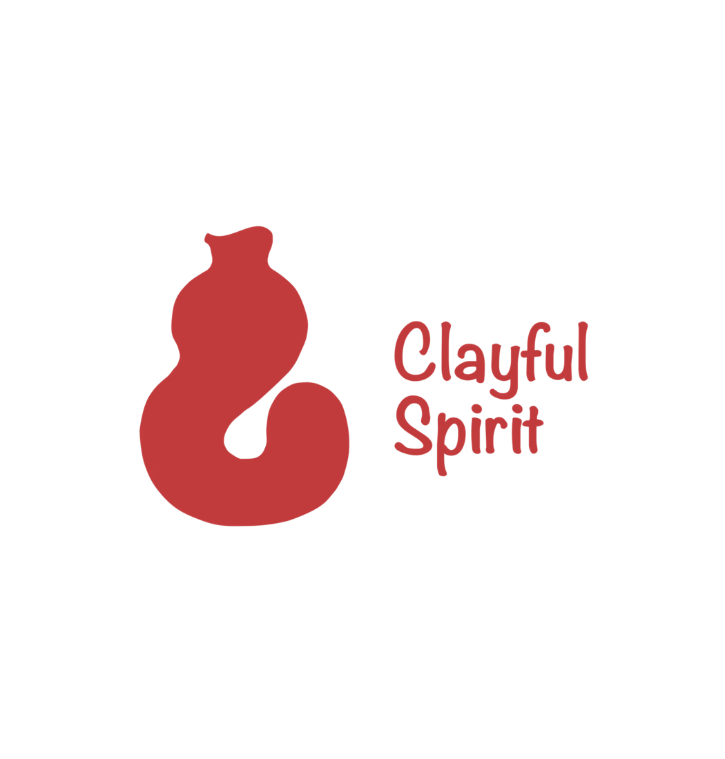
Clayful Spirit is a Bangalore-based pottery studio built around the idea of shaping clay with intention and joy. They came to me needing a visual identity that felt as tactile and human as the craft itself - something that didn't look like a generic "handmade" brand, but actually captured the rhythm of hands on wet clay.
The concept
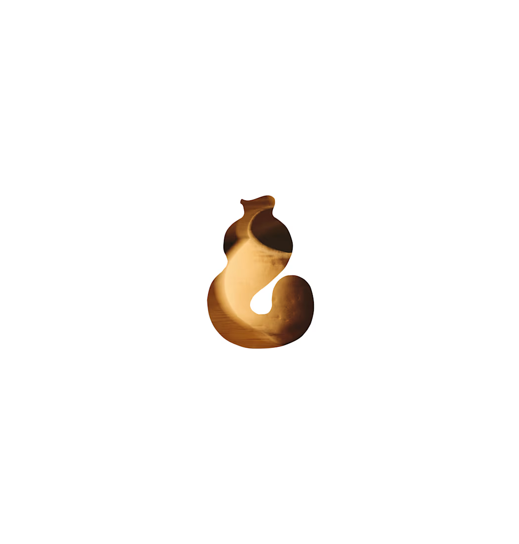
The core mark is a symbol that reads two ways at once - an abstract clay pot mid-throw on the wheel, and the ampersand-like curve of the number/letter "8," nodding to the infinite, looping motion of the potter's wheel. It's playful without losing craft-forward warmth, and simple enough to work as a stamp, an embosser, or a tiny favicon.
What I delivered
Primary logomark + wordmark lockup, paired with a custom hand-lettered logotype that mirrors the organic, slightly imperfect edges of thrown pottery
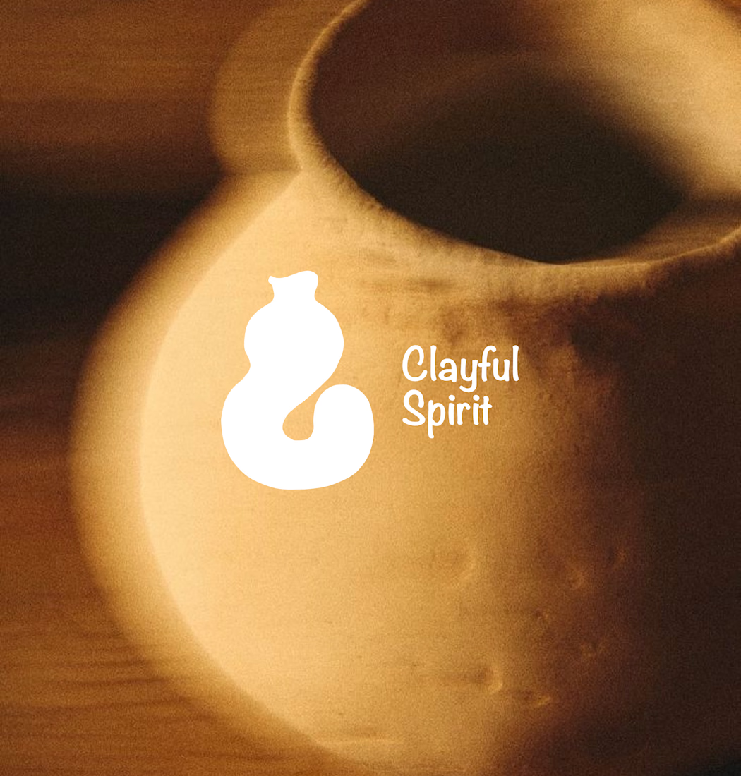
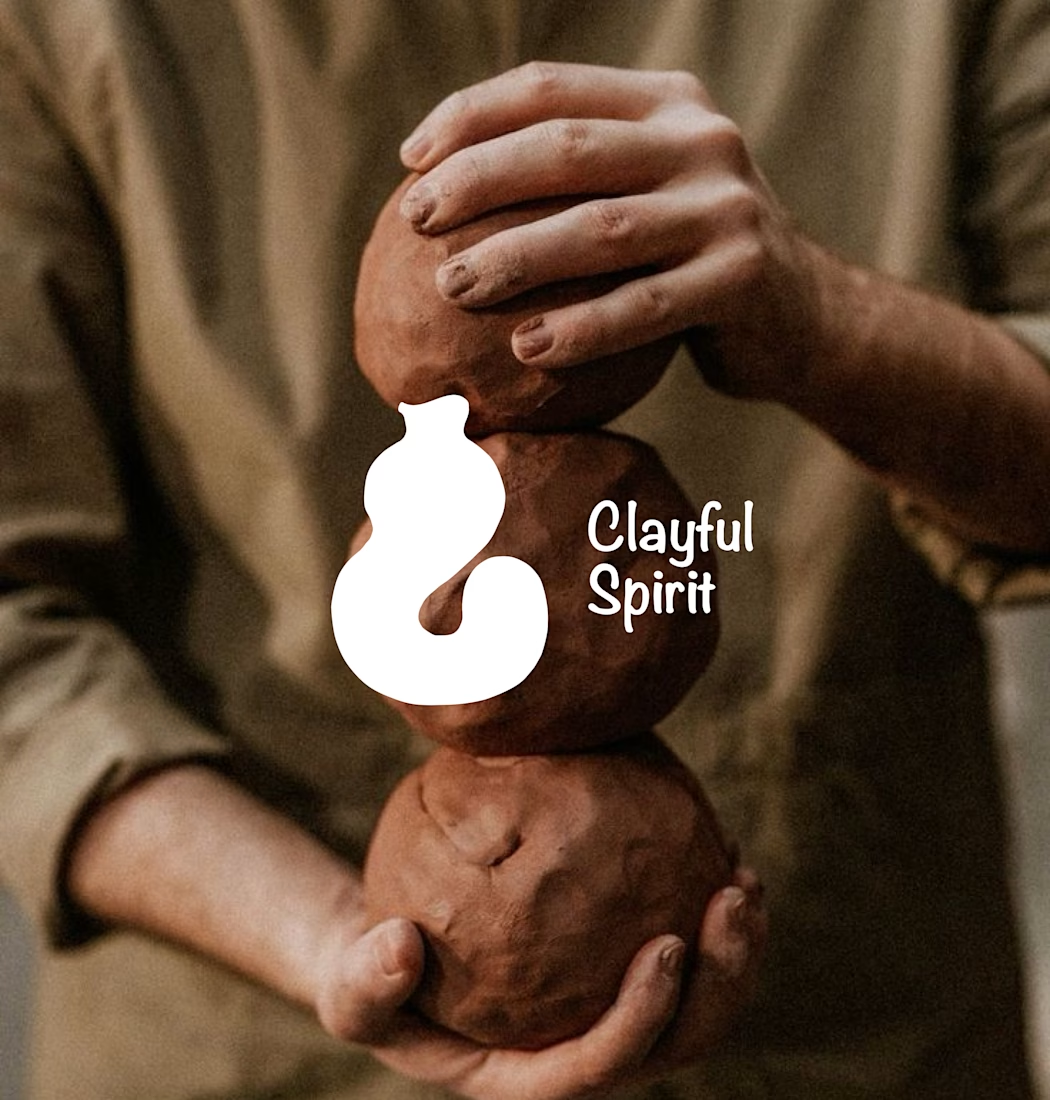
A flexible one-color mark that holds up in reverse (white on terracotta, red on cream) so it can live on packaging, clay stamps, and photography alike
A warm, earthy color direction (terracotta, clay red, cream) pulled directly from the studio's own materials
Real-world mockups against studio photography - raw clay, hands at work, pots on the wheel - to show how the mark behaves in-context, not just on a white background
Why it works
The mark was designed to disappear into the brand's own textures - sitting naturally on unglazed clay, catching studio light, holding up small on a hangtag or large on a shopfront. It gives Clayful Spirit a identity that feels less "designed" and more grown out of the craft itself.
Tools: Illustrator, Figma



This is up super coool!

The dual read of a pot mid-throw and a looping 8 is the clever part, but making it work as a single-color reverse mark is the harder problem most identity work skips — that's what actually lets it survive on unglazed clay and a small hangtag.

Making the mark work as a physical clay stamp is the quiet constraint doing all the work here - relief printing kills thin strokes, so the fat one-color silhouette was probably decided for you. Have you pressed it into actual clay yet, or is that still living in the mockups?

Absolutely beautiful work!


Awesome
The network for creativity
Join 1.25M professional creatives like you
Connect with clients, get discovered, and run your business 100% commission-free
Creatives on Contra have earned over $150M and we are just getting started






Related posts

From the cover to what’s inside 👀
Thank you to everyone who voted in my cover test. This time, I’m trying two short previews of DCS 654: my library of 654 dessert-inspired colors and matching textures, with ready-made palettes for your own design work.
Which video makes you more curious to explore the library: A or B?
And what made you choose that one?
You can take a closer look here: https://dcs.mariya.design/
36 voted
61%
23 voted
39%
59 votes
Closed


I’d pick B. It makes the colors and textures feel more engaging and makes me want to explore the full library.

Logos & Marks — Volume 12
A curated selection of recent logo and identity work.
This collection brings together commissioned projects, unused concepts, and exploratory directions across technology, AI, finance, sports, retail, and other industries.
The work explores geometric symbols, custom typography, monograms, and abstract forms, with a focus on clarity, distinction, and strong visual character.
Selected marks are available for acquisition.
For licensing, customization, or brand identity inquiries, feel free to get in touch.

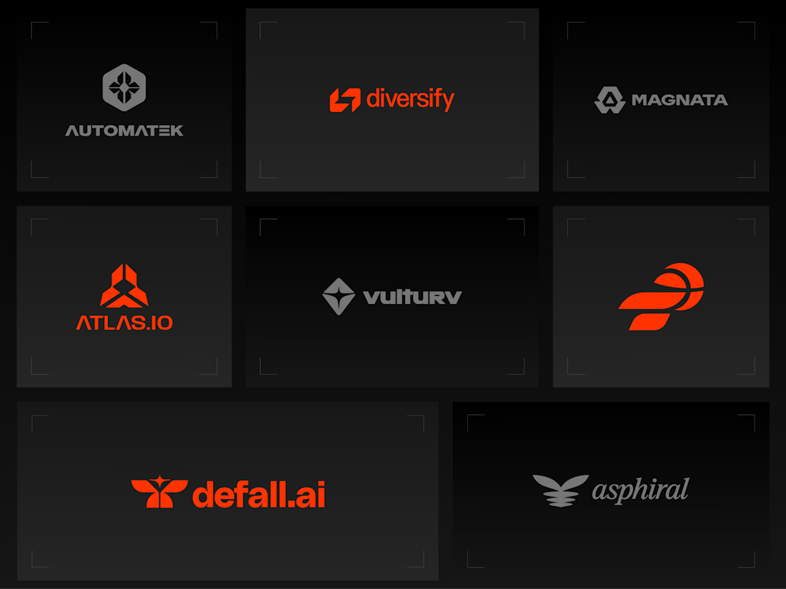
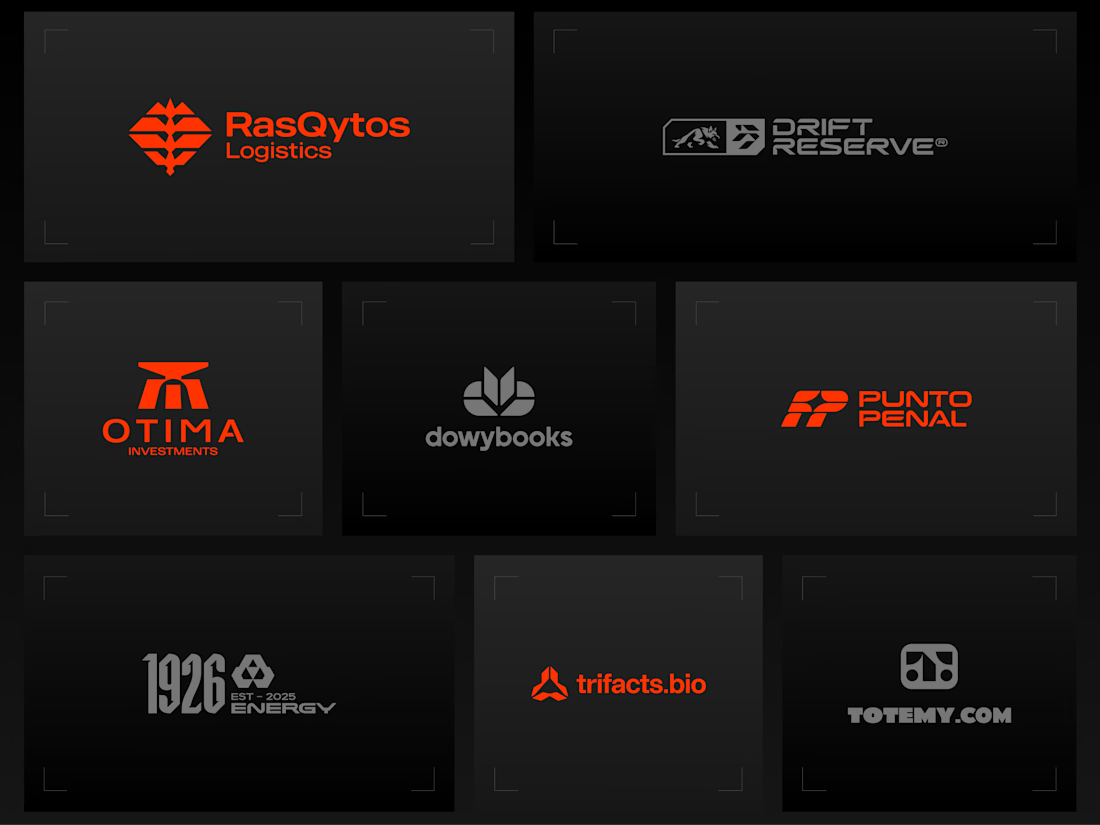
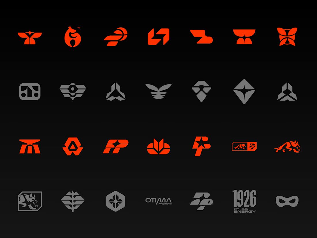


Holding the whole volume to one hot orange on charcoal makes the marks easy to compare, and the Otima symbol stacking a gate shape over the wordmark is my favorite of the set.

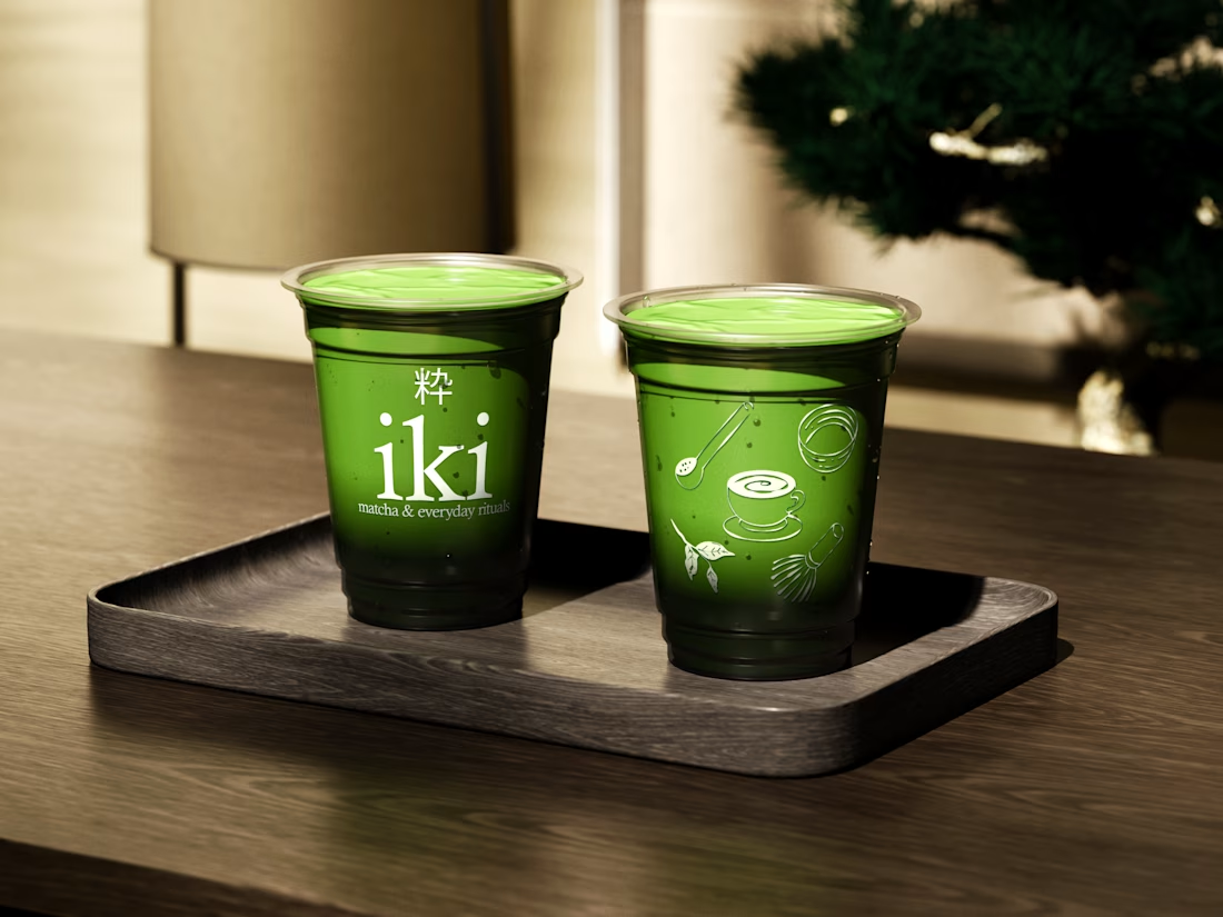
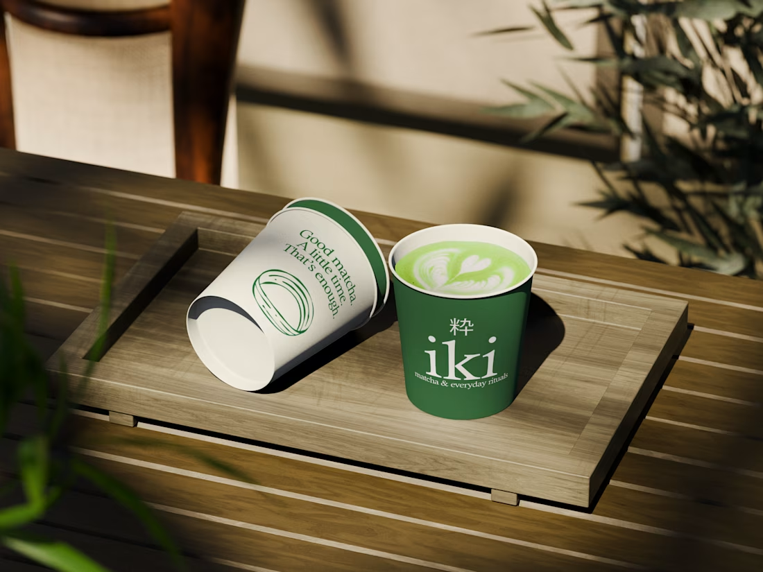
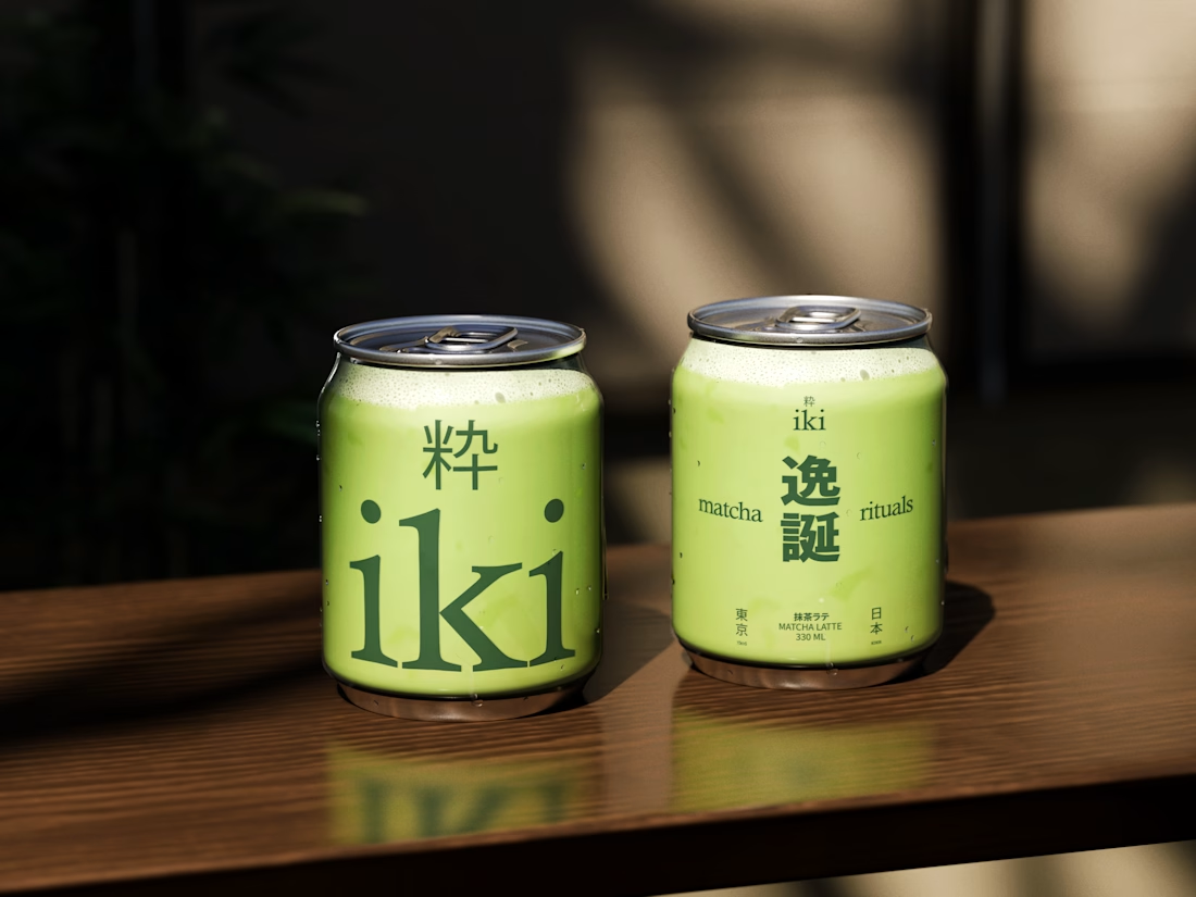
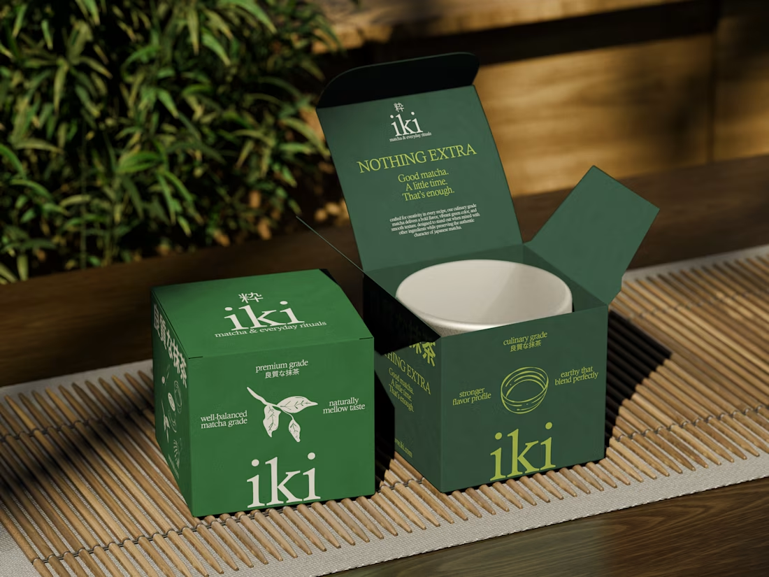
more visuals from iki, a matcha shop i’ve been working on 🍵
the project is getting close to its final stage, and it’s been really interesting to see how the initial concept has gradually turned into a complete brand.
from the strategy to the visual identity, every decision has helped shape a more cohesive and distinctive world for iki.
almost there. excited to share more of the final result soon

Strong concept and thoughtful execution. The logo feels distinctive and communicates the brand identity clearly.