pro
Mariya Vasileva
Brand Identity Design & Packaging Systems for Premium brands
- 20
- Followers


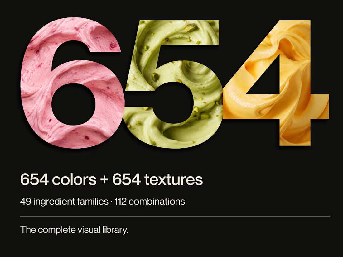
From the cover to what’s inside 👀
Thank you to everyone who voted in my cover test. This time, I’m trying two short previews of DCS 654: my library of 654 dessert-inspired colors and matching textures, with ready-made palettes for your own design work.
Which video makes you more curious to explore the library: A or B?
And what made you choose that one?
You can take a closer look here: https://dcs.mariya.design/
8
16
358
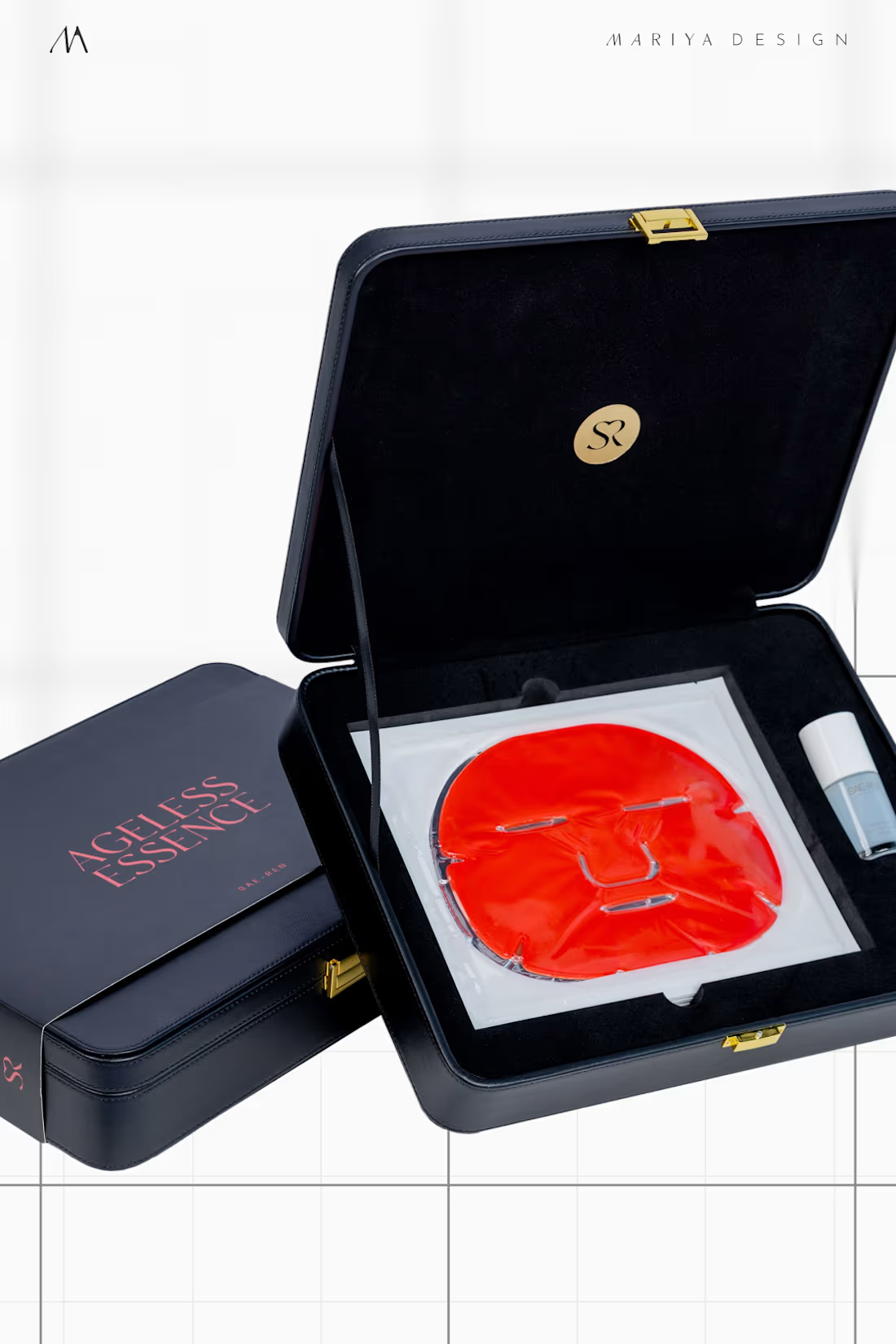
SAE-REN, a Singapore beauty lounge case study: skincare line packaging.
Treatment kits, bottles, ampoules, inserts, and sleeves shared the same structural hierarchy.
Controlled differences in color, finish, and material separated Pure (silver), Glow (gold), and later ASM (black) while keeping them part of one family.
next up: makeup expansion
1
198
11 days since I joined and I've been featured 3 times. Such a warm welcome from both the Contra community and team!
To be honest, I can post 5 times a day and never ran out of content, but I am not sure if people are actually interested in exploring my work (only client work).
I am a branding and packaging expert and have more than a decade-long experience of working with brands from around the world, including some from Fortune 500. However, I enjoy collaborating with business owners on a more personal level. That's when I started working with emerging and rising brands.
Below can be seen 2023-2024 highlights
1
185
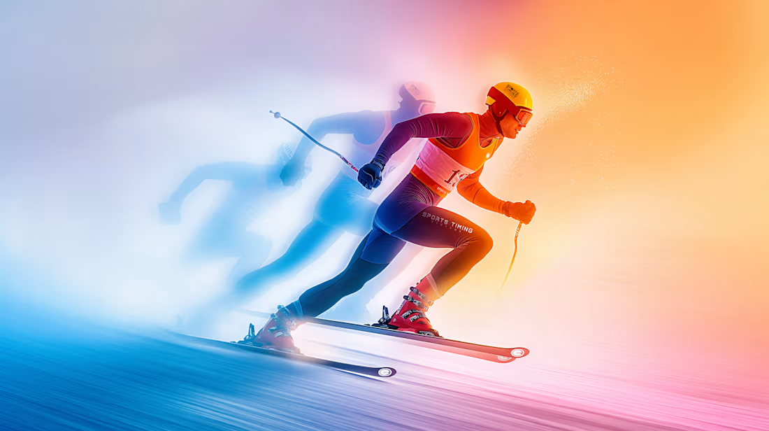
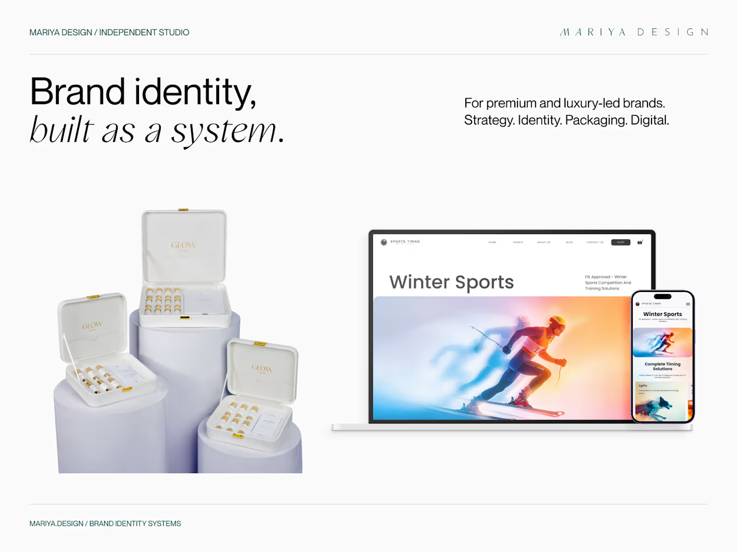
These 2020 banners for Sports Timing Systems took me hours upon hours. I had to use various tools and resources: 3D Max, 3D models, stock images, all mixed and edited in Photoshop.
When I did the brand evolution in 2024, I swapped the 3D models for AI-gen, yet the final looks/effects were post-produced in Adobe PS.
Which one feels neater, better, cooler, eye-catching?
In both cases visuals were made as series, matching the full branding I developed at the time.
21
22
2.4K